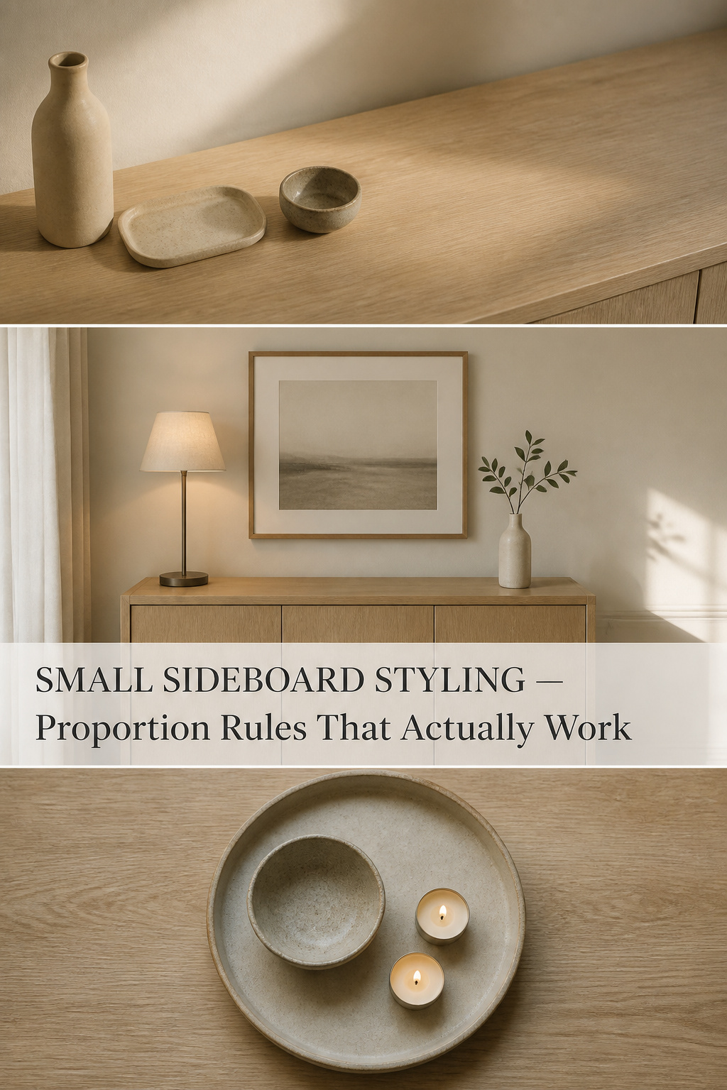
A small sideboard is the one quiet surface in a busy dining room. Yet most narrow ones look crowded and proportion-less, and no rearranging quite fixes it. The trouble is that small sideboard styling gets treated as a shrinking exercise — smaller piece, so smaller objects, more of them to fill the gap. That instinct is backwards. A compact surface is not a limitation to apologise for; it is a forced edit, and a forced edit is a gift.
TL;DR
- Keep three objects on a narrow sideboard and leave 50–65% of the surface empty — fewer, larger pieces read as deliberate where many small ones read as clutter.
- Cap the largest object at about one-third the sideboard’s length, set it off-centre, and make it the tallest of three height tiers; a slim buffet lamp (5–7 inch base) adds height without eating the 12–16 inch depth.
- Refresh by season with one swap, not an addition: the lamp and tray stay all year, and only the stem or the bowl changes.
Why Small Sideboards Get Styled Wrong (and the Reframe That Fixes It)
I lived for six years in a 38-square-metre apartment in Malmö where the dining table was also the desk and, some weekends, the workbench. The one console along the wall had no margin for error: pile it with small things and the whole room shrank; edit it down and the same square metres breathed. That apartment taught me what I tell anyone with a narrow buffet — the constraint is not the problem. The miniaturising is.
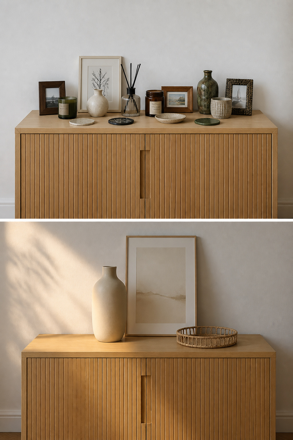
The miniaturisation trap: scaling objects down with the furniture
When the furniture is small, the temptation is to match it with small objects — tiny frames, little candles, miniature vases. From across the room they vanish, reading as visual noise because nothing is large enough to hold the eye. A compact sideboard needs the opposite: one larger anchor that stops the display disappearing at room scale, one well-chosen piece at the right size rather than five at the wrong one.
What constraint actually gives you: a forced edit
A small surface makes every object matter more, because there is nowhere to hide a mistake. That sounds like pressure, but it is clarity: it forces one honest question of each object — does this earn its place through genuine use or considered beauty? Anything kept from obligation goes back in the cupboard. Emptiness, on purpose, is rest for the eye.
Reading your sideboard’s proportions before adding anything
Before a single object lands, learn the surface. Narrow sideboards usually run 12–16 inches front to back — nothing should overhang into the walkway. Then do the thing most people skip: step back and look from across the room, where any scale problem is obvious at distance and invisible up close. For the universal principles, our dining room buffet decor guide covers the full picture; here we stay with the small surface.
Proportion First: Matching Object Scale to a Small Surface
The one-large-piece rule on a narrow sideboard
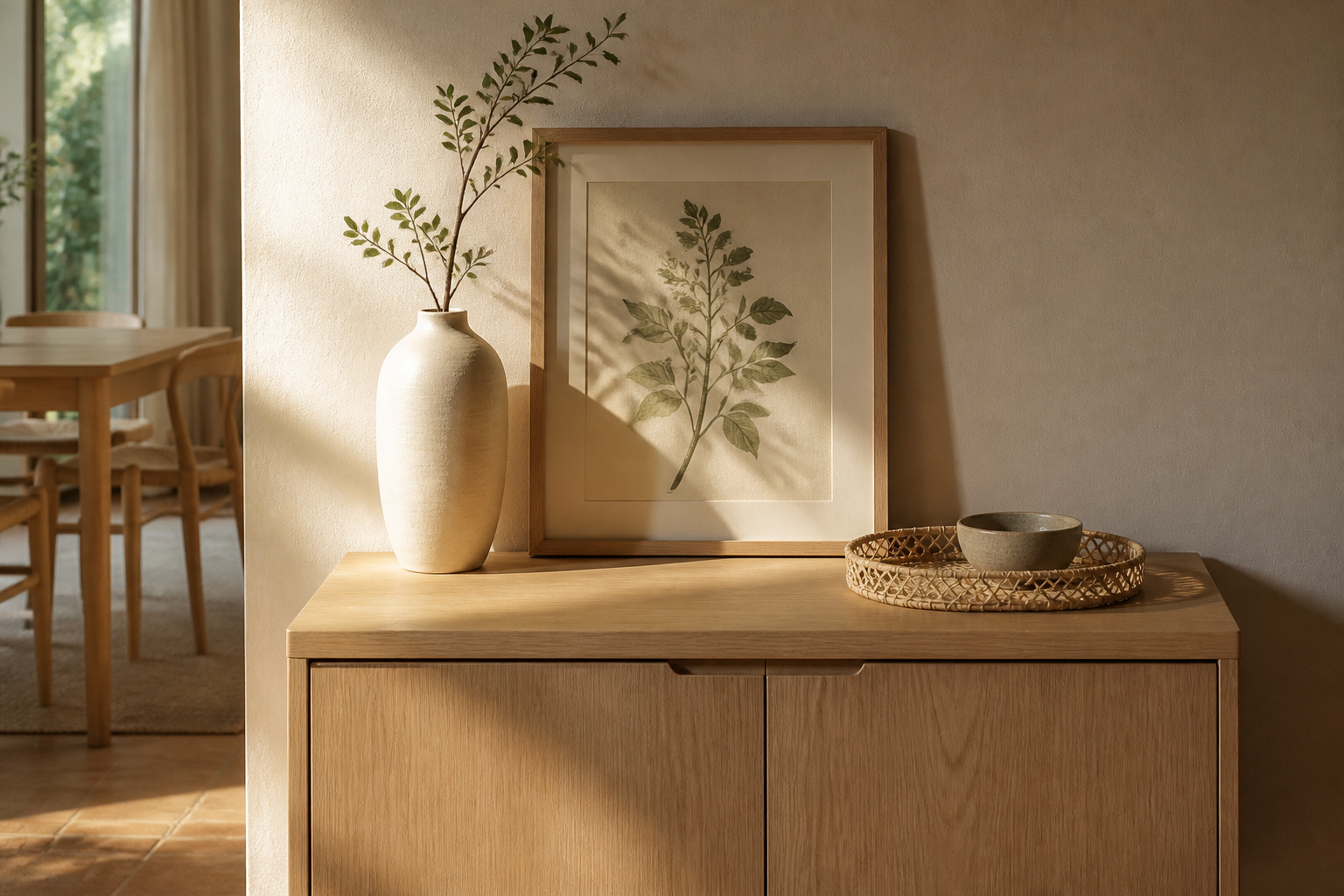
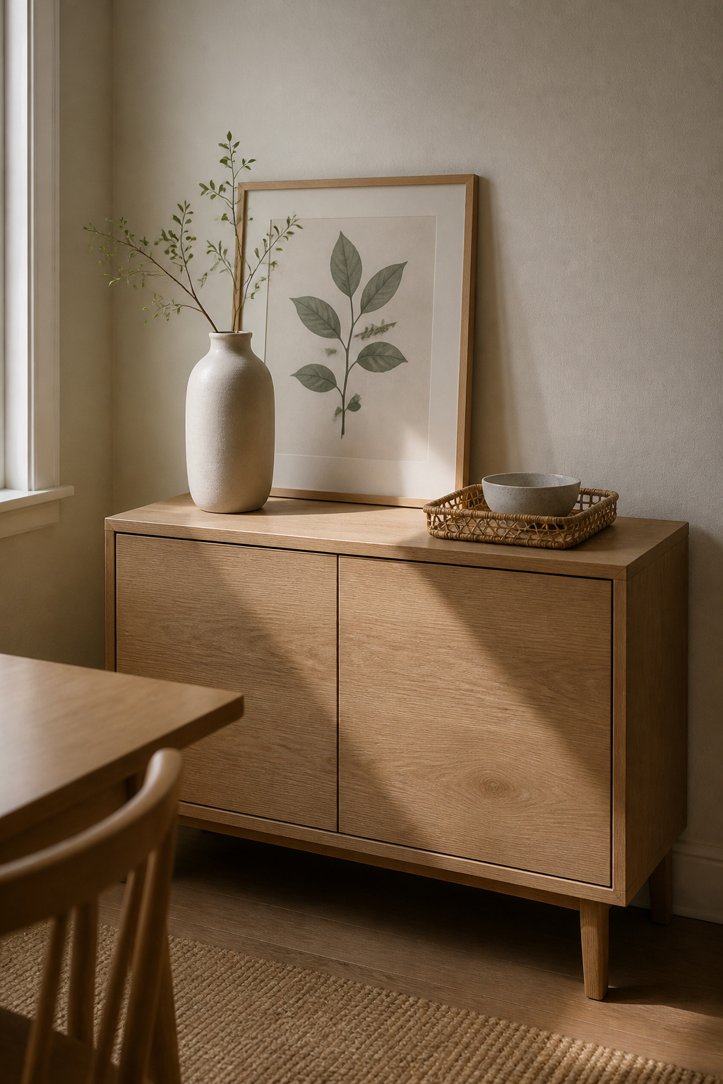
The largest piece should not exceed about one-third of the sideboard’s length — on a 36-inch piece, an anchor of roughly 12 inches. It should be the tallest thing on the surface, set slightly off-centre, since centring can make a narrow piece look shorter. A sculptural vase, a leaning print, or a slim lamp base all give height without horizontal mass:
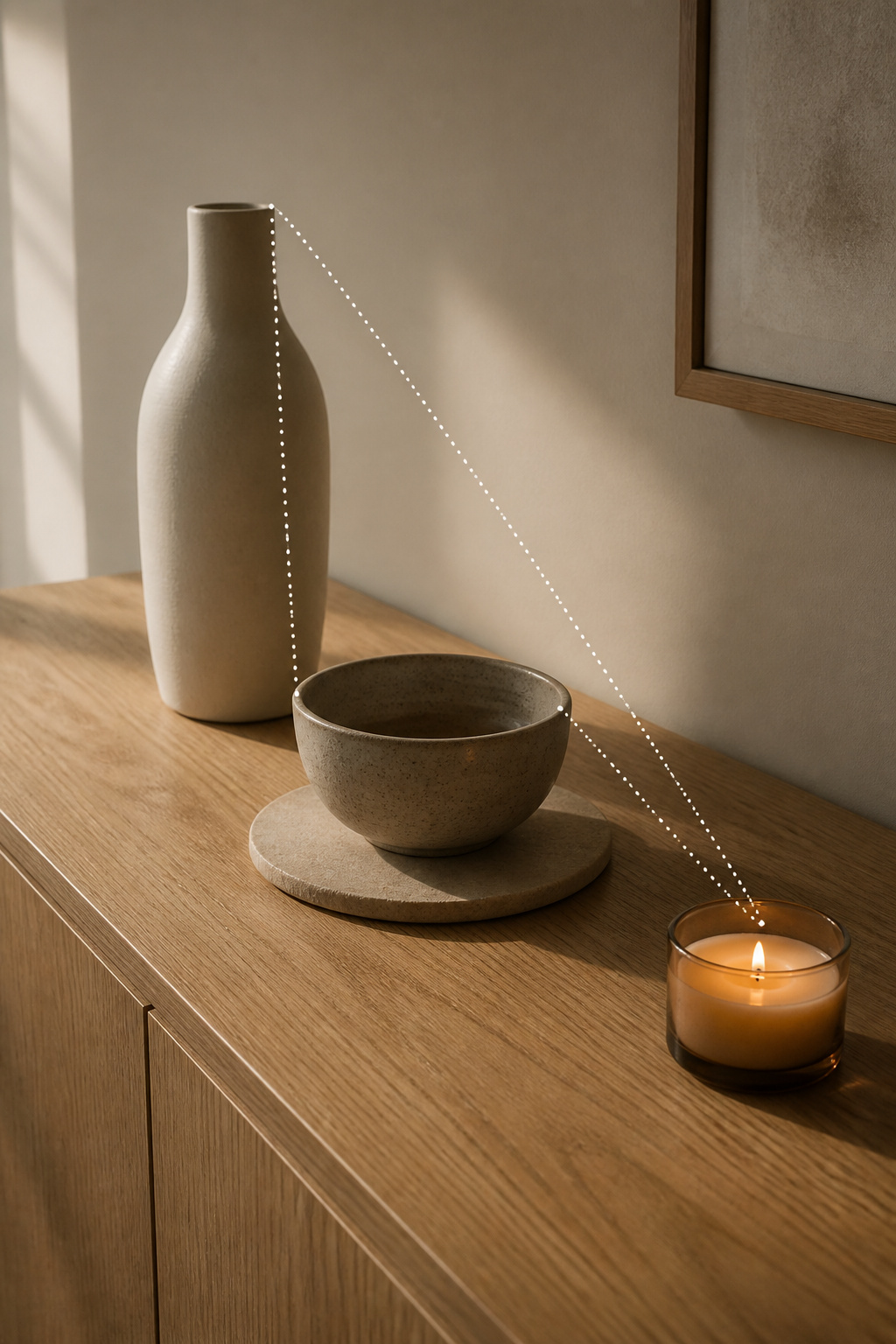
| Object role | Suited piece | Scale target | Contributes |
|---|---|---|---|
| Anchor (tallest) | Sculptural vase or slim lamp | ≤ one-third of length (~12 in) | Height and a focal point |
| Mid-tier | Bowl on a trivet, low book stack | 8–12 in tall | Bridges the height gap |
| Low accent | Single candle, short stem in a bud vase | 3–6 in tall | Completes the triangle |
Height still matters: the three-tier principle at compact scale
A flat display reads as unfinished, so give it three heights — tall (18–24 inches), medium (8–12), low (3–6) — placed back to front, which manufactures the depth a shallow surface does not actually have. Keep the triangle off-centre.
Width and depth limits — how far back objects can sit on a slim surface
Depth is the constraint people forget. A standard table lamp base can be 7–10 inches across, swallowing most of a 12–16 inch surface; a buffet lamp’s 5–7 inch base is narrow by design. Nothing should project past the front edge — on a 12-inch top, anything deeper than 8–9 inches crowds the working zone.
Fewer Objects, Better Chosen: The Edit That Changes the Room
Three objects maximum on a narrow surface — why this number works
Three is an odd grouping the eye reads as one intentional unit, and it protects the empty surface — add a fourth piece at the same size and the negative space vanishes. A large sideboard tolerates seven items; a narrow one tips into clutter at four.
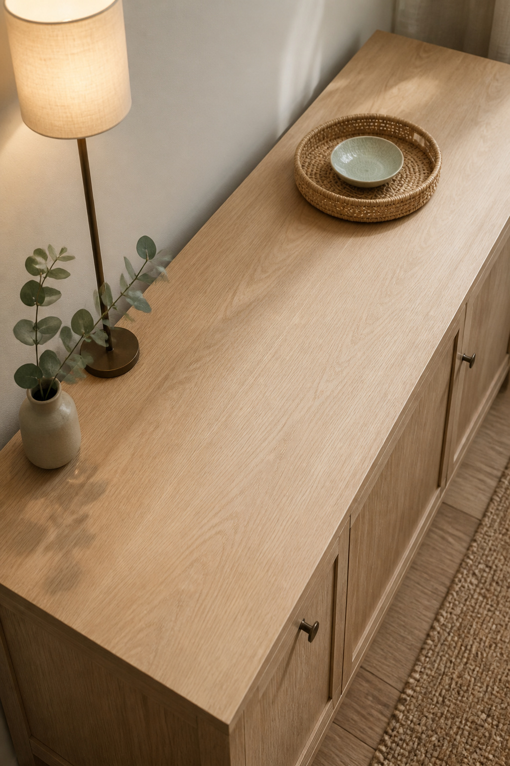
Which object categories earn space on a small sideboard (and which don’t)
Not every object deserves a place on a slim surface. The ones that earn it pull double weight:
- A lamp — adds height and light at once, the surface’s most valuable contribution.
- A tray — anchors a small group and contains it as one visual unit.
- A single stem or compact plant — brings organic shape without spreading.
- One leaning art piece — adds vertical interest while consuming no surface.
What does not belong: multiple small frames, figurine collections, loose candles without a tray — they pluralise the surface and the eye cannot resolve them. Texture earns its keep too: pair a matte ceramic, a natural fibre, and one glazed element rather than three pieces in the same material.
The serving-space rule: what must stay clear on a functional buffet
A dining room sideboard is furniture, not a display case. It needs a clear working zone — room enough to set down a platter when the meal arrives. The rule enforces the three-object limit for you: a lamp at one end, a tray and bowl at the other, the centre open and ready.
Dual-Purpose Objects: When One Piece Does the Work of Three
Lamp as anchor and height-builder on a slim surface
A buffet lamp is the clearest example. Its 5–7 inch base and 30–40 inch height give a small surface vertical structure no decorative object can, with the shade bottom near seated eye level — roughly 32–36 inches up — to light the display without glare. On a piece under 48 inches wide, skip the pair: a single lamp at one end frees half the top. For the full lighting treatment, see slim buffet lamps.
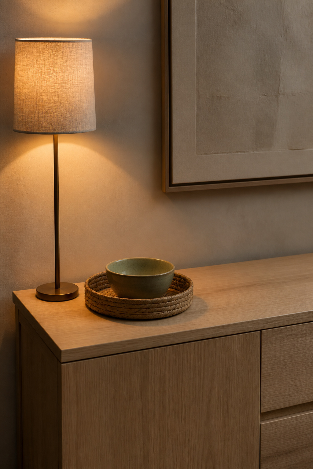
Tray as containment and negative-space definer
A tray turns a cluster into a single object. Set a bowl, a candle, and a small piece inside one and the eye reads “tray,” not “three more things” — your composition stays at three even as it holds more, and the surrounding emptiness reads as deliberate. Choose a round or small oval tray, roughly 20–28cm, not a long rectangular one that reads as a second surface.
Greenery that functions as the whole seasonal accent in a small display
One stem is the most efficient seasonal tool a narrow surface has — eucalyptus in spring, a dried seedhead in autumn, an evergreen cutting in winter, the slim vase never moving, only the stem changing. For a living plant, choose one that grows up rather than out: a snake plant, a single-stem succulent, a trailing pothos. This restraint-led approach sits close to modern minimalist styling, where the same few-objects logic is the whole point.
The Wall Above a Small Sideboard: Scale Rules That Prevent the Floating Effect
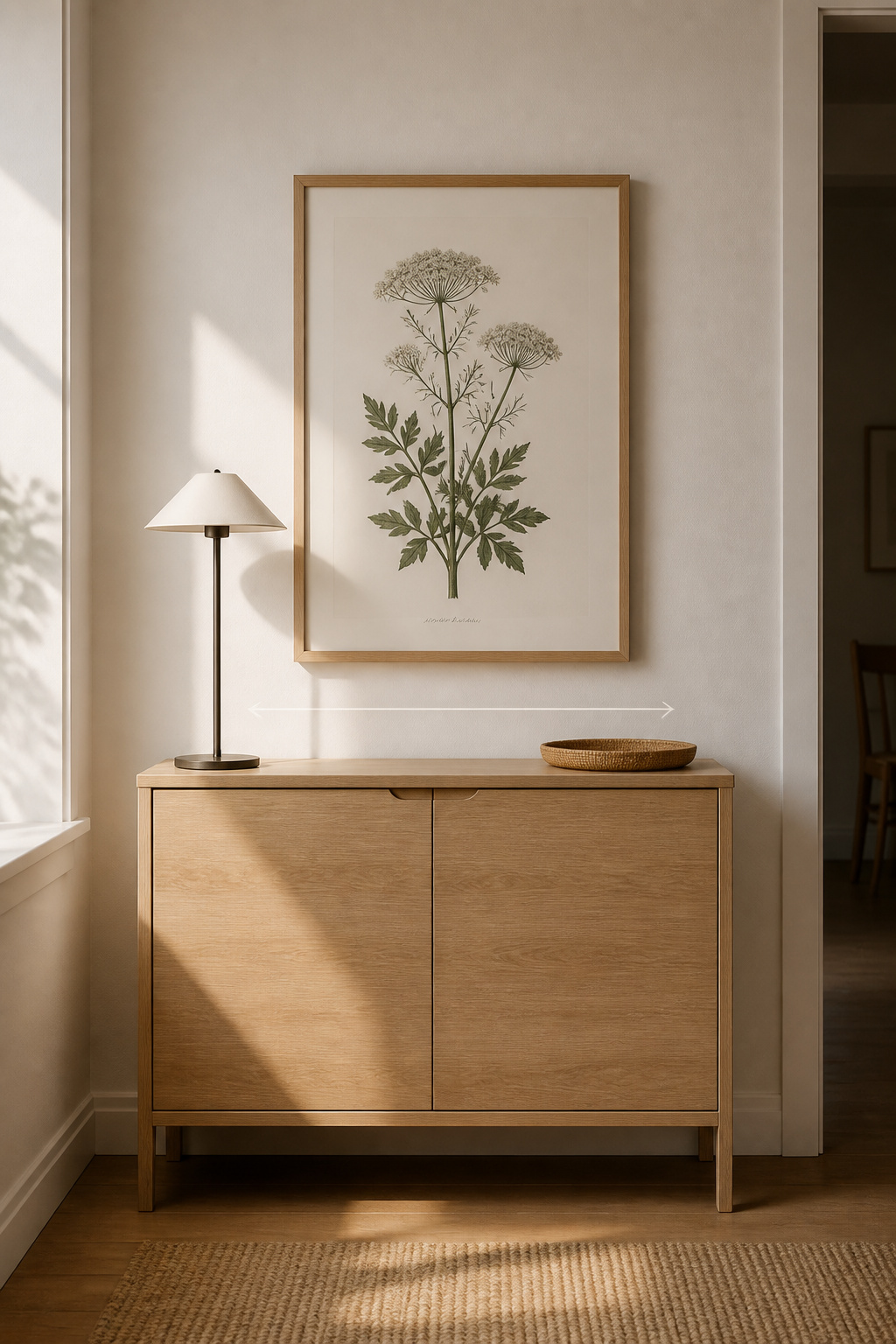
The wall above a narrow piece is where scale errors show most: a surface mistake is forgivable from across the room, but a wall mistake announces itself.
Why the wall above a narrow sideboard needs tighter width ratios
Whatever you hang should be 60–75% of the furniture’s width, which keeps it tied to the sideboard rather than floating as unrelated decoration. The gap between surface and frame should sit at 4–6 inches — a tighter gap than open wall art, because it anchors the piece on a compact wall. Past 75% the piece turns top-heavy.
Mirror vs artwork on a compact piece — which one opens the room
A mirror enlarges a tight dining room — it doubles perceived depth and bounces what little light there is, earning its place in a room with one window. Artwork does the opposite, adding warmth where light is already adequate or where a reflection would only show the opposite wall.
Single large piece vs small gallery — what the wall can hold
On a narrow surface, one large piece beats a gallery — the span is too short for a gallery to develop, and three small frames read as busy and disconnected. If you want more than one, stop at two, matched and hung level. Or lean a large print on the surface, which sidesteps the hung-too-high error.
Seasonal Refreshing on a Small Sideboard: Maximum Impact, Minimum Addition
A narrow sideboard tests seasonal styling harder than everyday display does: the proportions are already at the limit, so anything added on top breaks them.
Why seasonal swaps must respect the surface limit even more strictly
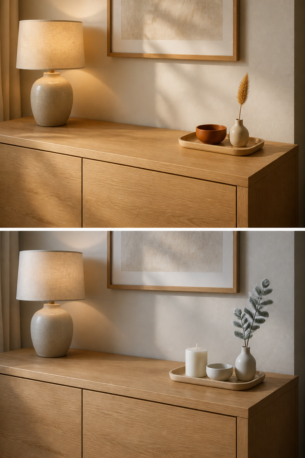
Seasonal styling on a small surface is a replacement exercise, never an addition one: every new piece has to displace an existing one, because the November arrangement will not survive a layer of holiday extras over it. The simplest way to hold that line is a small box of off-season accents, so the swap stays instant.
The one-swap method: change only the accent, never the anchor
The anchor layer stays put all year: the lamp and tray do not move. Only the single seasonal accent changes — the stem in the bud vase, the object in the tray, the colour of the low bowl. A working sequence runs a white pillar candle for winter, eucalyptus in spring, a dried seedhead in autumn; the whole refresh takes under five minutes. Seasonal change is its own subject; on a small surface, this one-swap method is what keeps it from tipping over.
Compact seasonal pieces that land without crowding
The pieces that work are small and singular: one pillar candle, one seasonal stem, one modest ceramic that swaps with the regular bowl. Keep that ceramic small enough to nest inside the tray rather than command the surface — a judgment call, not a measurement; the test is whether it still respects the one-third anchor rule. What fails is plural: garlands eat the length, an oversized pumpkin breaks the proportion. Colour is the lightest swap of all — clear glass to terracotta to sage shifts the season without changing scale.
A small sideboard was never the weaker version of a large one. Styled with proportion first, it becomes the calmer one — three considered objects and a clear top saying more than a crowded buffet could. You now have the method: anchor with one larger piece, hold to three, let each do two jobs, and refresh by swapping rather than adding. The constraint you started out fighting turns out to be doing the work. Photograph the result on a grey winter morning; if it holds in the worst light of the year, it holds.
FAQ
How many things should you put on a small sideboard?
Three objects is the practical ceiling for a narrow sideboard: a lamp for height, a tray holding one contained item, and one organic accent such as a stem or small plant. Leave 50–65% of the surface visibly empty. Three reads as deliberate; four or more reads as clutter on a compact top.
What size lamp works on a narrow sideboard without overwhelming it?
Choose a buffet lamp with a base of 5–7 inches and a total height of 30–36 inches. The slim base keeps the shallow 12–16 inch depth workable, while the height brings the shade bottom to seated eye level. On sideboards under 48 inches wide, a single asymmetric lamp beats a pair.
Can a small sideboard still have a statement piece above it?
Yes — and the wall needs something. Size the piece at 60–75% of the sideboard’s width: narrower and it floats, wider and it overshadows the furniture. Keep a 4–6 inch gap above the surface, or lean a large print on the top to skip hanging altogether.