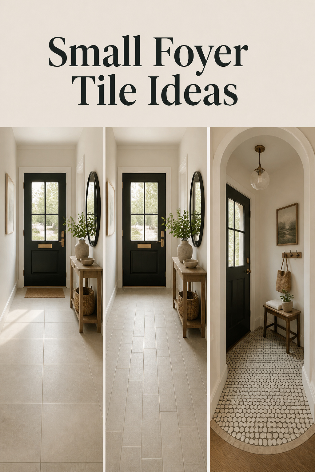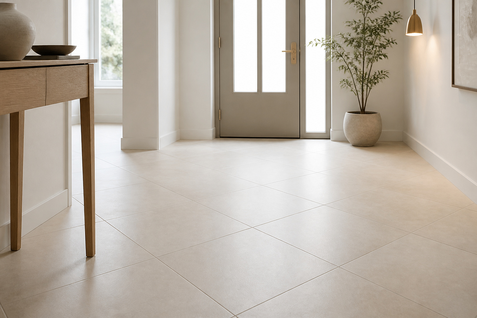

A small foyer rarely gets a fair hearing. The floor area is tight, often under 36 square feet, sometimes as little as 3 by 5 feet in a compact home. The light is poor, and by the time the boots and coats arrive the space feels cluttered before anyone has decided anything. So the instinct is to treat the size as a fault and cover it with something busy. That instinct is the mistake. The best small foyer tile ideas do the opposite: they use restraint to make a tight entry read as deliberate rather than merely small, and three tile variables do almost all of that work.
TL;DR
- Large-format tile (16×16 or 24×24) with tight, colour-matched grout reads as one continuous surface, because fewer grout lines stop the eye counting the floor.
- Grout colour matters more than people expect: match it closely to the tile, but choose a mid-tone over pure white so boot traffic does not show.
- A 45-degree diagonal set draws the eye to the corners and widens the space, at roughly 15% material waste versus 10% for a straight grid.
The Small Entry Is a Design Constraint, Not a Design Problem
A compact entry is the easiest room to get right, precisely because there is so little of it. Every choice is visible: in a 4-by-6-foot foyer the tile is most of what you see. The average US foyer runs 40 to 80 square feet; anything under 36 counts as small. None of that is a defect. It is the brief.
What a tight foyer is actually asking you to do
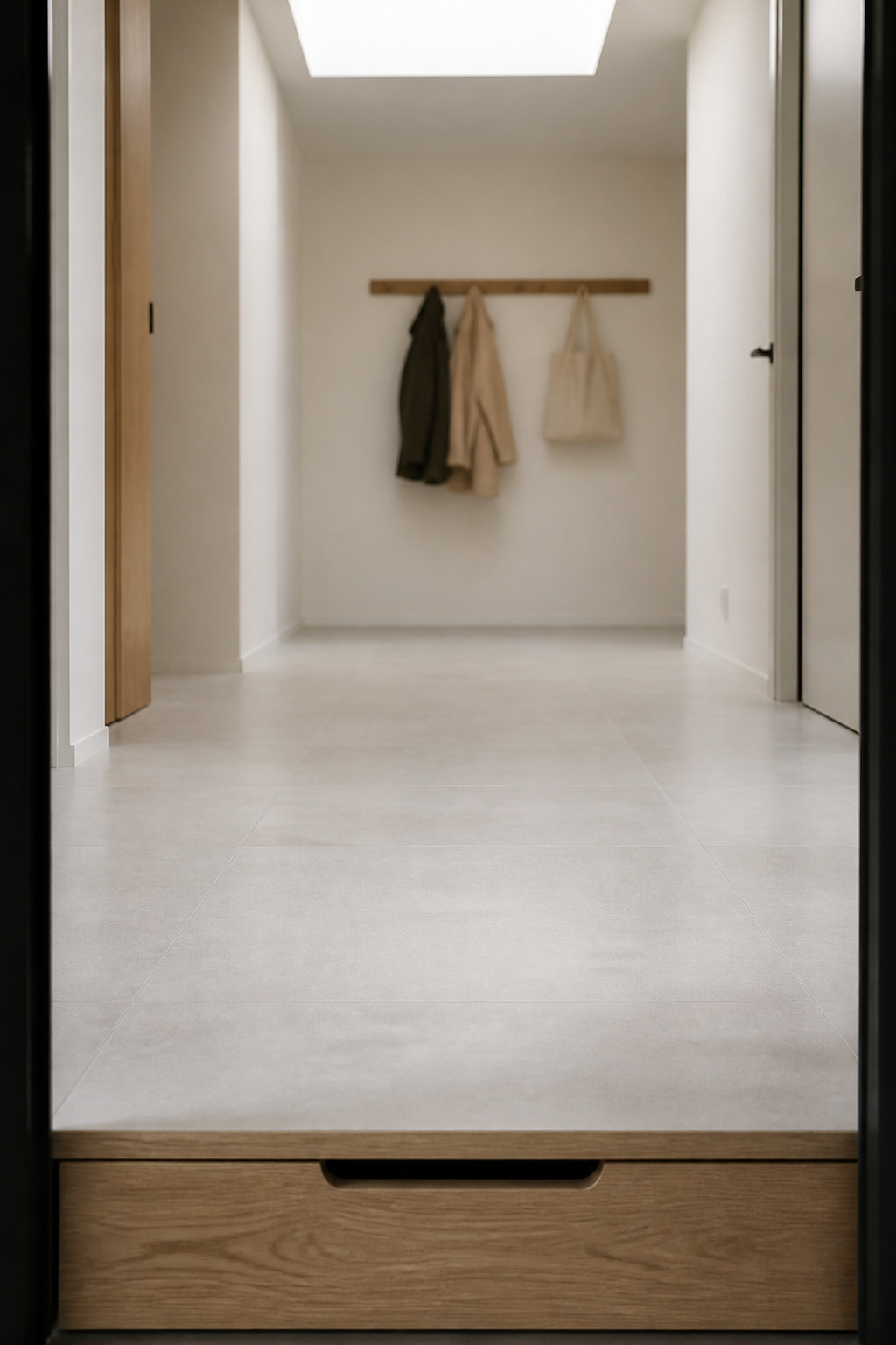
A small entry asks for fewer decisions, made well, rather than many stacked together. The floor also works hard underfoot, because an entry is wet and high-traffic, so it should meet the ANSI A137.1 wet slip standard: a minimum DCOF of 0.42 for interior floors walked on while wet. That practical floor sits under every aesthetic choice that follows.
Why the biggest visual mistake is trying to distract from the size
The common error is reaching for intricate pattern to make the entry “interesting.” In a small footprint, busy tile compounds the tightness: too much activity makes the floor read as busier, and therefore smaller. Large-format tile does the reverse. As Arizona Tile’s design editors note, large tile makes a small area seem larger through a simpler, more streamlined effect. Restraint is the expanding choice, not the timid one.
The three tile variables that change perceived space
Three levers control how a floor reads, and you can adjust each independently:
- Format — the tile’s dimensions, which set how many grout lines cross the floor.
- Grout contrast — how visible the grid is once the tile is laid.
- Lay direction — whether the lines point at the nearest wall or toward open space.
The rest of this article takes them in turn. For the wider decision, see the complete guide to entryway tile floors.
Large-Format Tile: Fewer Lines, More Floor
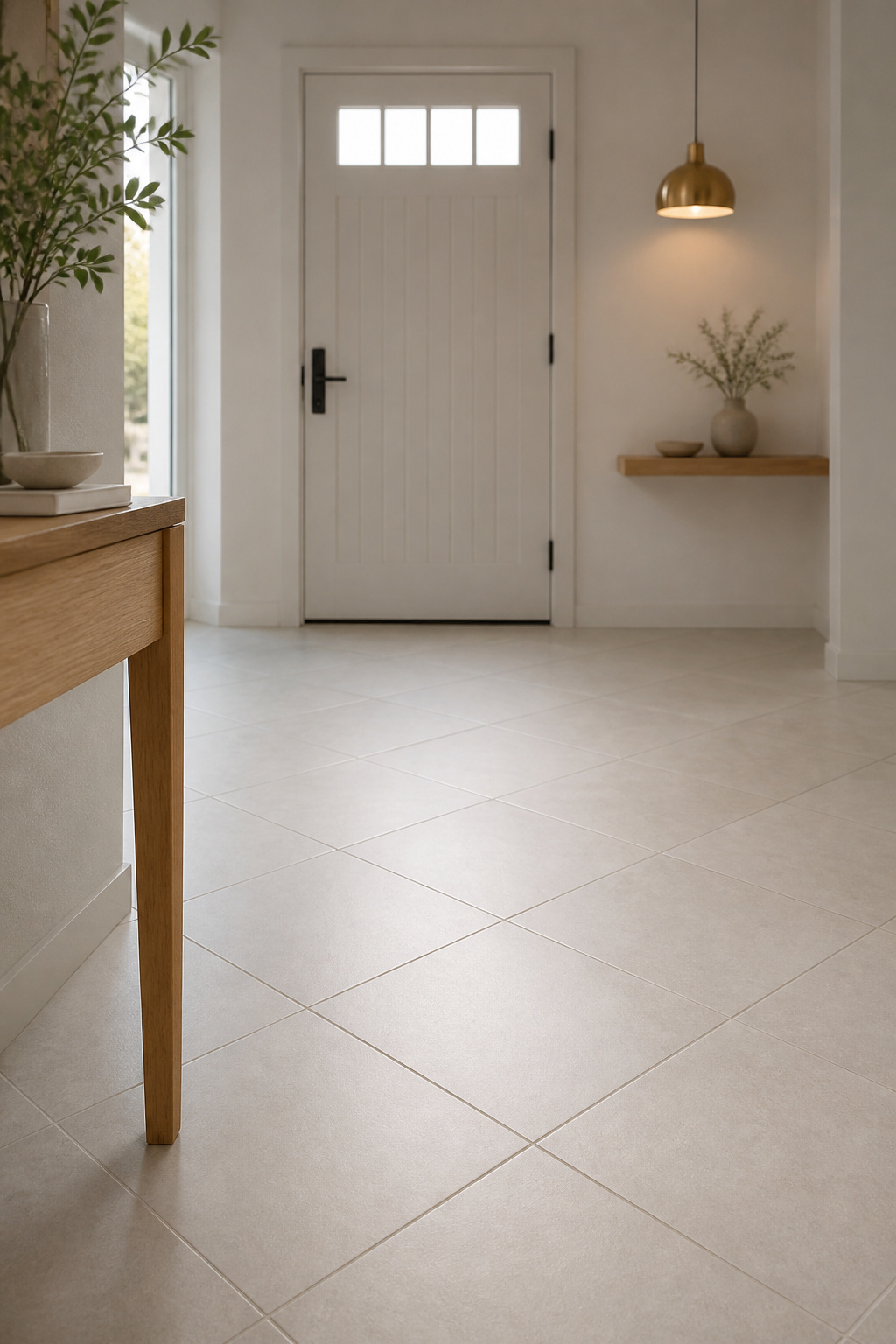
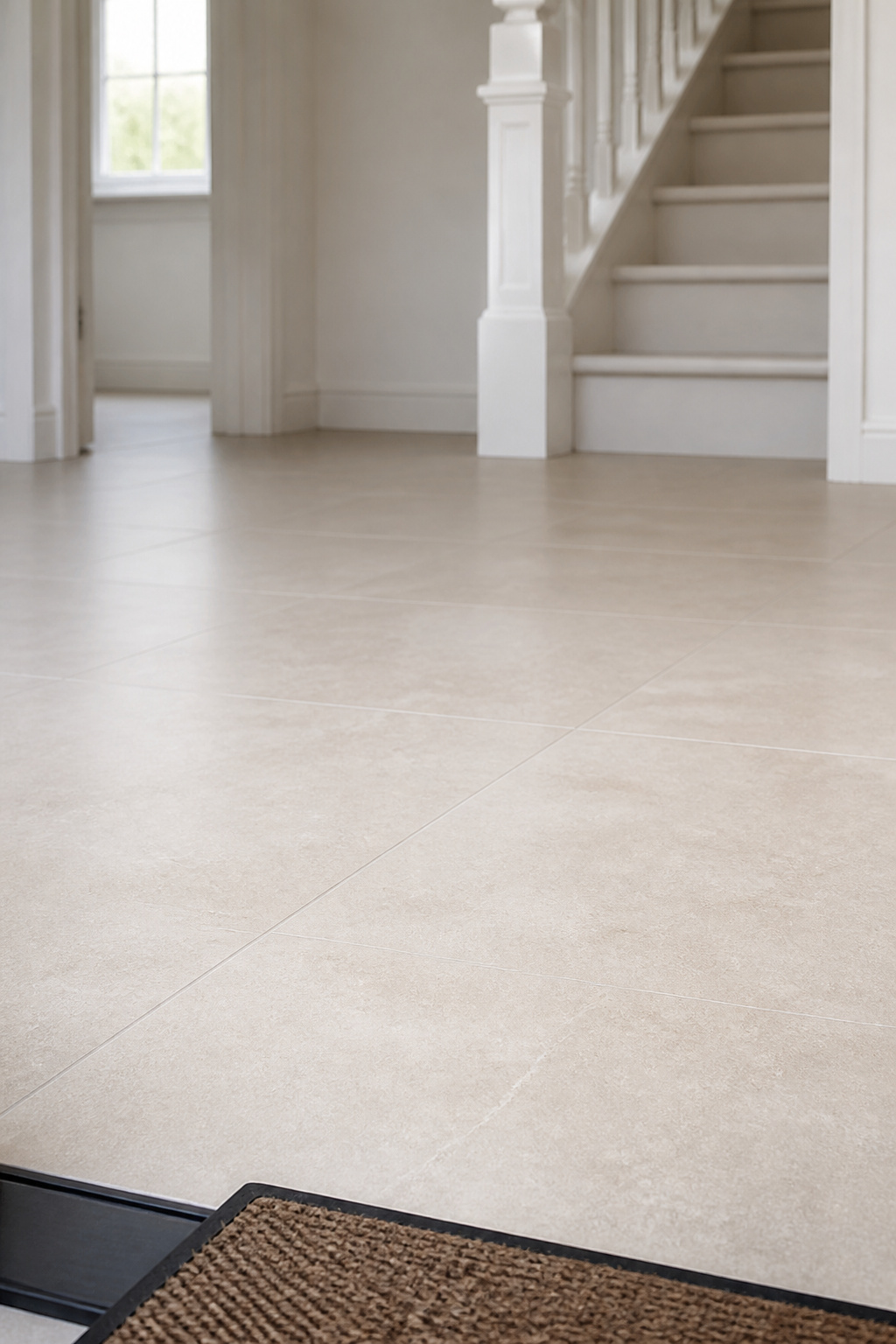
The canonical small-foyer move is large-format tile with tight grout. It works because grout lines are the main thing the brain uses to calculate floor size. Reduce the line count and the eye stops counting the grid.
Why grout lines are the enemy of a small space
Narrow grout lines minimise the visual breaks between tiles, so the floor reads as one continuous surface. There is a hard limit, though. ANSI A108.02 requires a minimum 1/8-inch joint for rectified tiles with any side over 15 inches, and Daltile recommends 1/8 or 3/16 inch on most large-format tile to prevent lippage, the uneven edge where one tile sits proud of the next. So the near-invisible effect comes from matching the grout colour, not from going below the standard. The dividend is practical too: fewer lines, fewer crevices to catch the mud a foyer collects.
16×16, 24×24 or 12×24: which format fits which entry footprint
Here I commit to one number rather than offering a menu. Run the maths on your dominant wall first, because the right format follows the footprint.
| Foyer width | Recommended tile | Why it fits |
|---|---|---|
| 4 ft (48 in) | 24×24 | Exactly 2 full tiles per row, no edge cuts |
| 4.5 ft (54 in) | 16×16 | 3 full tiles plus a clean 6-in strip, not a sliver |
| Narrow corridor entry | 12×24 | Plank runs along the long axis and reinforces depth |
A 24×24 in a 4-foot entry is close to ideal. The same tile in a 4.5-foot entry leaves a 6-inch off-cut, less than a quarter tile, which reads as a measurement error rather than a design choice; the 16×16 is the better tile there. If you are still weighing the tile body itself, that is the same decision as picking the right tile.
The minimum clear floor dimension where large format stops helping
There is no room so small that large tile stops helping the eye; the benefit holds even in very tight entries. The real limit is cut-piece proportion. The rule: choose the largest format that still leaves edge cuts of at least one-third of a tile width on the dominant axis. Below that, thin slivers along the walls undo the calm the big tile created.
Grout Colour: The Variable Most People Underestimate
Grout colour is its own decision, and the one that quietly undermines everything else when it goes wrong. You can lay a flawless large-format floor and draw a visible grid over it with one bad grout choice.
Matching grout to tile: how it reads as continuous floor
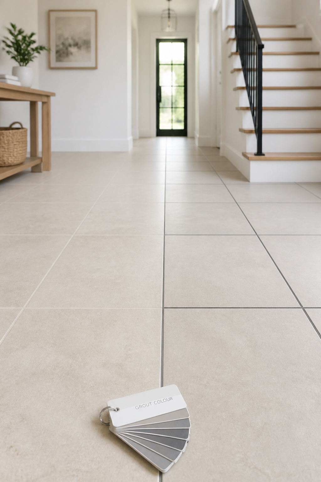
Matching grout to the tile body creates a more continuous surface, because the joints become part of the tile rather than a grid laid over it. This is standard practice in small-space design, where uninterrupted surfaces do the expanding. If your tile runs up a plinth, carry the same grout across both surfaces so the eye reads one envelope.
Contrasting grout in a small space: when it helps and when it hurts
Contrasting grout makes the grid the dominant visual. That is right for a deliberate checkerboard or patterned encaustic floor, where the geometry is the point, and counterproductive for a plain tile where you want continuity. One discipline either way: judge grout against the installed tile in the final light before committing. Grout shifts tone as it dries, and a sample that looks warm grey in the shop can read cool under LED.
Light versus dark grout and what each does to perceived depth
The contrast spectrum carries a practical trade-off:
- Light grout, light tile — maximum brightness, but it shows tracked-in dirt fastest.
- Dark grout, light tile — graphic interest, but the grid takes over and the seamless effect is lost.
- Mid-tone grout, light tile — the entry compromise: a warm greige or grey suppresses the grid yet forgives grit.
Apollo Tile’s editors make the same point from maintenance: a stain-resistant mid-tone, not pure white, hides everyday dust and holds up best in entryways. As a working guide, keep the grout within a shade or two of the tile, light enough to disappear, dark enough to forgive a muddy week. No industry tolerance fixes that figure; it is a judgement, tested in place.
Lay Direction: How the Tile Runs Changes How the Room Reads
Lay direction is the third lever, and the cheapest: in most layouts it costs nothing in material or time, provided you plan it before the first cut.
Straight set vs diagonal: the 45-degree trick for short entries
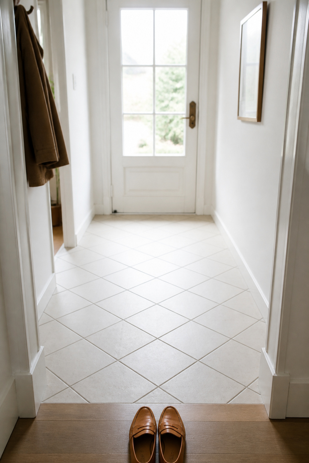
A 45-degree diagonal set draws the eye toward the corners rather than the walls. Since the longest line in any rectangle is its diagonal, the space feels wider and deeper at once. There is a mechanism underneath: a straight grid lets the brain quickly count tiles and fix the scale, while a diagonal set is harder to parse, so the size feels less obvious. The effect is strongest in square or compact rooms, the typical tight foyer.
Running bond and brick-set for narrow corridors
For a hallway-shaped entry, running bond earns its place. Offsetting each row by half a tile along the corridor’s length makes the entry feel longer and less tunnel-like. It suits 12×24 and 12×36 planks especially: the stagger spreads traffic wear more evenly than a stacked grid and pulls the eye away from both short end walls.
Why diagonal set adds waste and when it’s still worth it
The catch is cut waste. A diagonal install needs roughly 15% extra tile against about 10% for a straight grid, because every row generates angled off-cuts at both ends; herringbone runs higher still, near 18%. The diagonal earns that 5% premium in a small, roughly square entry, where 5% is only a handful of tiles. Order the extra before you start. For the deeper geometry of how a floor’s pattern shapes a room, see lay patterns that stretch a space.
When Small Tile Earns Its Place in a Tight Entry
Large format is not a universal answer, and pretending otherwise would be dishonest. Three situations call for smaller tile.
Traction versus expansion: the mosaic trade-off
The first is grip. A mosaic, typically 1 by 1 up to 2 by 2 inches, packs far more grout lines into each square foot, and those lines add traction underfoot. For an entry that meets wet boots and children, that friction is decisive. Polished large-format tiles often fall below the 0.42 wet DCOF minimum, while textured and matte porcelain mosaics reliably clear it. The traction gain is real and well documented, even if no source puts a single friction number on it. Where slip safety leads, small tile wins.
Smaller tile for curved or irregular entries
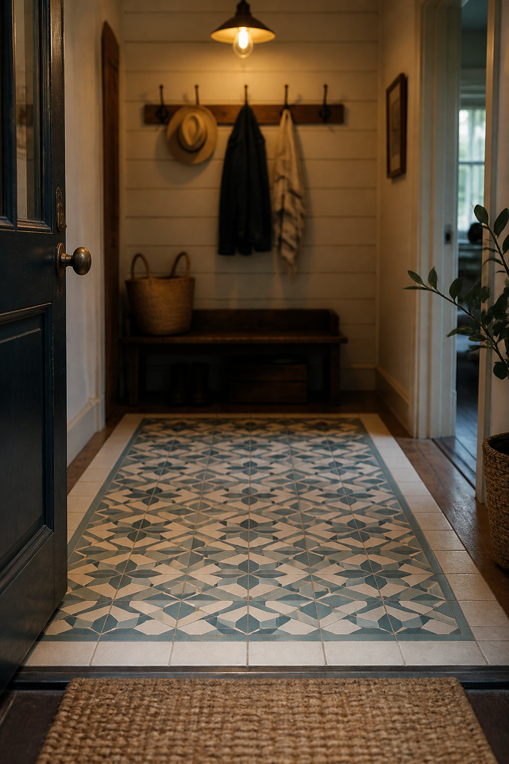
The second is shape. Small mosaic, including penny rounds and hex, conforms to a curved or sloped plane without the lippage large tiles produce on a gradient. For a curved alcove or irregular footprint, that flexibility makes the choice for you. A geometric mosaic inset can also act as a “tile rug,” marking the entry zone without a physical rug, which helps in an open-plan home with no walls to define the foyer.
Encaustic and pattern tiles: getting the detail without losing the floor
The third is style with history. Encaustic cement tile is the period-correct floor for many older entries, with motifs around 4×4 to 8×8 inches. The trick in a tight space is to keep the visual weight in the motif, not the grout: tone-on-tone colourways let the pattern read as detail rather than noise. One honest caveat: cement and encaustic are porous, must be sealed before and after grouting, and want resealing every year or two. That is real maintenance porcelain does not ask of you.
Light, Tone and the Ceiling Connection
The floor alone cannot rescue a dark, narrow entry, but its tone and finish work with the wall colour and ceiling to amplify the expansion or quietly cancel it. This is the part I test at seven in the morning in February: if a small entry holds up in the worst light of the year, it works in any light.
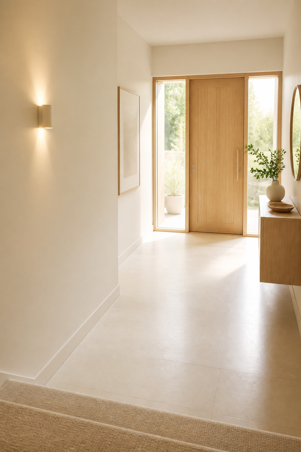
Light-reflective tile and what February does to a dark foyer
Soft neutrals, ivory, warm beige, pale grey, off-white, bounce what little light an entry gets. In genuinely dim foyers a satin or gentle gloss reflects more than a flat matte. The tension is that gloss can drop below the wet slip minimum. A layered approach resolves it: keep the floor in a low-gloss pale tile for grip, and let a brighter skirting tile, or a mirror nearby, do the light-bouncing where no one stands.
Tone continuity: matching floor tile to wall colour to push boundaries out
When the floor tile and the wall paint share an undertone, warm with warm or cool with cool, the line between them softens and the room reads as one envelope. Pale flooring “fades into the background,” as Living Etc.’s editors note, reading more like open space than a surface. The error to avoid is pairing a warm tile with a cool pale paint: they clash in daylight and produce a muddy boundary instead of a soft one.
The ceiling read: how a pale floor and pale walls change perceived height
Carry the pale tone up to the ceiling and the whole envelope reads as a single airy volume, taller as well as wider, because no surface gives the eye a hard edge to stop at. That is most useful in exactly the compact, low-ceilinged entry this article started with. Treated this way, a small foyer stops apologising for its size and becomes a quiet, composed threshold. You now hold the three levers: the format that removes the lines, the grout that hides the grid, and the direction that opens the corners.
FAQ
What size tile makes a small entryway look bigger?
Large-format tile, 16×16 or 24×24 inches, with tight, colour-matched grout is the standard choice; fewer grout lines let the floor read as one continuous surface. Match the format to the footprint: 24×24 suits a 4-foot entry, while 16×16 fits a 4.5-foot one with proportional cuts rather than thin slivers.
Should grout match tile colour in a small foyer?
Yes, for maximum perceived size, keep the grout within a shade or two of the tile body so it suppresses the grid and the floor reads as one surface. Avoid pure white, though, because it shows boot traffic fast; a mid-tone greige or grey hides grit while staying close enough to disappear. Contrasting grout suits only deliberately patterned floors.
Does diagonal tile really make a room look bigger?
Yes. A 45-degree diagonal set draws the eye toward the corners and along the room’s longest line, the diagonal, which makes a compact entry feel wider and deeper. The mechanism is partly cognitive: the angled grid is harder to count, so the scale reads as less obvious. The trade-off is roughly 15% material waste versus 10% for a straight set.