Most cottage kitchen cabinet colors that disappoint on the door were never the wrong color — they were the wrong sheen. A professional cabinet painter uses satin on roughly 95% of the jobs they take, because a hue loved on a paint chip behaves differently across a paneled shaker door in real light. Farrow & Ball even sells two finishes both called eggshell, one near 20% sheen and one near 40%. Pick the color, skip the sheen, and you can hang the exact paint you wanted and still not recognize your kitchen.
TL;DR
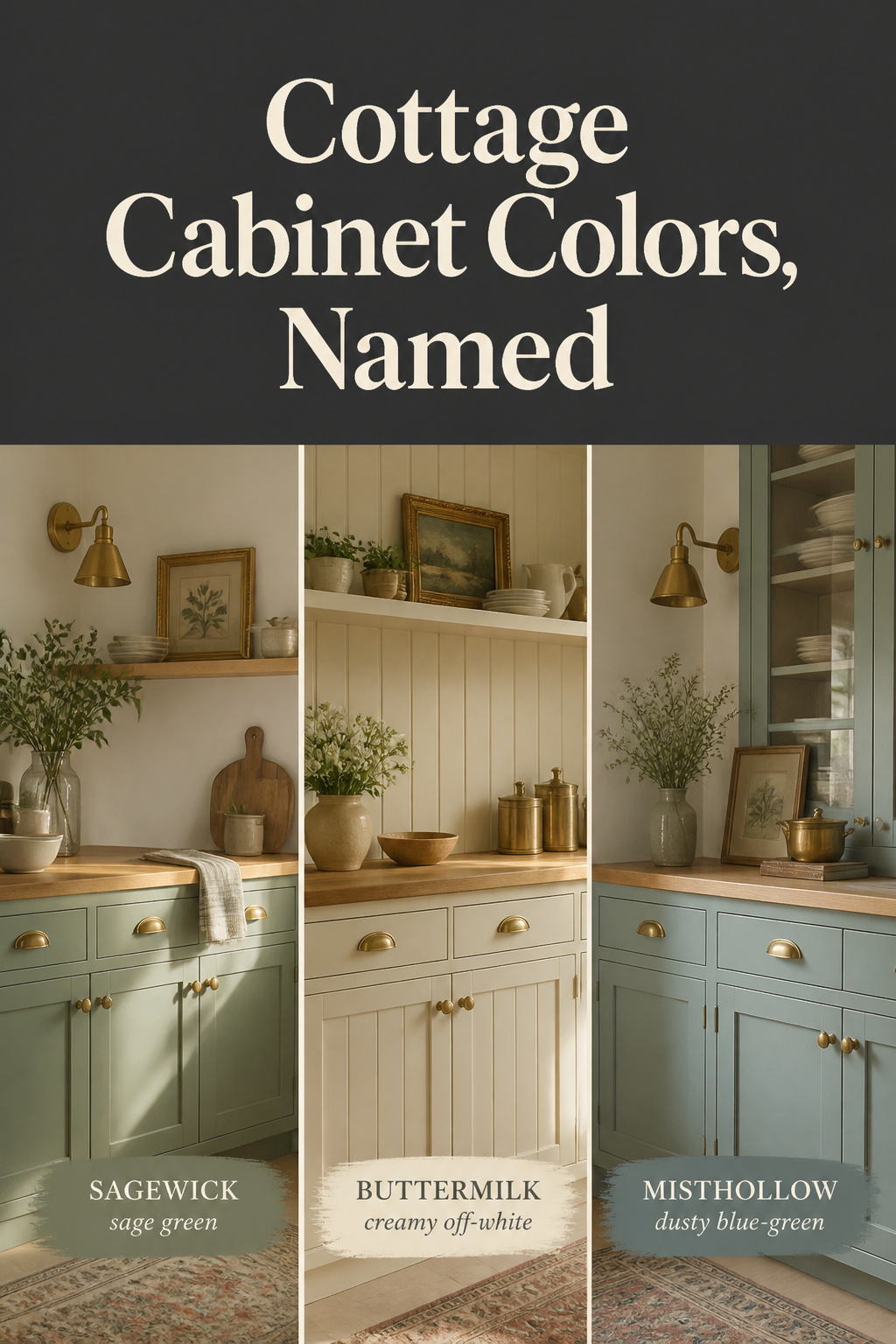
- The buyable cottage palette splits into three families: muted sages (Benjamin Moore October Mist, LRV 46; Sherwin-Williams Evergreen Fog, LRV 30), warm creams (Benjamin Moore Buttermilk, LRV 79.69; Farrow & Ball Shaded White, LRV 66), and dusty blue-greens (Farrow & Ball Oval Room Blue).
- Finish decides the read as much as hue: pros use satin on about 95% of cabinet jobs, and the same paint looks lighter at a higher sheen.
- Match LRV to your light — above 65 suits any room, below 20 (Calke Green ~9, Inchyra Blue ~12.5) needs real daylight — then pair cabinets to a same-family wall, not a stark contrast white.
The Detail Most Cottage Kitchen Repaints Get Wrong
The color is the decision everyone agonizes over. The finish is the one that decides whether it survives a real kitchen — and almost nobody weighs it as hard.
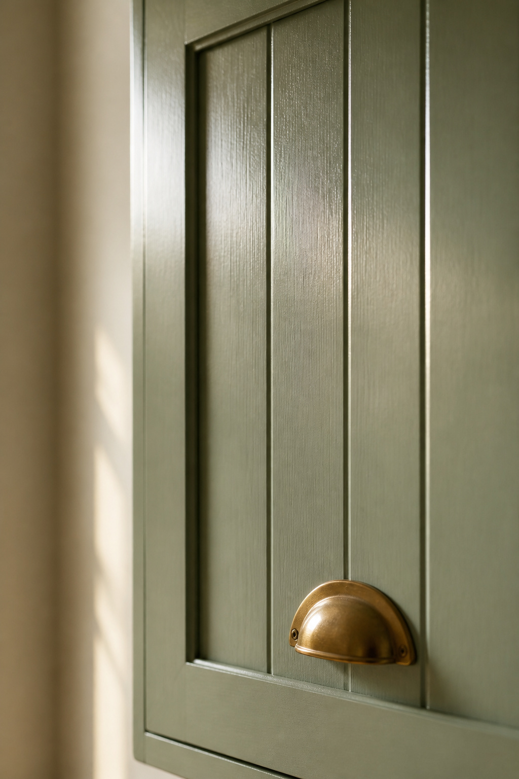
Why it’s usually the sheen, not the color
Sheen sets how much light a finish throws back:
- Flat / matte: reflects 0–5% of light — too fragile for kitchen wear
- Eggshell: 10–25%
- Satin: 25–35% — the professional default
- Semi-gloss: 35–70% — shows every fingerprint on a panel door
- Full gloss: 70%+
The same paint looks lighter as sheen climbs, so two cans of one color can finish as two different greens. Designer Melissa Read specs Farrow & Ball’s Modern Eggshell on cabinetry for a “muted, robust finish,” set apart from the velvety Estate Emulsion she uses on walls.
How light hits a painted cottage cabinet differently than a modern one
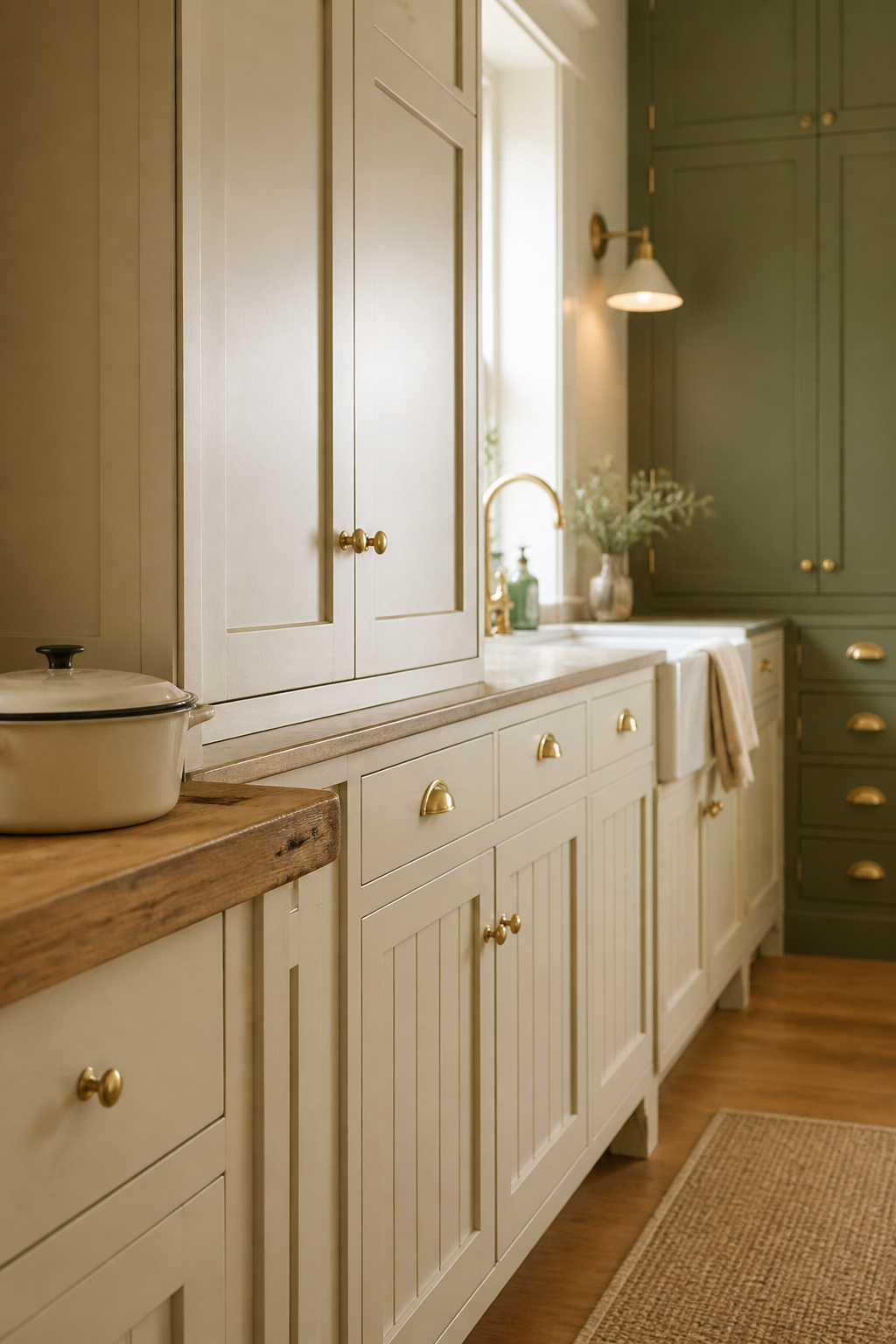
In-frame shaker and beadboard doors carry recessed panels and routed grooves a flat modern slab doesn’t, throwing thin shadow lines. Satin picks out that joinery; a flatter finish lets it recede. The gap is widest on deep paint — eggshell keeps a dark sage or blue from going muddy on a paneled front.
What this guide will get you to
Here’s the shortlist this guide is built around — buyable paints by family, with light-reflectance values so you can match a color to your room before opening a can:
| Paint (brand + name) | Family | LRV | Undertone / character |
|---|---|---|---|
| Benjamin Moore October Mist (1495) | Sage | 46 | Silvery green; Benjamin Moore’s 2022 Color of the Year |
| Benjamin Moore Saybrook Sage (HC-114) | Sage | 45 | Balanced green-and-silver |
| Sherwin-Williams Evergreen Fog (SW 9130) | Sage | 30 | Stormy, blue-leaning sage |
| Sherwin-Williams Clary Sage (SW 6178) | Sage | 41 | Warmer, yellow-leaning |
| Farrow & Ball Calke Green (No. 34) | Sage | ~9 | Deep botanical heritage green |
| Benjamin Moore Buttermilk (919) | Cream | 79.69 | Warm, faintly saturated cream |
| Sherwin-Williams Creamy (SW 7012) | Cream | 81 | Lighter, softer cream |
| Farrow & Ball Shaded White (No. 201) | Cream | ~66 | Stone-like deep off-white |
| Farrow & Ball Wimborne White (No. 239) | Cream | ~89 | Warm, bright near-white |
| Farrow & Ball Inchyra Blue (No. 289) | Blue-green | ~12.5 | Aged blue-grey on a slate base |
Sage and Muted Green Palettes
Why does the same sage look blue on one set of cabinets and gray on another? Sage is a family, sorted less by depth than by the undertone under the green.
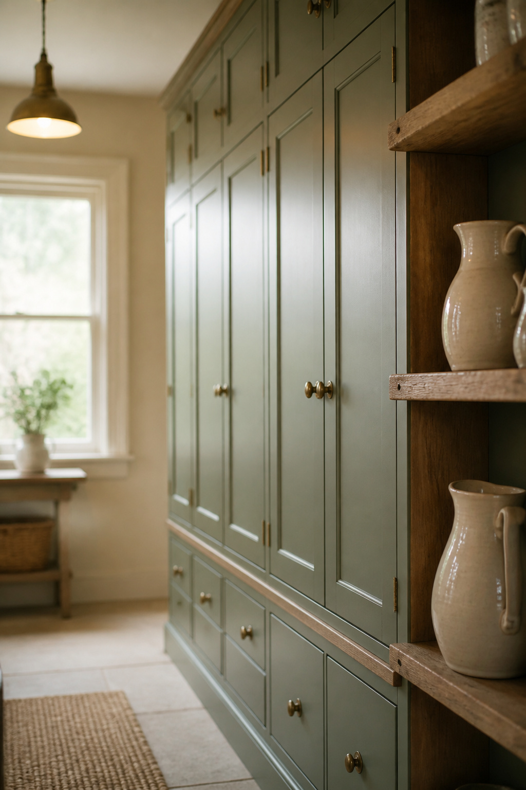
Named paint colors in this family
The names split by undertone: Evergreen Fog leans blue at LRV 30, Clary Sage leans yellow and earthier at 41, and October Mist and Saybrook Sage sit balanced between green and silver. For real lineage, Farrow & Ball’s Calke Green is a deep botanical shade drawn from the breakfast room at Calke Abbey, a National Trust house — a genuine heritage pigment, not a modern reinterpretation.
What kind of light this palette wants
High-LRV sages like October Mist (46) and Vert de Terre (48) look airy and forgive a dim room, while Calke Green near LRV 9 needs genuine daylight or it flattens into something murky on a north-facing wall.
Pairing wall colors
Color consultant Claire Powell recommends tinting the wall to the cabinet so original features shine rather than compete — the sage kitchen looks calmer, and more expensive, for it.
Buttermilk and Clotted Cream Palettes
Reach for a stark builder white because it photographs well, and it turns cold and clinical the moment it meets brass and pine — the cream family solves that.
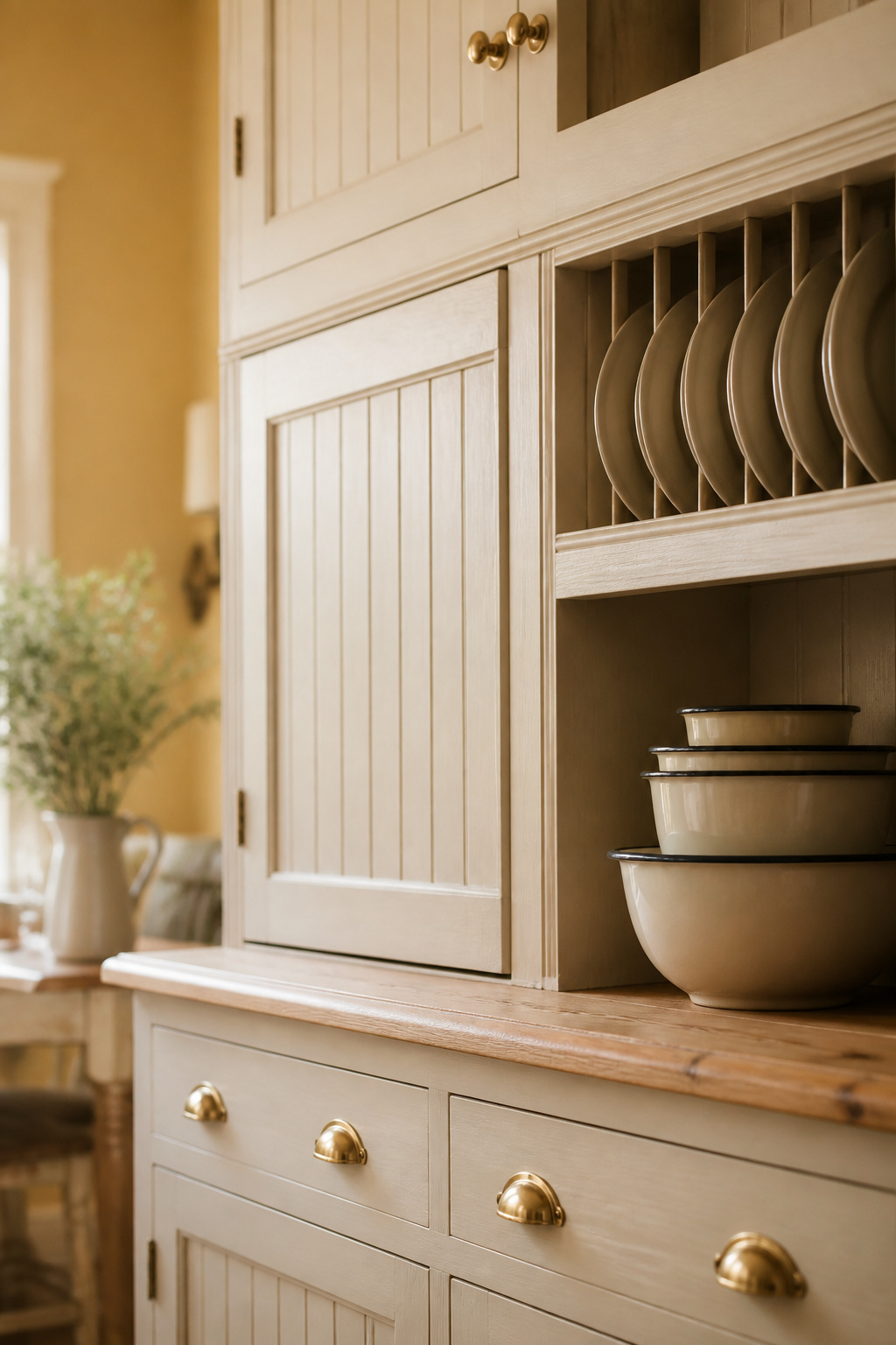
Named paint colors in this family
These creams cluster tightly, but LRV and undertone temperature separate them. Benjamin Moore Buttermilk is a warm cream at LRV 79.69 — a real cream, not a near-white — while Sherwin-Williams Creamy at 81 reads lighter. From Britain, Farrow & Ball’s Wimborne White sits near LRV 89 and the stone-like Shaded White at about 66. For cabinets, designer Lauren Robbins names Benjamin Moore Opaline her favorite warm white.
Where warm neutrals outperform stark white
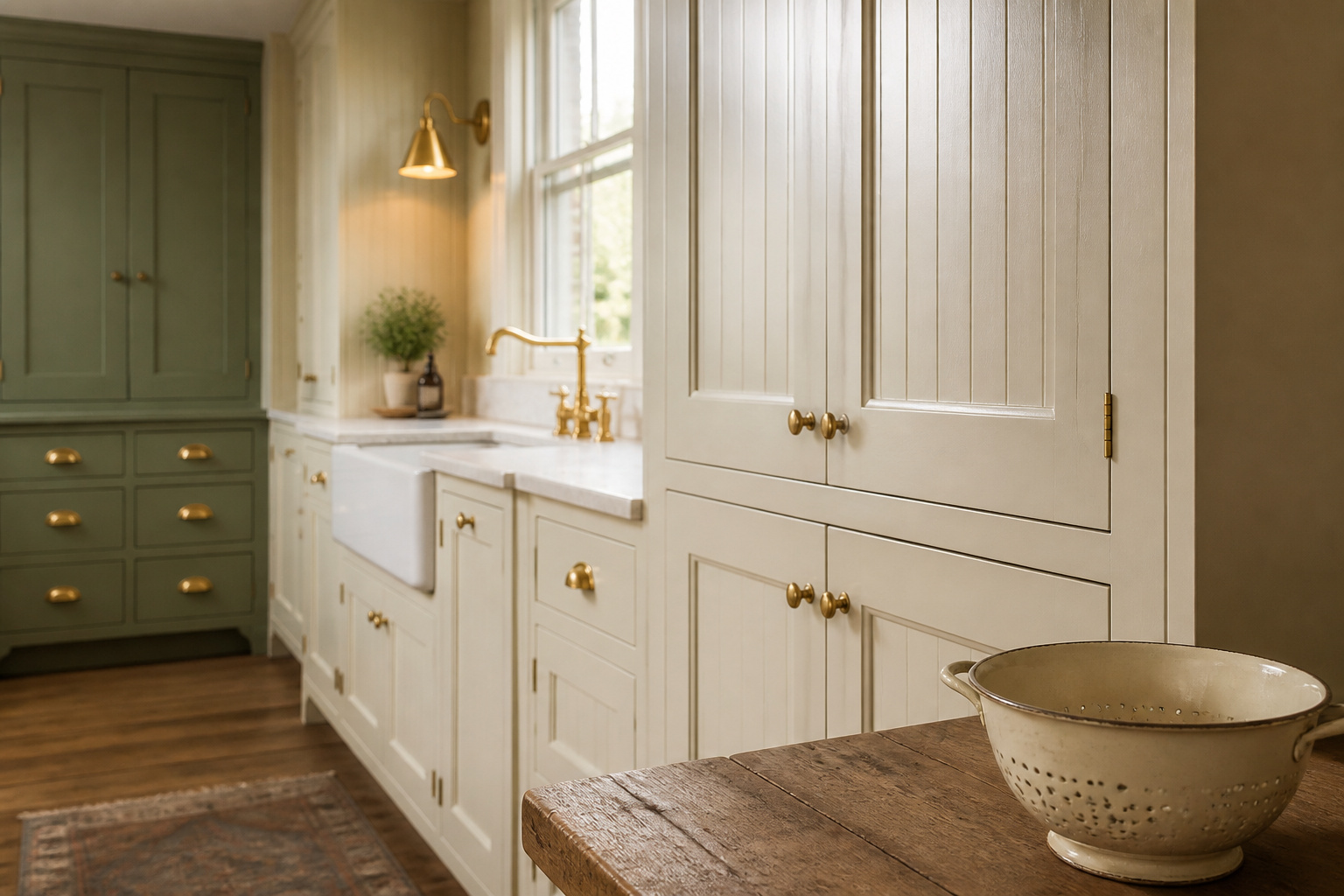
Against brass, copper and reclaimed pine, a warm cream holds its undertone while a cool, undertone-free white starts a quiet argument with every warm material in the room. There is a place for pure white — Lina Galvao specs the undertone-free Chantilly Lace for perimeter cabinets, but only in bright, well-lit spaces where daylight keeps it from turning cold. In a modest-windowed cottage kitchen, buttermilk carries the room and the true white fights it.
Pairing wall colors
A single cream across walls and cabinets is a small-kitchen trick: Fenwick & Tilbrook’s Anna Hill says matching the two “helps to create a sense of space and continuity,” making a small room feel larger and letting the pine, brass and enamelware carry the interest instead of the paint.
Dusty Blue and Blue-Green Palettes
Open a fan deck to the blues and the range runs from moody, green-tinged deep tones to the softest blue-grays. The chip barely settles it: the same blue leans cottage or coastal depending on finish and the wall beside it.
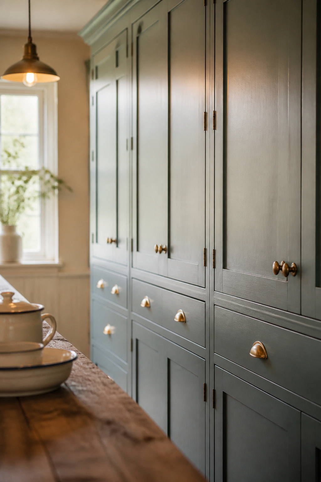
Named paint colors in this family
Farrow & Ball’s Oval Room Blue anchors the family — a deep, mid-toned blue-green that designer Claire Staszak calls “moody, yet still light and bright.” Around it sit the lighter Green Blue, Parma Gray and paler Mizzle. For depth, Inchyra Blue is an aged blue-grey near LRV 12.5. Quieter American options include Boothbay Gray and Stonington Gray, both good against wood worktops.
Why this family reads as coastal or cottage depending on finish
Melissa Read pairs Oval Room Blue walls in velvety Estate Emulsion with cabinets in Modern Eggshell, and that higher, brushable sheen is what stops the same blue from going flat and beachy. Set against warm brass, cream walls and a pine worktop, the color pulls firmly back toward heritage cottage rather than seaside.
Pairing wall colors
For a same-family scheme, Farrow & Ball’s Patrick O’Donnell pairs Oval Room Blue with an off-white like Slipper Satin — undertone-matched, not stark. For more drama, contrast walls in Inchyra Blue or Down Pipe hold up well. Either way, a hard bright white on the walls is the one pairing that drains the warmth.
Finish and Sheen: The Detail That Makes or Breaks the Look
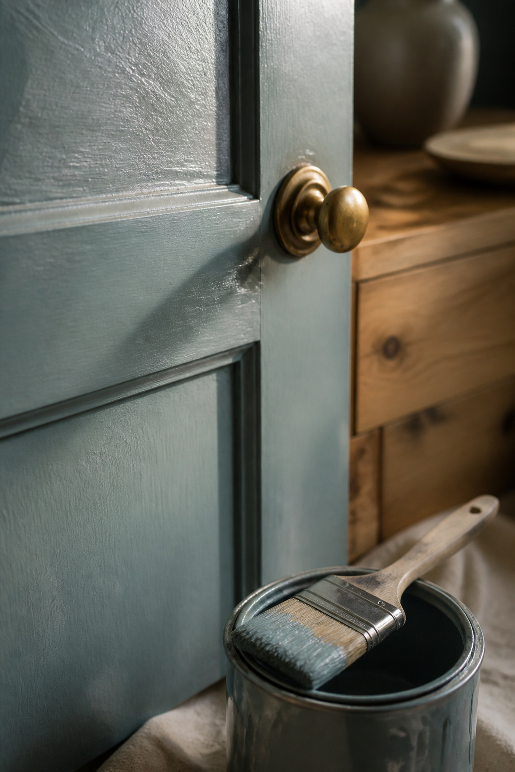
Years ago I took on a farmhouse kitchen built in the 1890s where the owners wanted a deteriorated built-in dresser torn out. I rebuilt it into the island instead — and the lesson came when I stripped it back. Under a later owner’s hard semi-gloss sat the original low-sheen coat, and in that soft finish the green looked deep and settled — the gloss had made the same color look hard and cheap. The hue never changed; the sheen did all the damage, and all the repair.
Why a satin or eggshell finish beats semi-gloss here
Flat isn’t recommended for cabinets — it doesn’t handle moisture or cleaning. Eggshell is marginally better but still lags on daily wear, which is why satin takes roughly 95% of professional cabinet jobs. Semi-gloss is tougher, but its shine highlights every imperfection on an older, hand-painted door — better suited to crisp modern kitchens than a soft, painted cottage front.
Brushed versus sprayed application
Spraying gives the even, flawless coat of a factory cabinet — a polished, modern look. Brushing does the opposite on purpose: a faint hand-painted texture, some risk of strokes, but the worked surface that signals heritage. Entry-level spray equipment runs about $2,000 or more, making a good brush the sensible tool for a one-off repaint.
How finish reads differently in the English original
This is where Farrow & Ball’s two eggshells become instruction rather than a quirk. The brand runs Estate Eggshell near 20% sheen for a traditional lower-shine finish and Modern Eggshell near 40% for a tougher one — period-correct and hard-wearing, side by side. The lower-sheen, brush-applied Estate tradition is tied most closely to the original English cottage kitchen style.
Choosing Between These Cottage Kitchen Cabinet Colors
So which family is yours? The honest shortcut is to stop comparing hues and start with your light, because the room decides more than the chip does.
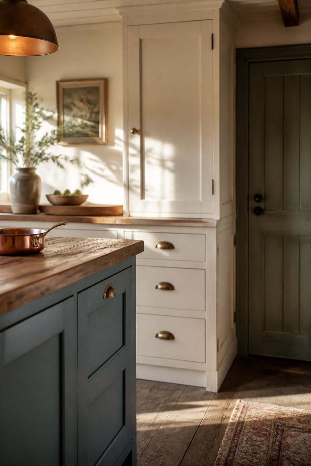
Matching palette to natural light and room size
Lighter shades look airy and spacious — the safer default for a small or low-light kitchen; deeper shades want real daylight or square footage. LRV is the fastest gut check: the high 60s into the 80s — Farrow’s Cream, Wimborne White, Buttermilk — suit any light, while anything below 20, like Calke Green or Inchyra Blue, needs strong daylight to avoid going flat.
How this decision changes in a modern cottage kitchen
On a simplified, less-ornamented shaker front, the same muted colors carry differently. With less panel detail to catch shadow, sheen and saturation do the work molding would otherwise handle — so a slightly deeper color, or a half-step up in sheen, earns its place on a plainer door. That’s the balancing act explored in modern cottage kitchens.
Committing to one and moving on
Then commit. Testing the color in the room’s own light is the one step no professional skips — a chip and a screen can’t show how it performs at full cabinet scale in real daylight. Paint two large samples on the actual doors, look morning and evening for a day, and choose. Once color and finish are settled, the rest of your cottage kitchen ideas fall into place around that decision.
FAQ
What is the most popular cottage kitchen cabinet color?
Sage green leads the field, and design publications like Domino describe it as a trend that is here to stay rather than one on its way out. Named shades recur across brands — Benjamin Moore October Mist, Sherwin-Williams Evergreen Fog and Little Greene Sage Green — pointing to genuine cross-brand consensus, not one retailer’s push.
Should cottage kitchen cabinets be glossy or matte?
Neither extreme. Professional painters recommend satin as the practical middle ground, since flat doesn’t clean well and full gloss shows every fingerprint. For a cottage look, lower-sheen finishes are the better aesthetic match; glossy, light-bouncing finishes belong to modern, minimalist kitchens rather than a soft, painted one.
Do cabinet and wall colors need to match in a cottage kitchen?
Not strictly, but color consultants specifically recommend matching in traditional, character-rich kitchens so architectural features and collected decor can shine without competing. Designers who prefer contrast argue that even a single-shade difference between wall and cabinet creates a new visual rhythm, so a close tint works as well as an exact match.