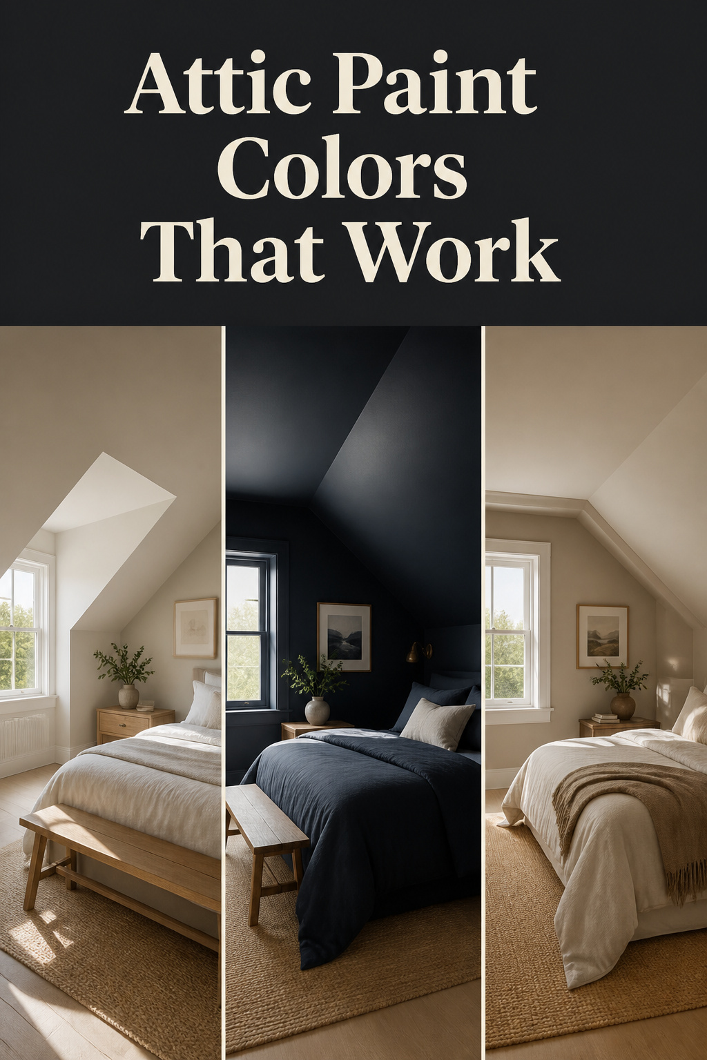
Most paint advice assumes a box: four flat walls, a horizontal ceiling, a clean line where the two meet. An attic bedroom is not a box. Choosing attic bedroom paint colors is different because the slope changes how light hits the pigment — continuously, from morning to dusk. I have watched the same warm greige read as sandy cream at noon and turn flat grey-blue by four o’clock in a north-facing room. The swatch on the flat wall at the hardware store tells you almost nothing useful.
TL;DR
- The single biggest decision is whether to run the wall colour all the way up the slope or stop it — stopping at the knee wall creates what designers call a “race track” band that makes the ceiling feel lower, not higher.
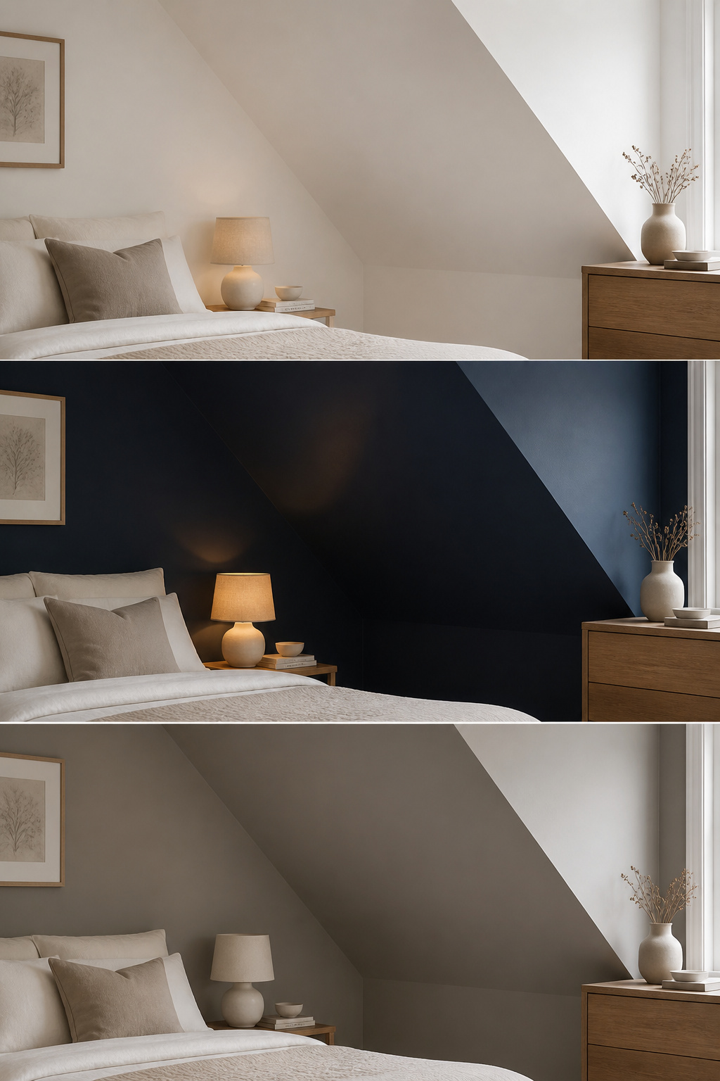
- Three strategies work in attic rooms: light-airy (pale warm neutrals, LRV 70–84), dark-cocoon (deep matte hues, suitable only where natural light is adequate), and wrap-around neutral (one mid-tone on every surface, the safest default).
- Test paint on the actual sloped surface — not a flat wall — at three times of day, and in the worst light the room will face.
Why Attic Bedroom Paint Colors Break the Normal Rules
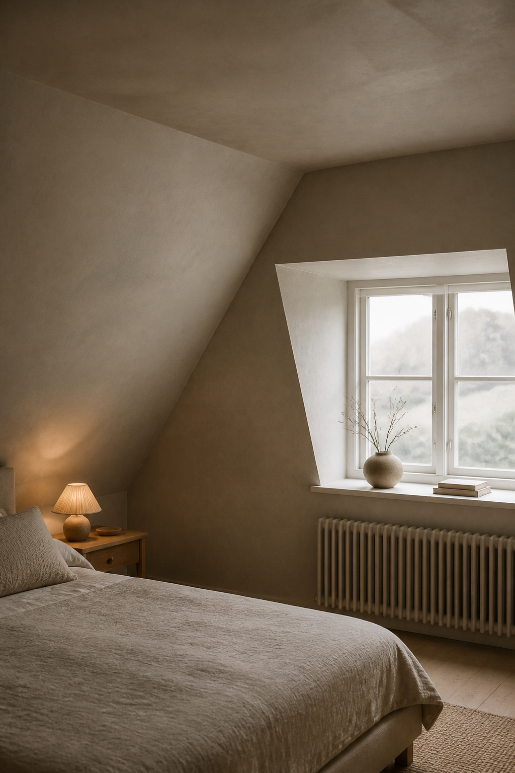
The paint rules that work in a standard bedroom assume consistent surfaces. A sloped ceiling plane intercepts light at a different angle than the vertical wall below it, so the same paint applied to both reads as two subtly different tones. Understood, this becomes a tool rather than a problem. For more attic bedroom inspiration, the full guide covers geometry, storage, and light alongside colour. This article takes colour on its own terms.
The slope changes how paint reads: why swatch-on-a-flat-wall fails
The angle changes how light hits the pigment. A warm greige can shift cooler and flatter on the slope, particularly in north-facing rooms where the light is already cool. Kristie Barnett of The Decorologist describes the reliable phenomenon: “When you paint your ceiling the same color as your walls, the ceiling color will appear a half shade lighter than the wall color. So it looks as though you’ve painted the ceiling a half a shade lighter, while it is actually the same color as the walls. The result? A ceiling that appears higher.” Test paint on the actual slope — not a flat wall — at dawn, midday, and evening.
The wall-and-ceiling decision as the hinge that determines everything
The most consequential colour decision is not which colour to choose. It is whether to run the wall colour all the way up and over the slope, or stop it. Stopping at the top of a knee wall and leaving the slope white creates what Barnett calls a “race track” — a horizontal band that makes the ceiling feel lower, not higher. Designer Laurel Bern concurs: the strip left between sloped sections “always looks strange — like a race track or something.” Extending the wall colour all the way around, without interruption, is the professional standard. The lower the angled section starts, the more important this becomes.
Three strategies, one for each room personality
Three strategies work for attic bedrooms: light-airy expansion, dark-cocoon immersion, and wrap-around neutral. Each is a complete design commitment — apply it consistently across walls, slope, and ceiling flat. Mixing them produces visual noise. One practical note for dark strategies: standard ceiling paint cannot be deeply tinted. Use full-formula wall paint in a flat or matte sheen.
Strategy 1: Light-Airy — Opening the Attic Without Losing Its Character
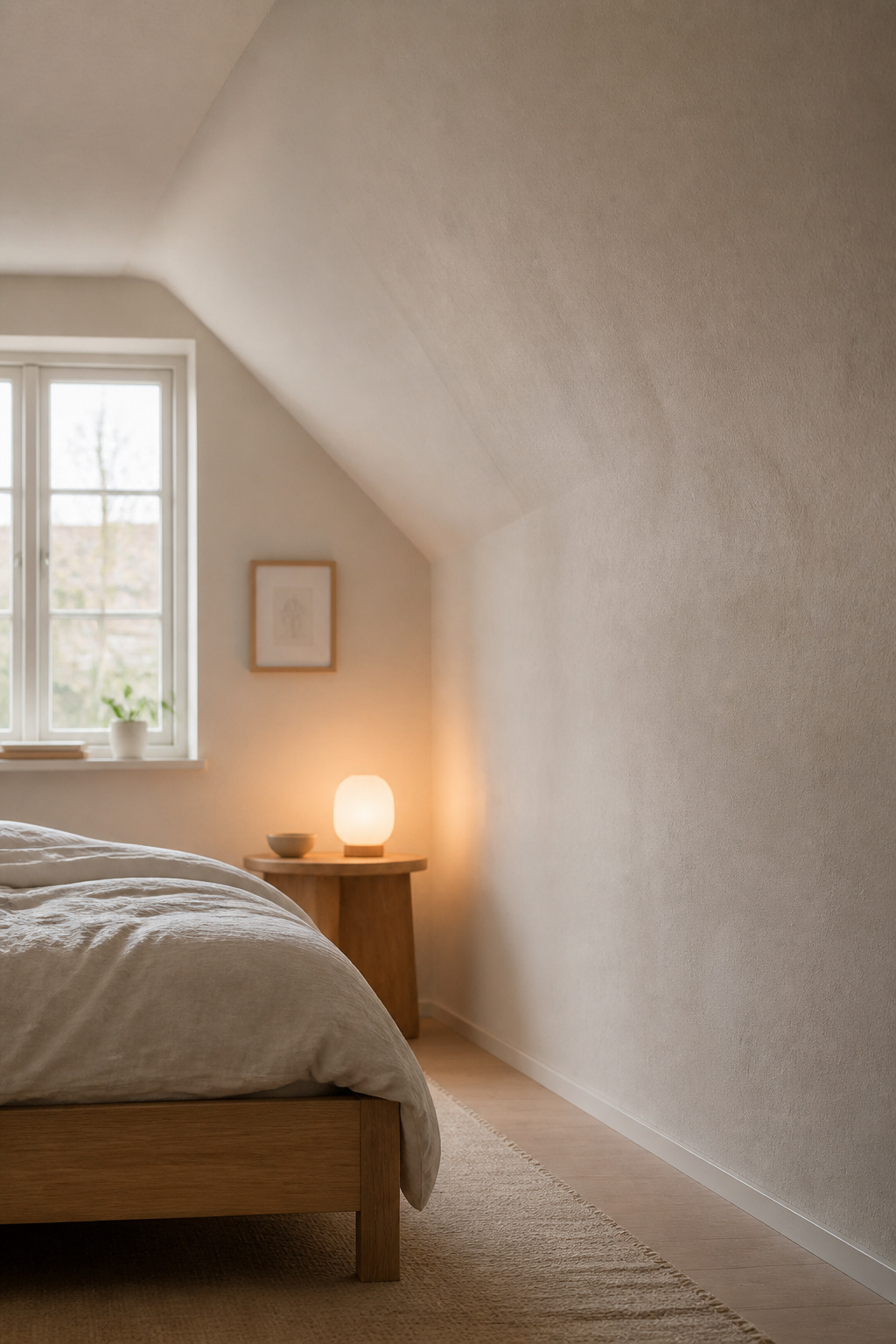
The light-airy strategy is the most reliable approach for attic bedrooms with limited natural light. The trap is choosing the wrong pale — grey-based or blue-based whites that a north-facing slope will push toward cold and clinical. For how attic light shapes color more broadly, the lighting guide covers the fixture plan.
Warm whites and pale naturals that expand without flattening
Benjamin Moore White Dove OC-17 (LRV 83.16) is the benchmark: soft warm white with creamy yellow undertones, holds warmth on a slope even in north-facing light. Benjamin Moore Pale Oak OC-20 (LRV approximately 70) reads as warm beige in good light; in low-light north-facing rooms it can shift to a medium warm grey — test first. Farrow & Ball Wimborne White No. 239 (LRV approximately 89) is one of the warmest near-whites in the F&B range, suitable for wrapping a pale-airy attic. Farrow & Ball Shaded White No. 201 (LRV approximately 66) gives a deeper creamy off-white for rooms that want pale but not bright.
Warm whites for sloped attic ceilings sit best in the LRV 75–85 range. Below 75 the ceiling plane darkens noticeably; above 85 the surface tips toward clinical brightness under direct daylight. The sweet spot for most orientations is LRV 80–84.
The ceiling trick: going one tone lighter on the slope
One refinement: dilute the wall paint with white in a ratio of approximately 80% white to 20% wall colour for the ceiling and slope. This creates the illusion of height while keeping the palette unified. The simpler alternative is equally effective — apply the same colour on wall and slope and let the natural half-shade graduation do the work.
How light direction changes the read of a pale color
North-facing attic rooms receive cool, blue-toned light consistently. Avoid colours with grey or blue bases. Farrow & Ball recommends New White, White Tie, and Yellow Ground specifically for north-facing rooms. South and west-facing rooms can carry cooler pale tones without going cold. East-facing rooms get warm morning light that shifts to cool flat light in the afternoon — warm undertones in the LRV 70–82 range hold best across this shift.
Strategy 2: Dark-Cocoon — When Going Dark Is Exactly Right
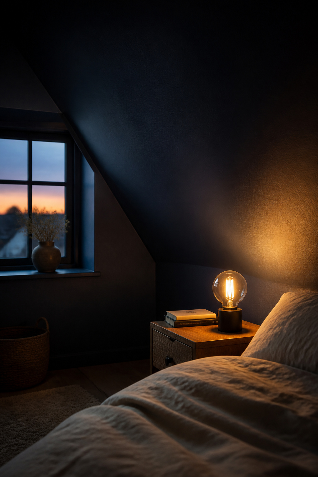
The dark-cocoon approach suits attic bedrooms with decent natural light, where the darkness reads as intentional depth. The conditions under which it works are specific. Pair the deep palette with warm natural textiles — off-white linen bedding, a wool rug, muted-tone accents — so the room reads as cocoon rather than cave.
The rooms where a deep wall-and-ceiling color works
Dark-cocoon works best in attic bedrooms with at least one good natural light source — a dormer or skylight — used primarily for sleep. Farrow & Ball Hague Blue No. 30 (LRV approximately 7) works in south- or west-facing attic rooms; its green undertones read as warmth under artificial light, making it safer than a straight cool navy. Benjamin Moore Kendall Charcoal HC-166 (LRV 13–14) has a mild green-brown undertone that reads as warm earth under warm-temperature light. Farrow & Ball Studio Green No. 93 (LRV approximately 7.2) creates genuine depth in a well-lit attic; in a dark north-facing room it risks reading as near-black. Matte finish is essential — satin or semi-gloss throws back glare and makes roller marks visible at height.
Undertone matters most in a dark palette
In dark palettes, undertone is amplified by depth. A navy with blue-purple undertones reads regal in warm light but cold and uneasy in cool light. A navy with green undertones stays warmer across conditions. Farrow & Ball Railings No. 31 (LRV approximately 28.4), a near-black graphite with blue undertones, works as a dark-cocoon colour in well-lit rooms with warm artificial light. Test undertone on an A3-sized sample (roughly 12 by 16 inches) under the room’s artificial light at 10pm — this matters more than testing under daylight for a bedroom.
The one light change that makes a dark attic room feel intentional
The critical pairing is warm-temperature artificial light at 2700K. As My Bespoke Room’s dark-ceiling guide puts it: “warm 2700K sources make a dark colour feel like velvet; cool daylight-tone sources make the same colour feel like a cave.” Wall sconces at mid-height are preferable to overhead fixtures — angled sconce light creates shadow and warmth that makes the cocoon feel deliberate. The practical rule: one sconce per bed side, aimed inward, on its own dimmer circuit.
Strategy 3: Wrap-Around Neutral — Dissolving the Angles
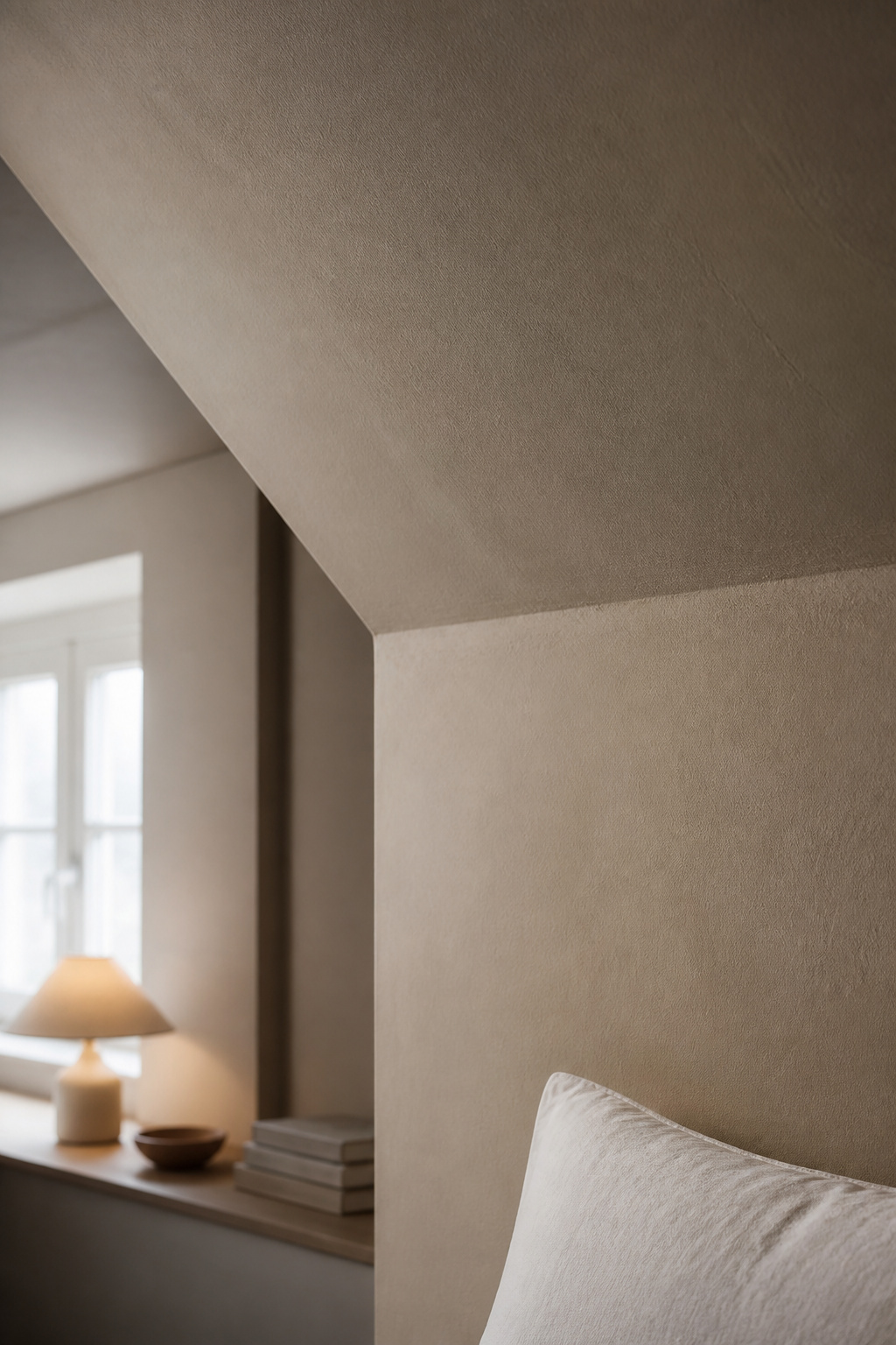
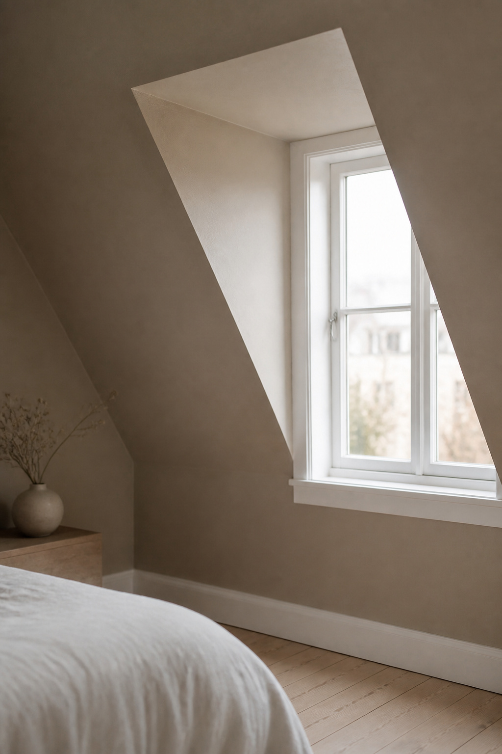
The wrap-around neutral is the most searched approach for attic bedrooms. By painting walls, slope, and ceiling flat in a single mid-tone, the line between wall and ceiling disappears — the eye reads one continuous room. For the spatial mechanics of where colour sits on the slope, see decorating sloped walls.
Painting walls and ceiling the same color: the geometry logic
Kylie Mawdsley of KylieMInteriors: “Using multiple colors can actually chop up an attic space and make it feel smaller. The lower your angled or slanted area starts, the better it looks painted the same color as the walls.” With no crown moulding interruption, the junction disappears and the volume reads as one. The same-colour wrap is most powerful in attic rooms because the slope typically constitutes a large proportion of the wall surface area.
Warm greige vs cool grey: which undertone to choose for your light
Benjamin Moore Pale Oak OC-20 (LRV approximately 70) suits south and west-facing attics; in north-facing rooms it can shift toward cool medium grey. Sherwin-Williams Accessible Beige SW 7036 (LRV 58) can read heavy in low-light attics — best for south or west-facing rooms. Farrow & Ball Elephant’s Breath No. 229 (LRV 53.62) reads as sophisticated greige in warm light but shifts toward near-lilac in cool north-facing rooms. Farrow & Ball Purbeck Stone No. 275 holds as a clean mid-grey in north-facing attics without tipping cold.
Trim color as the quiet contrast that keeps the room from feeling blank
When walls and slope are wrapped in a single mid-tone, white or off-white trim provides the quiet contrast that stops the room reading as flat. Benjamin Moore White Dove OC-17 (LRV 83.16) is the standard pairing for Pale Oak as trim: the LRV gap of approximately 13 points reads as distinct without being startling. In a full colour-drench — walls, slope, ceiling, and trim the same — the mono look suits intimate bedrooms where immersion is the goal. Baseboard and door trim should always use semi-gloss or gloss sheen regardless of wall finish; that sheen contrast makes trim register even when the colour gap is subtle.
Beam Color and the Palette: The Decision People Leave Until Last
Exposed beams are the structural luxury an attic gives you that a square box bedroom never will. How you treat them sets the room’s whole character.
Dark beam on a light ceiling: contrast rules for the slope
Wide, heavy beams can tolerate strong contrast — near-black on white. Slender attic rafters read better with a subtler contrast: mid-brown stain against off-white rather than ebony against bright white. The ratio of beam to ceiling is smaller, and high contrast amplifies slender rafters into visual noise. In a light-airy palette, the beam darkens as a single accent element; the walls and ceiling stay pale and the beam is the only dark note.
Painted-out beams: when to match the ceiling exactly
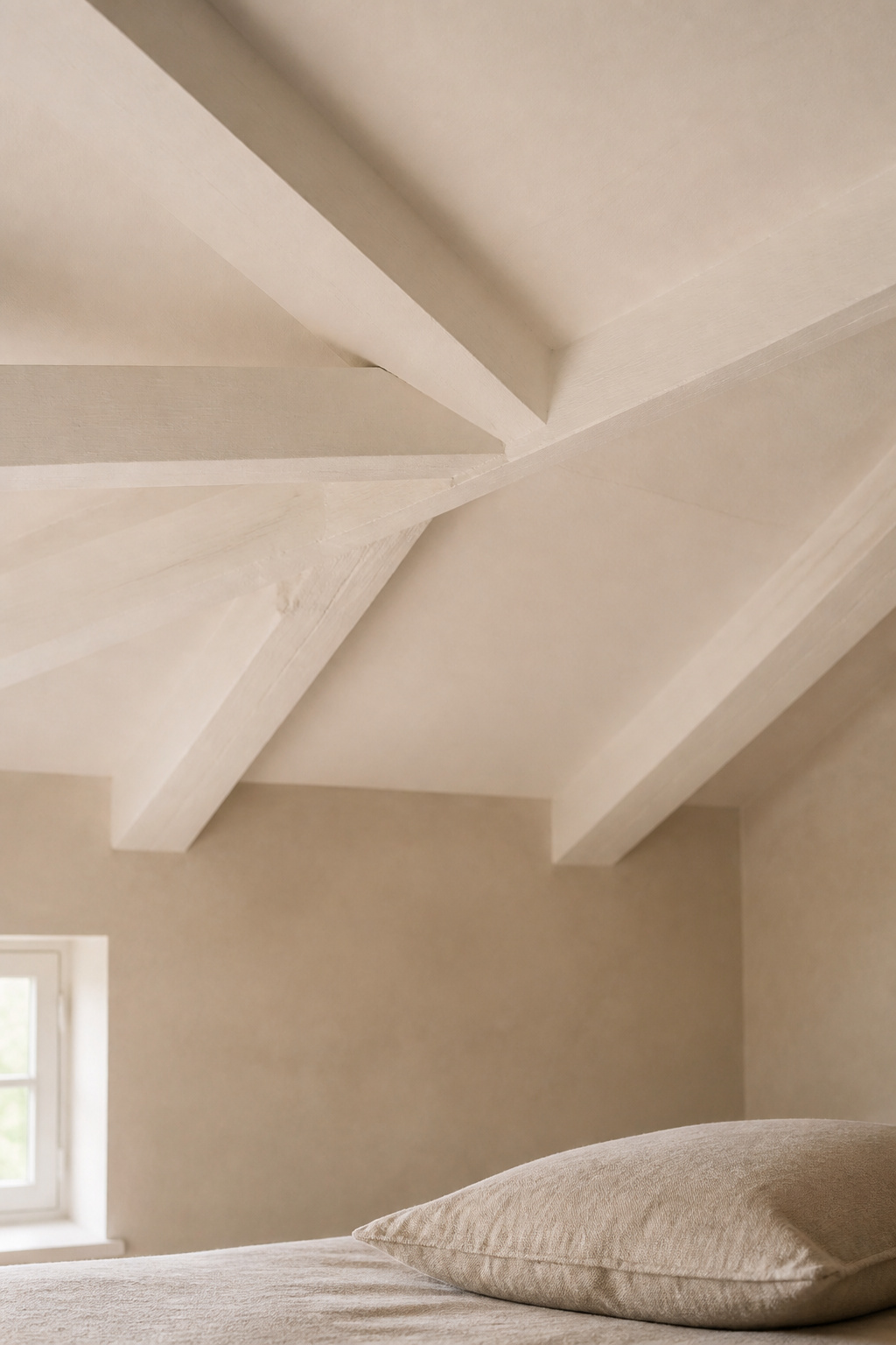
Plank and Pillow’s beam guide: “Painting your beams the same color as your ceiling for a seamless, sophisticated look… particularly useful in rooms where prominent beams reduce perceived headroom.” This works in wrap-around neutral and dark-cocoon strategies alike — beam and ceiling the same colour, room reading as one seamless object.
Stained wood beams: what palette they push you toward
Natural wood beams push the scheme toward warm earth tones. Cool grey and cool blue clash with the warmth of the wood. Light walls paired with warm-stained beams — honey oak, medium walnut — pair best with the warm-neutral wrap-around strategy.
The table below maps beam treatments against the colour strategies they suit:
| Beam treatment | Works with | Avoid with | Visual effect |
|---|---|---|---|
| Dark stain (near-black) | Light-airy | Dark-cocoon (beam vanishes) | Structural emphasis; draws eye upward |
| Mid-brown stain | Light-airy, wrap-around neutral | Dark-cocoon | Warmth without visual noise |
| Painted out (ceiling match) | Wrap-around neutral, dark-cocoon | — | Seamless ceiling plane |
| Natural / clear-sealed | Wrap-around neutral | Cool grey palettes | Farmhouse warmth; pushes toward earth tones |
How to Choose the Right Strategy for Your Attic Room
Three questions point the way. These are my own synthesis from eleven years working with rooms like this — not a quoted standard, but they have not failed me yet.
The three questions that point you to your strategy
Question 1: How much natural light does the room receive at its worst? Low-light or north-facing: choose light-airy or wrap-around neutral; never dark-cocoon unless a skylight is added. Good natural light, south or west-facing: all three strategies are viable.
Question 2: Is this room used primarily for sleep, or also for daytime work? Sleep-only: dark-cocoon is viable if natural light is adequate. Daytime use: light-airy or wrap-around neutral are more liveable.
Question 3: What emotional register do you want — expansive or intimate? Expansive: light-airy. Intimate: dark-cocoon or wrap-around neutral in a mid-tone.
Testing: why attic light demands a larger swatch and longer wait
Paint at least an A3-sized board — roughly 12 by 17 inches — and hold it on the actual slope for a full day. Test on all surfaces — vertical wall, slope, and ceiling flat — simultaneously. A colour that reads well in bright afternoon light may shift significantly in the flat grey light of a winter morning. Test in low, flat light. That is when the room’s true character shows, and it is the condition you will face every February.
Henrik’s one commitment per room: picking the strategy and sticking to it
For rooms with no strong preference signal, the wrap-around neutral in a warm greige — LRV 60–75 — is the safest and most forgiving strategy. It hides imperfections in the slope, reads warmly under both natural and artificial light, and works with every furniture palette.
The one common mistake across all three strategies is half-commitment: a dark-ish colour that is not fully dark, a light colour not quite pale enough, or a wrap-around that stops at the knee wall instead of carrying all the way up. The 38-square-metre Malmö apartment I lived in for six years taught me this. I painted it a single warm mid-greige. The walls matched the sloped ceiling in the sleeping alcove; the beams were painted out to match. It was not dramatic. It was correct, and correct is what lasts.
FAQ
Should you paint attic bedroom ceiling and walls the same color?
Yes, for most attic bedrooms. Painting slope and walls the same colour removes the visual line at the junction and makes the room feel larger. The slope reads half a shade lighter due to the angle of light — a natural graduation. Exception: if crown moulding separates wall and ceiling, match it to the trim or use a different ceiling tone.
What paint colors make a low-ceiling room feel bigger?
Very light blues, misty aquas, and muted blue-greens create a no-ceiling effect — the eye reads them as open sky. A pale colour on walls and sloped ceiling simultaneously removes the perceptible boundary between the two surfaces. Avoid colours with an LRV below 60; below that threshold, the slope absorbs rather than reflects light and the room feels compressed.
How do you pick paint for a room with slanted walls?
Decide first whether to match the slope to the walls or contrast it — matching dissolves the angled geometry, contrasting emphasises the architecture. For most compact attic bedrooms, matching is the stronger choice. Test on an A3 board (roughly 12 by 16 inches) held against the actual slope at morning, midday, and evening. Use eggshell or satin finish in low-light rooms.