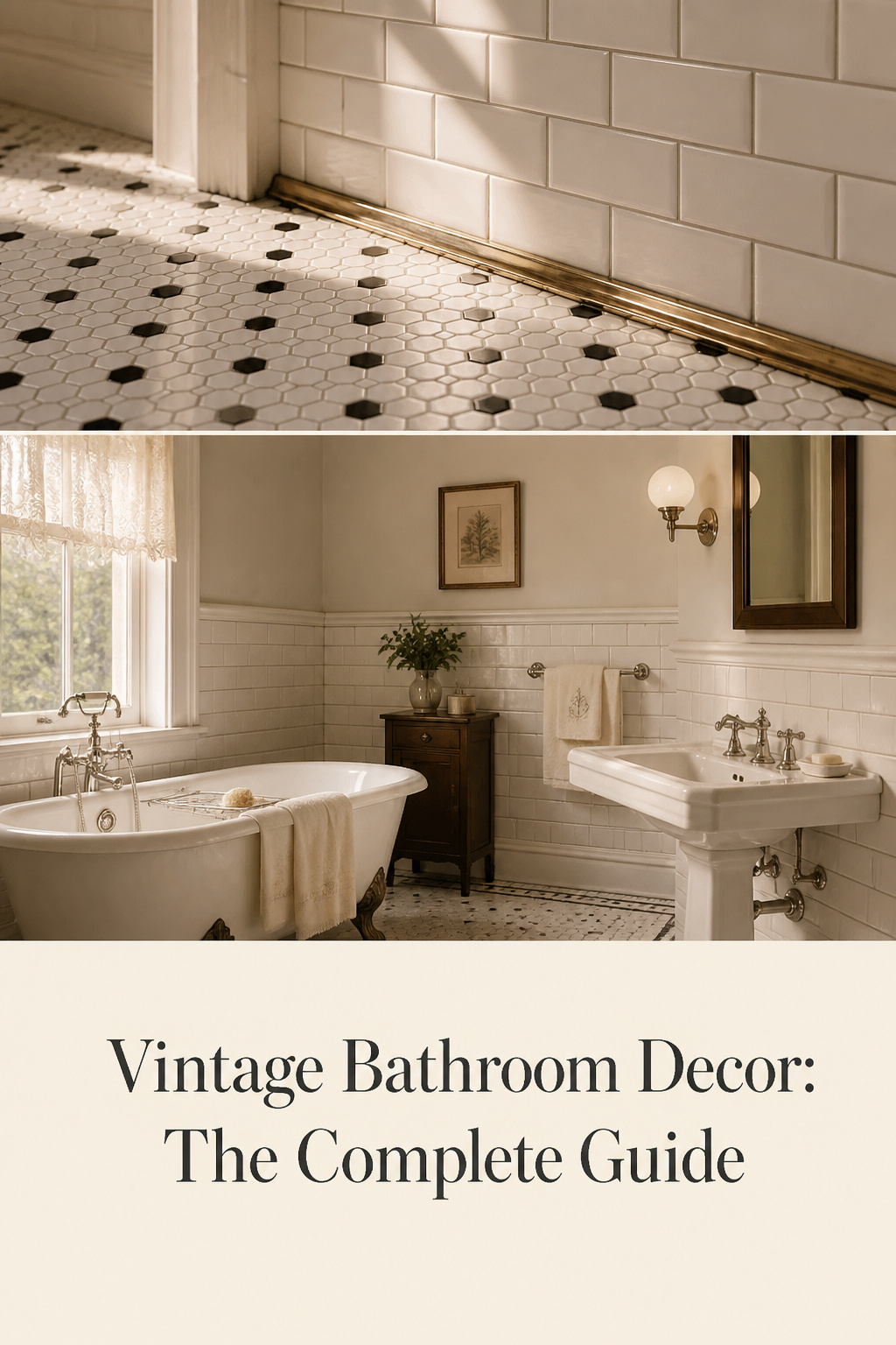
For the first thirty years of the twentieth century, a bathroom was less a room than an argument. The all-white tile, the exposed pedestal, the tub standing proud on four cast feet — none of it was decoration. It was a claim that this room was clean, modern, and nothing to hide. Then, decade by decade, the argument changed: colour crept in at the end of the 1920s, Streamline Moderne softened the lines through the 1930s, and the 1950s threw the whole white discipline out for a pastel celebration. Genuine vintage bathroom decor works because it reads one of those chapters correctly. Get the chapter right and the room has authority; mix two chapters and it reads as a renovation pretending to be old.
The good news is that the rules are knowable. A vintage bathroom is dated by three overlapping signals — its fixtures, its tile, and its palette — and once you understand which belongs to which decade, every other choice follows. This guide surveys all of it: the iconic fixtures, the period tile, the decade-coded colour, the walls above the tile, the accessories that finish the room, and how to handle a small space or a modern blend. Each component then has its own deep dive, linked where it belongs.
What Makes a Bathroom Genuinely Vintage
A vintage bathroom is not a single look. It is a sequence of distinct ones, each tied to a roughly fifteen-year window by what the factories could make and what the culture wanted. The turn-of-the-century bathroom answered to germ theory: white made dirt visible and therefore eradicable, so white 3×6 subway tile, white hex floors, and white pedestal sinks became the standard for any home built between 1900 and 1930.
The reason the decade matters is structural, not fussy. The three signals reinforce or undermine each other simultaneously. A 1920s black-and-white hex floor under a 1950s pastel wall reads as confused, because it asks a knowledgeable eye to place the room in two eras at once. So before you choose anything, fix the decade. The table below is the reference to return to throughout this guide.
| Era | Key fixtures | Signature tile | Dominant palette |
|---|---|---|---|
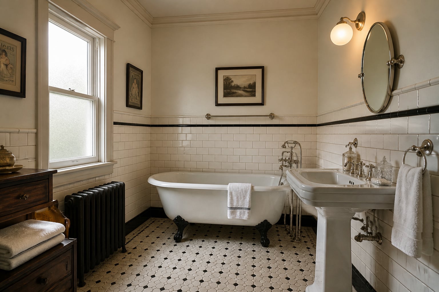
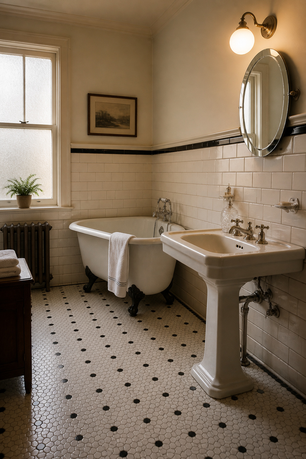
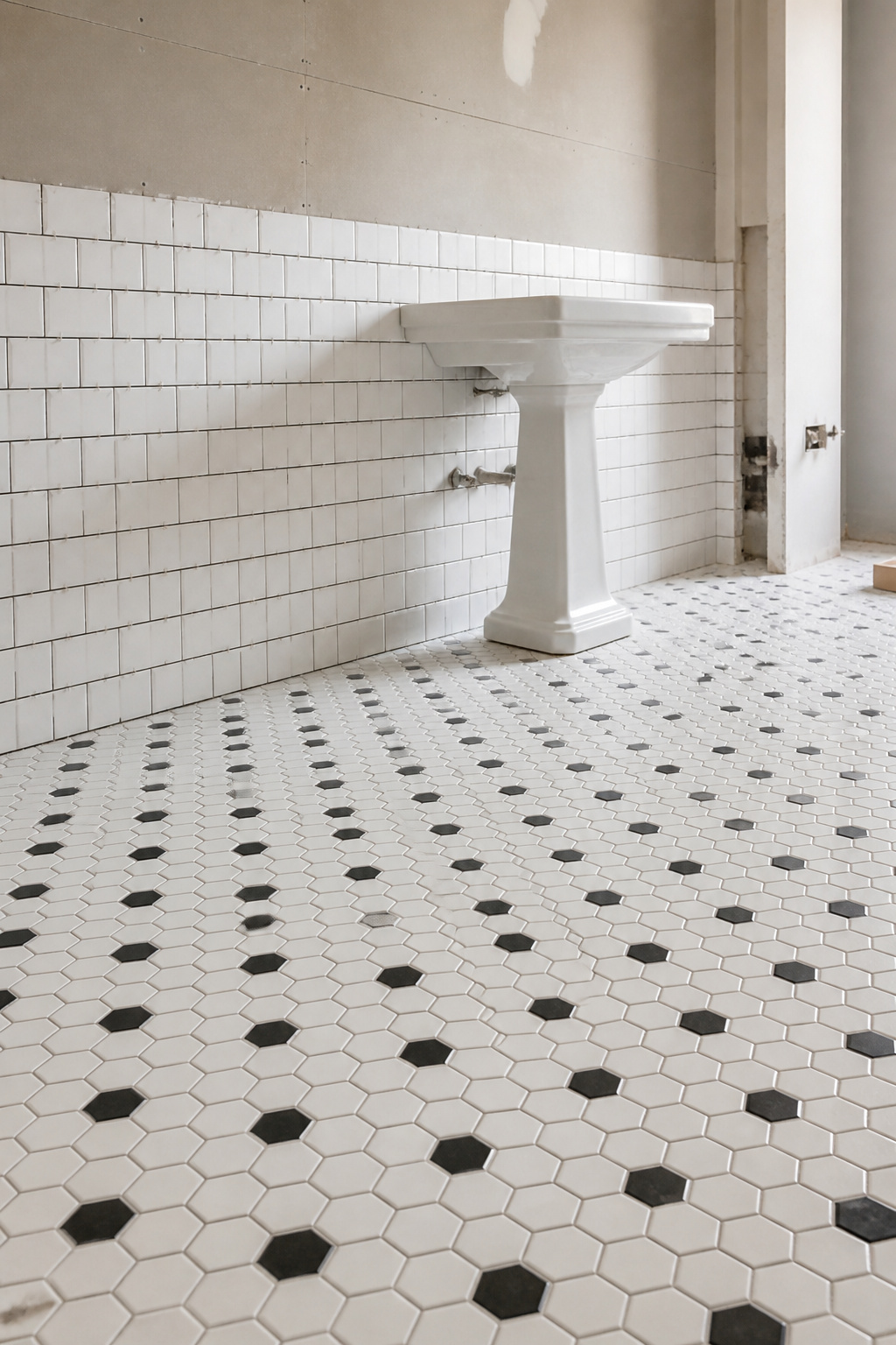
| 1900–1920 | High-tank pull-chain toilet, pedestal or wall-mounted sink, clawfoot tub | White 1-inch hex floor, white 3×6 subway wainscot | All-white with black accents; polished nickel |
| 1920s | Pedestal sink, clawfoot tub, two-piece toilet emerging | Hex/subway with black accents; first pastel subway late in the decade | White and black; nickel faucets |
| 1930s–40s | Pedestal sink, alcove tub gaining ground, cross/blade taps | Sea green, teal, pastel subway with Art Deco pencil borders; 4×4 white in the austere 1940s | Soft greens, teals, Art Deco blues; chrome |
| 1950s | Vanity cabinetry, alcove tub, two-piece toilet | Pastel 4×4 tile, 1-inch mosaic | Pink, mint, powder blue, butter yellow; chrome |
The era difference: Arts and Crafts, Streamline, and the pastel boom
The 1920s opened in the all-white sanitary tradition but moved steadily toward colour; as Old House Journal puts it, “by the end of World War I, white tiles were giving way to colored tiles,” and pastel subway tile debuted late in the decade. The 1930s brought Streamline Moderne — curving forms, long horizontal lines, and a palette of teals and soft greens — while the austerity of the 1940s pushed back toward plain white 4×4 tile.
Then came the reversal. Post-war prosperity produced the most colour-saturated era in bathroom history: peach, turquoise, coral, lemon, and above all pink. By some estimates, as many as five million of the 20 million new American homes built between 1946 and 1966 had a pink bathroom — one in four of everything constructed in those years. First Lady Mamie Eisenhower is credited with popularising the look when she redid the White House private quarters in pink.
The three signals — fixtures, tile, palette — and why all three matter
Fixtures establish the room’s silhouette, tile sets its surface vocabulary, and palette places it in a year — each carries a date on its own, and together they either agree or contradict. The clawfoot tub and the pedestal sink are the two most-named elements across every vintage bathroom guide, precisely because they are the load-bearing signal: they announce a pre-1950s room before any tile is laid. Original tile, in particular, deserves respect. As Old House Journal notes, “tiles matched to the era of the house will never go out of style, unlike modern updates that are in fashion today but will appear dated 10 years from now.”
Reproduction versus authentic: what to save, what to source new
The guiding ethic here is reversibility: never do to an old surface what the next owner cannot undo. Salvage before you replace; repair before you salvage. Original mid-century coloured tile and porcelain sinks still surface through specialist salvage, and quality reproductions from firms like Signature Hardware, Barclay Products, and Kingston Brass fill the gaps convincingly. The visual difference between a good acrylic reproduction tub and original cast iron is minimal from the floor — it lives in weight, heat retention, and the sound the tub makes when you knock it. Nickel finishes, once dismissed as old-fashioned, are exactly what restorers now want, and modern PVD makes them near-indestructible.
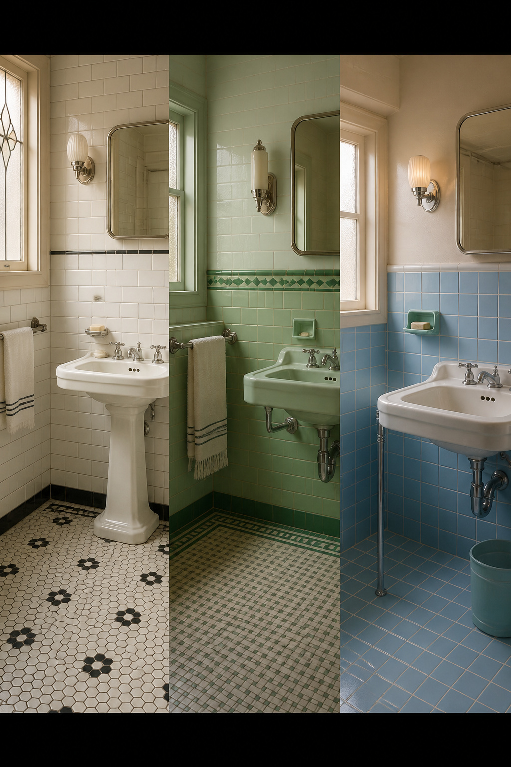
The Iconic Fixtures That Define a Vintage Bathroom
If you change nothing else, change the fixtures, because they carry more history than any surface in the room. The clawfoot tub and pedestal sink date a bathroom at a glance, and both have real material differences between original and reproduction. The full account of what is authentic, what each costs, and how each behaves lives in the dedicated guide to the iconic fixtures.
Clawfoot and roll-top tubs: cast iron versus reproduction
The claw-and-ball foot is older than the tub it props up — the motif came out of mid-18th-century Dutch and English furniture before being bolted beneath mass-produced cast-iron tubs in the Victorian era. The form we recognise today depends on one industrial breakthrough: in the 1880s, David Buick (later of automotive fame) developed the process for bonding porcelain enamel to cast iron.
The practical catch is weight. A standard 60-inch cast-iron clawfoot weighs 350 to 450 pounds empty; filled, with a bather, the load tops 1,100 pounds concentrated on four small feet. Most residential floors were not built for that, so upper-floor installations typically need joist reinforcement assessed first. On cost, basic acrylic reproductions start around $600, quality cast-iron reproductions run $1,500 to $5,000, and restored antiques can reach $10,000 and beyond.
Pedestal and console sinks: why the pedestal still fits
Pedestal sinks became the bathroom staple of the 1910s through the 1940s, and the form is super-typical of homes from that whole span. It exposes the floor and reduces the visual mass of the sink wall, which is why it still suits most bathrooms — small ones especially. The shift to vanity cabinetry was almost entirely a 1950s phenomenon; as StarCraft Custom Builders notes, vanity sinks were advertised as early as the 1920s but “few were built until the 1950s when they became common.” That fixture change marks the end of the classic vintage era. A period-accurate pairing puts a white pedestal basin under nickel or chrome cross-handle faucets.
Cross-handle taps and high-tank toilets: the small hardware that dates the room
The hardware details are where authenticity is won or lost. Cross-handle faucets are the period-correct choice for 1900 to the 1940s, with nickel dominant through the 1920s and chrome taking over in the 1930s. Hot and cold porcelain buttons on metal cross handles read specifically as 1910s–1930s rather than generic vintage. High-tank toilets with pull chains are the most accurate fixture for an Edwardian bathroom; by the 1930s the tank had migrated onto the bowl, making the two-piece toilet virtually standard. Single-lever faucets barely featured in the period, so avoid them in a room aiming for pre-1950s accuracy.
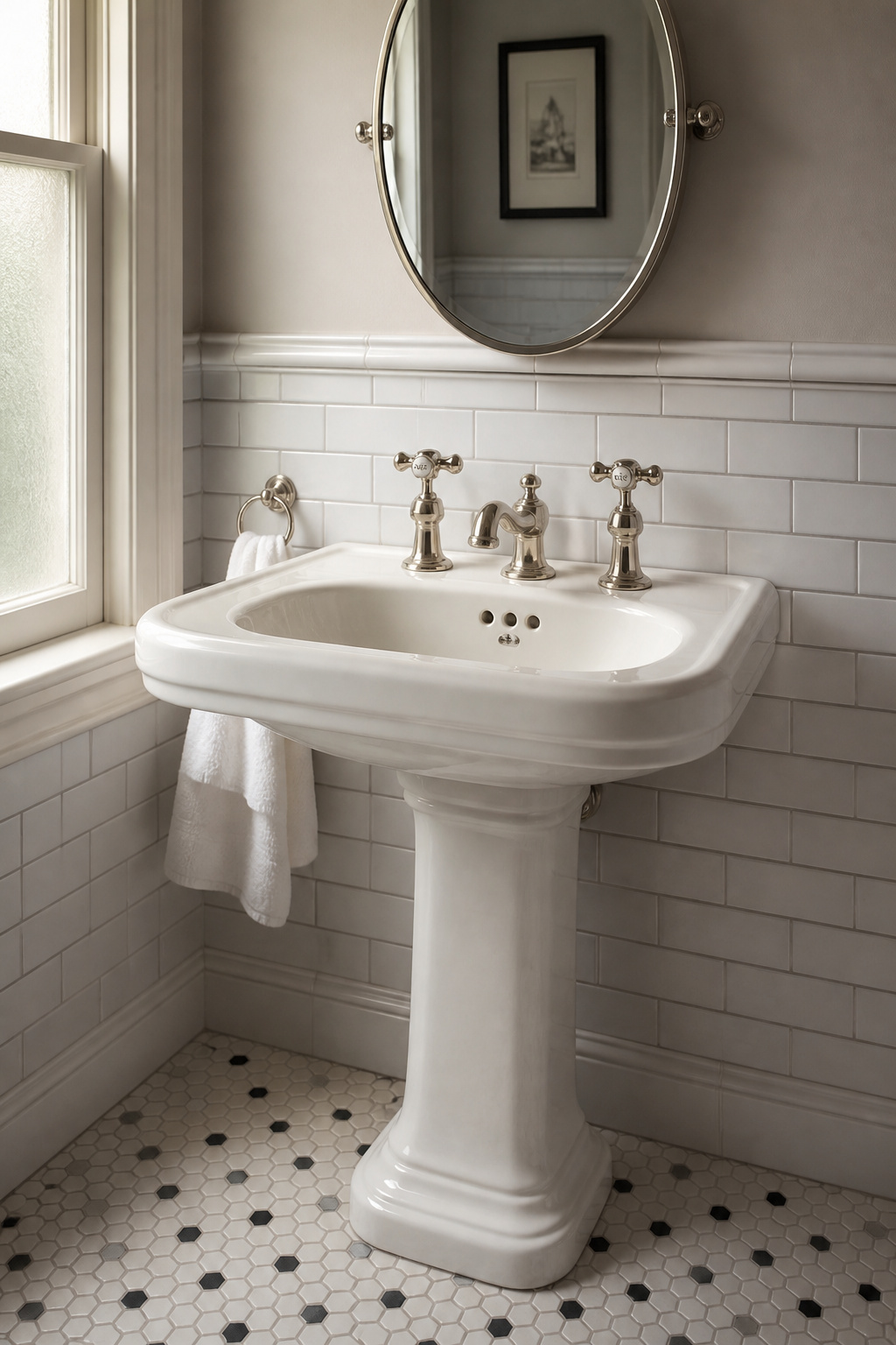
Period Tile Patterns and Where They Belong
Tile is the second signal, and it has a clear vocabulary: small-format mosaics on the floor, subway tile as a wall wainscot, and black-and-white combinations as the 1920s calling card. The layout, grout, and proportion details that make reproduction tile look genuinely old fill the full guide to period tile patterns.
Penny rounds, hexagons and basketweave on the floor
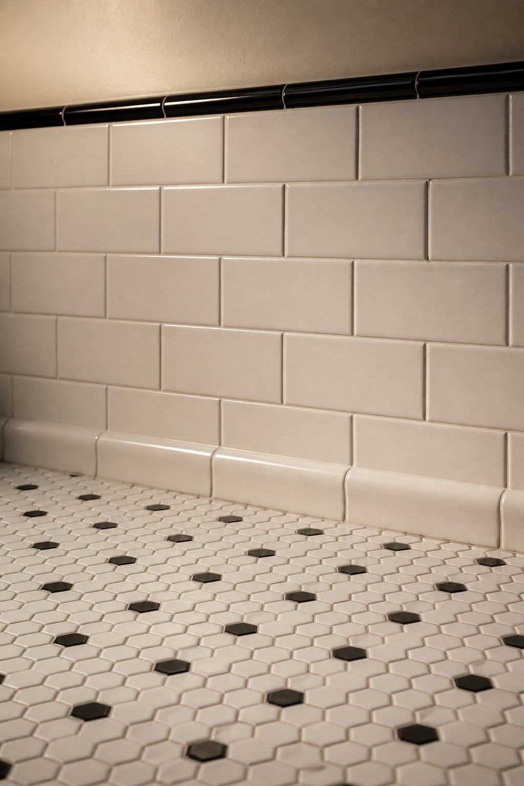
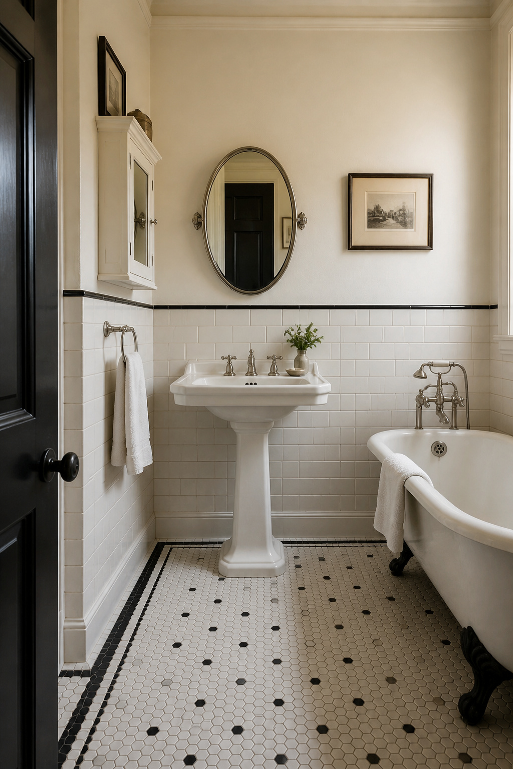
The classic 1-inch hexagon dates to the 1890s and was the Victorian bathroom floor standard, usually white with the occasional black accent. These small formats were chosen less for looks than for cleanliness and footing — and because, counterintuitively, they made compact rooms look larger. Penny rounds, in 3/4-inch and 1-inch sizes, allowed easy drainage and secure footing. Basketweave — rectangular tiles paired into a woven pattern — was a Depression-era and early-1930s choice, often set with a subway wainscot and a contrasting pencil border.
Subway tile walls: proportion and grout
The 3×6-inch subway tile traces directly to architects George C. Heins and Christopher Grant La Farge, who specified that exact size for New York City’s first subway station in 1904. White 3×6 subway with a white pedestal sink is period-appropriate for any home built between 1900 and 1930; after the 1940s the 4×4 tile took over, which is why subway reading as vintage is specifically a pre-1940s signal. The period-accurate grout colour is light grey or soft white, and grout-line width matters as much as colour — wide modern joints undermine the period reading more than the wrong shade does.
The classic black-and-white combination and why it reads as 1920s
White hex floors with simple black borders, plus a few black subway tiles scattered into white walls, is the signature 1920s palette. It works because it references the hygienic white-with-contrast convention of the era. By the 1930s the contrast had shifted to teal-and-white or sea-green-and-ivory, so pure black-and-white without pastels specifically signals the 1900s to early 1920s. One precision point: as Jane Powell observes in Bungalow Bathrooms, art tiles were not an Arts and Crafts feature — they belong to 1930s bath design, not the 1900–1920 golden age many people assume.
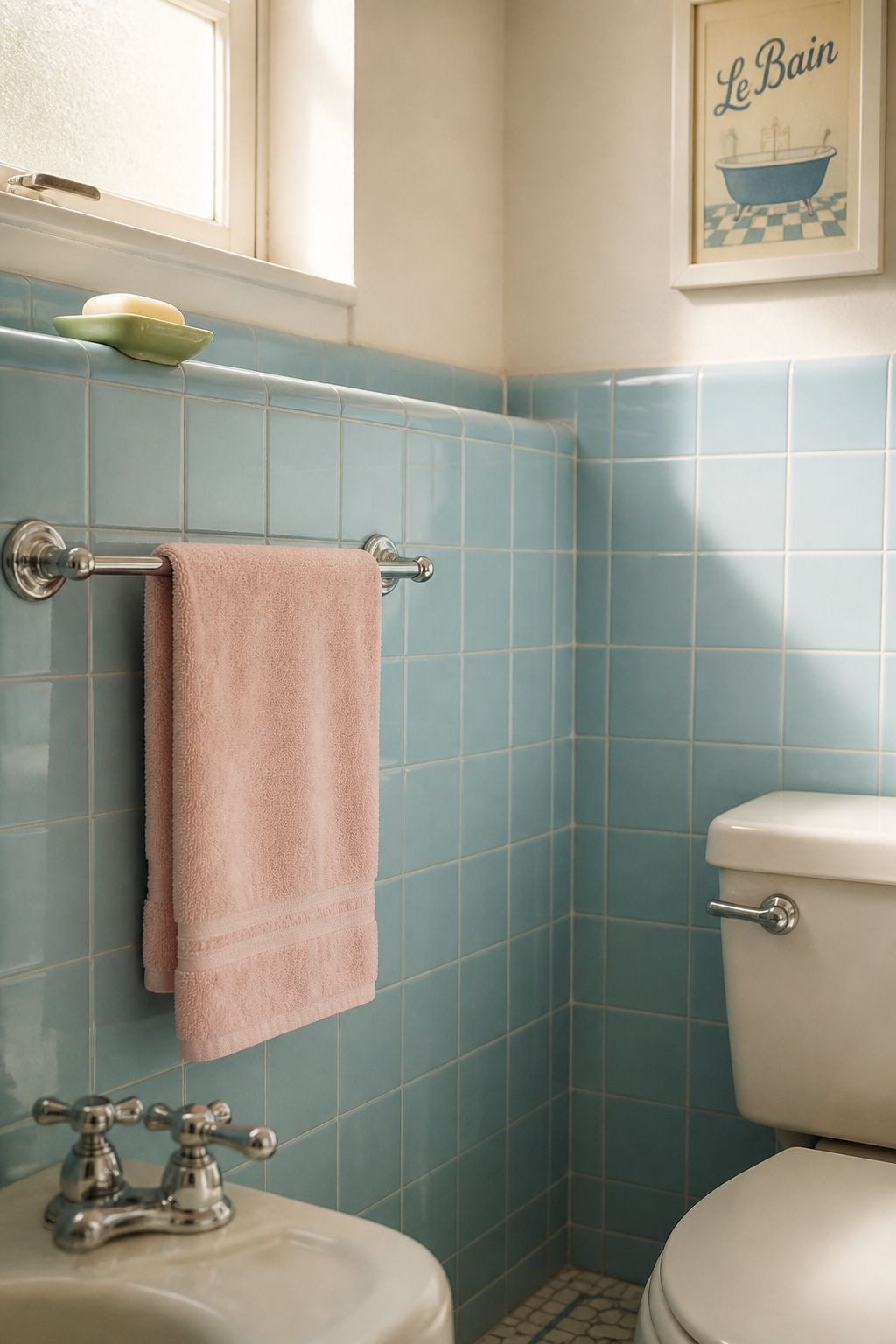
Choosing a Period Colour with Confidence
Palette is the most decade-legible signal of the three, because the colour shifts between eras were radical rather than gradual. That makes the choice easier: pick your decade first, then match the colour to it. The decade-by-decade palette, with named period shades and the rule for keeping pastel from tipping into parody, is covered in full when it comes to choosing a period colour.
Why colour is decade-coded — and how that narrows the choice
Each palette tracked a cultural moment. Sanitary white followed germ theory; muted 1940s tones tracked wartime austerity; the 1950s pastel explosion tracked post-war optimism. Choosing a period colour is therefore a historical decision as much as an aesthetic one. The useful shortcut: fixture era and palette era should align, so a period-accurate bathroom is far easier to achieve when both point to the same decade.
1920s white-and-black, 1940s soft greens, 1950s pastels: a brief map
The 1920s defining combination is pure white with black accents; the first true pastels appeared late in the decade, but only as accents within a white-dominant room. The 1930s introduced mint, teal, cerulean, and sea green alongside Streamline forms, before 1940s austerity pushed back toward white and sombre combinations like burgundy and dark grey. The 1950s then opened the full rainbow — pink (the most popular), peach, turquoise, lemon, coral — coordinated across tub, sink, toilet, and tile as a complete suite by makers like Crane Plumbing and Eljer.
Using period colour without tipping into kitsch
The line between genuine and kitsch is restraint in application. Full-room colour on walls, fixtures, and tile at once was a 1950s phenomenon only; earlier decades used colour in one surface against a white or cream ground. The safest single intervention is colour on the walls alone — a period sage or powder blue above white subway tile and white fixtures reads as 1930s without overwhelming. Even the boldest 1950s bathrooms kept one element, usually the ceiling or counter, white as a neutral anchor. That anchor is what stops a pastel room reading as a costume.
Wallpaper, Beadboard and the Rest of the Wall
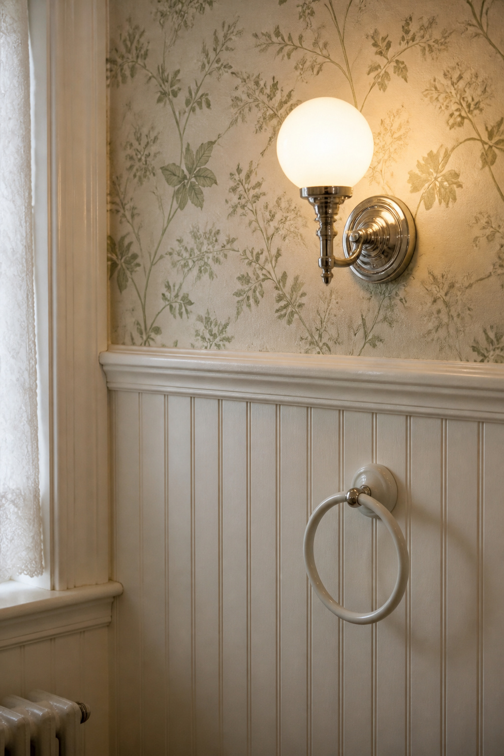
Tile only ever covered the lower wall in a period bathroom, which leaves a large surface above it where character often lives most distinctly. The decisions here are the transition height, what goes above it, and how to survive the humidity. The floral patterns, beadboard heights, and damp-room practicalities are covered in the dedicated guide to wallpaper and wall treatments.
Where tile stops: the transition height
Before the 1950s, tile was applied as a wainscot to the lower wall, reaching higher only around the tub — full floor-to-ceiling tile is a post-1950 convention. Pre-war wainscots typically ran 48 to 54 inches from the floor, considerably higher than the modern 36-inch vanity-height convention. The top of the tile was capped with a pencil border or a row of bullnose trim, then plaster or wallpaper ran up to the ceiling. That cap rail detail matters: a bare grout-line edge at the top of subway tile reads as modern, not vintage.
Period wallpaper versus paint in a damp room
Botanical prints, classic toile, and floral pastoral patterns are the period-appropriate paper choices, with fishscale and nautical motifs common in 1930s bathrooms. Use paper above the wainscot and on accent walls, never at floor level or across all four walls of a wet room — and choose a vinyl-backed or moisture-resistant substrate, since traditional paper fails fast without a vapour barrier. Where you would rather paint, the 1920s convention above white subway tile was almost always white, cream, or soft ivory; a 1930s bathroom might introduce a soft sage or powder blue. Either way, use a semi-gloss or gloss finish rather than matte for humidity resistance.
Beadboard and wainscoting: the right height
Beadboard wainscoting — narrow vertical panels separated by a small bead ridge — gained popularity in the Victorian era and suits bathrooms from 1890 to the 1940s, where it served as moisture protection before ceramic tile became universal. The period-accurate height for Victorian work is 48 inches (four feet); the 32-to-36-inch height common today reads modern, not historic. Painted beadboard in white, cream, or a soft period colour is a sound alternative to a full tile wainscot when budget is tight, as long as the finish is gloss enough to shed moisture. One caution: picture rails were a feature of period living and dining rooms, not a standard bathroom detail, so treat a picture rail as a decorative choice rather than a mark of authenticity.
The Accessories and Styling Layer
This is the lowest-cost, highest-legibility intervention in the whole room — the layer that turns a clinical period reconstruction into a lived-in one. Mirrors, brass hardware, glass jars, and textiles each carry a recognisable vintage signal at every price point. The budget-first, what-to-thrift approach gets the full treatment in the guide to accessories on a budget.
Mirrors, brass hardware and apothecary glass: the low-cost signals
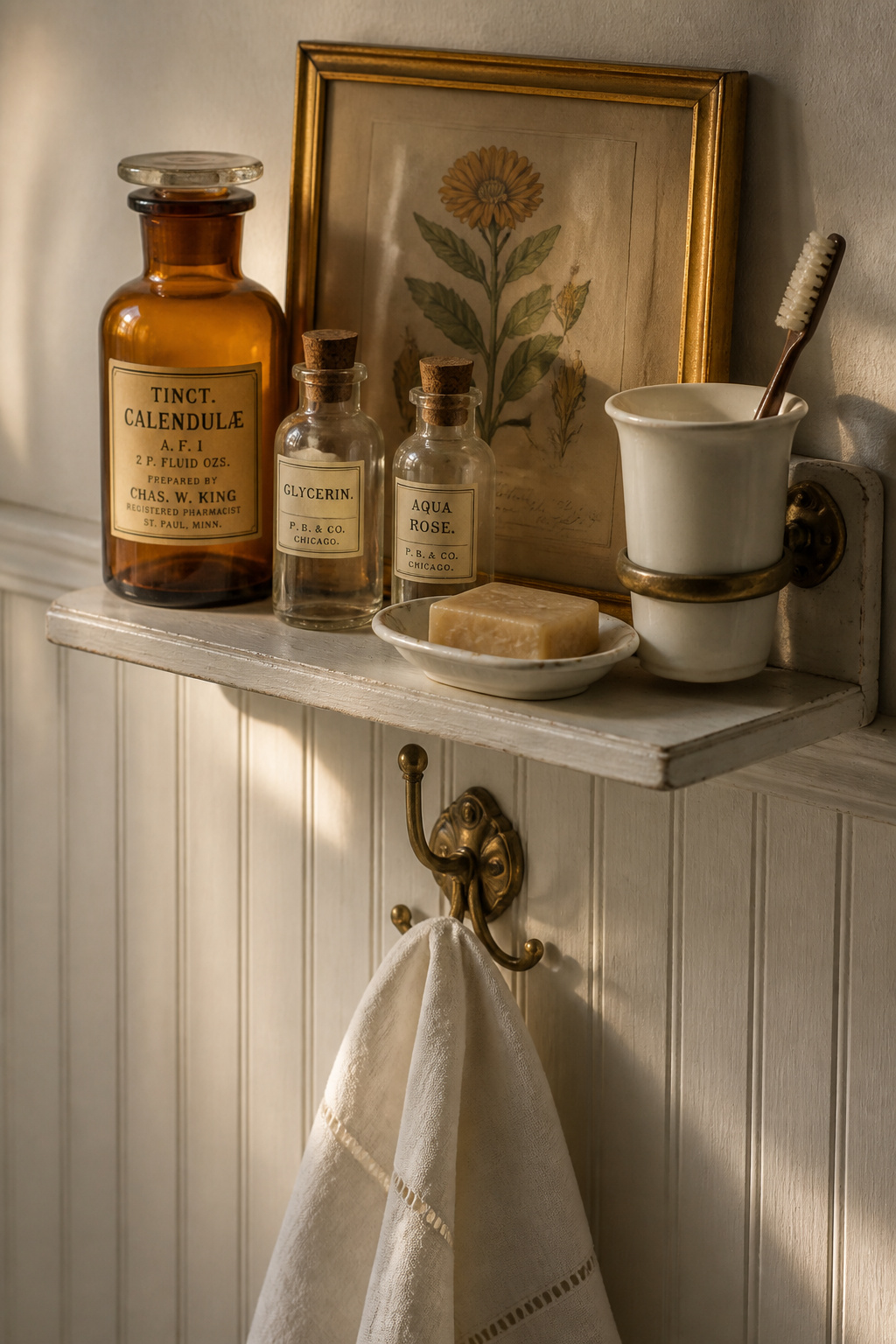
A mirror sets the tone for the whole room, and its frame dates the era: a nickel oval bevelled mirror reads Edwardian to 1920s, an ornate gilded frame reads late Victorian, a geometric frame reads 1930s. Antique brass on towel bars, hooks, and rings is the fastest single upgrade, and unlacquered brass develops a warm patina no chrome matches. Apothecary jars and milk-glass containers are the strongest single accessory signal — though in honesty these are period-inspired pieces borrowed from pharmacy and kitchen culture, not original bathroom furnishings. Styled on a shelf in groups of three to five, they read immediately as vintage.
Fringed textiles, café curtains and lace: how fabric changes the register
Fabric is the softening layer that shifts a bathroom from clinical to domestic, and it is the most renter-friendly of all. Fringed cotton towels, linen hand towels with simple embroidery, and café curtains over the lower half of a window are all reversible. Café curtains read as a fitting period-inspired touch rather than a strict historical requirement, so use them freely where they suit the window. Lace and crochet panels are specifically a Victorian and Edwardian signal; for a 1920s–1930s room, a small botanical or geometric cotton pattern is more accurate.
What to thrift and what to buy new
The honest split follows function. Thrift everything that hangs on or sits on a surface — mirrors, glass jars, milk-glass, framed botanical prints — since these are non-functional and easy to assess at a glance. Buy new everything that attaches to plumbing or electrical: faucet hardware, load-bearing towel bars and hooks, and anything electrical (vintage wiring is not safe). The one exception worth hunting is antique porcelain accessories in their original wall-mount brackets, which modern reproductions rarely replicate.
Vintage Style in a Small Bathroom
A small bathroom is not a problem to solve here — it is the original specification. The standard pre-war bathroom was 5 feet by 7 feet, with upscale versions reaching 5 by 9, because architects treated the bath as a utility room that should not steal space from the living and dining rooms. So a compact vintage bathroom is historically correct, not a compromise. The constraint-led approach, with renter-friendly versions throughout, is covered in full in the guide to vintage style in a small bathroom.
Why period bathrooms are already small — and why that helps
The tight pre-war footprint is exactly why small-format tile became the floor standard: 1-inch hex and penny rounds were chosen because they made spaces look larger, the repeated pattern reading as a continuous plane rather than emphasising the room’s edges. Large-format tile, anything over 4×4, works against both period accuracy and spatial legibility here.
The pedestal sink as the small-bath decision
The pedestal sink is the natural small-bathroom fixture: it takes up little floor and visual space and frees circulation a standard 24-inch vanity would block. Its trade-off — no counter storage — is exactly why vanities replaced it in the 1950s. The period-accurate resolution is wall-mounted storage: a recessed medicine cabinet, shelves above the toilet, or a wall-hung cabinet. A 23-inch pedestal, cross-handle faucets, hex floor, and subway wainscot fit comfortably in a 5×7 room with clearance to spare.
Tile scale and layout that widen a tight room
Two moves help a tight room read larger while staying period-plausible. Keeping the floor, fixtures, and walls white maximises the light-reflective surface and is the most accurate choice for a 1900s–1930s room — colour, in that context, belongs in the accessories. Laying square tile diagonally, at 45 degrees, creates a width-expanding effect; this is established design advice rather than a documented period specification, so treat it as a tool.
Blending Vintage Character with Modern Function
Most readers will not build a museum-accurate room; they will build a modern-vintage one — period character with contemporary plumbing, ventilation, and lighting. The art is knowing which elements tolerate modernisation and which break the period reading. The deliberate old-meets-new balance is the subject of the guide to blending vintage with modern.
Which pieces to keep period-accurate, which to update
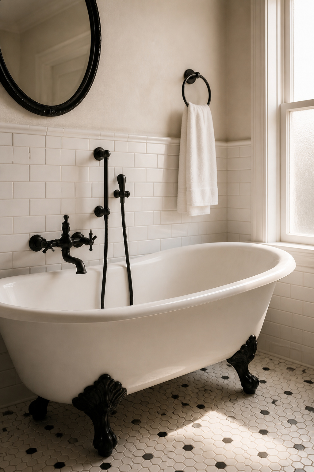
The governing principle is reversibility, and it splits the room cleanly. Modernisations hidden within the structure — plumbing lines, drains, ventilation ducting, wiring — add function without touching character, so update them freely. Modernisations visible on the surface — faucet silhouettes, tile format, wall treatment — must be chosen carefully. The reliable move is old form with new finish: a period cross-handle silhouette in matte black or brushed brass reads as a knowing choice, because the eye registers the form first and the finish second.
A clawfoot tub with matte-black or brushed-brass fittings
A white cast-iron clawfoot with black feet and matte-black faucets is the textbook modern-vintage combination: an unmistakably Victorian silhouette in a contemporary finish. The one rule that holds it together is finish consistency — white tub, black feet, black faucet, black towel bar is a coherent set, while mixing matte black with chrome and unlacquered brass breaks the language. Choose one metal and repeat it everywhere. A clawfoot shower enclosure on a ceiling- or tub-mounted ring lets the tub work as a full shower without losing its silhouette.
Lighting, ventilation and storage: where modern belongs
Three systems are where modern belongs, all hidden in plain sight. Period-style fixtures now come with integrated LEDs, but the colour temperature must be warm — 2700 to 3000K; a cool-white bulb inside a milk-glass sconce reads wrong the moment it lights up. A modern exhaust fan is historically excusable, since the period bathroom relied on window ventilation and only needed power extraction once air conditioning closed the windows; behind a grille painted to match the ceiling, it disappears. Storage is the genuine functional gap, best filled with a recessed medicine cabinet, painted-pine shelves, or a nickel étagère.
How to Start: The Renovation Order That Gets Vintage Right
Every other section is about what to choose; this one is about the order to do it in, because the most expensive vintage-bathroom mistakes are sequencing errors: tiling before the plumbing is roughed in, buying fixtures before the tile is chosen, or painting before the grout has cured. The decisions interlock, so the order is not optional.
- Demolish and expose. Strip existing surfaces back to studs and subfloor, exposing the plumbing and electrical you will be working around.
- Rough in plumbing and electrical. Relocate supply lines and drains to suit the new fixture plan before anything is closed up.
- Waterproof and lay the subfloor. Install cement board and a waterproofing membrane in the wet zones.
- Tile the floor, then the walls. Floor first, walls second, so the wainscot meets a finished floor cleanly.
- Grout and cure. Allow the grout a minimum of 24 to 72 hours to cure fully before any weight goes on it.
- Set the fixtures. A freestanding clawfoot installs last, on the finished and sealed floor; an alcove tub reverses this and goes in before its surrounding tile.
- Finish the walls. Paint or hang wallpaper above the tile only once the grout below has cured, or moisture will bubble the finish.
- Add hardware and accessories. Towel bars, hooks, mirror, and the styling layer go on last.
The single most important decision sits before step one: choose your decade. The decade fixes the fixture type, the fixture fixes the tile format, and the tile fixes the palette — so deciding it first prevents almost every period-mismatch error. The fixture is the highest-cost, longest-lived element, which makes it the logical place to lock the era.
The mistakes worth naming are the negative of that advice. A Victorian clawfoot with 1950s pastel tile is a sixty-year era gap — both look old, but they reinforce nothing. And the structural check is not optional: a loaded cast-iron tub tops 1,100 pounds concentrated on four small feet against a floor rated near 40 pounds per square foot, so an upper-floor installation needs an engineer assessment first. Hold to an era range of ten to fifteen years, audit every visible element against it before you install, and the room will read exactly as old as you intend.
If you take only three principles from this guide, take these. Fix the decade before you buy anything — fixtures, tile, and palette must agree, or the room reads as a renovation rather than a survivor. Respect what is already there: original tile and fixtures are the bones of the house, and reversibility is the ethic for everything you add. And remember that the most common failure is not bad taste but a mismatched period set, which is entirely avoidable. Get those right, and the deep dives behind each component will reward whatever detail your project asks of you.