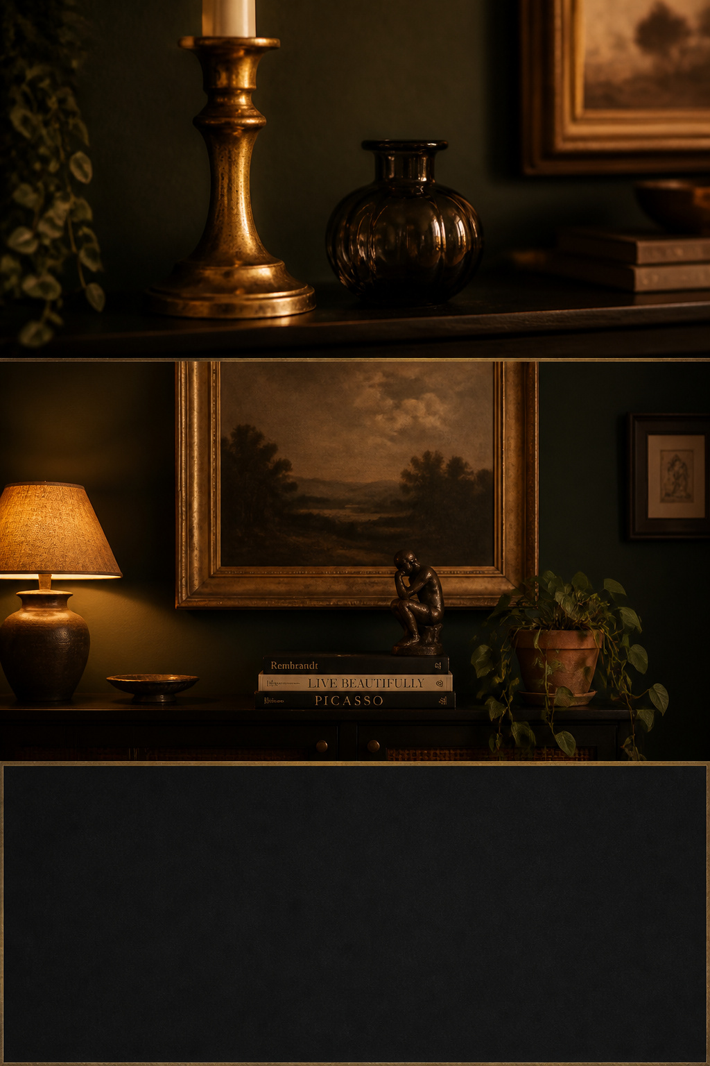
Walk into any shop selling decorative objects and you face a hundred candlesticks, a wall of frames, more vases than a room could ever hold. Against a white wall, most of them would do. Against a dark one, most of them vanish. That is the rule that makes moody living room decor and styling its own discipline: the wall stops being a neutral backdrop and behaves like a stage, so every object is either performing or sitting in the dark. This guide is about what earns its place — and what to leave on the shelf.
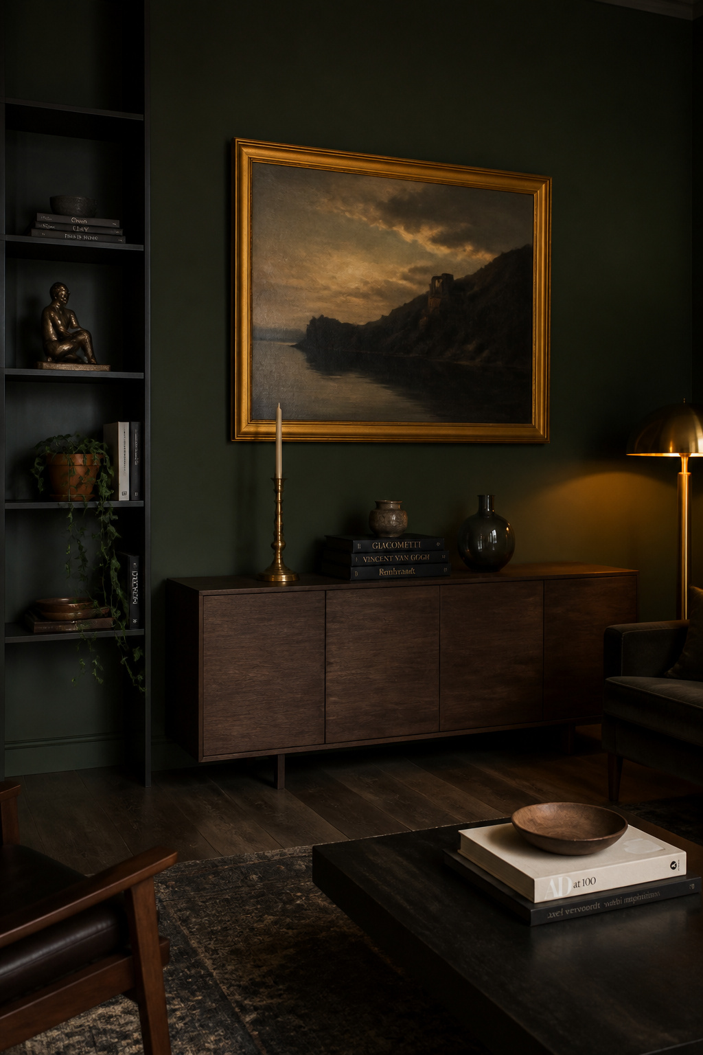
TL;DR
- Warm metals lead: aged brass and bronze catch the lamplight dark walls absorb, but cap distinct finishes at two or three in a 70/20/10 split, and repeat each metal at least twice so it reads as a choice, not an accident.
- Choose objects with reflectivity, tonal contrast or sculptural mass — gold-leaf frames, foxed mirrors, smoked glass, pale ceramics, trailing plants in light pots. Dark matte objects against dark walls simply disappear.
- Style dark shelves to roughly 20–30% empty surface, use the rule of three by object type rather than count, and let the bare dark shelf read as depth, not as a gap to fill.
This is the finishing layer of the wider dark living room guide — the part that comes after the paint and lighting are settled, and the part most people rush.
The Selection Standard for Moody Living Room Accessories
Before any object goes on a surface, it has to pass one test: not “do I like it” but “does it survive the wall behind it.”
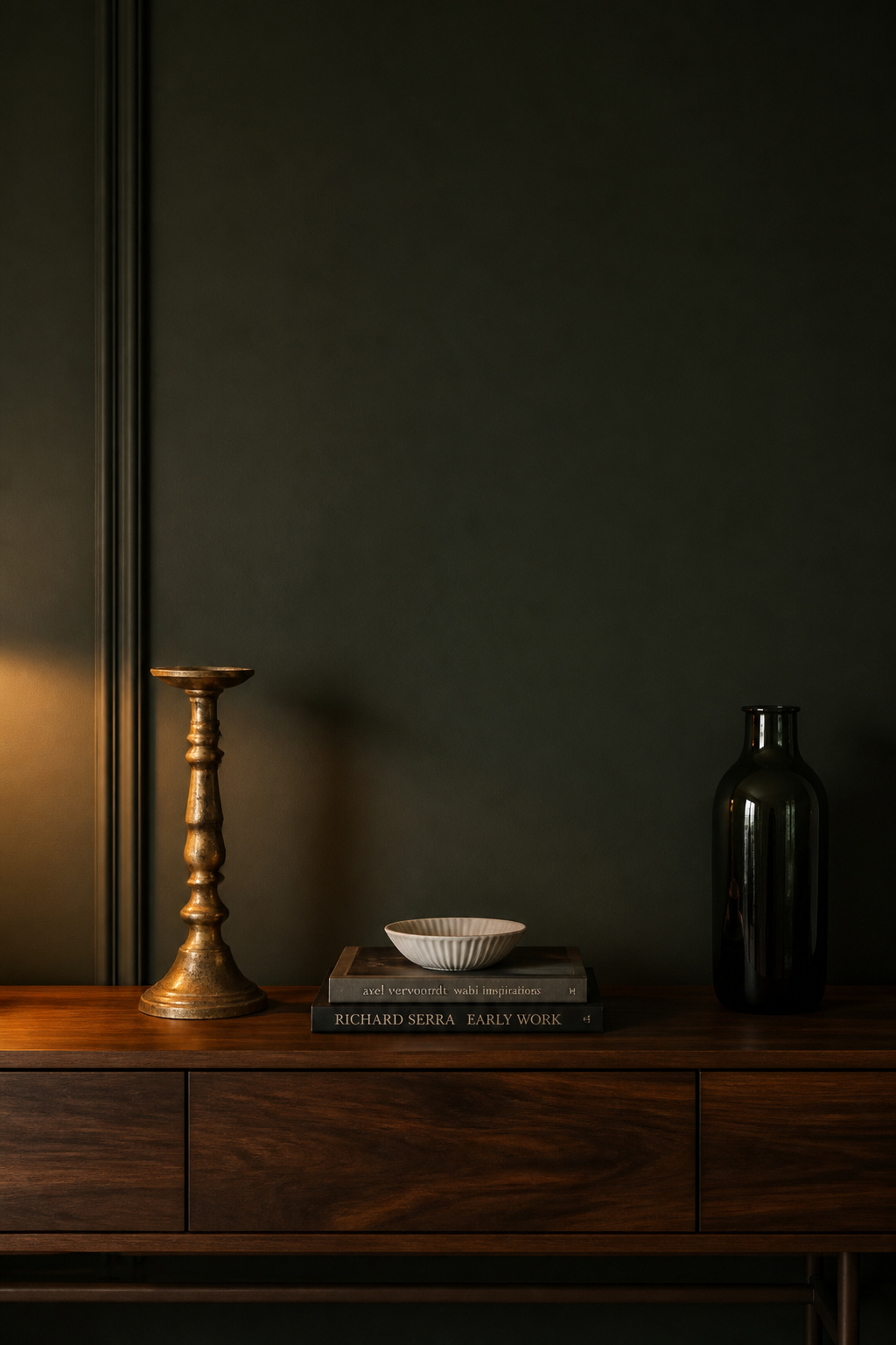
Why dark walls raise the bar for every object in the room
A dark matte wall absorbs light rather than reflecting it, so a low-contrast object leaves no silhouette and reads as more wall. In a pale room, a mediocre object is merely unremarkable; in a moody room, it actively fails. Principal designer Ryan Austin Hagood of r.a.d. Interiors names the upside: dark walls “provide a backdrop for artwork and plants in a very dramatic way.” The backdrop is a stage, and good styling works with the wall’s depth rather than sitting flatly in front of it.
The ‘earned its place’ test: what passes and what disappears
Objects that earn their place fall into three groups: reflective or metallic surfaces that catch light, strongly contrasting tones that separate from the dark, and pieces with enough sculptural mass to read as a silhouette across the room. What fails is the dark, matte, mid-toned thing — brown, grey or olive accessories that merge and go. As House of Jade Interiors warns: “Too dark and it will blend in with the shelving. Too much of one colour and it will feel flat.”
The collected look versus the curated showroom
Aim for collected, not showroom. Tatum of Cavendish Lane Design describes the collected room as “a space that evolves over time rather than being designed in a single shopping trip.” A piece with provenance — a bowl from a trip, an inherited candlestick — adds soul that “can’t be replicated,” and that lived-in note is what separates intentional from theatrical. That accumulated quality — a bowl from a trip, an inherited candlestick — is what separates intentional from theatrical, and no single shopping trip produces it.
Brass, Bronze and Dark Metal Accents That Work Against Dark Walls
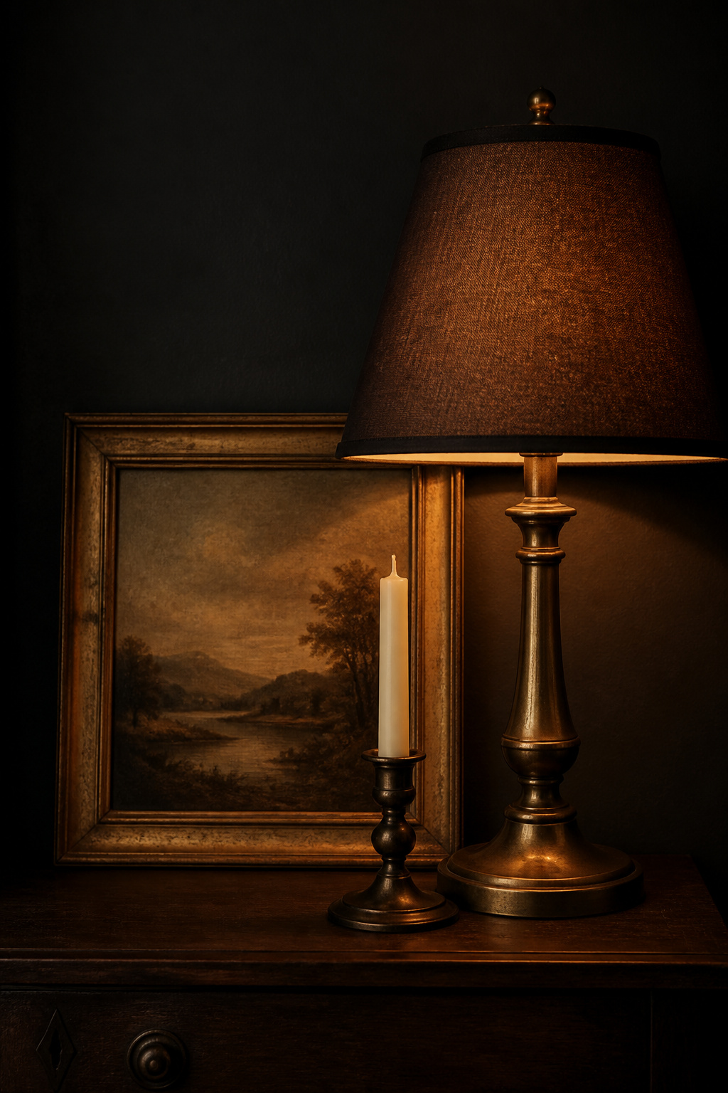
If you do one thing on this list, make it metal. The reason is physical: the wall absorbs light, and brass hands some of it back. Designer Dani Crawford of Kimmel Studio Architects names “metallic finishes in warm brass tones” among the tools that “wrap up” a moody scheme.
| Metal finish | Mood character | Pairs with dark color family |
|---|---|---|
| Aged / unlacquered brass | Warm, romantic, collected | Charcoal, deep green, navy, plum |
| Bronze | Grounded, architectural, weighty | Deep green, navy, grey-black |
| Dark iron / matte black | Restrained, secondary anchor | Any; used as the 10% accent |
Brass and aged brass: the warmth that reads richest on dark paint
Brass introduces a warm yellow-gold tone that contrasts immediately against cool dark hues, which is why it tops nearly every designer’s list. Halman Thompson, specialists in aged-metal finishes, note that an aged brass mirror “pops” even in a mainly-black room and that “midnight blue and brass work wonders together.” Reach for unlacquered, naturally patinated brass over bright polished: the uneven, slightly tarnished surface suggests age rather than newness — exactly the collected note a moody room wants.
Bronze and dark iron: the cooler, more grounded alternative
When the walls skew genuinely cool — charcoal or grey-black rather than green or navy — bronze does brass’s job with more gravity, running deeper and browner. A brass-leaning room reads romantic; a bronze-leaning room reads architectural. Dark iron and matte black belong in a supporting role, grounding the scheme while the brass draws the eye.
How many metals before a room tips into chaos
Restraint separates rich from frantic. Designer consensus caps distinct metal finishes at two or three per room, distributed roughly 70/20/10 — a dominant metal, a secondary, and a small accent. Just as important: repeat each metal at least twice. One lone brass object reads as an accident; a brass candlestick, lamp base and frame read as a deliberate thread. Skip polished chrome and bright nickel; their coolness fights the warmth the palette is building.
Art in a Moody Living Room: What Shows and What Disappears
Art is where dark walls reward you most and punish you fastest. It comes down to three things: the frame, the subject, and how you group it.
Frame choice: gold leaf and dark wood over white and black
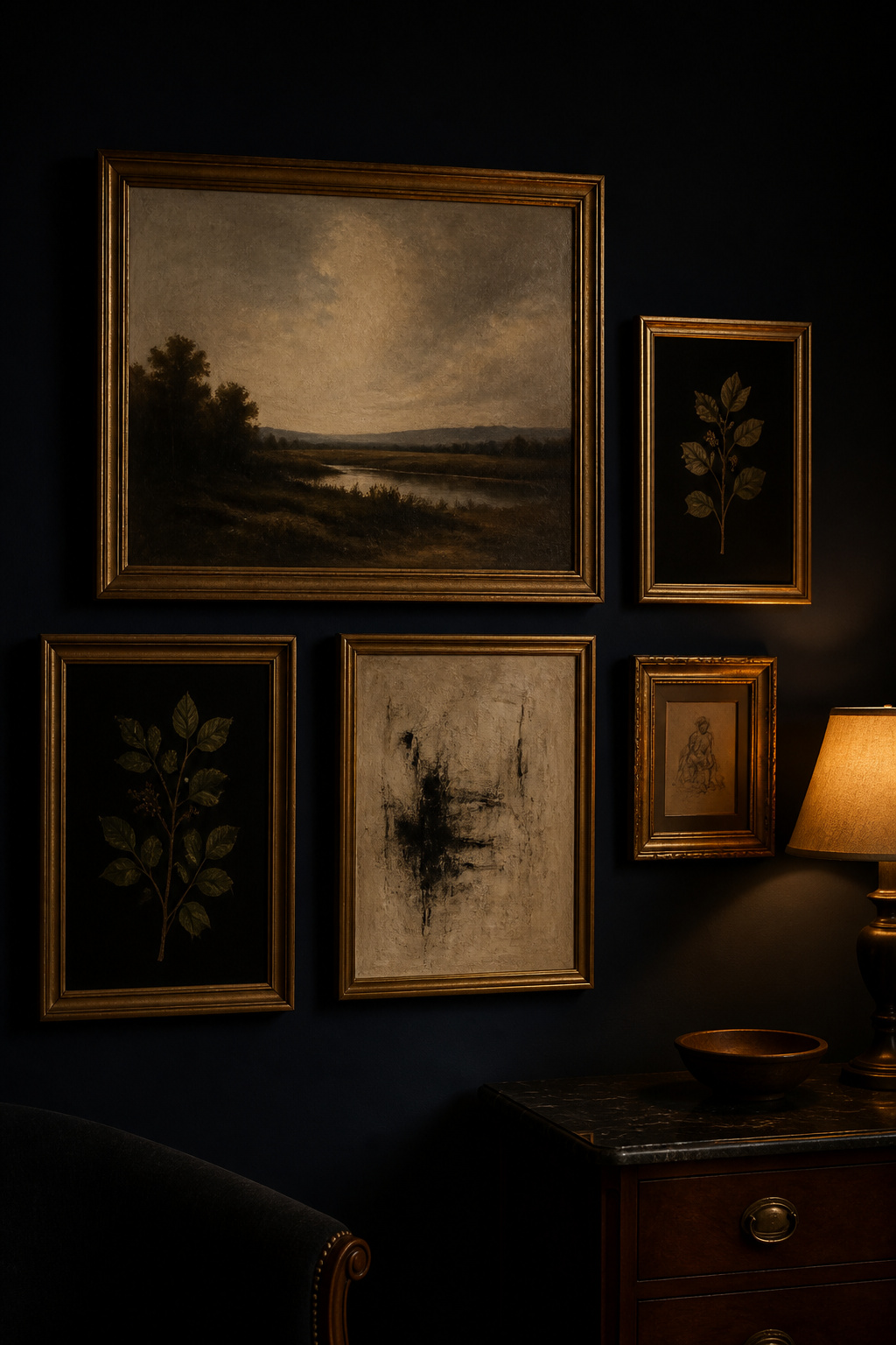
The frame does more work on a dark wall than on a pale one. Warm metallic frames — gold leaf, aged gilt, antique gold — are the most consistent recommendation, catching ambient lamplight and drawing a visible border between art and wall. Halman Thompson note that “ornate gold or carved wooden frames” keep a jewel-toned room “curated and intentional.” Carved walnut and mahogany work too. White and bright matte-black frames read clinical against dark paint.
Subject matter: what reads as intentional on dark walls
A piece needs internal tonal range to survive a dark wall. Art with light and dark passages — a still life with highlighted objects, a landscape with sky, an abstract with a pale field — has the contrast to lift off the background. A uniformly dark canvas vanishes. The working test: does the piece hold something light enough — a highlight, a pale sky, a white mount — to separate from the wall? Old masters-style compositions and botanical studies on dark grounds earn their place precisely because they carry that internal contrast while reinforcing the room’s atmosphere.
Gallery wall logic: spacing, consistency, scale
Keep 2–3 inches between frames so the cluster reads as one composition; wider fragments it, tighter flattens it. Asymmetry is forgiving here — you balance visual weight rather than match shapes, so a small dark piece can offset a large pale one. Frame-finish consistency matters more in a dark room than in a light one: with no support from the wall, mismatched finishes read as random, so choose one dominant material plus one accent. And err large — above furniture, cover 70–75% of the wall width to give work enough presence from the sofa.
Glass, Mirrors and Reflective Accessories as Styling Objects
Reflective objects do double duty: they are styling pieces in their own right, and they quietly return the light the walls take. Before buying, check three things: does it catch light from your existing lamp positions? Does it have enough tonal contrast to register from 8–10 feet away? Does it have the height or mass to hold its spot without other objects propping it up?
Antique and foxed mirrors as mood objects, not just light tools
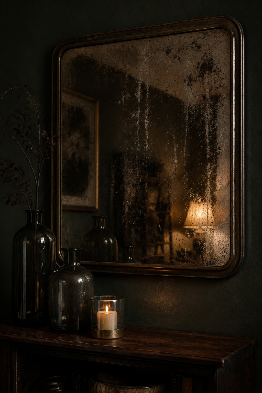
A foxed mirror — its silvering broken into dark blooms and streaks by age — is the antithesis of the sharp modern mirror, and that is the point. The speckled glass diffuses reflection into “a softer and more inviting glow,” adding “depth and warmth to a room without feeling too glossy or modern.” Rather than extending the room the way a clear mirror does, it interprets it — which suits a space trying to feel enclosed. A darker foxed patina works better than bright mercury shimmer; hung behind open shelving, it throws lamp warmth back through whatever you style in front of it.
Dark glass, smoked glass and coloured vessels
Smoked glass — tinted with grey, bronze or charcoal — brings tonal interest without the visual noise of clear glass. House of Isabella describe it as “moody, sultry, and seductive; the veiled transparency creates a sense of intrigue.” Being semi-transparent, it lets light pass rather than blocking it like a solid dark object. It needs a neighbour to read against, though: set a smoked-glass vase beside a pale ceramic or a stack of pages-out books, and layer vessels at different heights so candlelight through them builds depth.
Lacquered boxes, candlesticks and vessels that earn the job
High-gloss lacquer works on the same principle: a glossy surface against matte walls creates a pool of reflected light without requiring a mirror or a metal. Taper candles in brass or iron holders compound the effect — a warm moving flame plus a metal base in one object. Both categories bridge the two layers either side of styling: the layering velvet and texture that absorbs light, and the moody lighting fixtures that supply it.
Styling Dark Shelves: The Approach That Reads Collected, Not Cluttered
Dark shelves are where mistakes compound most visibly. The fixes are specific and reward a slow hand.
The rule of three, applied by object type
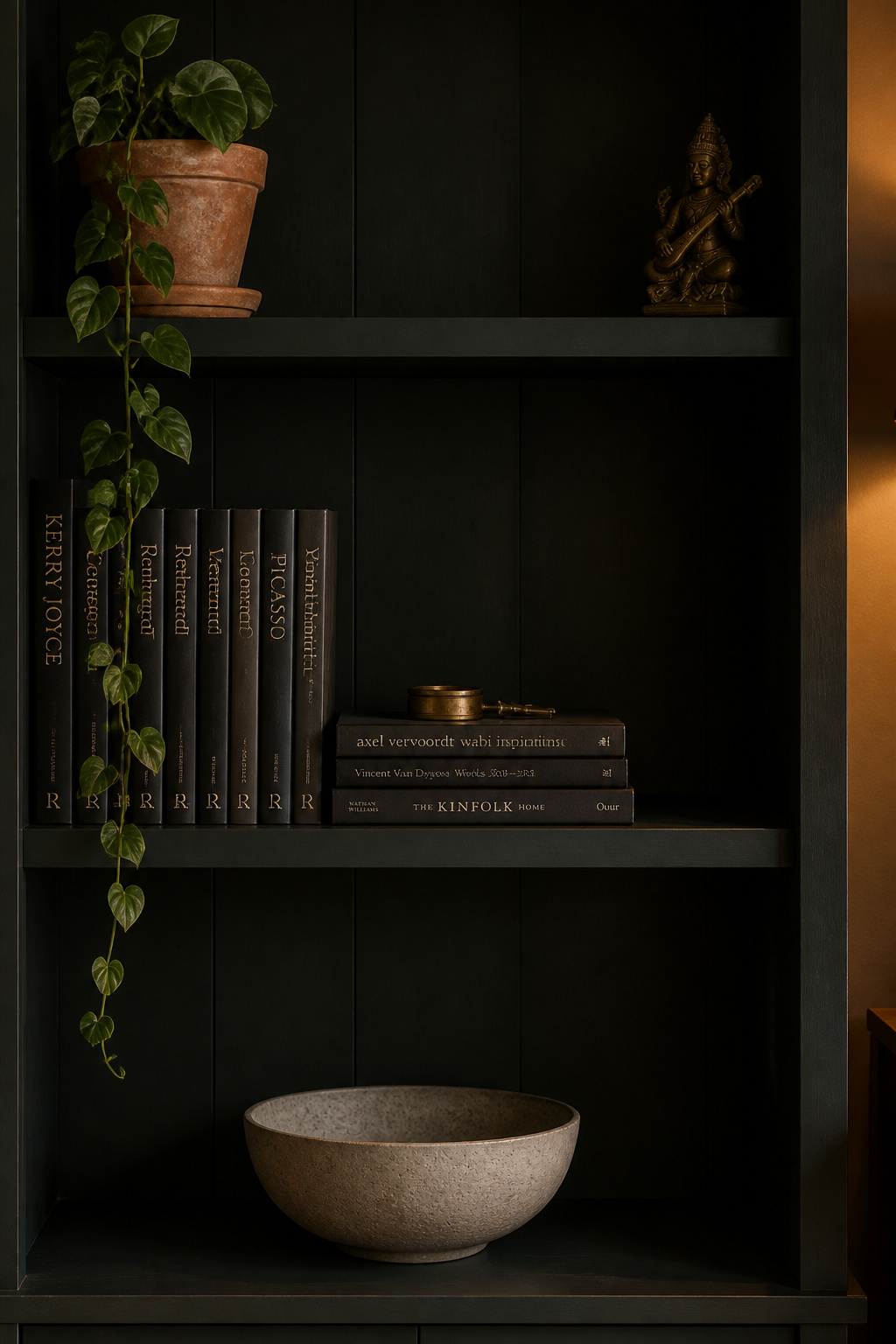
Objects in threes read more naturally than pairs because the eye travels across the group instead of splitting it. On a dark shelf, the three should be three types — one tall vertical object, one horizontal stack, one small sculptural piece — not three in the same format. The three-zone principle reinforces this: lightest and tallest up top, the visual anchor in the middle, the heaviest low. Vary heights so some pieces “stand alone… giving the shelves room to breathe,” as House of Jade Interiors put it.
Books as styling material: spines out or pages out
Books pull double duty as decor. Turned pages-out, the cream edges “read almost like linen against the dark background, adding softness without breaking the mood.” Turned spine-out in rows of jewel-toned bindings — burgundy, forest green, near-black — they build library density that distinguishes a lived-in shelf from a styled prop. Alternate vertical rows with horizontal stacks of two to four books, which give you flat surfaces for a small brass object or a crystal.
Negative space: why leaving gaps is the correct call
Leave roughly 20–30% of each shelf visually empty. Below that, it collapses into noise; above it, it reads unfinished. The part unique to dark shelves: a bare section of dark surface does not look like a gap — it reads as shadow and depth, reinforcing the mood. Fill some shelves edge to edge with books, then leave others sparse. That alternation of full and spare is the rhythm that separates “collected” from “packed.”
Greenery and Natural Objects in a Moody Living Room
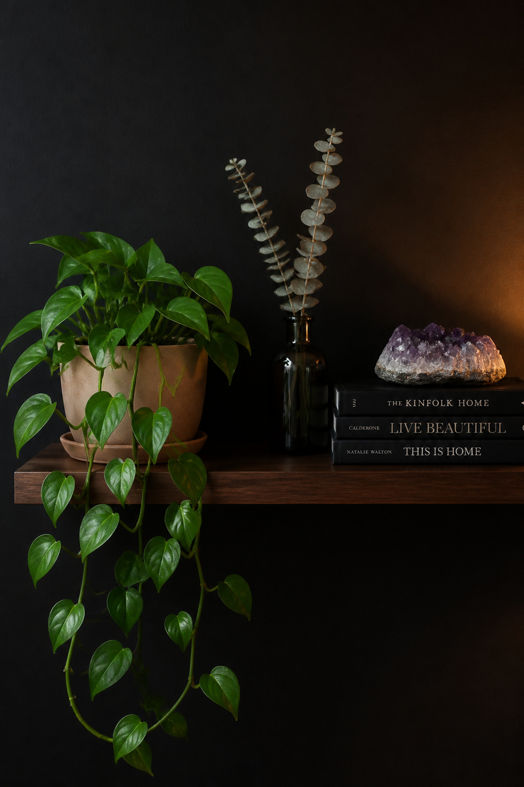
Greenery is the highest-contrast, lowest-cost addition here — Ryan Austin Hagood notes that real plants “elevate a moody living room, adding life without too much brightness.” The catch is that a dark-walled room is usually a low-light room, so the plant needs to survive the conditions and be styled to register.
Which plants work, and which disappear
The plants that earn their place share two traits: bold, glossy or architectural leaves that throw a clear silhouette, and genuine low-light tolerance. ZZ plants are the most reliable for dark rooms — they thrive in low light, tolerate near-neglect, and want water only every two to three weeks. Snake plants do the same in an upright sculptural form. Pothos trails over a shelf edge; ferns add feathery contrast but need more moisture, so save them for rooms with a window.
Dried botanicals, moss and organic objects
Where light is minimal, go inert. Preserved moss needs no soil, water or light — its “smooth, carpet-like surface captures light softly without reflecting it” — and works framed or in a vessel. Dried botanicals (eucalyptus, lunaria, seed pods) tolerate any conditions, though dark-dried stems in a dark vessel against a dark wall vanish twice over, so give them a pale container. Organic objects — raw crystals, driftwood, interesting stones — serve the same styling role with none of the care requirements.
Styling greenery so it pops rather than merges
Two moves make foliage read. First, position the main plant against the wall opposite your light source so the leaves are lit from one side and silhouetted against the surface behind. Second, mind the pot: a pale stone, white ceramic or terracotta container grounds the plant visually, where a dark pot under dark leaves on a dark shelf disappears entirely. As House of Jade put it, “the green really pops against that dark blue.” It is the simplest move in this guide, and often the one that finishes the room.
Moody styling reduces to one habit: ask each object whether it earns the wall behind it. Lead with warm metal, because brass and bronze return the light the walls absorb. Choose art, glass and mirrors for contrast and reflectivity, never for fitting in. Treat shelf negative space as a design element rather than a failure to style, and let plants do the cheap, high-impact work of bringing life to the dark. Buy slowly, mix old with new, leave room to breathe — and the room will read as one assembled over years, which is the only version of this look that ever feels true.
FAQ
What accessories look best in a moody living room?
Warm metallics — aged brass, bronze, oxidised copper — have the highest impact, because they catch and redistribute the lamplight dark walls absorb. Behind them sit four supporting categories: gold-leaf-framed art, antique or foxed mirrors, smoked-glass vessels, and trailing plants in pale pots. Each works by offering reflectivity or tonal contrast against the dark surface.
Should I use gold or silver accessories in a dark living room?
Gold — brass, aged brass, gilt — is the near-universal recommendation, because its warm amber tone counteracts the cool depth of dark walls and feels more at home than cool chrome. Silver suits charcoal or near-black walls leaning industrial, ideally in an oxidised, less-reflective form. If you mix both, let one metal dominate roughly 70% and keep the other as accent.
How do I style shelves in a dark room without it looking messy?
Leave 20–30% of each shelf visually empty; on a dark shelf that bare space reads as depth, not a gap. Apply the rule of three by object type — one tall piece, one book stack, one small sculptural object — and avoid repeating heights. Use pale ceramics, pages-out books and terracotta pots as contrast anchors so darker objects beside them register.