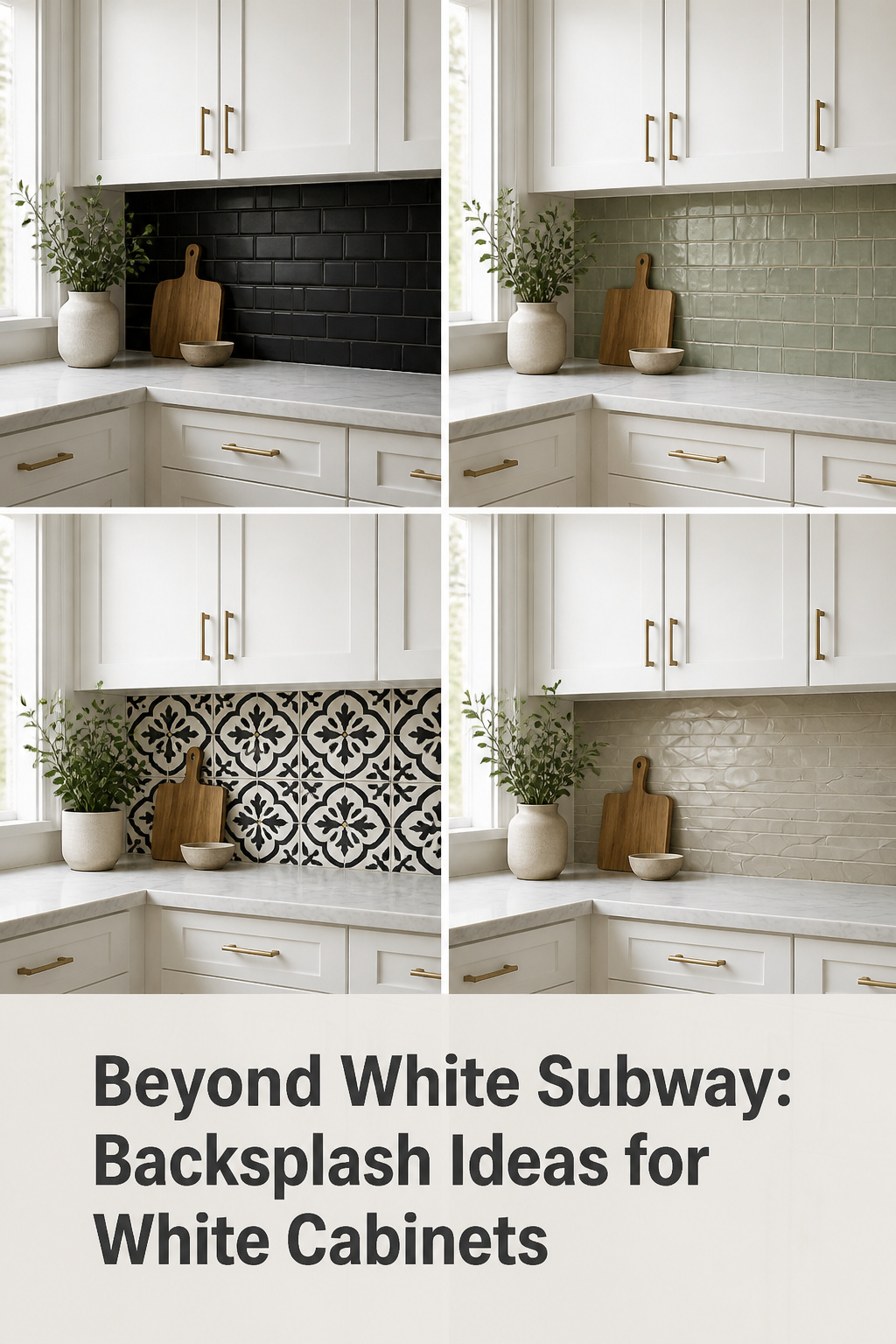
There is a belief that white cabinets need a white backsplash to match — usually white subway tile, the most common backsplash in US kitchens. It feels like the safe choice, and it asks no colour decision of you. But it is also the move that quietly flattens a kitchen. White tile against white cabinets reads, in most homes, as one undifferentiated plane at eye level: clean for a week, then washed-out. The truth professional designers work from is the opposite. White cabinets are not a constraint that dictates the backsplash — they are a backdrop that frees it.
TL;DR
- White cabinets work with almost any backsplash: a light grey or greige tile with slightly darker grout is the safe-but-deliberate pick that adds depth white-on-white cannot.
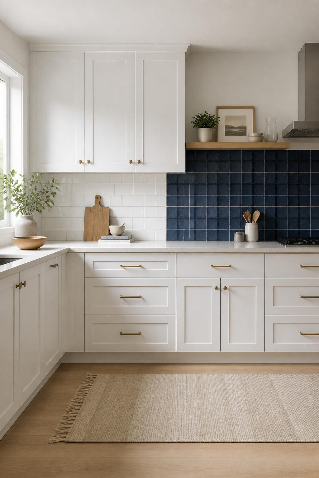
- The bold pick designers call timeless is a dark contrast tile — charcoal, navy or black — with warm brass hardware to keep it from reading industrial.
- If you keep white tile, add the interest with texture or contrast grout, not flat tile — flat white-on-white is what reads sterile.
White Cabinets Don’t Demand a White Backsplash
The instinct to match the backsplash to the cabinet is understandable. It is also the one move most likely to leave the kitchen feeling unfinished. The fix is to stop thinking of white as a colour to repeat and start treating it as a backdrop.
The default everyone reaches for
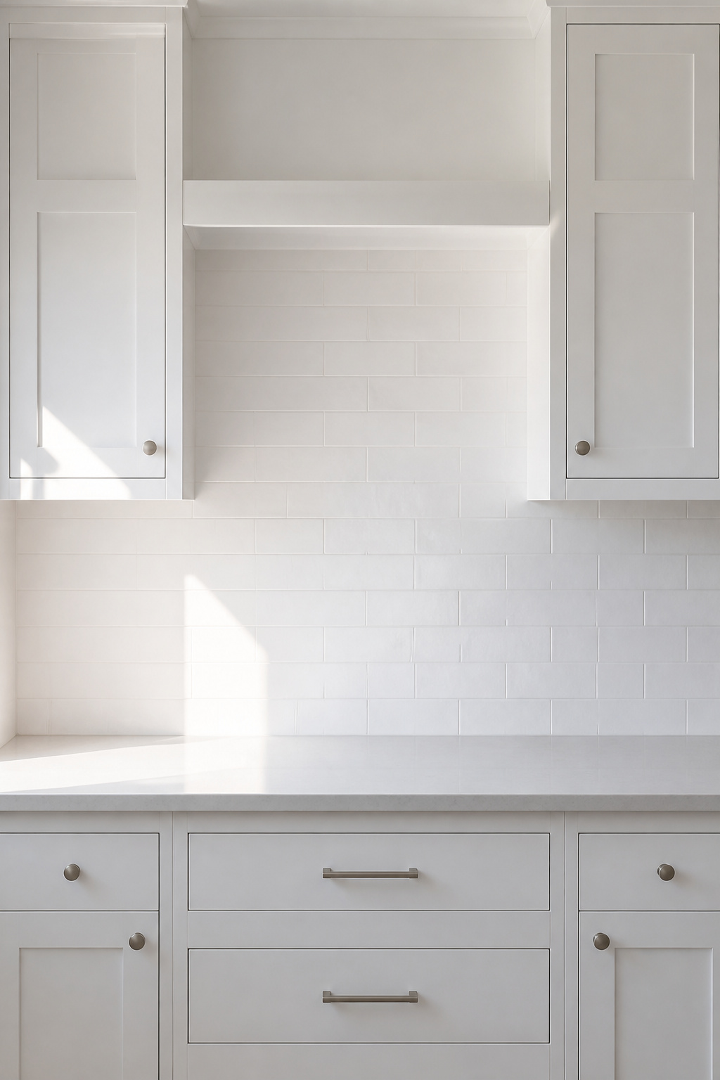
White subway tile is consistently the most common backsplash in American kitchens, and the reason is honest: alongside white cabinets it feels safe and demands no colour decision. But safe is not the same as right. The backsplash sits at eye level and you see it constantly, so the tile you choose changes how the cabinet white itself reads. That makes it the highest-leverage decision in the kitchen — too important to settle by default.
Why white-on-white can fall flat
Interior designer Luki Anderson of Studio Officina Architecture puts it plainly: “All-white kitchens need some visual interest to contrast with their neutral color, so make sure you introduce some character.” Without it, white tile on white cabinets reads flat and one-dimensional. Vrindra Khanna of Khanna Schultz names the mechanism: it is the sameness of uniformly white finishes that washes the wall out. A material with natural variation — a hand-glazed tile, a contrasting grout — is what gives the eye somewhere to rest.
White cabinets as a canvas
Christie Ward of design studio Ward + Gray says it directly: “Given a white backdrop, I think you can get away with just about any color to work alongside white.” White cabinetry reflects light through the room, so a coloured or textured tile reads more vividly against it than it would against a darker cabinet. And the backsplash zone is small — counter to the underside of the upper cabinets, roughly 18 inches of wall in a typical kitchen. That makes it one of the most affordable changes in the kitchen, and against white, the most visible. For the wider view, see the full set of kitchen backsplash ideas and options.
Contrast: Let the Backsplash Speak
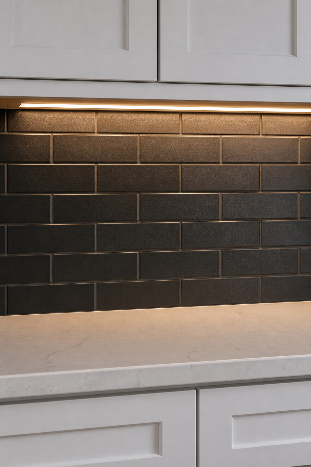
The brightness of a white kitchen is an asset, and contrast is the most direct way to use it. A darker backsplash grounds the wall and gives the room depth, turning the backsplash from background into the thing you actually chose.
Dark and black tile against white
A solid black or deep-tone backsplash against white cabinets is, as Kitchen Cabinet Kings describes it, “a classic combination that exudes elegance.” The trick is that the dark tile creates the illusion of depth while the white cabinets keep the space feeling light and airy — the room reads grounded, not heavy. Deep navy, charcoal and slate blue all do the same work as pure black while reading a touch softer. One condition is non-negotiable: a dark backsplash needs under-cabinet LED lighting, or it disappears into shadow and looks muddy rather than deliberate.
Warm wood and metal tones
Contrast does not have to mean cold. Warm wood-look porcelain — installed as staggered planks, water-resistant where real wood is not — brings an organic warmth that pale stone cannot. Metal works too: brushed steel or copper gives a clean, durable surface, and the brushed finish hides fingerprints a polished one would show. Ward + Gray’s guidance on hardware makes a related point: antique brass metal tends to pair well with white for an authentic, vintage feel — unlacquered brass patinas with age rather than dulling. A few warm-metal fittings stop a black-and-white scheme from tipping into industrial.
Contrast grout on light tile
There is a lower-commitment way to get the graphic effect of contrast without a dark wall: dark grout on light tile. Charcoal or near-black grout against white subway, Backsplash.com notes, makes “a bold, graphic statement,” drawing the tile grid as a deliberate pattern while the wall still reads light. It is the practical choice too — dark grout hides dirt and holds its colour far better than light grout, which shows every splash. Because the overall wall stays bright, it suits small kitchens where a fully dark backsplash would feel closed-in.
Colour: Quiet to Bold
White cabinets take the risk out of colour. The cabinet’s brightness dilutes whatever sits behind the counter rather than fighting it, so a colour reads as intentional rather than loud. The range runs from barely-there to confident.
Blues and greens that pair with white
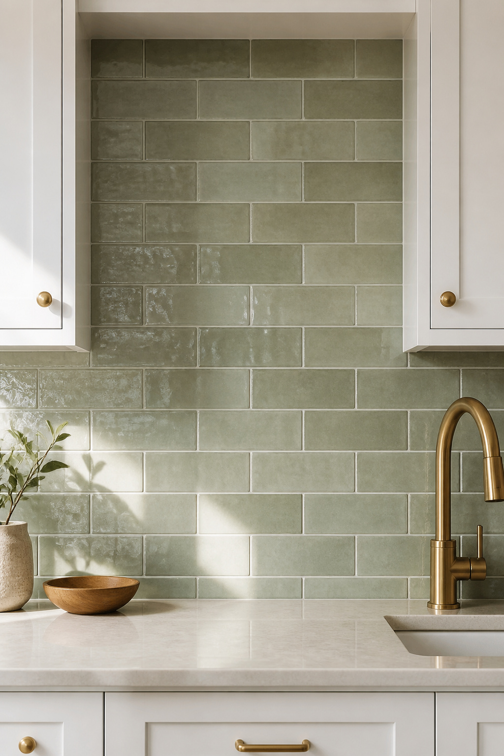
Blues and greens are the colours designers reach for most against white. Christie Ward regularly specifies white kitchens with sage green “bringing in colour from stone tiles.” There is a practical logic underneath the preference: blues and greens behave as near-neutrals, pairing with a wide range of countertop tones — and the backsplash has to work with the counter as well as the cabinets. A multi-tonal surface like zellige works better here than a flat colour, because the variation keeps the wall alive. Brushed brass or gold fixtures are the warm accent that keeps a cool blue-green from reading cold.
Neutrals: greige, sand, soft grey
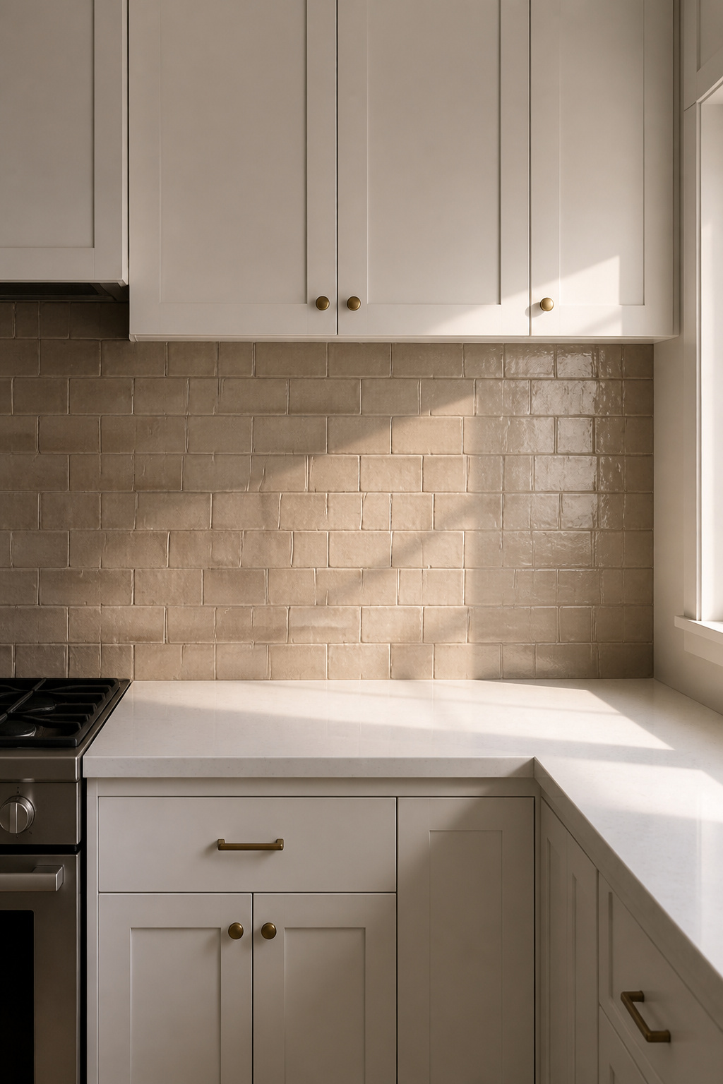
If colour feels like a step too far, the neutral family sits between white and contrast. NARI’s designers describe sand, greige and warm ivory tiles as creating “a serene, sophisticated kitchen” — warm and light rather than cold and stark. Grey is the same idea in a cooler key: the choice, as Backsplash.com frames it, when you are “bored of all-white designs but still want to create a bright and airy feel.” This family is the right call when the rest of the kitchen — flooring, island, hardware — already carries the visual interest, and the wall just needs quiet depth.
A narrow band of colour as restraint
There is a Nordic way to use colour: not a field of it, but a single line. NARI’s guide names the move directly — “install a narrow band of colourful tile within an otherwise neutral backsplash” to add interest without overwhelming the room. A single course of patterned or hand-painted tile, set at mid-height in a plain field, is an old domestic habit in Scandinavian and Dutch kitchens, where one accent row personalised a working wall. It is restraint as a design choice: enough colour to be yours, contained enough to never tire of.
Pattern and Texture
Pattern and texture are the third lever, and they let a white kitchen gain depth with no colour at all. The interest comes from shape, shadow and surface. The risk is the same generosity working against you — the white cabinets that tolerate almost anything can be overwhelmed by a pattern that is too big or too busy for the room.
Arabesque, picket and geometric shapes
Shape alone adds movement. Arabesque tile — the scalloped lantern shape, roughly $8 to $18 per square foot — suits a clean white kitchen that still wants character. Picket tile, an elongated hexagon, is gaining ground in 2026: its vertical geometry helps stretch a smaller kitchen, making the wall feel taller. And a graphic black-and-white geometric tile, NARI notes, “provides bold contrast without overpowering the space” — pattern doing the work a colour change would otherwise do. The classic white-subway starting point, and what layout does to it, belongs to classic white subway layouts.
Handmade-look and 3-D texture
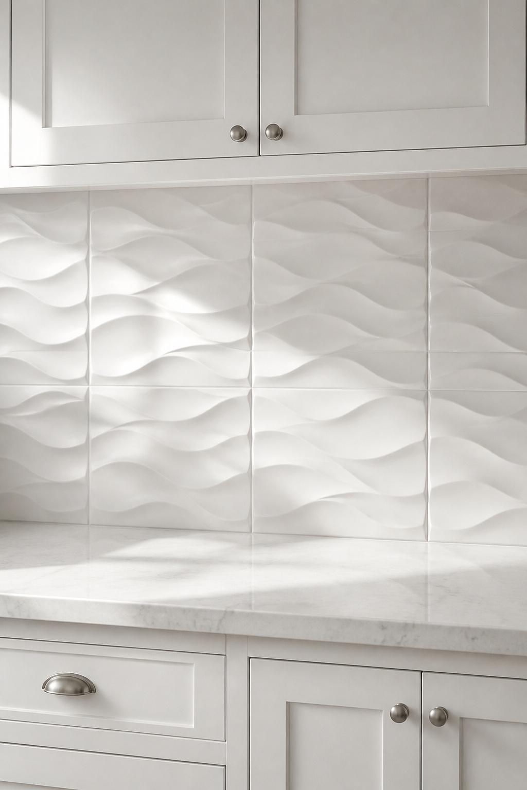
Texture is where white-on-white earns its keep. A 3D tile, as The Tile Shop’s team puts it, “juts out from the wall, creating natural shadows and a wonderful sense of dimension” — in an all-white kitchen the interest comes purely from light and shadow, no colour required. Handmade-look and zellige tiles work the same way through subtle surface variation. On one all-white project, the studio Chango & Co. let the tile do everything: “the natural shimmer of the Zellige works hard to bring more depth to the space, so you don’t need to think too outside the box with anything too bold in terms of color.”
When pattern is too much
Scale is the threshold, and here practitioner judgement matters more than any fixed rule. A small mosaic can get lost on a long wall; an oversized repeat can swamp a galley kitchen. From working with kitchens under three metres of backsplash run, a tile whose pattern repeats beyond roughly 25 to 30 centimetres is worth questioning — that is a check worth making in the room, not a ceiling to cite. Two habits keep pattern from tipping over: contain a bold repeat behind the stove as a framed feature panel while the rest stays plain, and offset complexity with simplicity everywhere else. Choosing between a quieter and a busier option is partly a material call — pick the material and contrast sets that out.
Choosing Your Backsplash for White Cabinets on Purpose
You came in with one belief: that white cabinets need a white backsplash. You leave with four levers — contrast, colour, pattern, grout — and the only task left is to choose one on purpose. That comes down to reading your kitchen, then committing to a single pairing.
Match the choice to your kitchen’s light
Before the tile, read the light — this is a check worth making, not a rule. Light direction shifts how colours read, and the effect is worth testing in your own space. A north-facing kitchen takes cool, flat daylight all day, so blues and greens may read colder there than you expect; warmer neutrals or a warm-toned tile tend to counteract it. A bright, south-facing kitchen can carry deep jewel tones — emerald, navy — because saturation needs light to read rich rather than oppressive. A tile can shift a full shade between a 10am reading and a 9pm one, so see your shortlist on the actual wall, in both daylight and your evening lights, before you commit.
Three things to observe before shortlisting:
- Which direction does the main kitchen window face, and how long does direct light reach the backsplash wall?
- Does the kitchen feel cool or warm at mid-morning — before you add any tile?
- How does the countertop read under your evening lights? The backsplash must work alongside it in both conditions.
One safe pick and one bold pick
Within those limits, the whole field reduces to two reliable choices. This is the table I would hand a client — not a catalogue of every option, but the safe pick and the bold pick for each thing you might want the wall to do.
| What you want the wall to do | Safe pick | Bold pick |
|---|---|---|
| Add depth without colour | Greige tile, slightly darker grout | Charcoal or black tile, brass hardware |
| Bring in colour | Sage green, handmade-look or zellige | Navy blue, glossy subway or herringbone |
| Let pattern do the work | White 3-D or handmade-look texture | Graphic geometric, contained behind the stove |
Read it down your own want, not across. The safe column never misfires; the bold column rewards a kitchen with the light and the nerve for it.
The deliberate-decision test
Here is the test that separates a chosen backsplash from a defaulted one: if someone asked why you picked it, could you answer in a sentence? “A charcoal tile with warm grout, to ground the counter.” “Sage green, because I wanted warmth.” “I let the texture do the work and kept everything else plain.” If the honest answer is “it seemed safe,” the decision is not made yet. Andrew Saladino of Kitchen Cabinet Kings frames the standard: the backsplash “doesn’t have to match exactly, but it should complement your kitchen’s overall colour scheme and style.” Make the choice alongside the cabinet, not after it — once both are in, each changes how the other reads. That is the whole move: not white-on-white by reflex, but a pairing you can name.
FAQ
What backsplash goes best with white kitchen cabinets?
No single backsplash fits every kitchen — the best choice depends on your light, your countertop tone, and how much contrast you want. For an always-right pick, light grey or greige tile with slightly darker grout adds depth without colour risk. For a confident statement, deep charcoal or navy with brass hardware is the timeless option designers reach for.
Should backsplash be lighter or darker than white cabinets?
Either works, for different goals. A darker backsplash grounds the wall and turns it into a deliberate focal point — the direction most recommended for 2026 renovations, especially charcoal and navy. A lighter or white backsplash keeps the kitchen airy but needs texture or contrast grout to avoid reading flat. Dark tile needs under-cabinet lighting so it does not vanish into shadow.
Is a white backsplash with white cabinets too much?
Not inherently, but white-on-white needs intention to avoid reading flat. As designer Luki Anderson notes, all-white kitchens need some visual interest against their neutral colour. The most effective approaches use texture — 3D tile, handmade-look, zellige — or contrast grout rather than flat white tile. Warm metals and wood elements elsewhere keep the scheme from feeling sterile.