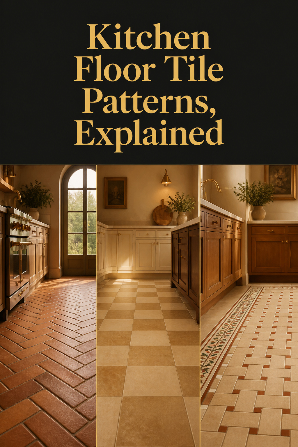
Geometric floor tile arrived from the 1860s in churches and grand public buildings; within thirty years the technique had reached ordinary terraced houses. Institutional grandeur went domestic in a generation. Kitchen floor tile patterns are having that moment again, and the revival stays quiet about one thing: the layout gets treated as a finish decision, chosen last off a photograph, when really it is a line item with its own bill. The same tile, laid four ways, produces four quantities of offcut and four bills for labour.
TL;DR
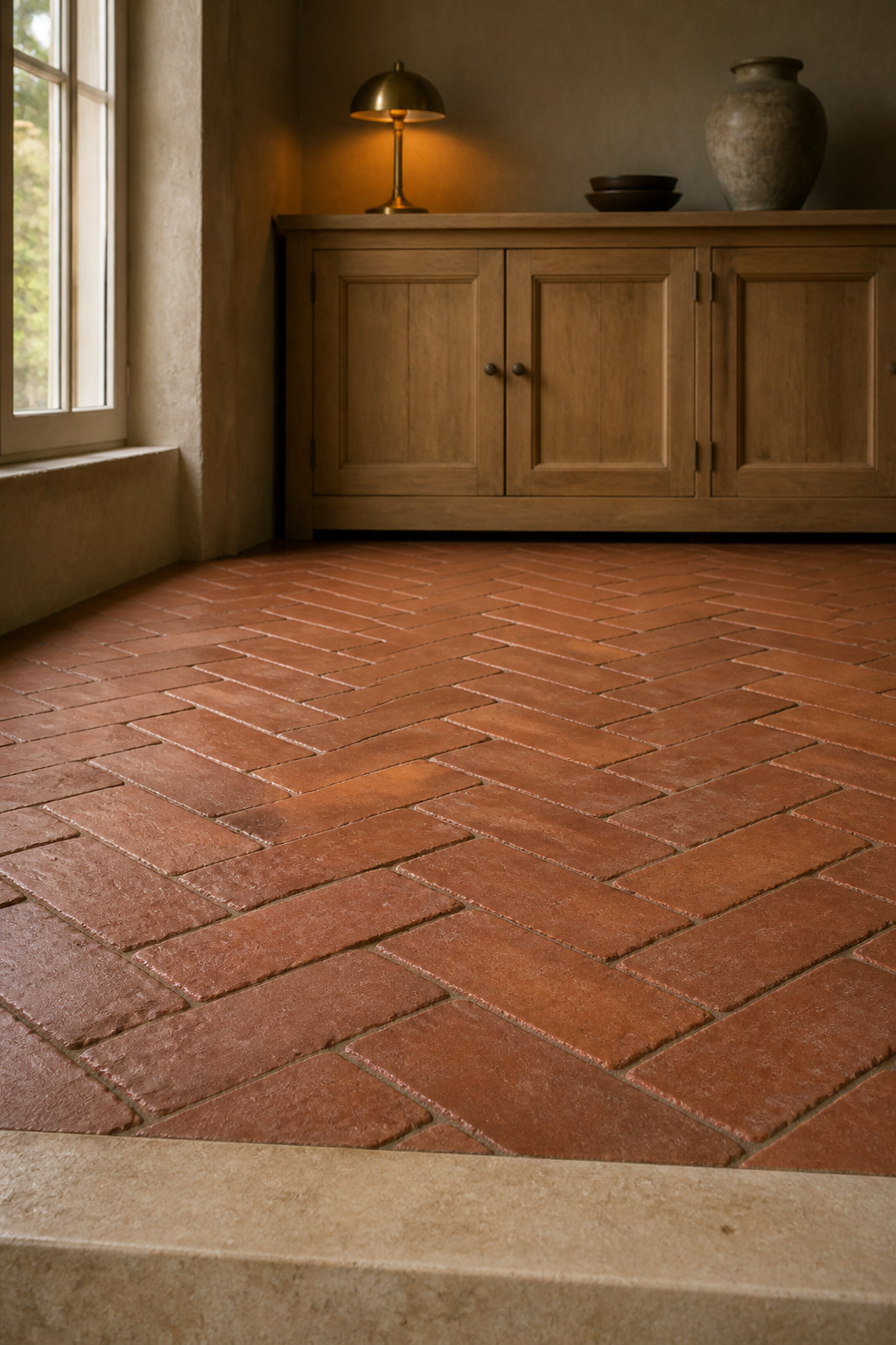
- Budget the pattern apart from the tile: running bond wastes about 10% of your order, diagonal 15%, herringbone 18%, basketweave 15–20%.
- Herringbone’s labour premium is unsettled — tilehub.com publishes 10–15%, novatileandstone.com 15–30%, a third trade source higher still. Get it quoted.
- Cabinetry and an island hide close to half a kitchen floor, so plan the pattern for the visible field.
Layout Is a Different Decision Than Material
Pattern advice usually stops at the photograph, never mentioning that one layout puts an extra fifth of your order in the bin. Material is a separate question; Tess Carver takes it in the complete kitchen flooring guide.
Why the Same Pattern Works in Porcelain, Clay or Stone
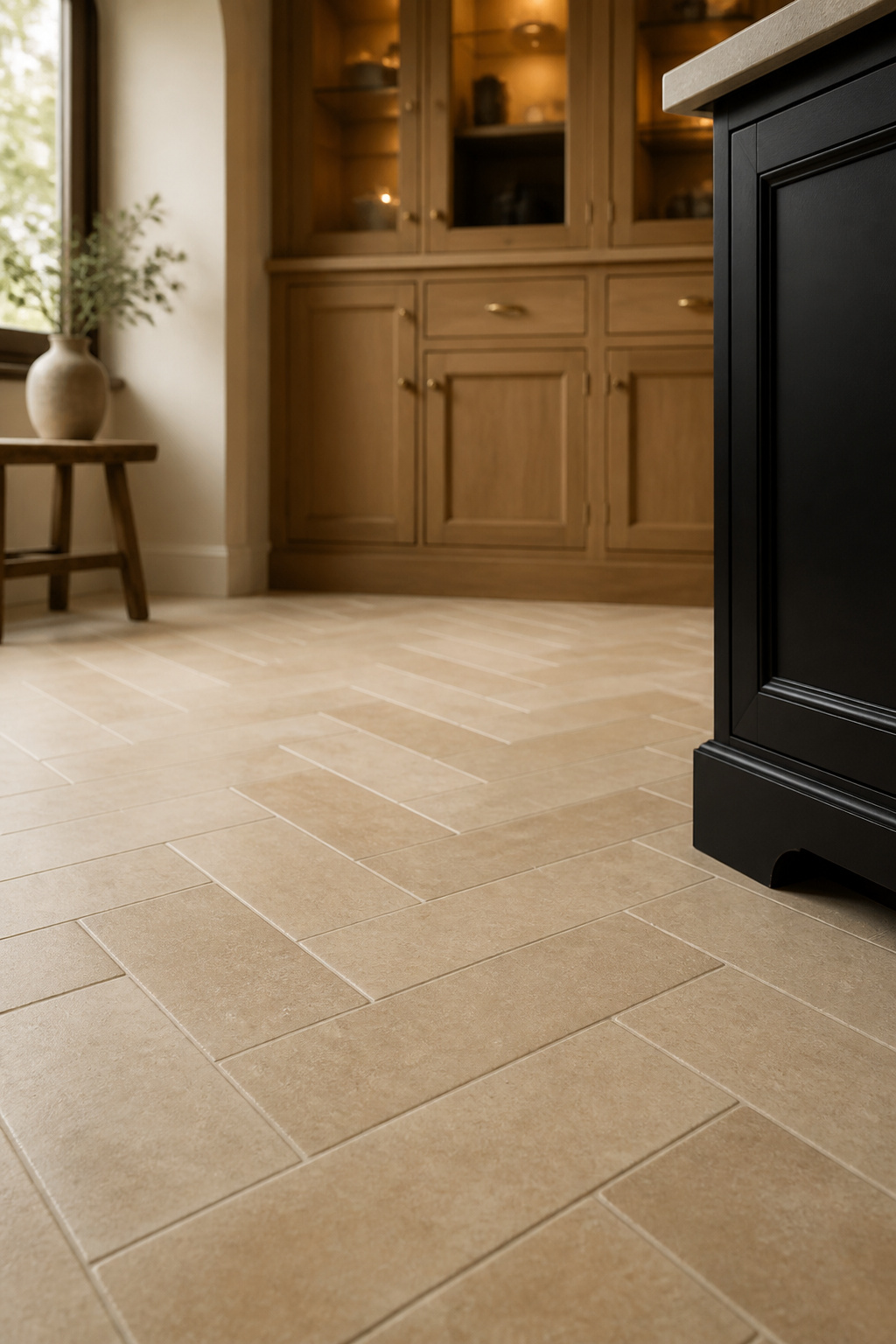
A layout’s rules come from the tile’s dimensions, not its substance. ANSI A108.02 sets a minimum 1/8-inch joint for rectified tile with any side over 15 inches, and caps running-bond offset at 33% — beyond that, lippage risk means an approved mock-up. Handmade tile widens the joint to about 3/16 inch, never the geometry.
What “Kitchen-Anchored” Pattern Advice Means
So every pattern below is judged on kitchen terms: cuts along a cabinet run, resolution at an island, grout ageing in front of the range. A full tile at one wall and a sliver at the other is the tell of a floor nobody set out.
Herringbone and Chevron Aren’t the Same Thing
The Angle That Tells Them Apart
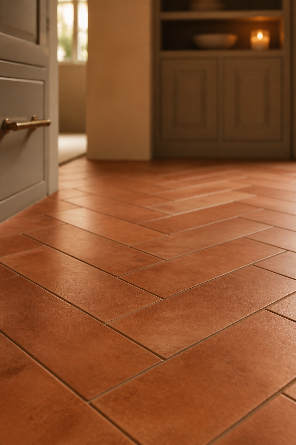
Most floors described to me as herringbone are chevron. Chevron tiles are mitred at 45 degrees at both ends and meet edge to edge in one unbroken V; herringbone uses uncut rectangles interlocked at 90 degrees into a staggered zigzag. That mitre is also the cost.
Which Reads Busier in a Small Galley
Chevron is the sharper and more defined of the two, with a stronger sense of movement; herringbone stays structured and quieter, which is why it turns up far more often in a narrow galley, where a calmer, more restrained pattern reads better than a busy one.
Cut Waste for Each
Two numbers get merged constantly. Material overage is the settled one — roughly 15–20% for herringbone against 10% for a straight lay.
Labour is not settled. Tilehub puts herringbone’s premium at 10–15% over straight lay and chevron’s at 15–25%; novatileandstone puts herringbone at 15–30%, quoting $10–15 per square foot against $4–7 for running bond; a third trade source goes higher again. None is a standards body, so averaging them invents a number nobody published. Get your own room quoted in writing rather than budgeting from a percentage, mine included.
Checkerboard’s Current Revival
Hard Black-and-White
Houzz reported searches for “checkerboard floor” up 38% through Q3 2025. Designer Rebecca Lagos frames the range precisely: the pattern “can feel bold and modern when used in high-contrast applications, or soft and romantic when paired with more muted tones.” Familiarity is why black and white keeps returning.
Tone-on-Tone Checkerboard
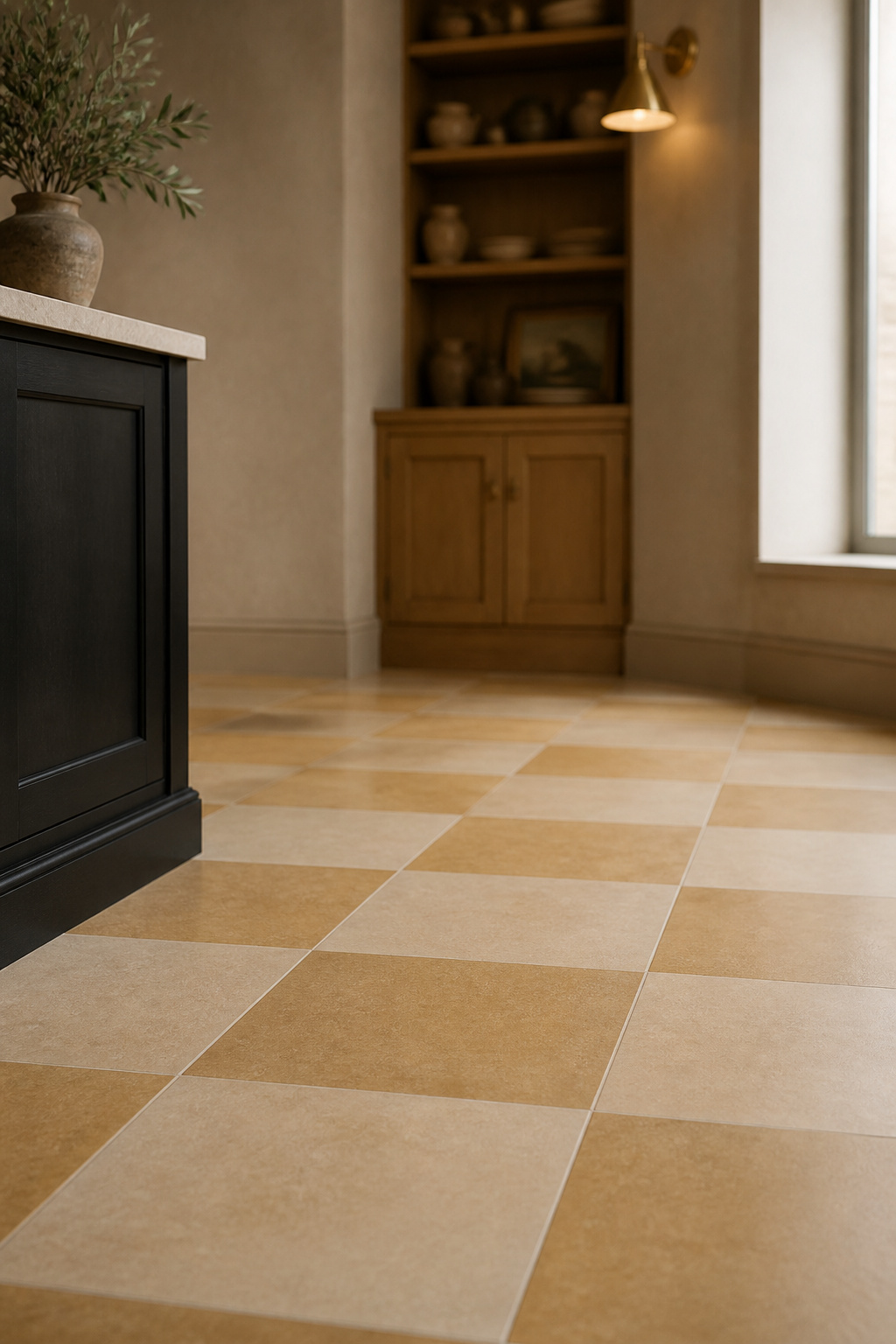
Designer Emma Ainscough tells anyone finding the contrast overwhelming to go softer and more neutral rather than abandon the pattern. In a kitchen I drop it almost to nothing — honey and dijon limestone rather than black and white — so the grid never competes with the cabinets.
Scale Choices That Keep It From Looking Like a Diner
Checkerboard’s read comes from contrast as much as pattern module: hard black and white tips toward retro diner, tone-on-tone in two close hues never does — the same softening that carries the pattern also keeps it out of novelty territory. Henrik Larsson covers how tile scale changes a small kitchen in more depth.
Running Bond, Stack Bond and Diagonal Layouts
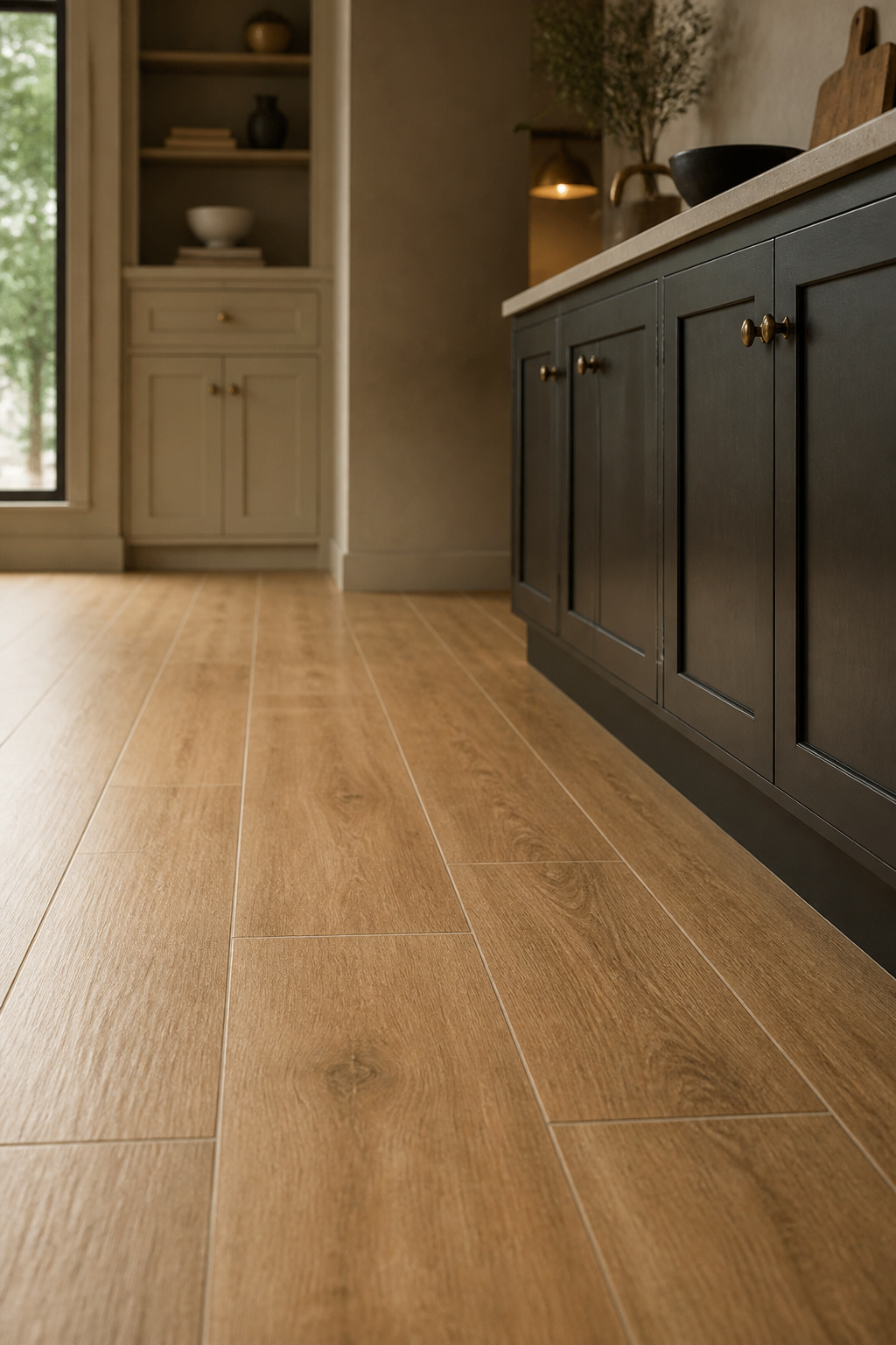
Taste settles less of this than cut waste and what a layout does against a long cabinet run:
| Layout | Cut waste | What it does against a cabinet run |
|---|---|---|
| Running bond | ~10% | Elongates the room when laid lengthwise; cheapest to set out |
| Stack bond | ~10% | Character comes almost entirely from grout colour |
| Diagonal (45°) | ~15% | Perceived as roomier; corner cuts add 15–35% to labour |
| Herringbone | ~18% | Quieter than chevron in a galley; labour premium disputed |
| Basketweave | 15–20% | Period infill; 15–25% more labour than straight lay |
Checkerboard is absent because no waste figure is published for it — geometrically a straight grid, so budget it as one.
Running Bond Against a Straight Cabinet Run
Laid lengthwise along the run, the offset reads more elongated — a real lever in a narrow plan. It is also the cheapest layout to set out against a long toe-kick.
Stack Bond’s Grid Effect
Grout colour is nearly the whole effect: contrast makes the grid the point, matching grout minimises it. With no offset to disguise size variation, stack bond demands rectified tile.
Diagonal Layouts and Corner Waste
The 45-degree cut adds 15–35% to labour on top of its 15% waste, so order 15% extra. In return it tricks the eye into perceiving more floor — why it recurs in small and mid-sized kitchens.
Basketweave and Encaustic Borders: The Period Layouts
I spent two years on a Victorian terrace with my father, the project that turned a history degree I had no plans for into a trade. Most of what I learned in those two years I learned kneeling down.
Basketweave in Small-Format Tile
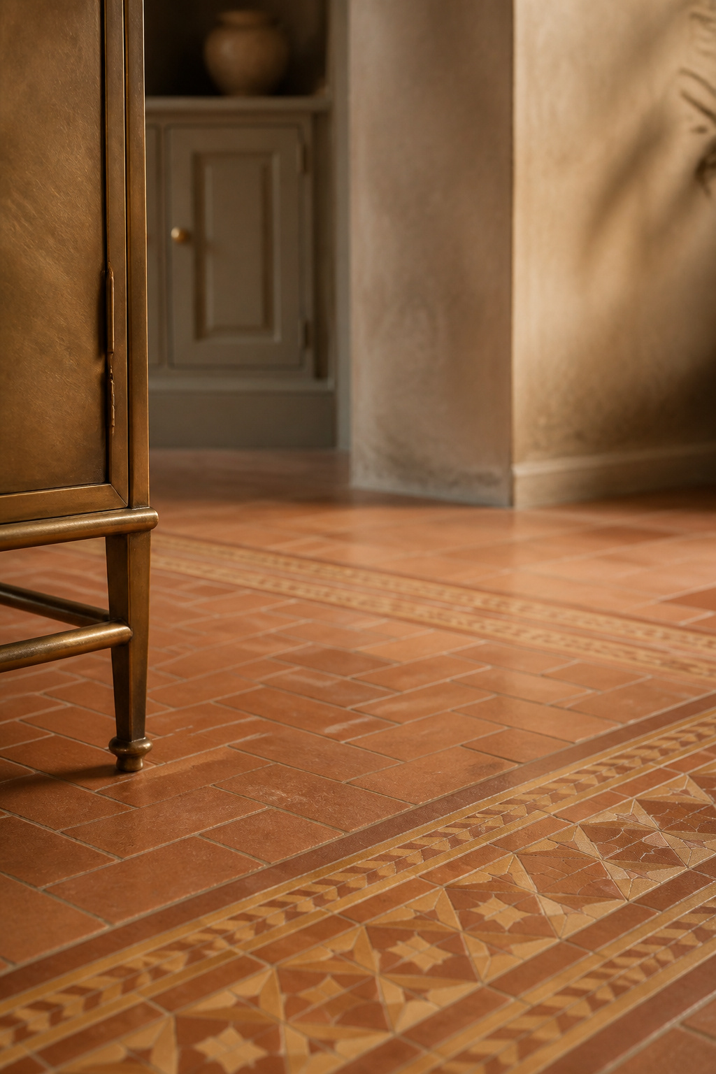
Basketweave mosaic dominated American halls and bathrooms from the 1890s through the 1930s. Its 15–25% labour premium is the price of precision: the interlock has to stay aligned or the whole field goes crooked.
Encaustic Borders as a Framing Device
Herbert Minton pioneered the technique, and Minton is still the name on the back of most surviving originals. The pattern is not glaze but inlaid coloured clay slip, two to six colours, running down through the body of the tile — which is why an encaustic floor can come up from under decades of grime or old bitumen with its colours still as strong as the day they were pressed. There was no surface to wear off.
Where These Read Right in a Modern Kitchen
The documentary record for these floors is halls, churches and public buildings — not kitchens. The craft transfers; the provenance does not. So scale down. Reproduction patterned encaustic runs $10–30 per square foot material-only in 2026, making a full field a hall-scale bill. A narrow border framing a plain or basketweave field carries the same detail for a fraction — and laying clay tile in a traditional pattern has its own demands.
Choosing Between Kitchen Floor Tile Patterns
Three questions decide this, and none is which photograph you liked.
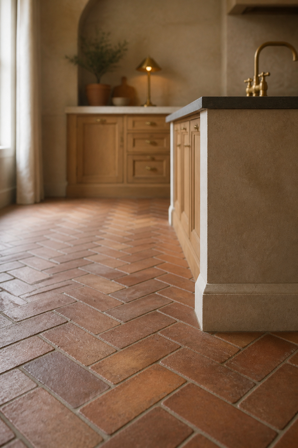
If You’re Working Around Islands and Peninsulas
Cabinetry and an island hide close to half a kitchen’s floor, so the pattern only has to resolve in the visible field. Three rules for the set-out:
- Map every permanent fixture first: island legs, peninsula corner, appliance footprints.
- State the starting axis. Parallel to the longest sightline stays calm; radiating from the island throws awkward cuts to the perimeter.
- Land cuts at an island or peninsula edge deliberately, at least half a tile wide.
Cuts that land there look intended rather than tolerated.
If Grout Maintenance Worries You
Grout is the vulnerability, not the tile face. Steam near the stove carries oil droplets that settle and harden until vinegar no longer lifts fresh grease. Deep clean every few months, and keep mats at the stove and sink — how often to reseal is a material question, and clay and stone each keep their own cadence rather than one kitchen-wide number. Contrasting grout sharpens a herringbone or checkerboard; matching grout forgives staining.
One caution, because zellige sits at the centre of several traditional patterns and photographs beautifully. It needs a joint near 3/16 inch — more grout surface exactly where staining is worst — and it measures roughly 0.16 DCOF against ANSI A326.3’s 0.42 minimum for level interior floors expected to be walked on when wet (the standard that now specifies this, moved out of ANSI A137.1 where it originated). On a wall I have no objection; on a kitchen floor in front of a sink, I would not.
If Budget Caps the Waste You Can Afford
Waste follows cut geometry rather than tile price, so budget porcelain laid in herringbone still carries the full premium. Pattern and material are two lines on the same quote.
Three principles survive. Cut waste is knowable before you commit, so cost the geometry before you fall for the picture. Labour is not knowable from any published percentage; have your own room quoted. And plan for the visible field, half of which vanishes under cabinetry the day the kitchen is fitted.
FAQ
Does grout color affect how a tile pattern looks?
Yes, more than most people expect. Contrasting grout sharpens a pattern’s geometry and suits decorative layouts like herringbone or checkerboard, while matching grout blends the joints and lets the tile’s colour carry the room. On a stack-bond grid it is almost the whole effect.
How wide should grout lines be for a kitchen floor pattern?
That depends on the tile, not the pattern. ANSI A108.02 requires a minimum 1/8-inch joint for rectified tile with any side over 15 inches in a running-bond layout, and an absolute floor of 1/16 inch. Handmade tile needs roughly 3/16 inch to absorb its size variation.
Can you mix two different patterns in one kitchen floor?
Yes, and it is an established move, but the two need a shared thread — a common colour, texture or material — rather than unrelated layouts side by side. Let one pattern be the hero and the second support it, with a deliberate rather than abrupt transition.