
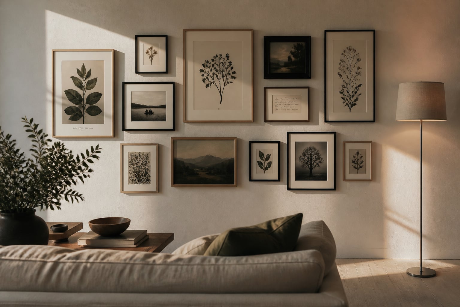
For most of a century, the dominant living room wall held one large thing: a print, a painting, a mirror chosen to fill the space above the sofa and be done with it. That instinct is fading. The living room gallery wall — a composed group of framed pieces read as a single arrangement — has quietly become the standard treatment for the wall a room is built around, and the reasons are cultural before they are decorative. A wall assembled from several pieces says what a lone print cannot: that the people who live here chose these things over time, and that the room is still being written.
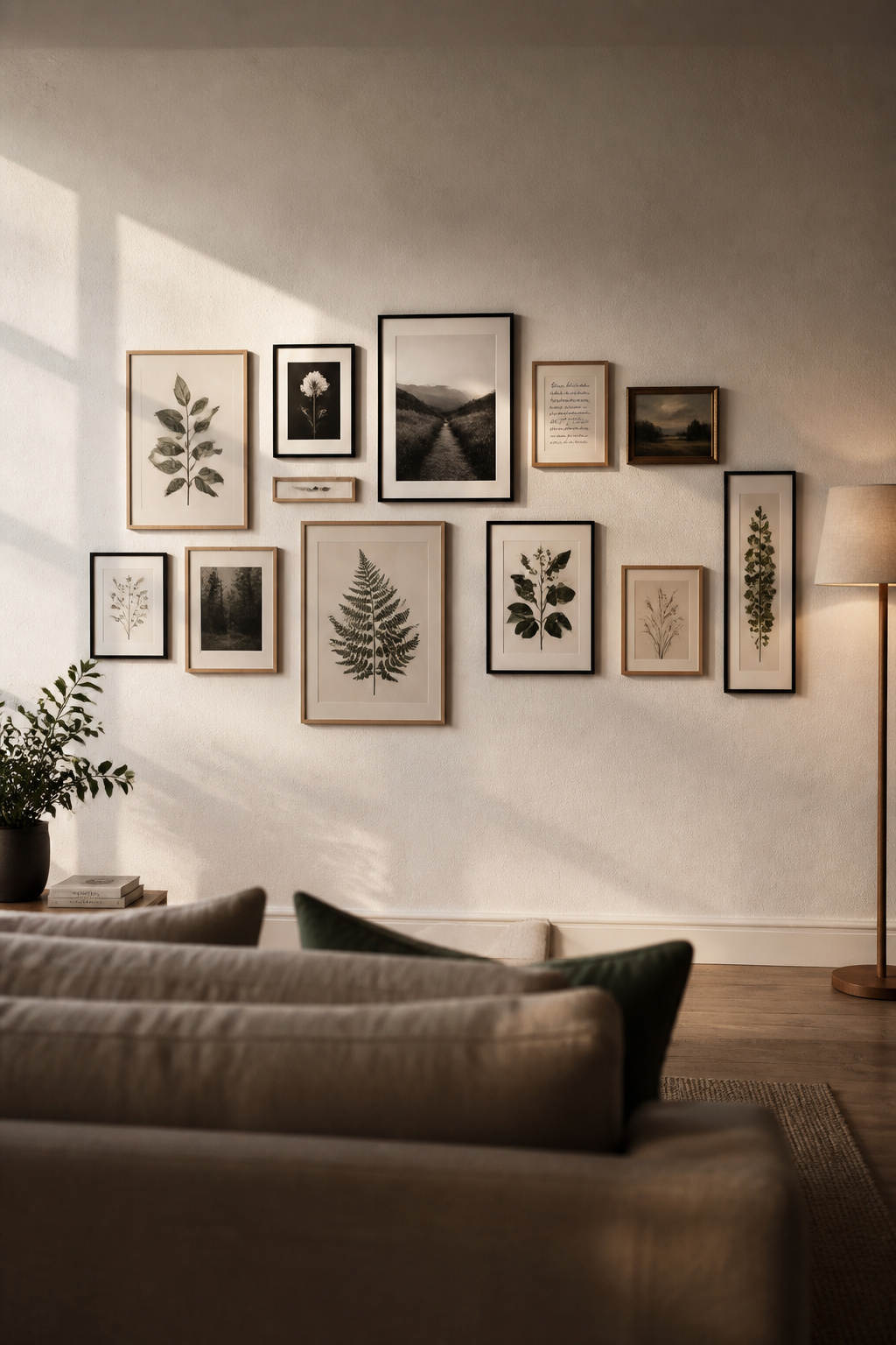
I should say what I mean, because the word has stretched. A gallery wall is not a wall covered in art; it is a deliberate composition — pieces sized, spaced, and unified so the eye reads them as one shape with internal variety. Almost every gallery wall that fails does so not because the art was wrong but because the composition was never actually composed. What follows is the complete survey — layout families, cohesion, measurements, room context, the TV problem, and how to hang it — with each section pointing to a deeper guide where the decision deserves one.
Why Gallery Walls Have Replaced the Single Statement Piece
The cultural shift from display to narrative: what changed in how we decorate
The salon hang is older than most people assume. It began at the Académie Royale de Peinture et de Sculpture in Paris in 1667, when so many works needed to fit one wall that they were hung floor to ceiling — the largest canvases up high, smaller still lifes at eye level. The French word salon simply means living room, a pleasing accident given where the format has ended up. By 1725 it had moved to the Salon Carré of the Louvre, drawing up to 500,000 visitors in a two-month run at its peak.
What has changed recently is not the technique but its purpose. The matched-print gallery — four coordinated botanicals bought as a set — has itself begun to feel dated. Design publications describe a kind of statement fatigue: a turn away from walls purchased all at once toward walls that look collected over years, chosen now for what they say about the people in the room rather than how well they fill a space.
What a well-composed gallery wall does for a living room that one large print cannot
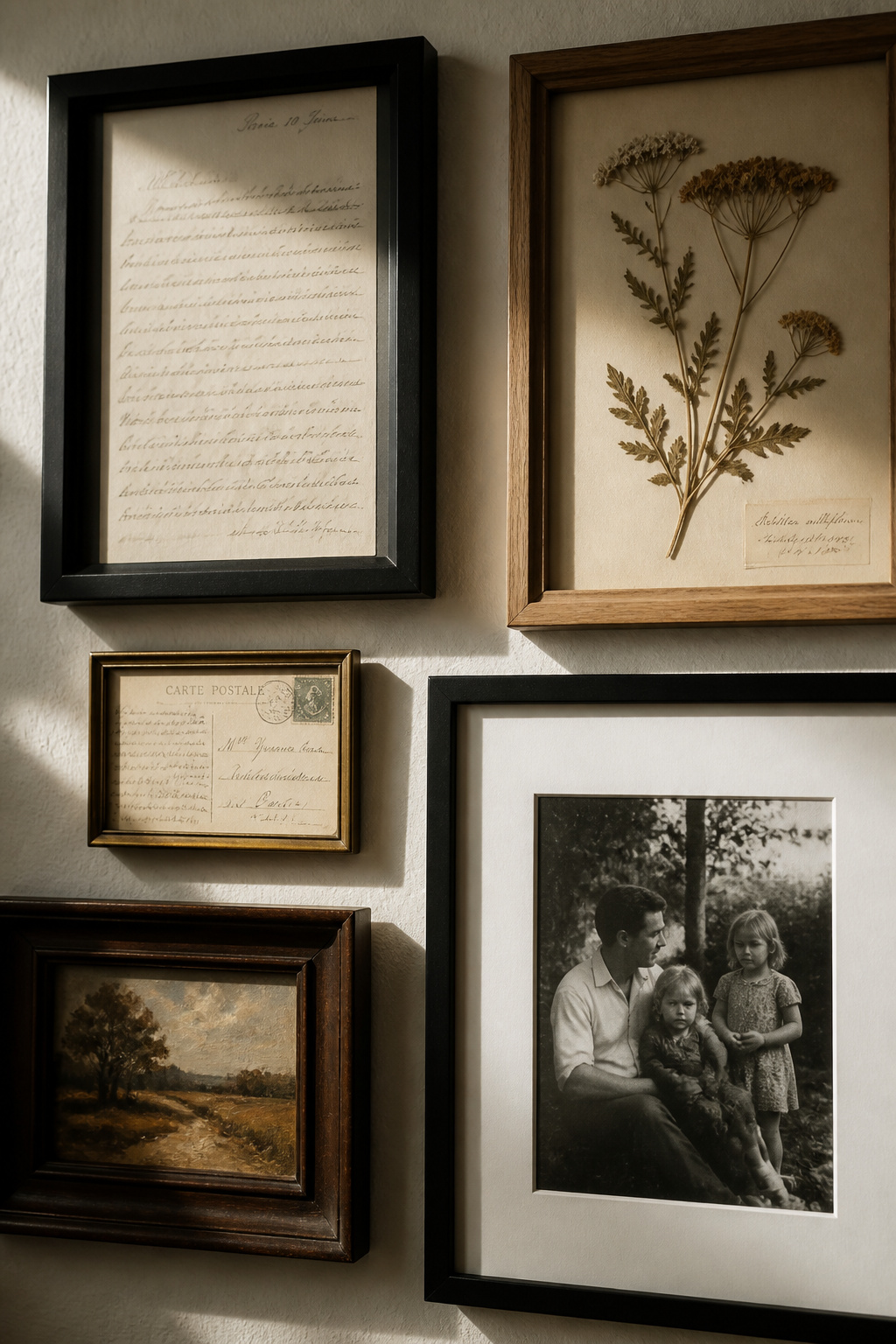
Two practical things, and one less obvious. First, a gallery wall distributes visual weight across a wide zone, so it can anchor a wall no single affordable piece could fill — a nine-foot sofa wall would otherwise need a single artwork six to seven feet wide to satisfy the proportion rules. Second, it lets a wall hold a narrative: a photograph, a botanical print, and a framed handwritten note carry more biography than any one purchased artwork. The less obvious benefit is that a gallery wall is inherently updatable — a statement piece is replaced whole, but a gallery wall absorbs a new frame the way a shelf absorbs a new book. As the designer Tiffany Cobb puts it, with the right elements “a gallery wall can tell a story and turn a room into an immersive experience.” A bought print asks to be looked at; a wall of your own things asks to be lived with.
The 2026 direction: memento walls, collected eclecticism, and personal objects
The clearest signal of where this is heading is what designers now call the memento wall — framing items chosen for emotional weight rather than decorative value: handwritten letters, pressed flowers, ticket stubs, a napkin from a meal worth remembering. Alexis Vitale of Vitale Design Group describes it as “a curated moodboard for your life — layered, lived-in, and quietly intimate.” This is not a fringe taste: the 1stDibs 2026 Interior Design Survey found maximalism (39%) and eclecticism (38%) the most requested residential styles. The designer Sean Symington notes the move toward “more personal, collected walls,” with the qualifier that matters: these walls “work best when they feel intuitive rather than overly curated.” That tension — between intuitive and composed — runs through everything that follows. A gallery wall should look unforced and be quietly disciplined; the rest of this guide is how.
The Four Layout Families: Grid, Salon, Linear, and Ledge
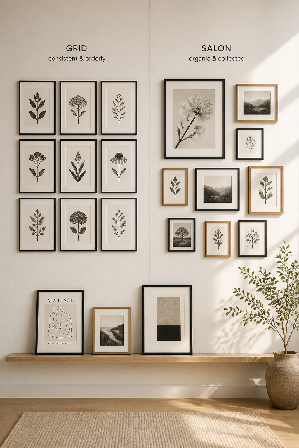
Almost every gallery wall belongs to one of four families, and choosing the right one is mostly a question of what you already own.
Grid arrangement: when symmetry earns its keep and when it flattens
A grid uses frames of identical or closely matched size in equal rows and columns — a 3×3 of 8×10 or 11×14 frames is the common beginner format, and it sits cleanly in modern and Scandinavian rooms. Its strength is calm; its condition is consistency. It needs one shared subject or treatment across every frame — black-and-white photography, a botanical series, matched portraits — or it reads as a random assortment forced into boxes. Its weakness is rigidity: it cannot absorb the varied sizes that come from collecting over time, and one mismatched piece breaks the system. Use it when you control content from the start.
Salon hang: controlled eclecticism and the visual logic behind apparent randomness
The salon hang is the most popular format and the most misunderstood — it looks random and is anything but. An anchor piece sits slightly off-centre, and the arrangement builds outward, distributing large and small pieces across the whole field so weight is balanced rather than clustered. The discipline hiding under the apparent chaos is spacing: a consistent 2–3 inch gap, held throughout — that even gap is what separates a composed salon wall from clutter. The interior designer Marie Cloud recommends anchoring with a large piece off-centre so the eye has somewhere to land first. The 8-to-12-frame mixed-size salon is the most requested layout.
Linear arrangements: the single row above a sofa, shelf or console
A linear gallery places frames in a single horizontal or vertical band, creating one strong line. It is the right answer for a narrow wall, a wall above a console, or a room where a salon arrangement has nowhere to grow. Three to five frames of varied sizes work well in a row above a sofa, provided the total span still respects the furniture-width rule. The catch is that a single row is the least forgiving of inconsistent spacing — every gap sits on one axis, so any variation shows. A cardboard strip cut to 2.5 inches, used as a spacer, is the practical fix.
Picture ledge systems: the updatable gallery and why renters love them
A picture ledge — a thin shelf the frames lean on rather than hang from — solves a different problem: change. It needs only two or three screws to mount, not a nail per frame, so frames can be rearranged or swapped in minutes with minimal damage. IKEA’s MOSSLANDA ledge, in 21- and 45-inch lengths, is the most-cited product; stacking two or three at different heights gives a salon-style layered look without the holes. The ledge also beats adhesive strips on weight — a properly anchored 45-inch ledge holds a combined 30–40 lbs, where a pair of large adhesive strips is rated around 7.5 lbs and fails on a humid wall. That low-damage, high-capacity combination makes the ledge the backbone of most renter-friendly, no-nail hanging methods, where every damage-free approach gets the full comparison.
Choosing Art and Objects That Cohere Without Matching
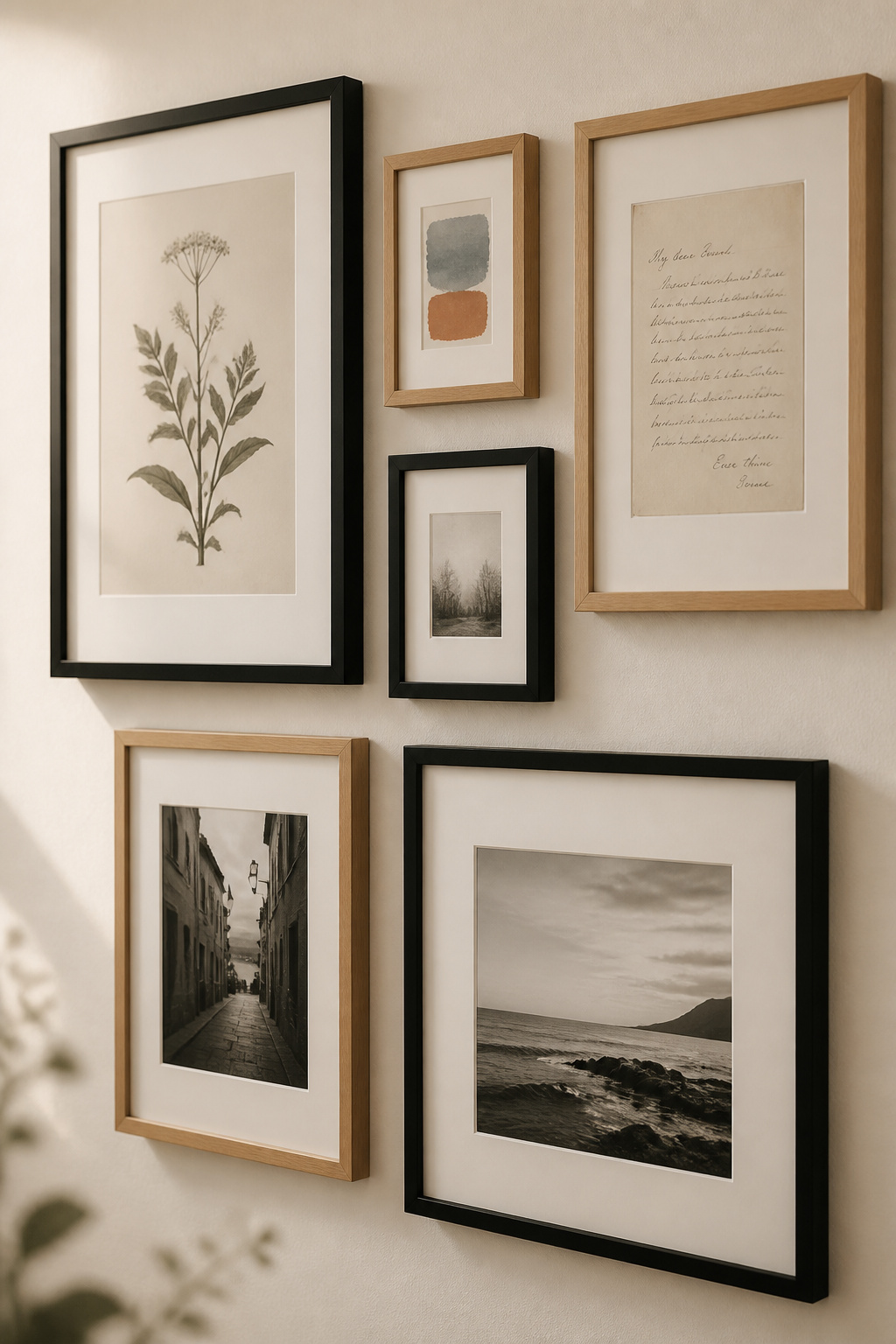
The fear behind most gallery walls is that mixed pieces will look like clutter. They will — unless one thing holds them together. Cohesion is never achieved by matching, but by a single deliberate thread.
The unifying thread: colour, subject, frame, or finish — pick one and commit
Three elements do the holding: a consistent frame colour (or a deliberate two-colour mix), consistent spacing throughout, and one shared thread in the art — a colour palette, a subject, or a mood. The professional rule is to vary only one element at a time: vary frame size but hold the colour; vary the colour but hold the profile; vary both at once and you need a very strong thread in the art to rescue it. Black and natural-wood frames, the most common living-room mix, read as intentional when held to a ratio — roughly 70% one finish, 30% the other — rather than split evenly, which reads as indecision. The designer Mary Beth Sullivan calls it a storyline: “establish a storyline with the frame colour to bring together the different sizes.”
Mixing photographs, prints, and three-dimensional objects without clutter
Photographs, paintings, and prints mix readily once the thread is set — monochrome photographs beside colourful prints work when the frames agree. Three-dimensional objects belong here too: a small sculpture, a woven textile, a mirror, architectural salvage. The interior designer Nadia Watts builds with exactly this range, held together by one shared finish or colour family and a consistent gap from the flat frames. The object is depth the wall would otherwise lack.
Frame and mat choices: when to match and when to vary
The mat is the quietest cohesion device and the most underused. A single mat tone across every frame — warm white, linen, soft grey — unifies wildly varied art instantly, because the eye reads the consistent border before the differences inside. White mats lend a fresh, gallery feel; black mats give graphic prints their contrast. You can mix matted, floated, and full-bleed pieces, but keep at least two of each so the variation reads as chosen rather than a mistake. The designer Kathy Kuo’s instruction: hold the frame material and finish consistent, let size and depth vary — movement from the frames, calm from their sameness.
The editing rule: how many pieces is one too many
The most common cause of a cluttered wall is too many pieces, and the most common mistake in fixing it is adding more. On a small wall — under roughly six feet — three to five pieces is the ceiling; beyond that the wall reads as busy rather than collected. The repair is almost always subtraction — remove two or three small pieces and enlarge one. Treat the blank wall between the frames as a material in its own right, not space waiting to be filled: a three-inch gap lets each piece be read singly, a one-inch gap fuses them into a mass. Restraint, used on purpose, is what lets a wall breathe.
A family’s photographs are the hardest content to cohere this way, because emotion fights editing — that has its own guide in family photo wall ideas that feel designed. And the most forgiving thread of all is to remove colour entirely; the case for black and white gallery wall schemes is made there in full.
The Core Measurements Every Gallery Wall Needs
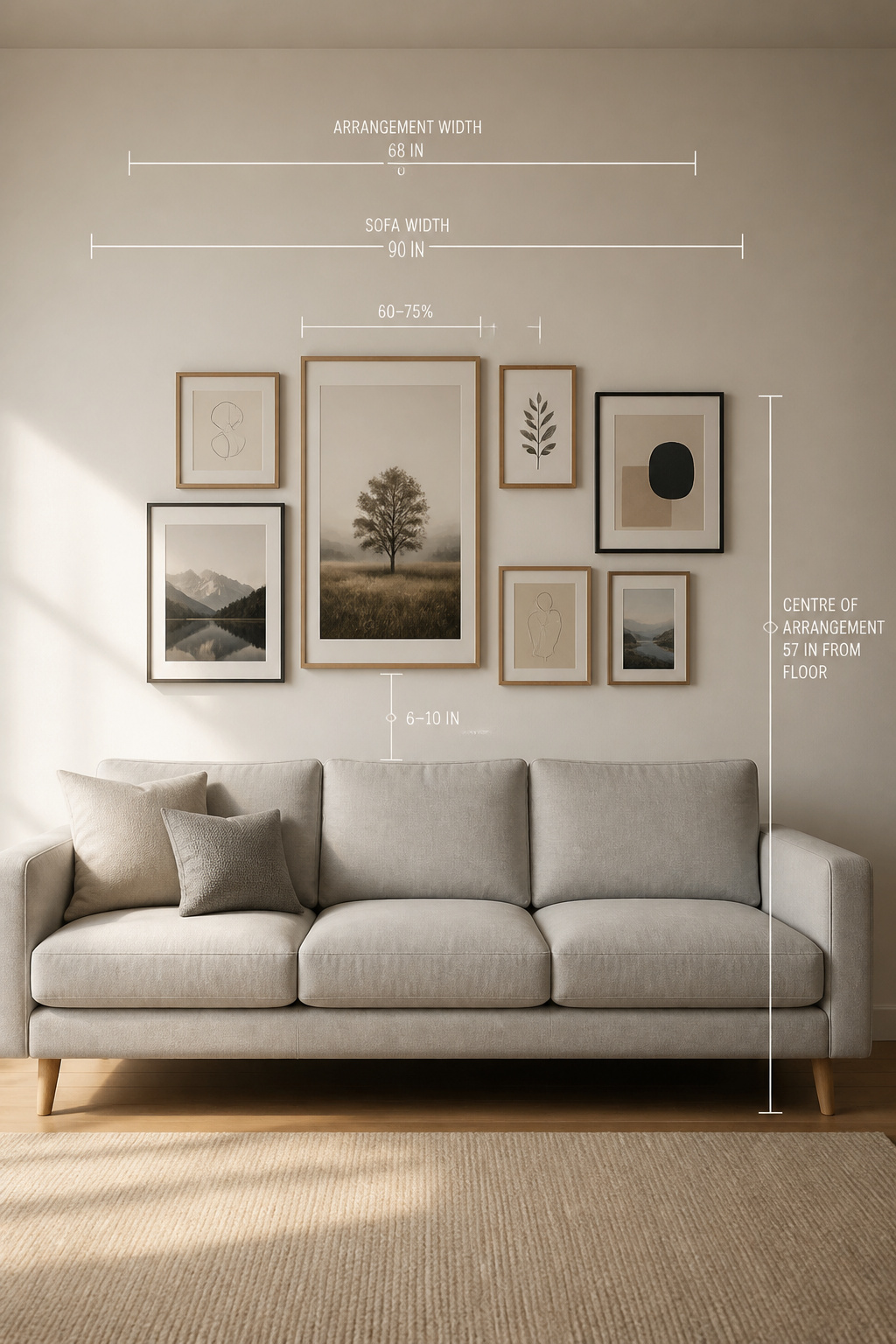
Four numbers sit behind nearly every well-hung gallery wall, recurring across museum practice and professional design guidance alike. Knowing them removes most of the guesswork that puts extra holes in walls.
The 57-inch centre-height rule and when to break it
The 57-inch rule places the visual centre of the arrangement at 57 inches (about 145 cm) from the floor — the accepted average adult standing eye level, used as a hanging standard by museums worldwide. The crucial point: it applies to the visual centre of the whole group treated as one unit, not to each frame. Find the geometric centre of the planned arrangement and set that to 57 inches. Two exceptions matter. With ceilings of ten feet or more, raise the centre toward 60 inches — the figure was calibrated for standard eight-foot ceilings. And above furniture, the rule is superseded entirely, which brings us to the most important number of the four.
Spacing between frames: the 2–3 inch standard and its exceptions
The standard gap is 2–3 inches (5–8 cm) — the spacing that forces separate pieces to read as a connected group while still letting each breathe. It scales with frame size: under 16 inches take 2–3 inches; 16-to-24-inch frames take 3–4 inches; over 24 inches take 4–6 inches. On a large wall every gap can grow by an inch without losing cohesion. The practical tool is the 2.5-inch cardboard spacer — faster and more accurate than re-measuring each gap.
Art span relative to furniture: the 60–75% sofa-width guideline
A gallery wall above a sofa should span 60–75% of the sofa’s total width, measured edge to edge and treating the whole arrangement as one shape — the outer edges of the outermost frames define the span, so a 90-inch sofa wants 54 to 67.5 inches of art. When in doubt, go wider: art too small above a sofa is the single most common gallery wall mistake, and an arrangement under 60% reads as undersized however well each piece is chosen. The sofa wall is the most proportion-sensitive site of all, with its own visual-weight and layout math — the full treatment lives in sizing a gallery wall above the sofa.
Bottom-row clearance above furniture: the 6–10 inch range
Above furniture, start from the furniture, not the floor. The bottom edge of the lowest frame should sit 6–10 inches (15–25 cm) above the highest point below it — a sofa’s seatback, a console’s surface, a headboard’s top. Below six inches the art crowds the furniture; above ten it disconnects and floats. This rule supersedes the 57-inch standard whenever furniture sits beneath the wall; let the centre rule govern only empty walls.
How the Gallery Wall Relates to the Room: Furniture, Light, and Scale
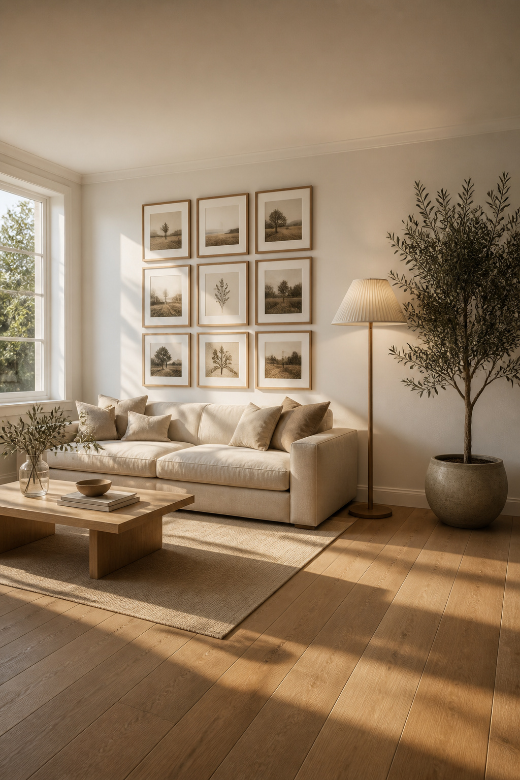
A gallery wall is not a self-contained object. It reads in the context of the whole room — furniture, light, existing visual weight — and most walls that feel slightly off are correct in isolation and wrong in their setting. This is the part only the room can teach, and it is more design principle than fixed measurement.
Reading the room: which wall earns a gallery and which should stay clear
A gallery wall belongs on the wall that anchors the primary seating — usually the longest uninterrupted surface, the wall the sofa faces or sits against — and it needs a continuous flat run of at least five feet to read as one composition. Walls broken by windows, a fireplace, or built-in shelving should stay clear or take only a small arrangement; a gallery fighting architectural interruptions can never resolve into a whole. In an open-plan room, give it the wall seen on entry — the first visual statement — not one that reveals itself only from a narrow angle.
Balancing a gallery wall against the room’s existing visual weight
Visual weight comes from contrast against the wall, size, frame depth, and texture: a large dark frame carries far more than the same size in pale oak. Distribute the heavy pieces across the arrangement rather than piling them on one side. Then look at the room whole — a gallery wall on one side needs a counterweight on the other, a substantial piece of furniture, a floor lamp, or a tall plant, or the room tips. And let the wall answer the sofa: a strong-coloured sofa wants a lighter, more varied wall; a neutral one lets the wall carry more weight.
Natural and artificial light: how it changes what the wall reads as
Light decides what the wall actually looks like, hour by hour. Natural light shows colour most truthfully but shifts all day, and direct sun fades art over time — so favour indirect light; a wall perpendicular to a window is kinder than one opposite it. For artificial light, lighting designers recommend 3000K and a Colour Rendering Index of 90–95; below CRI 80, warm tones go muddy and cool tones turn harsh. For a dense salon wall, a linear fixture that washes even light across the arrangement beats individual picture lights — reserve those for grids, where each piece reads on its own.
Avoiding the most common scale mistake — art too small for the space
The most-cited failure, again, is scale: a well-composed arrangement covering only half the sofa width reads as undersized regardless of how good the pieces are. The diagnostic is simple — stand at the room’s threshold and look. If your eye reads the sofa first and the wall second, the art is too small; the arrangement should resolve from the doorway. The cheapest insurance is painter’s tape: mock up the exact outer dimensions on the wall before printing or buying a single frame. It costs nothing and settles most scale questions before they become expensive ones — and undersized art turns out to be only the first of a short, predictable list of errors the next section takes up.
Gallery Walls With a Screen: The TV Wall Problem
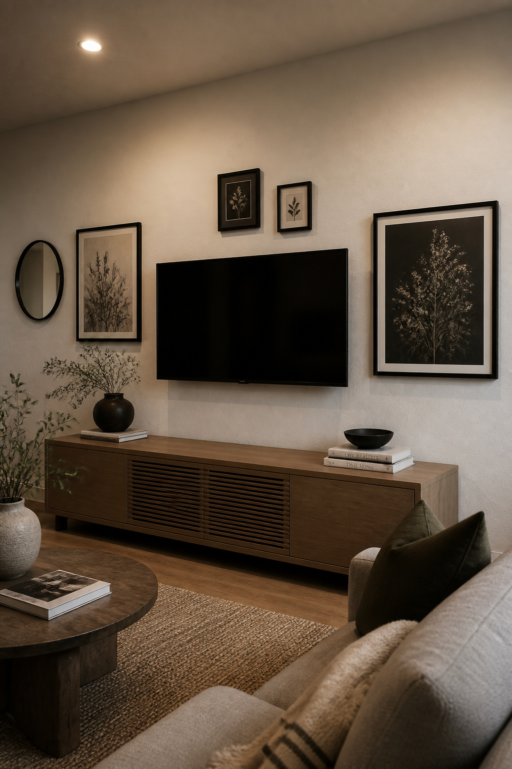
A television is the hardest thing a gallery wall has to absorb, because it is two problems wearing one frame. Off, it is a large dark void that dominates the arrangement; on, it is a bright light source that makes the surrounding art recede and seizes the visual hierarchy by brightness alone.
Why the TV complicates everything — and one principle that resolves it
One principle resolves both states: treat the television as the arrangement’s largest frame, not an appliance dropped into a gallery — compose the surrounding art in relation to the screen’s dimensions and placement, not despite them. It helps that the right mounting height is lower than instinct suggests: eye level when seated, which for most seating puts the screen’s centre at 42–48 inches from the floor, closer to the gallery standard than people realise.
Treating the screen as the largest frame: asymmetric placement
Place the TV off-centre — not centred on the wall or the sofa. A centred screen reads as a focal point and turns the art around it into decoration; an asymmetric screen reads as one element in a composition. Counterweight its dark mass with a substantial piece on the opposite side rather than ringing it with small frames, which only emphasise its size. And echo the bezel: a matte-black screen integrates best among black or very dark frames, which narrows the contrast between art and screen when the TV is off.
When a Frame-style art TV genuinely helps vs marketing reality
An art-mode television — the Samsung Frame is the best-known — earns its place through a matte, anti-reflective surface and a near-flush mount that lets it sit like a framed piece rather than protruding from the wall, and that matte finish genuinely solves the “black mirror” reflection problem. But it has real limits: the light comes from the screen rather than reflecting off it, so even at its best it does not fully read as paint or print — and a standard TV framed thoughtfully among dark-toned art can reach comparable integration for far less. Integration is a composition problem before a hardware one. The whole question — art-mode trade-offs, glare, the brightness reality, viewing distance, and hiding the cables — gets the full treatment in building a gallery wall around a TV.
Planning and Hanging: From Floor Mockup to Final Nail
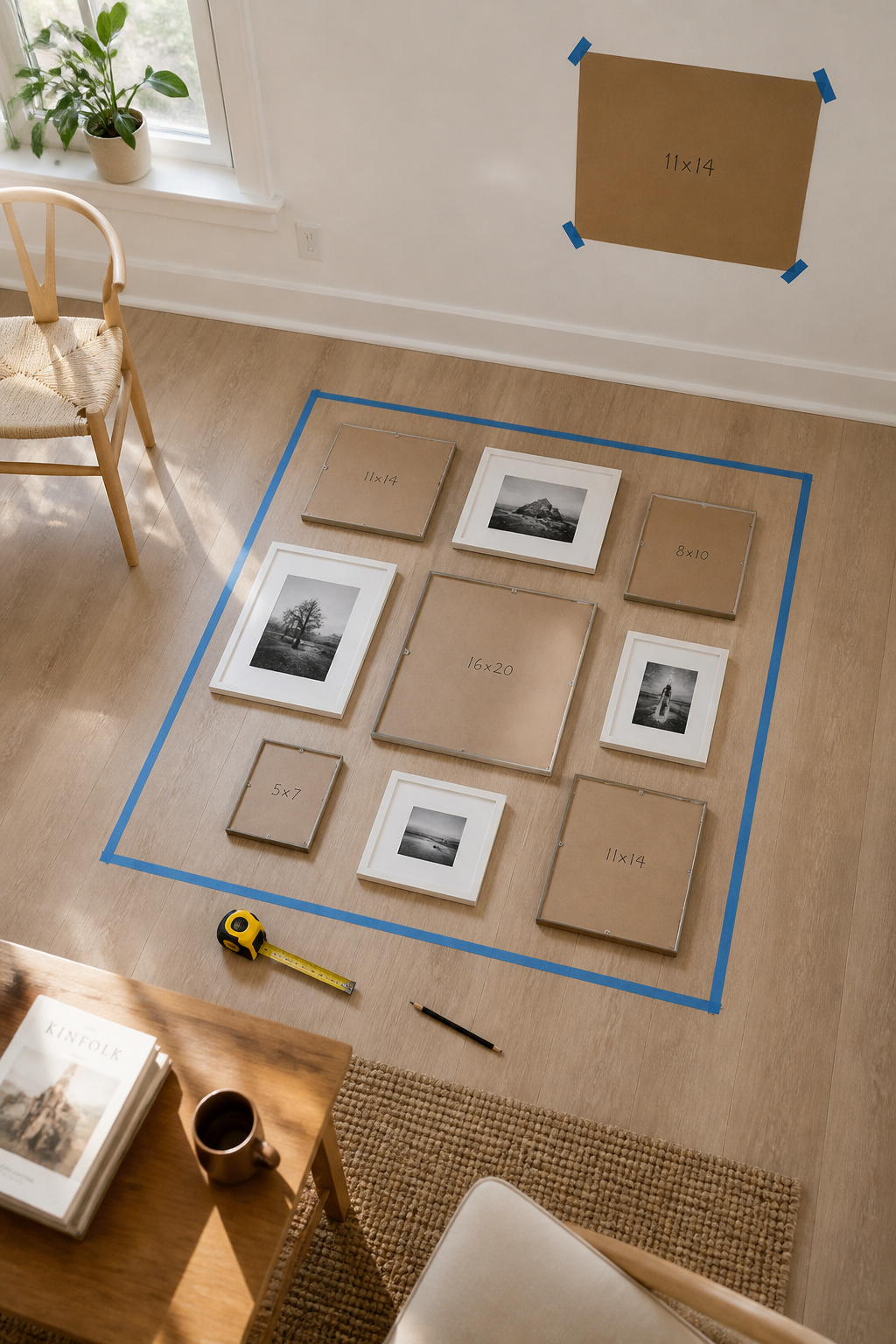
Designers are unanimous on one point: most gallery wall failures are planning failures, not taste failures. The wall goes wrong before the first nail. Three steps prevent nearly all of it.
The floor mockup method: why every professional does this first
Lay every frame on the floor in the intended arrangement, inside a tape outline matching the wall zone’s exact dimensions, then photograph it from directly above. This single step catches spacing problems, awkward size relationships, and imbalance before any hole exists. Start with the anchor — the largest piece — set where it will finally sit, often slightly off-centre, then build outward, alternating large and small to spread the weight. As Young House Love put it after years of reader stories about patched holes: “The floor layout is everything.” Twenty minutes with paper and tape saves an afternoon with spackle.
Paper templates and wall marking: the sequence that prevents extra holes
Trace each frame onto kraft or printer paper, cut to exact size, and mark the hanging-hardware position on each template. Tape the templates to the wall in the arrangement from your mockup photo, adjusting until it reads right — paper is free to move, nails are not. Then drive the nail or hook straight through the paper and tear the template away; the fixing lands exactly where it belongs, with no separate measuring. Hang from the centre outward (or top down) so each new piece has two settled neighbours to space against, rather than working from an edge where errors compound.
Hardware selection by frame weight: the decision most guides skip
This is the step most guides omit, and the most common reason pieces fall. Match the hardware to the weight: picture hooks and angled nails hold up to about 20 lbs in drywall; 20–50 lbs needs a flat hook with a rated drywall anchor; over 50 lbs means a stud or toggle bolts. The sawtooth hangers on the back of many frames top out around 25 lbs — fine for prints, not for heavy canvases. For a wall you expect to change, a rail-and-cable system carries up to 300 lbs per track and lets you reposition frames endlessly without new holes. The full step-by-step, with tools and honest time estimates, is in the step-by-step gallery wall hanging process, with the damage-free variants in the renter-friendly, no-nail hanging methods.
Common Gallery Wall Mistakes and the Quick Fixes
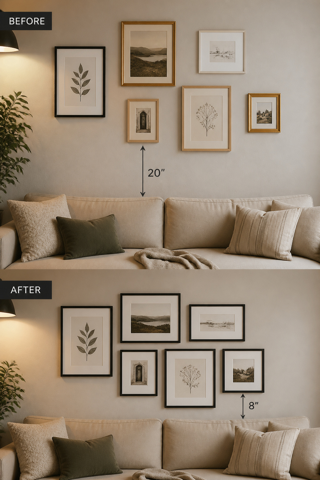
Most walls that read as wrong fail for the same short list of reasons, and the fixes are nearly all cheap. Three account for the majority.
The three mistakes that account for most walls that look wrong
Homes & Gardens lists the five most common errors as art hung too high, pieces too small, gaps too wide, no cohesive link, and skipping the mockup. Three compound each other most: art too high disconnects the wall from the furniture, art too small makes the room feel under-furnished, and no unifying thread makes the whole thing read as random. Fix any two and the third frequently resolves on its own.
Art hung too high: why it happens and the single measurement that cures it
This is the near-universal mistake, and the cause is mechanical: people hang while standing, at their own eye level, typically 10–18 inches above where the art should sit relative to the furniture. The cure is one measurement. Sit on the sofa, mark 6–8 inches above the seatback, and set the bottom of the lowest frame there. The designer Jennifer Squires says it best: “Sit on your sofa. That’s where your eye lives when you’re in the room. Your art should meet you there.”
No cohesive link between pieces: the fastest visual repair
When a wall reads as random, the fastest repair is a shared mat — replace mixed or absent mats with a single warm-white or linen tone and a visual thread appears without changing a frame. If that is not enough, limit frame finishes to two at most; three or more demand a very strong thread in the art. And the fix is almost always subtraction: remove the pieces that don’t share the dominant palette or subject before reaching for anything new. This is only the headline; the full diagnostic — seven errors, each with its test and cheapest fix — is laid out in the gallery wall mistakes that flatten most arrangements.
Starting Your Living Room Gallery Wall: The Decision Sequence
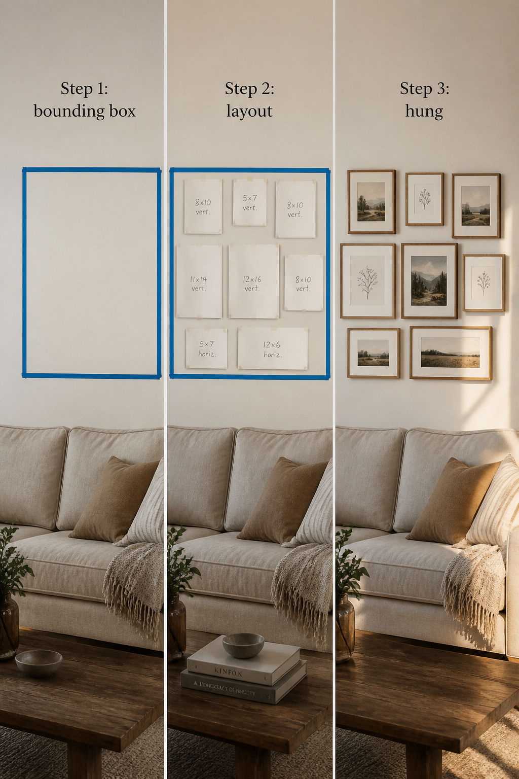
Everything in this guide reduces to a sequence, and the order is not optional: each step constrains the next, and skipping or reordering them is the root of most problems.
Step 1: Choose your wall and define the bounding box
Pick the wall that anchors the primary seating and offers the longest uninterrupted run — five feet or more. Mark a bounding box in painter’s tape: width at 60–75% of the furniture below, height set by the wall and the arrangement depth you want. Watch the wall’s light across a full day — a west-facing wall in afternoon sun wants UV-filtering glass; a north-facing one is the most forgiving. Map any switches, outlets, or sconces inside the box and keep frames at least two inches clear of them.
Step 2: Pick your layout family and unifying thread
Choose the layout family by what you own or will collect: a grid needs matched sizes, a salon varied ones, a linear row three to five compatible widths, a ledge no fixed sizes at all. Then commit to one unifying thread before buying a single frame — colour palette, subject, frame finish, or mat tone. That decision gates every purchase after it. The two choices are independent: a salon hang can run on a colour thread, a grid on a subject thread.
Step 3: Gather, edit, and mock up before anything touches the wall
Gather every candidate in one place and edit hard — start with about 30% more pieces than the final wall needs, because editing is far easier on the floor than on the wall. Remove anything that breaks the thread or won’t fit the box. Then lay it all out, photograph it from above, and keep that photo as your working document through the template stage. As the designer Kathy Kuo says: “Lay out all your frames on the floor before hanging… you’ll thank yourself later.”
If I had to reduce the whole guide to the three things most walls ignore, it would be these. Size to the room, not the wall in isolation: an arrangement that respects 60–75% of the furniture and 6–10 inches of clearance belongs to the space; one that doesn’t, floats. Give the pieces one honest thread and let everything else vary — cohesion is a single decision, repeated. And plan on the floor before the wall, because twenty minutes with paper and tape catches every error that hours of spackle and rehang would otherwise be spent on. A gallery wall is not a decorating shortcut; it is a small, deliberate composition that earns its place by looking collected rather than bought. Build it in that order and it will hold for the ten years a good room should last, absorbing whatever the next one brings.