Before you choose a single colour, notice what you want the room to do for you. A bathroom is the first space you meet in the morning and the last you stand in at night — a daily reset more than a decorating problem. So the right question is not which colour is fashionable. It is which colour lets your shoulders drop the moment you walk in. That feeling is what a boho bathroom color palette is really for, and the earthy tones at its centre are less a trend than a return to the colours the body already trusts.
TL;DR
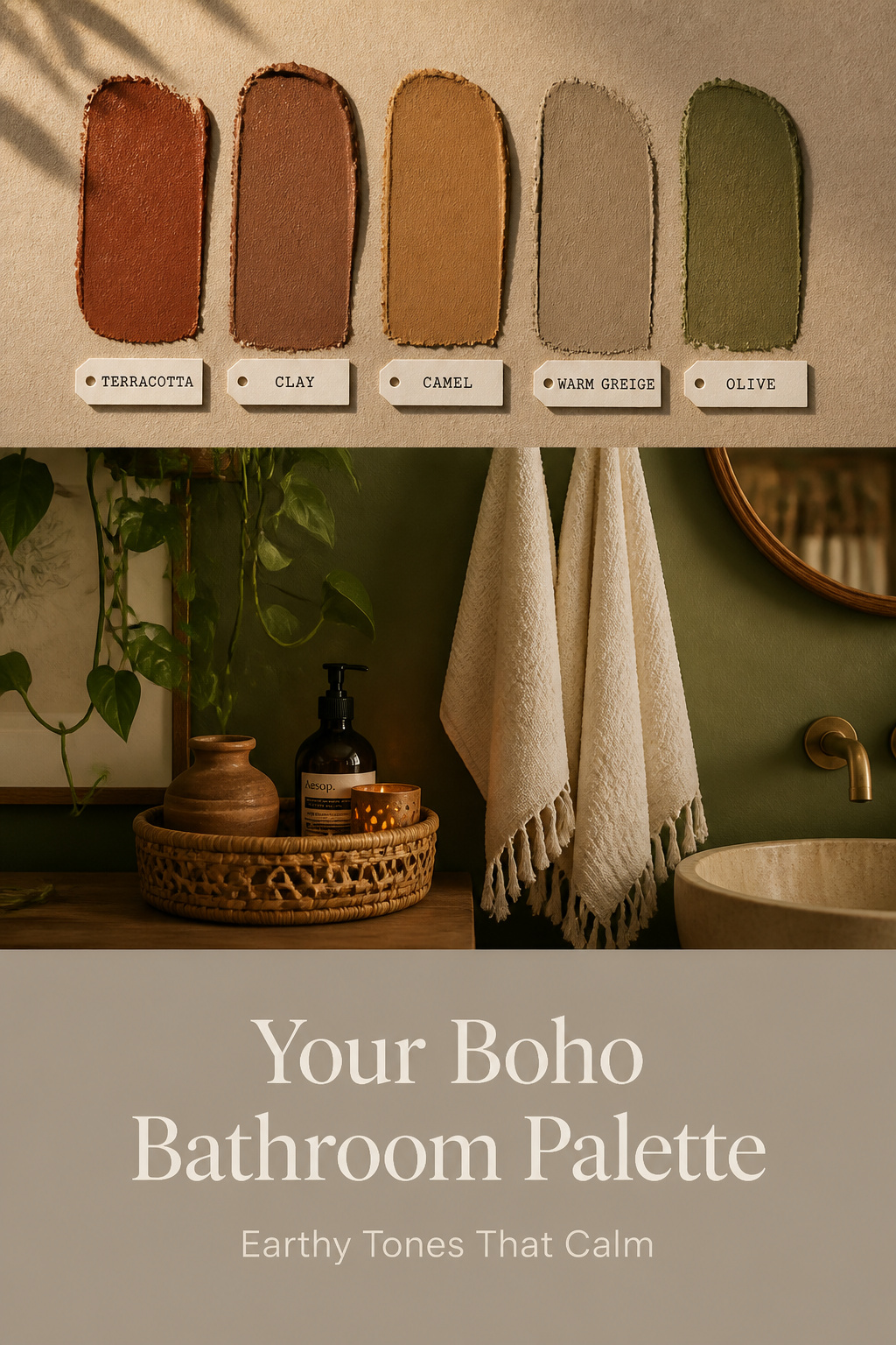
- The grounding boho palette runs on low-chroma earthy tones — terracotta, clay, camel, warm greige and olive — kept airy with cream; warm neutrals read as safety to the nervous system where cool grey reads as clinical.
- Use the 60-30-10 rule (60% light neutral, 30% mid-depth earthy tone, 10% accent), and keep deep colours like Cavern Clay (LRV 20) to one feature wall, not all four.
- Use a bathroom-rated paint such as Aura Bath & Spa or Farrow & Ball Modern Emulsion; standard flat paint peels and mildews within 12–18 months.
Why the Boho Palette Is About Feeling, Not Fashion
How earthy tones settle the nervous system
Earthy colours work on you before you have a single thought about them. They mirror the textures of nature — clay, wood, soil — and the limbic system, which processes emotion and memory, reads those tones as signals of safety and belonging. A 2025 randomised study published in PMC found that in biophilic environments built around earthy palettes, fatigue, depression and anxiety all decreased while vigour and attentiveness rose, the shift visible after only brief exposure.
So the colour on your wall is an input to your mind, not just a backdrop. Muted earth tones lower the felt sense of stress — that is the whole case, before we name a single paint.
The difference between a trendy palette and a grounding one
A trendy palette chases saturation and novelty. A grounding one does the opposite. The tones that calm are low in chroma — drawn from materials rather than a colour wheel — and they cohere with wood, stone and rattan instead of shouting over them. Edward George London’s boho colour guide makes the same distinction: terracotta, camel and warm beige form the primary, anchoring layer, while saturated hues and metallics are only the accent on top. The earthy base does the psychological work.
The clearest sign this palette has outlived fashion: terracotta, sage and cream keep being named the defining boho bathroom combination year after year. A colour that stays is a colour that grounds.
Why warm neutrals work in a bathroom specifically
A bathroom is small, enclosed and often poorly lit — exactly the conditions where cool grey turns institutional. Warm neutrals do the reverse. Oat, sand, stone and warm beige read as reassurance, which is what makes a bathroom calm enough to linger in.
The undertone is everything. Choose a warm base, not a cool one. Neutrals around LRV 50–60 stay open without going cold; in a windowless bathroom, warm tones at LRV 75 or above hold onto the little light you have. For how this palette sits alongside plants, tile and textiles, see the complete boho bathroom style guide.
When you stand in the room, breathe once and notice the undertone — if it feels like sun on clay rather than concrete, you have the right neutral.
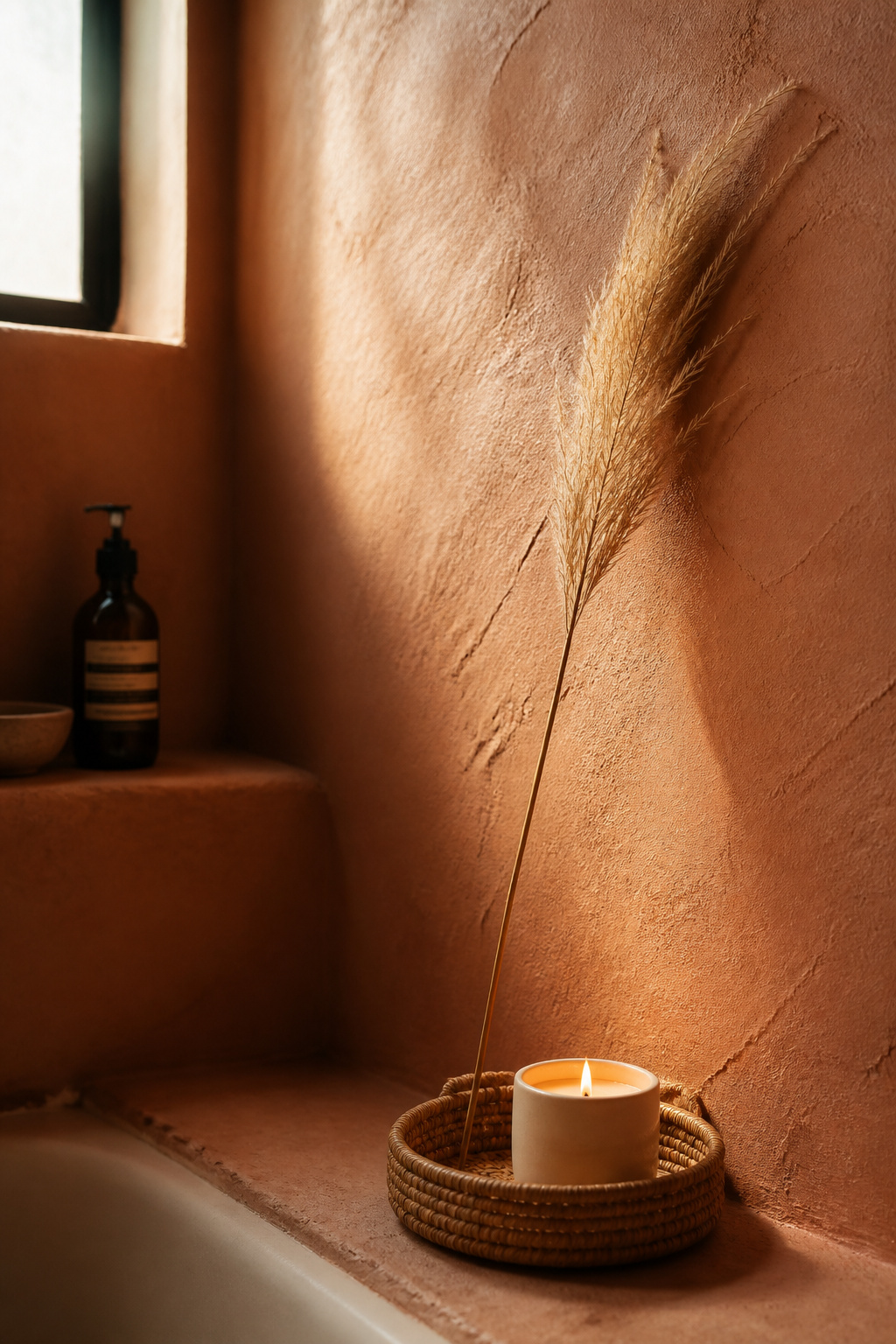
The Core Boho Bathroom Palette: Terracotta, Clay and Warm Greige
Terracotta and clay: the anchor tones
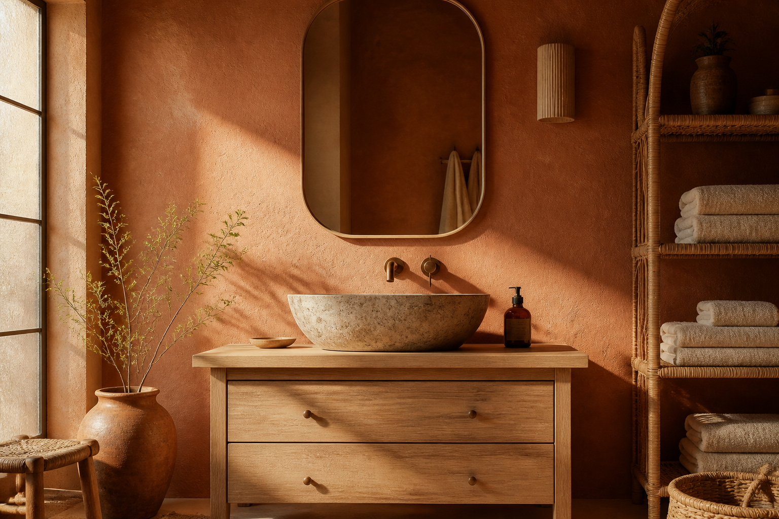
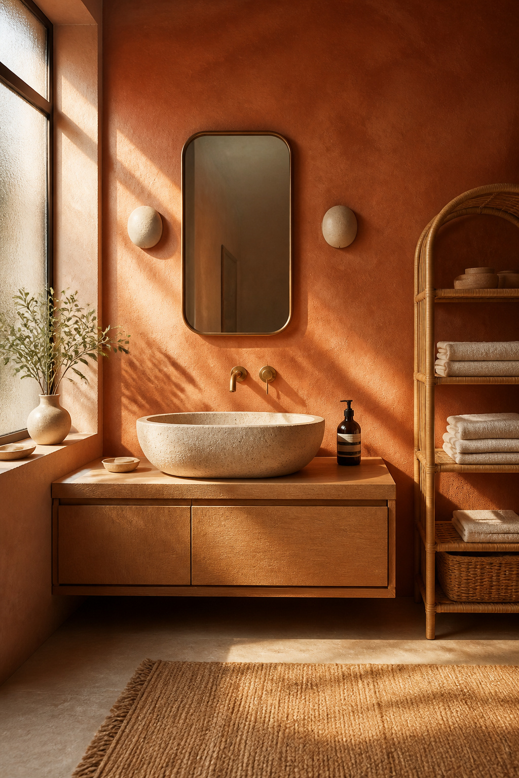
Terracotta is the soul of the palette — baked-clay warmth carrying the memory of adobe walls and desert light. Benjamin Moore Baked Terra Cotta 1202 is the classic, with russet-brown undertones and availability in the mildew-resistant Aura Bath & Spa line. Sherwin-Williams Cavern Clay SW 7701, the 2019 Colour of the Year, runs deeper at LRV 20 — beautiful, but low enough that it drinks light and belongs on one wall, not four.
Clay sits a step lighter and browner, a blush-earth hybrid. In a smaller bathroom where full terracotta would close in, a softer clay reads as warmth without weight.
Warm greige: the tone that holds everything together
If terracotta is the soul, warm greige is the spine — the neutral that lets every other tone breathe, avoiding both the chill of grey and the heaviness of beige. Sherwin-Williams Accessible Beige SW 7036 (LRV 58) is the reliable choice, a grey-beige with a faint green undertone that keeps it earthy; consultants pair it with terracotta, deep browns and olive. One caution: Farrow & Ball’s Elephant’s Breath is lovely in warm light but shifts toward lilac in cool north- or west-facing rooms, so match it to your light first.
When and how to mix them without muddiness
The fear most people bring to this palette is mud — two warm tones turning to sludge where they meet. The fix is structure, not luck. Lean on the 60-30-10 rule: greige takes the 60% wall role, terracotta or clay the 30% feature, a saturated note like olive or brass the final 10%. Mud happens when two warm tones of different undertones sit edge to edge with nothing between them; a cream or off-white buffer acts as an optical reset — which is why the much-cited “clay tiles, white grout, sage towels” formula reads clean rather than confused.
The table below sets out the five working tones — the mood each one carries, where it wants to go, and a real paint to start from. Read it as a starting point for swatching, not a rule.
| Tone | Mood / effect | Best placement | Paint example |
|---|---|---|---|
| Terracotta | Grounding, ancient warmth — baked clay and desert light | Feature wall behind the vanity; floor tile in larger rooms | Baked Terra Cotta 1202 (Benjamin Moore) or Cavern Clay SW 7701 (Sherwin-Williams, LRV 20 — one wall only) |
| Clay | Softer, lighter warmth — a blush-earth hybrid, less intense; LRV 25–35 range | All four walls in small bathrooms; vanity cabinet | Dead Salmon No. 28 (Farrow & Ball) — a muted, flat pink-clay |
| Camel | Golden-tan comfort — bridges terracotta and greige | Vanity, wood shelving, door frames; towels and textiles | Antique White SW 6119 (Sherwin-Williams)* |
| Warm greige | Neutral anchor — lets the other tones breathe | Dominant wall and ceiling (the 60% role) | Accessible Beige SW 7036 (Sherwin-Williams) |
| Olive | Living, biophilic note — calm and stable; shifts with the light | Second accent wall; cabinet; plant pot and textile accent | Rosemary SW 6187 (Sherwin-Williams) |
*A note on camel: the widely shared “Dromedary Camel SW 7694” code belongs to the HGTV Home by Sherwin-Williams line, not the core Sherwin-Williams range, and its LRV is not confirmed at source. For a general bathroom project, a stocked warm off-white like Antique White SW 6119 is the safer, more available camel.
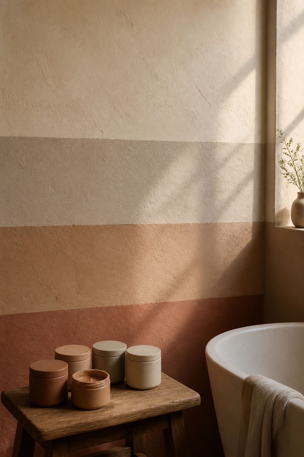
Olive and Cream: Keeping the Palette Airy
Olive as the living, natural note
Without olive, terracotta and greige read as desert. With it, they read as garden. Olive is the palette’s living note — a visual biophilic cue that promotes calm and stability even in a bathroom with no room for plants. Sherwin-Williams Rosemary SW 6187 is a soft, herbaceous olive with grey undertones, called out for calm spaces; it stays botanical rather than military because it lacks the heavy brown cast of darker olives. Its golden-green shifts through the day, which is what gives an earthy bathroom a sense of being alive.
Cream and warm white to prevent heaviness
Cream is not the background here. It is the safety valve — the active lightening agent that stops the earthy tones from closing in. Reach for a warm white, not a stark one: Benjamin Moore White Dove OC-17 (LRV 83.16) is bright without going icy, while Navajo White OC-95 leans warmer still, a better partner when terracotta needs softening rather than contrast.
The mistake to avoid is pairing terracotta with a bright white above LRV 90 — the white reads cold, the terracotta garish, and the calm collapses.
The proportion rule: how much of each
Cream and light tones should hold at least 30–40% of the visible surfaces. The same 60-30-10 logic applies: lightest neutral 60%, mid-depth earthy tone 30%, accent 10%. In a very small bathroom — roughly under 50 square feet, about the size of a typical powder room — keep to three visible colour surfaces: one earthy tone, one cream, one accent. More than that and the room tips from collected into chaotic.
Tonight, count the colour surfaces in your bathroom. If you can name more than three, you have found why it feels busy.
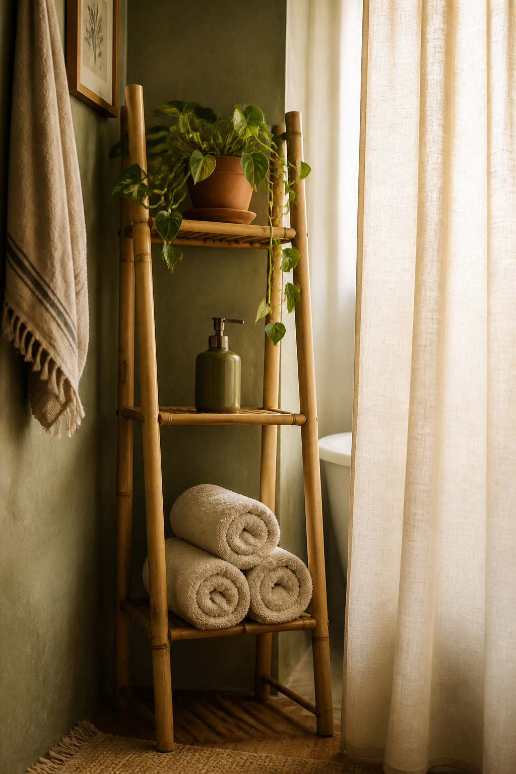
Where to Put Colour and Where to Stay Neutral
Knowing the tones is half the work; the other half is placement. Where colour lands decides whether the room feels grounded or heavy. Here is where each decision wants to go:
- Full-wall colour vs feature wall — Medium-depth tones (LRV 35–55) can cover all four walls in a larger, windowed bathroom; deep tones under LRV 25 belong on a single feature wall behind the vanity.
- Grout — A warm sand or greige grout unifies an earthy tile palette; bright white can pull the look toward Scandi and stains quickly on busy floors. (Tile and grout get the full treatment in choosing tile in your palette.)
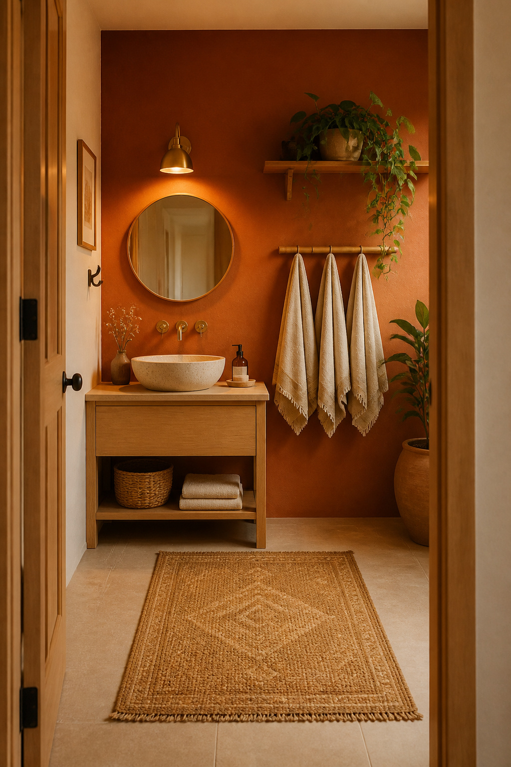
- Vanity — A natural lever for terracotta or olive: a colour hit at eye level that leaves the walls calm.
- Towels and soft goods — The reversible colour layer; go one step lighter or cooler than the wall rather than matching it exactly.
- Accessories — Terracotta pots, a woven cotton rug and a rattan frame deliver the whole palette against rental-white walls when you cannot paint at all.
For a windowless room, the gentlest approach is cream or warm greige on every wall, with the earthy colour arriving through tile, vanity and accessories — you keep the palette and protect what little light you have.
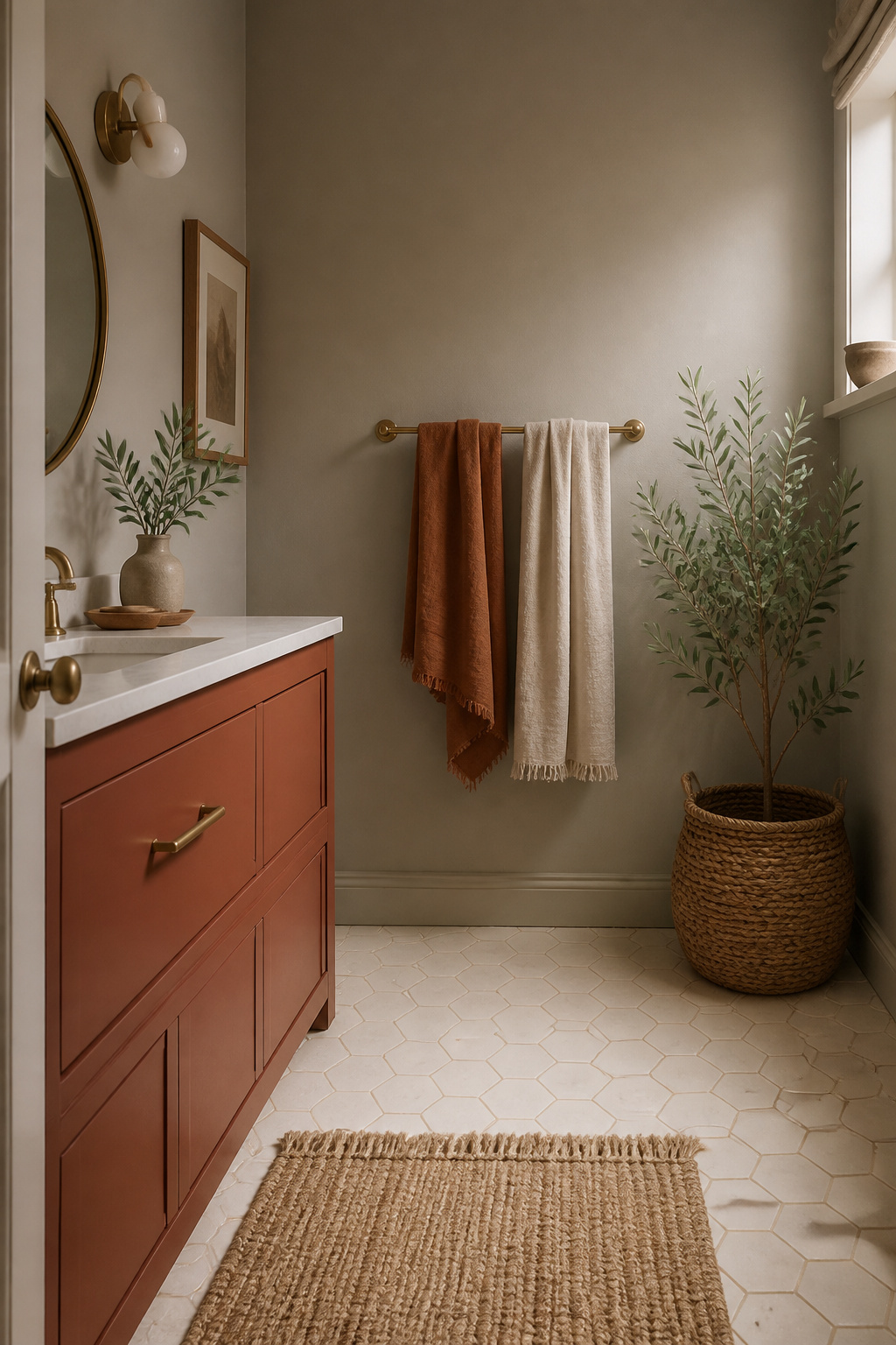
Carrying the Palette Through Textiles and Soft Layers
Matching towels and rugs to the wall tone
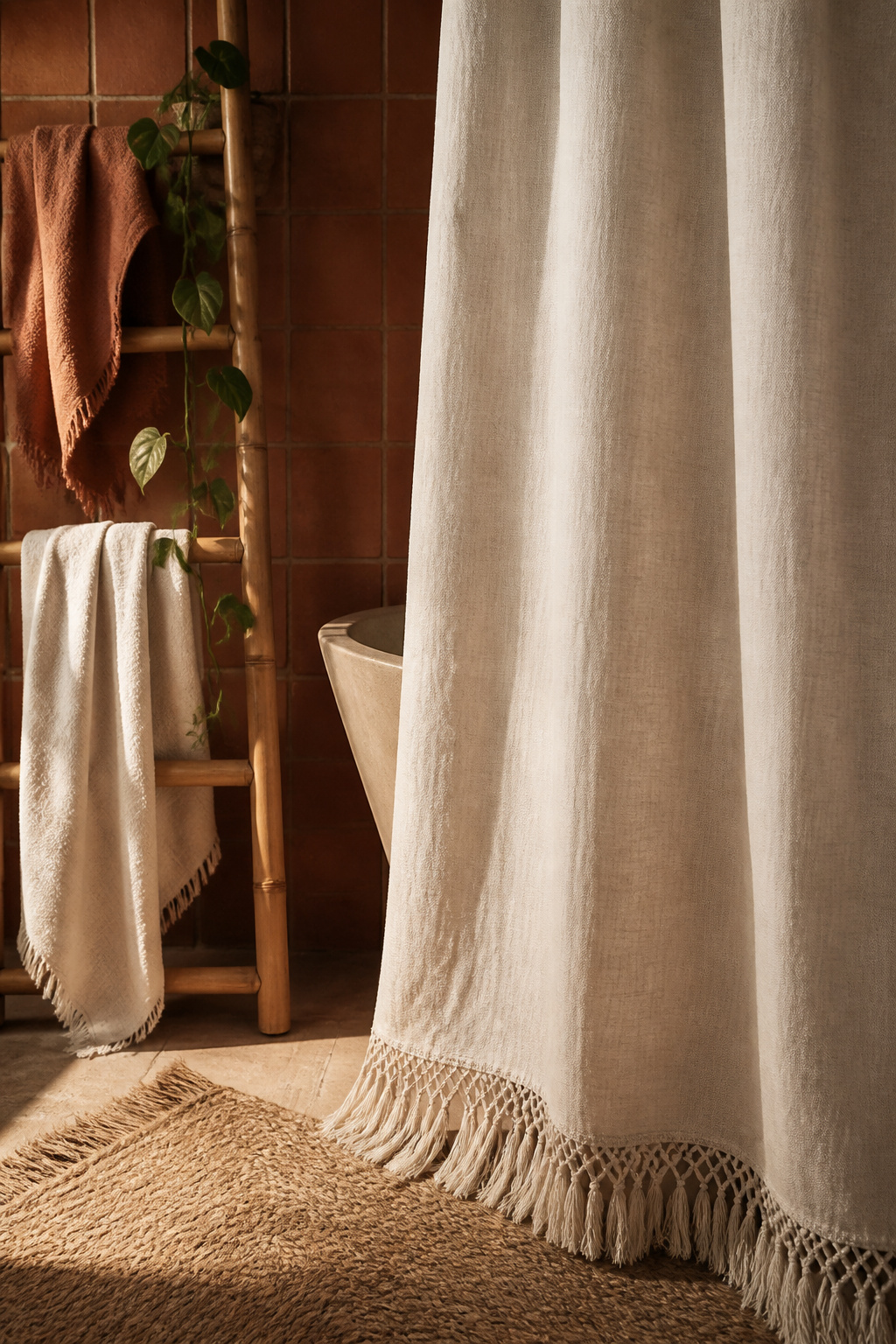
Textiles are where the palette becomes touchable, and they forgive more than paint does. Linens do not need to match — they need to pair, sharing an undertone or tonal family. A woven cotton or wool rug in terracotta, cream and olive is the fastest way to break up a plain tile floor while echoing the wall. For a terracotta wall, take the towels a step lighter, to clay or cream, rather than matching exactly; tonal layering reads richer than a single flat colour.
Pattern in the palette: geometric versus organic
Pattern adds the collected quality without adding new colour. Geometric prints — kilim, tribal, Moroccan — bring structure; organic botanicals reinforce the biophilic calm. The discipline is to limit competing patterns to one surface plane: one patterned rug or one patterned curtain, not both, or the room starts to argue with itself.
How the palette reads when the shower curtain goes in
The shower curtain is the largest single textile in most bathrooms, and closed it almost becomes a fifth wall. A cream or off-white linen curtain with a fringed or tasselled hem is the most versatile choice across every earthy combination — it lightens the room and adds texture without introducing another hue. For the full picture on rugs, towels and curtains, carrying the palette into textiles goes deeper — and notice, before you shop, which textile surface your eye wants to settle on first.
Paint Brands and Specific Colours Worth Knowing
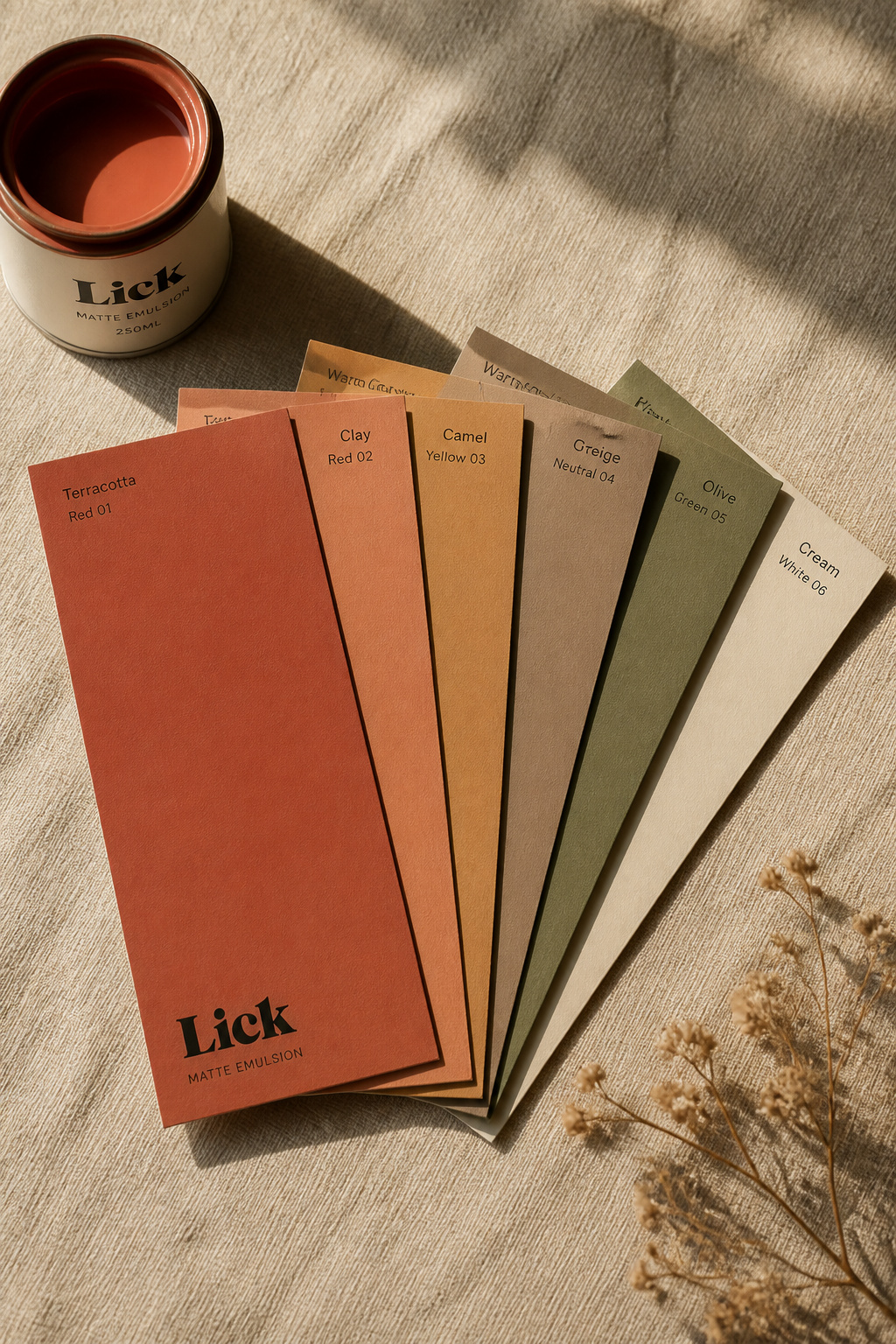
These are the colours worth swatching, grouped by where they fit and how much they cost. Swatch every one as an A4 card on the actual wall before you buy — terracotta in particular shifts dramatically between brands and between morning and evening light.
- Benjamin Moore Baked Terra Cotta 1202 — the go-to BM terracotta, in the mildew-resistant Aura Bath & Spa formula.
- Benjamin Moore White Dove OC-17 — LRV 83.16; the warm white for brightness without iciness.
- Benjamin Moore Guilford Green HC-116 — LRV ~57–59; a lively, spa-like grey-green for the biophilic layer.
- Farrow & Ball Red Earth No. 64 — a saturated red-earth accent, recommended by F&B for small spaces.
- Farrow & Ball Dead Salmon No. 28 — a flat, muted pink-clay with an 1805 pedigree; a sophisticated clay bridge.
- Sherwin-Williams Cavern Clay SW 7701 — LRV 20; the widely stocked, hardware-store terracotta for feature walls.
- Sherwin-Williams Accessible Beige SW 7036 — LRV 58; a best-selling, budget-friendly warm greige.
- Behr Terra Cotta Urn PPU2-12 — the most accessible terracotta for a DIY budget.
Two finish rules matter more than any colour name. Use a bathroom-rated paint — Aura Bath & Spa, Farrow & Ball Modern Emulsion, or a satin like SW Emerald Interior — because standard flat paint peels and mildews within 12–18 months in a humid room. And choose matte over gloss: a matte sheen, as Benjamin Moore notes of its boho bathroom work, “brings a softness to hard materials like wood and porcelain” and holds the calm earthy tones are there to create.
The One-Colour Test: How to Know If Your Palette Is Working
How to tell when the palette is working
Colour works on you before you decide anything about it. The reliable test is not a sample chip — it is a moment. Paint an A4 card in each candidate colour and live with it on the wall for two days in different lights. The palette is grounding when the room feels quieter without being smaller, when the eye settles rather than searches. Colour psychology backs the instinct: that felt response tracks LRV and chroma far more than hue. A muted terracotta around LRV 30–40 grounds; the same hue at high saturation reads as aggressive. Which is why you test with A4 painted cards, never two-inch chips — a chip reads up to 30% lighter than the full wall.
What to do when the palette feels heavy
If the room feels oppressive, do not add more colour — add more light. The most reliable fix is shifting from four earthy walls to three cream and one earthy. A large mirror, at least 70% of the vanity width, doubles the cream’s presence by reflecting it. And dark colour does not, in itself, shrink a small bathroom — mirrors, lighting and white fixtures keep it open.
Adjusting without repainting
The fastest lever is the softest one. Swap a rust towel set for cream and the whole palette lifts. Set a white ceramic pot where a terracotta one stood and the eye gains an anchor of brightness. And check your light: warm 2700–3000K lamps animate the palette’s warmth, while anything above 3500K greys out the very wood and clay tones you chose it for.
The room is working when your first breath inside it is slower than your last breath outside it — not when you start rearranging.
FAQ
What is the most popular color for a boho bathroom?
Terracotta is the single most-cited boho bathroom colour across 2025–2026 trend reports, valued for the timeless depth and warmth it gives a room. It is most often paired with sage and cream — terracotta on the feature wall or vanity, sage through a plant or textile, cream as the dominant light tone — with earth tones overall trending around 55%.
Can you use dark colors in a boho bathroom without it feeling small?
Yes. Dark colour does not inherently shrink a small bathroom; it can add depth and dimension when paired with good lighting and bright white fixtures. Keep colours under LRV 25, such as Cavern Clay at LRV 20, to one feature wall rather than all four, and favour warm tones — they read as a deliberate cocoon, not an accidental cave.
Do boho bathroom colors work with white fixtures?
White fixtures are the standard pairing for an earthy boho palette. They supply the neutral anchor the 60-30-10 rule needs, giving the eye a resting point so the room never feels oppressive even with bold walls and vanity. Choose a warm white with a slight cream undertone — cool bright white clashes against terracotta and clay tones.