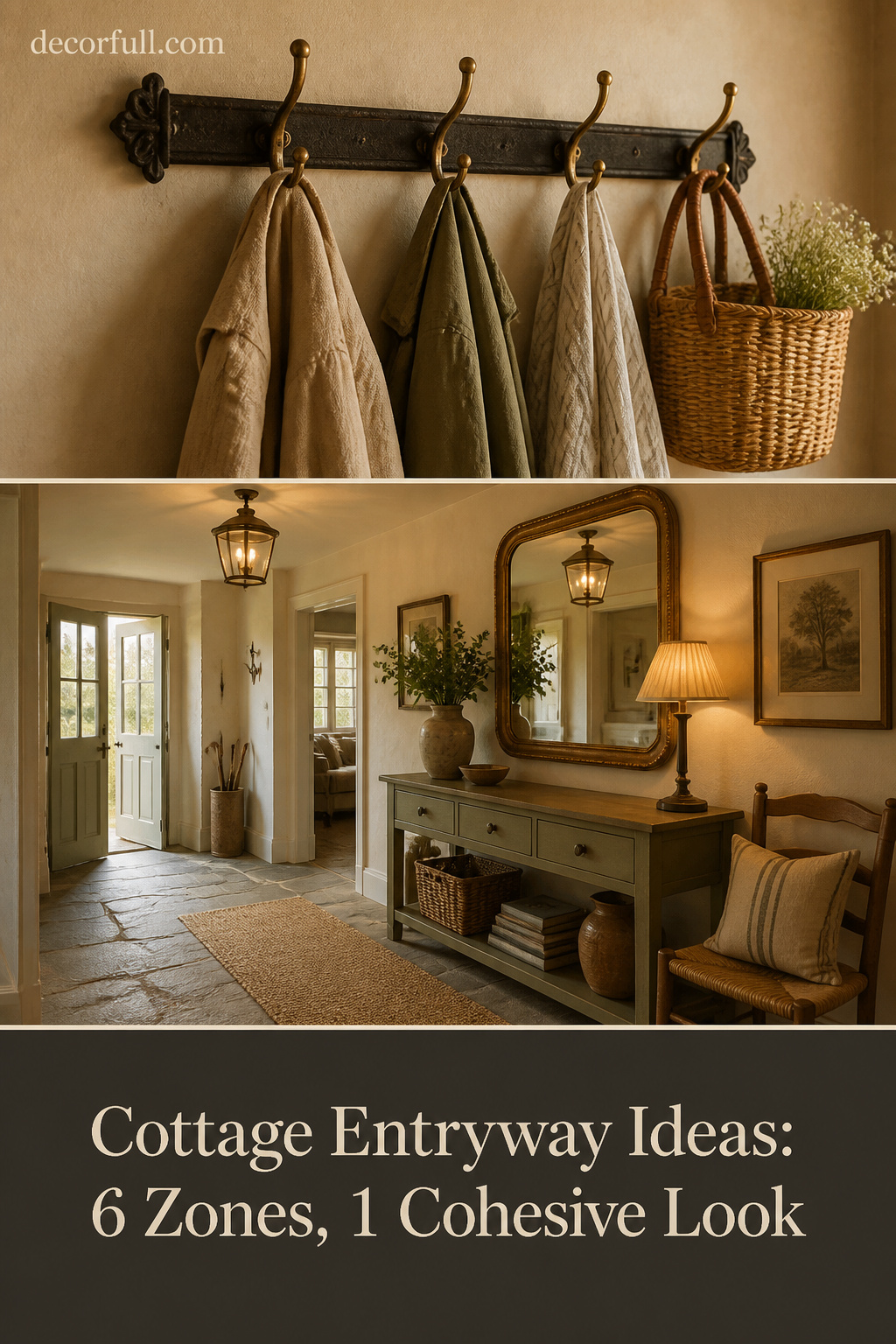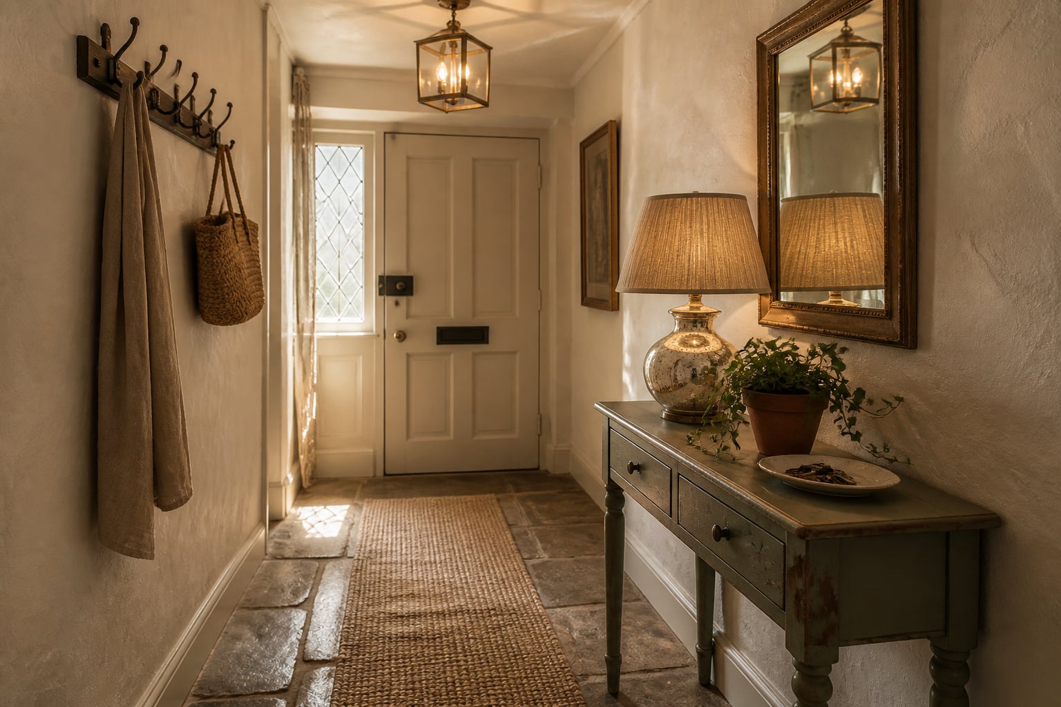

Save fifty cottage entryway ideas to a folder and a strange thing happens: each image is lovely, yet together they refuse to add up to a room you could actually build. One has a stone floor, the next a painted console, a third a wall of brass hooks — and nothing tells you which decisions hold the whole together. That gap between beautiful pictures and a coherent plan is where most cottage entries stall. The fix is not more inspiration. It is a framework, because every cottage entry, however small, is built from the same six working zones, and once you can see them you stop collecting pretty fragments and start making a hall that hangs together.
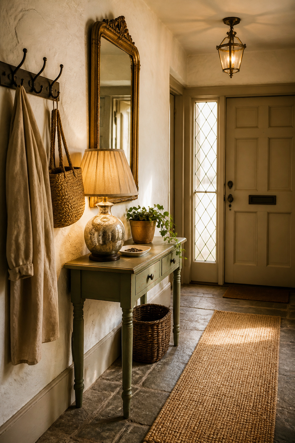
Look closely at the period halls that read as genuinely characterful and they are never the ones with the most ideas crammed in. They are the ones where six decisions — colour, floor, storage, light, the landing surface, and how to handle a tight footprint — were each made well and made to agree with each other. This guide walks all six at survey depth, so you finish able to name what your own entry needs, then hands you off to the deeper guidance where the detail lives.
What the Best Cottage Entryway Ideas Have in Common
Cottage character is not a colour or a single object; it is a quality of being settled. The materials look as though they have earned their place. The trouble with idea galleries is that they show you the settled result without the system underneath it, and a system is exactly what a coherent entry needs. So before any shopping, it helps to hold the whole entry as six zones rather than a pile of purchases.
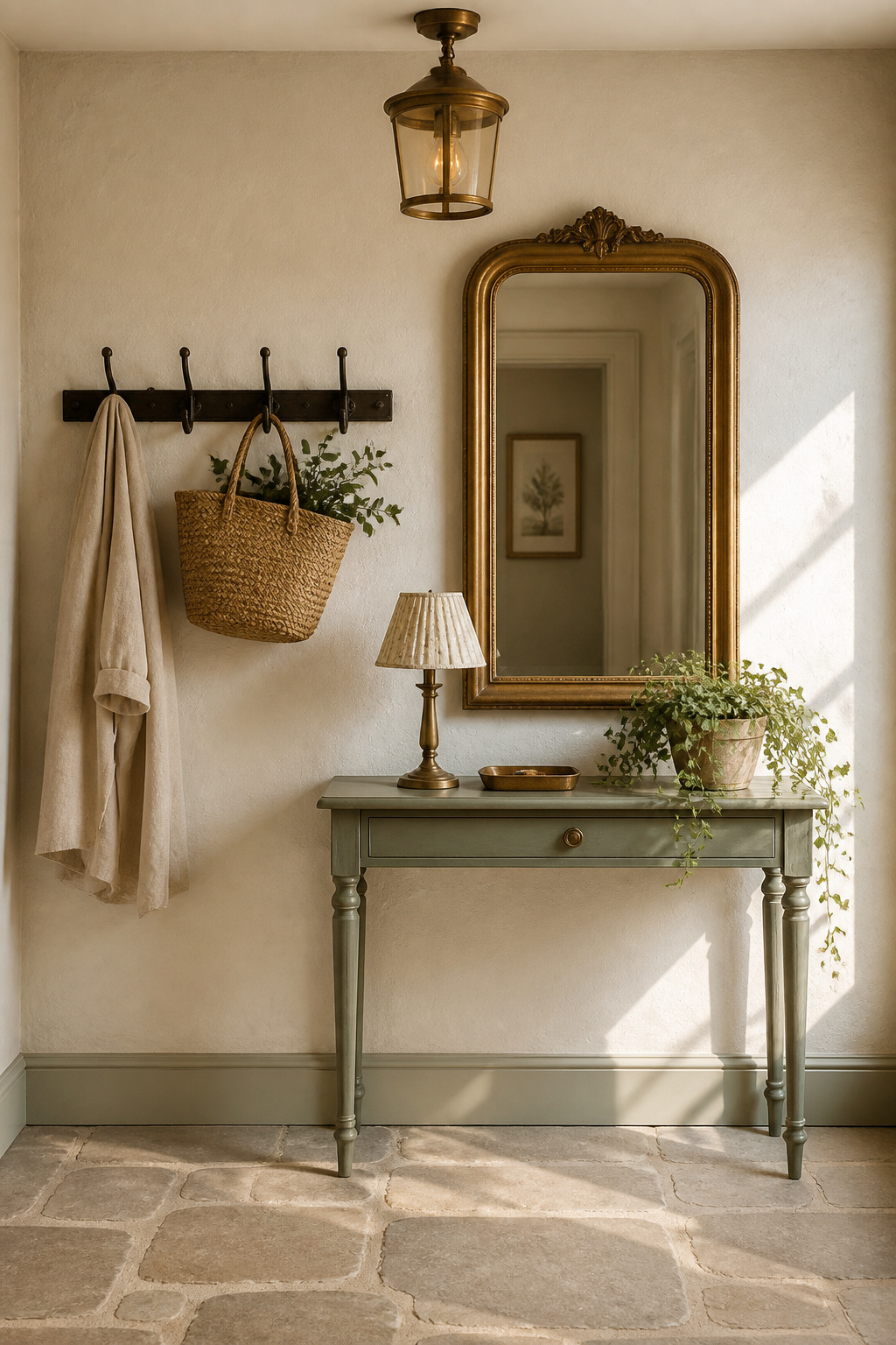
The six functional zones every cottage entry shares
Strip a cottage entry to its working parts and the same six zones appear every time, whether the hall is eight feet wide or barely four. Independent enough to plan one at a time, and connected enough that a decision in one constrains the next. As designer Artem Kropovinsky of Arsight puts it, “An entryway isn’t just a home’s first impression; it’s a taste, a teaser, of the narrative that unfolds within its walls” — which is the case for treating these zones as one story, not six separate buys.
| Zone | What it covers | The deeper guide |
|---|---|---|
| Colour and wall | Paint, wallpaper, panelling, trim | Paint colours and wallpaper |
| Flooring | Stone, tile, wood-look, runners | Durable cottage entryway flooring |
| Storage and hanging | Cubbies, baskets, hooks, peg rails | Mudroom storage; coat hooks |
| Lighting | Overhead, sconces, console lamp | Cottage entryway lighting |
| Console / landing surface | The table, mirror and daily-essentials tray | Styling the console |
| Tight-space management | Editing, slim furniture, mirrors | Narrow cottage hallway ideas |
Read the table as a map, not a checklist. Most of this article works through those rows in turn.
Heritage materials and why they read as cottage from the doorstep
A cottage entry announces itself through material before colour. Natural, slightly imperfect materials — reclaimed wood, stone, brick, woven wicker and rattan, wrought or cast iron — communicate age and permanence because their texture and colour variation cannot be faked by a flat factory finish. Alan George of Edward George London frames the modern-cottage palette the same way: “Think reclaimed wood, stone floors, and soft textiles like wool and linen. These components work together to create an atmosphere that is both modern and timeless.” Wall panelling does the same job vertically. Tongue-and-groove, beadboard or shiplap below a dado line adds the surface variation painted drywall can never produce, and it shields a high-traffic wall from scuffs into the bargain — a detail English cottages have used for well over a century.
The difference between cottage character and cottage clutter
Here is the line the galleries blur. Cottage character is curated; cottage clutter is merely accumulated. “One of the most common errors I see is the tendency to over-decorate, which can make even the largest entryways feel cramped,” warns Elissa Hall of EDH Interiors. The correction is intentional negative space — leaving some wall, some surface and some corner deliberately bare so the few genuinely good pieces register. A worn, painted finish and visible wood grain make a hall feel settled; the same pieces with three more objects crowded around them make it feel chaotic. “Entryways are thresholds,” note Tal Schori and Rustam Mehta of GRT Architects. “They should reflect something of the character of the home and people that lie beyond.” That is a brief for editing, not for filling.
Colour and Wall Treatment: The Backdrop That Sets the Tone
Colour is the backdrop every other zone is read against, so it earns the first real decision. A cottage entry wants warmth without going yellow, and depth without going dark — a narrower target than the paint aisle suggests, but a reachable one once you know the families that work.
Warm whites, creams, and heritage greiges — what works and why
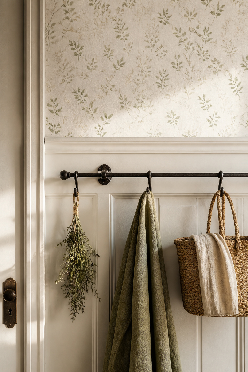
The cottage palette clusters in three bands: warm whites, soft creams, and heritage greiges. Benjamin Moore White Dove OC-17 is the single most-cited shade, and the numbers explain why. Its LRV of 83.16 makes it a true white with creamy-yellow warmth and a calming trace of grey — bright enough to lift a dim hall, warm enough never to read clinical. It reads progressively warmer in south- and west-facing light, and in the north-facing entries common to cottage architecture it balances cool flat light rather than amplifying it. Sherwin-Williams Alabaster sits beside it with a touch more cream body. For more depth without crossing into greige, Benjamin Moore Chestertown Buff HC-9 is a luminous heritage option; for entries that take more light and can carry a deeper tone, Farrow and Ball Elephant’s Breath and Little Greene’s French Gray bring genuine heritage pedigree, the latter rooted in eighteenth-century English interior tradition.
When wallpaper earns its place in a cottage entry
An entry is one of the best rooms in the house for wallpaper, precisely because no one lingers in it. A pattern that would tire you in a sitting room reads as a welcome surprise in a hall passed through in seconds. For cottage character, reach for vintage-inspired prints — classic florals, small botanical sprigs, damasks or narrow stripes — on a warm cream or stone ground that lets white architectural details stand out. The reliable move in a tight entry is the two-part treatment: panelling or wainscoting below a dado line, wallpaper above, so the pattern lifts the eye without overwhelming a narrow space. That backdrop is also what the console vignette is composed against, so the two decisions are really one.
Trim colour and its relationship to a tight entry’s proportions
Trim is where proportion is quietly won or lost. Painting the trim the same colour as the walls, with a higher sheen for subtle contrast, blurs the room’s edges and makes a narrow entry feel larger — particularly effective under five feet wide. On finish, specify eggshell or satin on walls and semi-gloss on woodwork; flat paint cannot survive a high-touch entry. Emma Bestley of YesColours is blunt about it: “This is a high-traffic area. The quality and finish of the paint must be a careful consideration.” The historic two-tone wall — colour or panelling to dado height, a softer finish above — was, as designer Celine Erlam of Indie & Co notes, “done in older buildings to hide scuffs and scratches, and to protect the walls,” which makes it both period-accurate and practical. This zone rewards real depth; the full palette logic, named shades and sheen rules live in the dedicated guide to cottage entryway paint colors and wallpaper.
Flooring That Survives a Real Entry While Reading as Cottage
The floor takes the daily abuse — wet boots, grit, the dog — so it is the one zone where charm and durability genuinely compete. The most authentic cottage materials are also among the toughest, and where they are not, modern porcelain stands in convincingly.
Stone, brick, and heritage tile — the durable originals
Natural stone is the original cottage floor, and slate is the standout for an entry: its cleft texture is rugged and rustic, its porosity low once sealed, and it stays slip-resistant even wet. Flagstone is the other heritage workhorse, flat and smooth for a cleaner look or textured for full rustic character, and after sealing it asks only for sweeping and a light mop with a pH-neutral cleaner. Stone’s hardness is its strength and its caveat — extremely durable, but tough underfoot over long standing, and prone to chip at unprotected edges under sharp impacts. One stone to avoid: limestone is the most porous of the family, stains and scratches readily, and is not recommended for a heavy-traffic entry.
Wood-look and patterned porcelain for modern performance
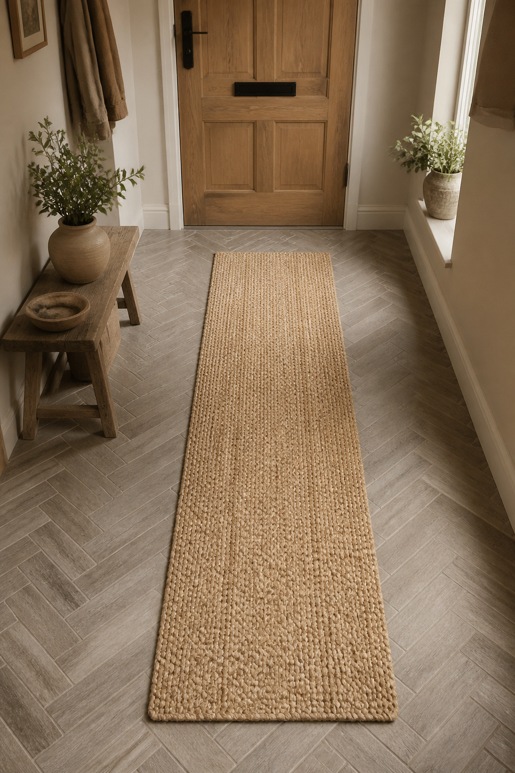
Where you want grain warmth with less maintenance, wood-look porcelain delivers the appearance of timber with the durability tile brings to a wet, gritty entry. For the strongest performance, porcelain beats ceramic outright. Pattern is where heritage and performance meet most happily: herringbone-laid porcelain is extremely hardwearing, and the laying pattern itself appears in English cottage and farmhouse floors as far back as the seventeenth century. Classic checkerboard, terracotta tones and natural stone looks dominate the cottage and farmhouse tile category for good reason — they have read as right in these floors for centuries, and still do.
| Flooring | Cottage read | Durability | Watch for |
|---|---|---|---|
| Slate | Authentic, rustic | High (sealed) | Hard underfoot |
| Flagstone | Authentic, characterful | High (sealed) | Edge chipping |
| Wood-look porcelain | Warm, grained | Very high | Choose porcelain over ceramic |
| Herringbone porcelain | Heritage pattern | Very high | Pricier to lay |
| Limestone | Soft, pale | Low | Stains; avoid in busy entries |
Runners and washable rugs: where pattern and warmth come in
Hard floors want softening, and a runner does three jobs at once. As designer Rachel Usher notes, a runner softens acoustics, protects the floor beneath, and adds texture in one move. Choose the fibre for wear: jute, seagrass and sisal suit cottage entries and take heavy traffic, and washable polypropylene-jute blends add practicality where moisture is a risk. The one firm rule is colour — avoid white. “That will show the most amount of wear and tear, and dirt immediately,” warns designer Brooke Speckman of Design Hutch; patterned or medium-toned wool hides real life far better. Leave at least twelve inches of bare floor visible on every side. The complete material-by-material breakdown is in durable cottage entryway flooring.
Storage and Hanging: Making the Hardworking Entry Charming
Storage is where a cottage entry most often tips from charming into chaotic, and the cause is almost always treating it as one problem instead of two. An entry has both things to hang and things to contain, and they want different solutions.
The reliable model splits the work cleanly. Wall-mounted hooks take the daily-rotation coats and bags — the items you want visible on arrival and grabbed on the way out. Contained storage — baskets, cubbies, cabinets — swallows everything that would otherwise pile up: shoes, accessories, the seasonal overflow. Mixing the two also reads better than either alone, because the eye moves between open hooks and closed baskets and finds that more restful than a wall of one or the other. Los Angeles designer Peter Dunham puts the case for the closed half plainly: “Any kind of storage for shoes seems like a good idea, but never looks tidy” — which is why shoes belong behind a basket lid or a cabinet door, not on open display.
On the contained side, built-in cubbies are the cottage ideal because they can be sized exactly, take no floor space, and accept a beadboard back for authentic character; budget fifteen to eighteen inches of cubby width per person. Woven baskets in jute, seagrass or willow hide clutter while adding the natural texture that reinforces cottage materiality. On the hanging side, height and spacing are not guesswork: mount an adult coat rail at sixty to sixty-six inches above the floor, and space hooks ten to twelve inches apart for coats, fifteen for heavy parkas. A peg rail at adult height pairs naturally with a lower second rail at thirty-six to forty-two inches for children aged four to ten. Each half has its own deep guide — the full contained-storage playbook in cottage mudroom storage ideas, and the hanging detail, finishes and fixings in coat hooks and rack ideas.
Lighting a Cottage Entry: Warmth Over Brightness
Lighting is the zone most often left to a single overhead bulb, and that one default undoes a great deal of careful work elsewhere. A flat wash from the ceiling shadows faces, erases depth, and reads as functional rather than welcoming. The cottage correction is to think in warmth and layers rather than raw brightness.
Fixture types for low cottage ceilings — semi-flush, pendants, and sconces
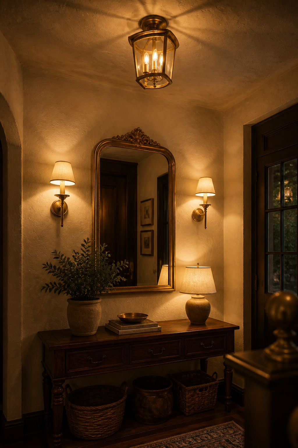
Ceiling height dictates the fixture. On a standard eight-foot ceiling, a semi-flush mount or short-drop pendant is the safe choice — a semi-flush drops only four to eight inches and holds the seven-foot floor-clearance standard, and nothing should hang down more than twelve inches total. Reserve a four-sided glass-panel lantern pendant, the most period-appropriate cottage fixture, for entries nine feet or taller where it has room to read. Sconces flanking a mirror or doorway add a second layer without using any ceiling height, which makes them especially useful in a narrow hall where a pendant feels imposing.
Aged brass, bronze, and lantern forms: why they suit heritage entries
Finish is what marries the fixtures to the rest of the entry. Aged brass and oil-rubbed bronze are the standard cottage recommendations precisely because they patinate rather than stay showroom-new, reinforcing the settled look the whole hall is reaching for. The full heritage-appropriate range runs through aged, antique and brushed brass, oil-rubbed and new bronze, and matte black for a modern-cottage edge. Brushed nickel and chrome read too contemporary for a traditional cottage and break the warmth — a small decision with an outsized effect on whether the entry feels of a piece.
Layering overhead and accent light in a small space
The cottage plan is three layers, not one fixture: a ceiling source for ambient reach, a sconce or picture light for mid-level fill, and a table lamp on the console for low, warm accent. Tie them together with colour temperature — warm white at 2700 to 3000K throughout. Anything from 5000K up turns clinical, greys out aged brass and chills cream plaster, undoing the warmth in a single bulb choice. A dimmer on the main fixture lets the same entry run bright for a morning departure and low for an evening return — one of the cheapest upgrades a small entry can have. The full fixture-by-fixture guidance, scale rules and layering plan are in cottage entryway lighting ideas.
The Console or Landing Surface: Function Meets Character
The console is the one zone that is mostly on display, and it is also the entry’s hardest-working surface — keys, post and the daily landing of pockets all happen here. Treated as decoration alone, it fails at the job; treated as job alone, it loses the character. The aim is both.
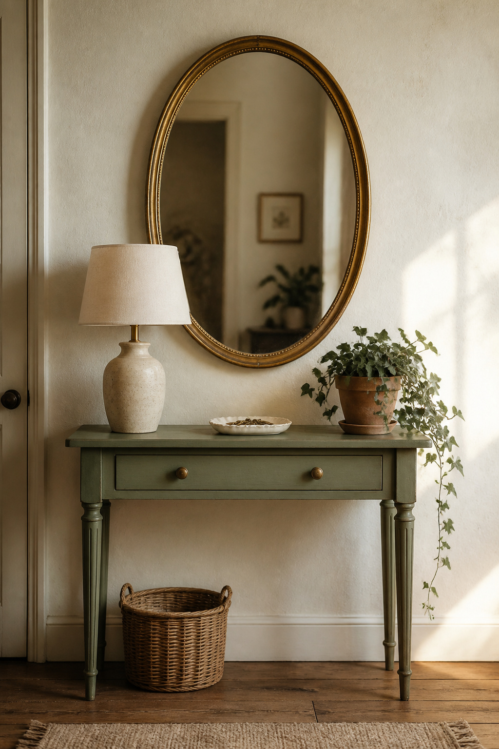
Table selection — scale, depth, and material for a cottage foyer
Get the dimensions right and the rest follows. Console height runs thirty to thirty-six inches; for cottage-scale entries with eight-foot ceilings, thirty to thirty-two inches is the practical sweet spot — below thirty reads as a low side table, above thirty-six as a sideboard. Depth wants twelve to sixteen inches: enough surface for a vignette without stealing the walkway, since a fourteen-inch console in a fifty-inch hall still leaves the thirty-six inches of clear passage an entry needs. Length should cover roughly two-thirds of the wall behind it. For cottage character, a rustic wooden console with turned or tapered legs carries presence even in a slim profile, and a painted finish in sage, off-white or aged navy suits the heritage palette better than raw wood alone.
The tray-lamp-mirror-greenery formula as a starting point
There is a reliable four-element formula for the surface: a console, a mirror or artwork above it, a vessel for daily essentials, and a light source. The mirror has its own proportions — roughly two-thirds to three-quarters the console’s width, centred at fifty-seven to sixty inches from the floor, and hung six to eight inches above the surface so a styled layer of objects can sit beneath it without the mirror appearing to float. As Jen and Mar of Interior Fox observe, positioning a mirror “above a console table” creates “a focal point… drawing your eye into the home from the entrance.”
Keeping the landing surface functional alongside its display role
Function is the half people skip, and it is the half that keeps the surface from drifting into clutter. A tray or bowl for keys, a small container for post, and easy reach to the lamp switch are the practical minimum; without them, daily items scatter across the styled surface and the look collapses within a week. A console with a drawer or a basket shelf below hides those essentials so the top stays dressed. This is also the zone where the console tolerates a bolder or more personal choice — the one piece in the hall where character and function genuinely overlap. The full selection-and-styling method, vignette variations and seasonal moves are in styling a cottage entryway console table.
When the Hallway Is Narrow: The Tight-Entry Playbook
Most cottage entries are small — period halls were rarely built with generous circulation — so a tight footprint is the rule, not a problem to apologise for. The instinct in a narrow hall is to add cleverer storage; the more reliable first move is to take things away.
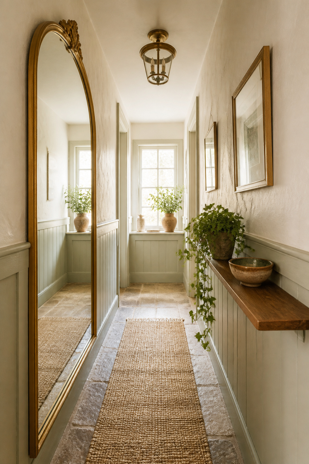
The clutter-discipline principle — editing before adding
A tidy hall reads as bigger even when the dimensions have not moved an inch. Clear floor and uncluttered surfaces signal openness, which is why hidden storage and a daily habit of clearing the console outperform any furniture purchase. The professional starting point is editing before adding: remove anything that does not serve one of the six zones before buying a single new piece. “Overcrowding with too many items makes this area feel too chaotic,” notes Isfira Jensen of Nufacet Interiors, “with less than optimal room for movement.”
Slim and floating furniture choices for restricted widths
When furniture does go in, keep it light on its feet. Hold thirty-six inches of clear floor passage at all costs — in a forty-inch hall that caps a console at twelve inches deep. Sleek-legged pieces and floating shelves let the eye and the light travel under and through them rather than stopping at a solid base, which keeps a narrow entry from feeling boxed in. A wall-mounted floating shelf, with no legs to interrupt the floor plane, is the most space-efficient landing surface for entries under forty inches wide.
Mirrors, vertical lines, and runner direction as space expanders
Three tricks expand a tight hall without construction. A large mirror hung opposite the natural light source nearly doubles perceived width and amplifies what light there is — a full-length mirror at the end of a hall draws the eye through and makes the corridor feel longer. Vertical lines lift the eye and add height: narrow stripes, vertical panelling, or tall slim frames in a column. And runner direction matters: laid parallel to the hall a runner elongates it, while one laid across bisects and shortens the space. The complete small-space method, with layouts for the tightest footprints, is in narrow cottage hallway ideas.
Putting the Zones Together: A Cottage Entry That Coheres
This is the part the idea galleries leave out, and it is the part that decides whether your entry reads as collected or merely cluttered. Six good decisions do not automatically make one good room — they have to be tuned to each other. Coherence comes from a shared palette and a sequenced order of operations.
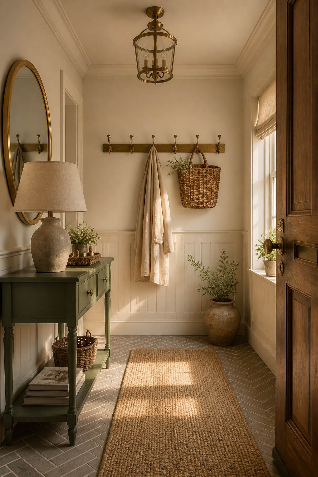
The connective tissue is tone. A soft-neutral family — warm whites, creams, stone greys — ties the natural-material zones (the flagstone or wood-look floor, the wicker baskets, the wooden console) to the decorative ones (wall colour, fixture finish). The floor sets the warmth register for everything: a warm-grey stone pulls the walls toward warm white, terracotta supports earthier tones, pale wood-look porcelain accepts a wider range. Metal finish wants the same discipline — pick one warm-metal family and hold it across the lantern, the hooks, the mirror frame and any metal legs. Mixing aged brass with chrome is the quickest way to break a palette that everything else got right.
A few assembly mistakes recur, and naming them is half the cure:
- Painting the entry a colour that ignores the adjoining room, so the hall reads as a separate decision rather than the first chapter of the house.
- Letting too many focal points compete — a statement mirror and a gallery wall and a bold fixture and an elaborate vignette, each fine alone, collectively exhausting. Give the entry one primary focal point, usually the console and mirror together.
- Mixing metal finishes with no single reference standard, so the hardware argues with itself.
- Choosing furniture scale by tape measure alone — a delicate console reads as lost under an eight-foot ceiling; a piece with presence anchors the same space.
The cure for all of them, as designer Catherine Wilson of CCW Interiors says, is to “design with the end in mind… create a comprehensive design plan before you make a purchase.” If you are starting an entry from scratch, work the zones in this order — structure before style:
- Flooring. Lay it first; it sets the warmth register and tells you which wall colours and metal finishes will sit naturally against it.
- Wall colour and treatment. Choose to complement the floor’s undertone, and make any wallpaper or panelling decision now.
- Lighting. Specify and install fixtures before furniture arrives — they are fixed points the console and mirror are then arranged around, not the reverse.
- Storage. Fix peg rails, hooks and any built-in cubbies to the wall next, since they own their own wall zone and their height relationship to the console matters.
- Console and mirror. The last big furniture decision, sized around the clearances the floor and wall layout already set.
- Runner, vignette and greenery. The finishing styling pass that turns a functional hall into a characterful cottage welcome.
That sequence is the whole framework in working order. You no longer have fifty unconnected images; you have six zones, a tonal thread to run through them, and an order to act in. Start with the floor, let each decision narrow the next, and the entry that emerges will feel collected over time rather than assembled in an afternoon — which is, in the end, the only thing that ever made a cottage entry feel like a cottage.