There is a particular frustration in a sideboard that has been styled and still looks wrong. You added the vase, the books, the little brass thing, the second little brass thing. Each object is fine alone, but together they read as busy and unresolved — nothing like the calm surfaces you see in interiors images. When a surface looks off, the instinct is to add one more piece to balance it, and that instinct is the problem. Good modern sideboard styling rarely comes from adding; it comes from deciding what to remove, then trusting the space you create.
TL;DR
- Work in a tight neutral palette — one warm neutral, one cool, one natural material — and let texture replace pattern; matte stoneware, cane, linen and wood grain carry a modern display without a single painted object.
- Use three objects at different heights and stop there; designers leave 30–40% of the surface bare, and on a minimalist credenza that proportion runs closer to 40–50%.
- One off-centre lamp and one large artwork finish the composition — a symmetrical pair of lamps or a gallery wall both fight the restraint you are trying to build.
Why Modern Sideboard Styling Starts With What You Remove
Modern minimalism is not a competition to own less. It is a decision about what gets to stay. Scandinavian interiors read as calm not because they are bare, but because everything in them was chosen on purpose — the discipline is in the editing.
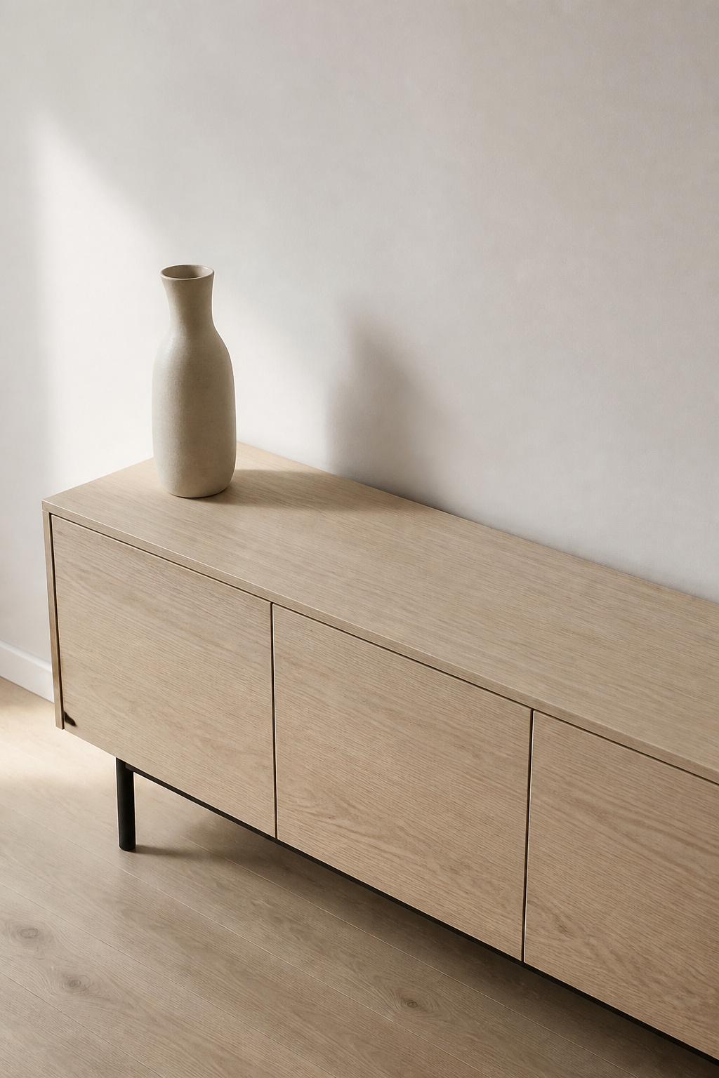
Emptiness is a material, not an absence
Most people read empty surface as a job left unfinished. Designers read it as an element in its own right. The space around and between objects — negative space — balances visual weight and lets the few things you keep actually register. A single artwork on a blank wall has more impact because nothing competes with it; the same logic governs a sideboard top. The gaps are part of the composition.
There is a Swedish word for this instinct: lagom, roughly “just the right amount” — neither too little nor too much. On a sideboard, it is the difference between a surface that breathes and one that strains.
What “minimalist” actually means here
Minimalist does not mean less taste; it means more decision. Every object earns its place by doing visual or practical work, and the absence of clutter tells a visitor that what remains was chosen, not accumulated. My grandparents’ summer cottage on the archipelago had unpainted pine walls, oil lamps, and a single open shelf of everyday crockery. Nothing was styled. Yet that shelf has stayed in my head for years as the clearest picture of enough I know — the standard a modern surface reaches for.
The reset: clear it first
Before you place anything, take everything off and start from bare wood. This sounds obvious, yet almost nobody does it, because we style by addition — nudging the existing pile rather than rebuilding from nothing. With the surface empty, you can read its proportions, see where the daylight falls, and decide what the display should be before a single object goes back. The principles below assume you have done this; for the wider survey first, our dining room buffet decor guide covers the fundamentals every style shares.
Palette: The Case for a Tight Neutral Range
A modern surface holds together because its colours are disciplined, not because its objects match. The method I keep returning to is three tones and no more: one warm neutral, one cool neutral, one natural material. This is my own working rule rather than an industry standard, but it holds.
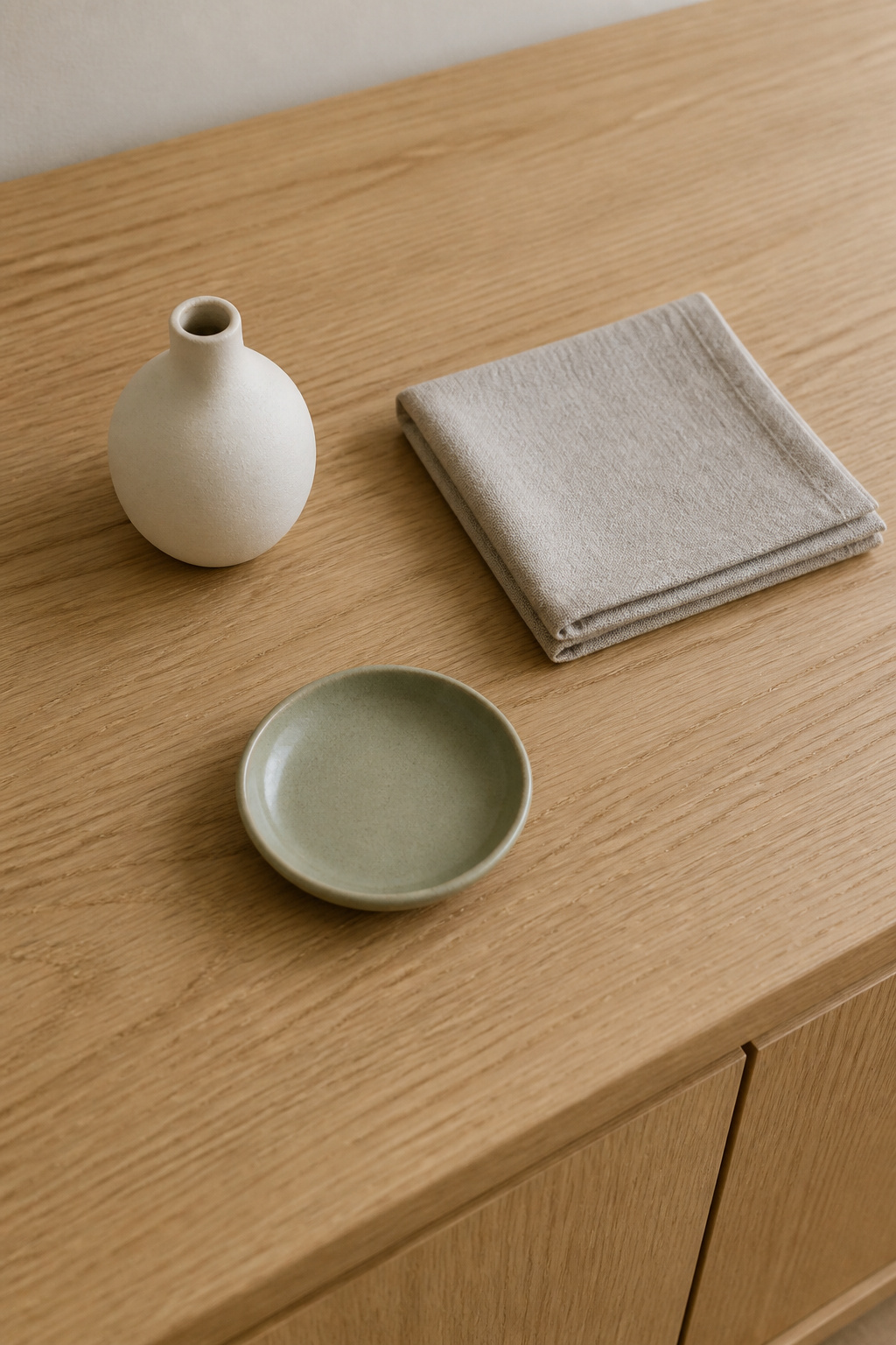
Why styling works in threes
Warm neutrals — cream, soft taupe, warm white — make a surface feel inviting. Cool neutrals — pale grey, greige — keep it from going sweet or heavy. Pair one of each and the display reads as neither cold nor cloying. The third tone is natural: wood grain, stone, raw clay. The furniture’s own timber counts, which is why a walnut or oak credenza is already a third of the way to its palette.
| Tone role | Where it lives | Example |
|---|---|---|
| Warm neutral | One object | Cream matte stoneware vessel |
| Cool neutral | One object or textile | Greige folded linen |
| Natural material | The surface or a found object | Oak grain, a pale river stone |
| Accent (optional) | One small object, once | A single sage dish |
The accent move, used once
A neutral base is the ideal ground for one deliberate colour — and the key word is one. An accent is punctuation, not a theme; a single sage dish lands harder against a quiet surface than it would in a colourful one. Two accents stop punctuating and start arguing.
Materials as colour
This move separates modern from traditional styling. Instead of painted or glazed objects supplying colour, the materials do it: wood, stoneware, linen, jute and stone all carry tone and warmth without a drop of pigment. Choose objects for material first and shape second, and the palette mostly takes care of itself.
Texture Over Pattern: Wood, Stoneware, Cane and Linen
If colour is disciplined, texture is where a minimalist surface earns its interest. Pattern adds noise; texture adds depth without raising the volume.
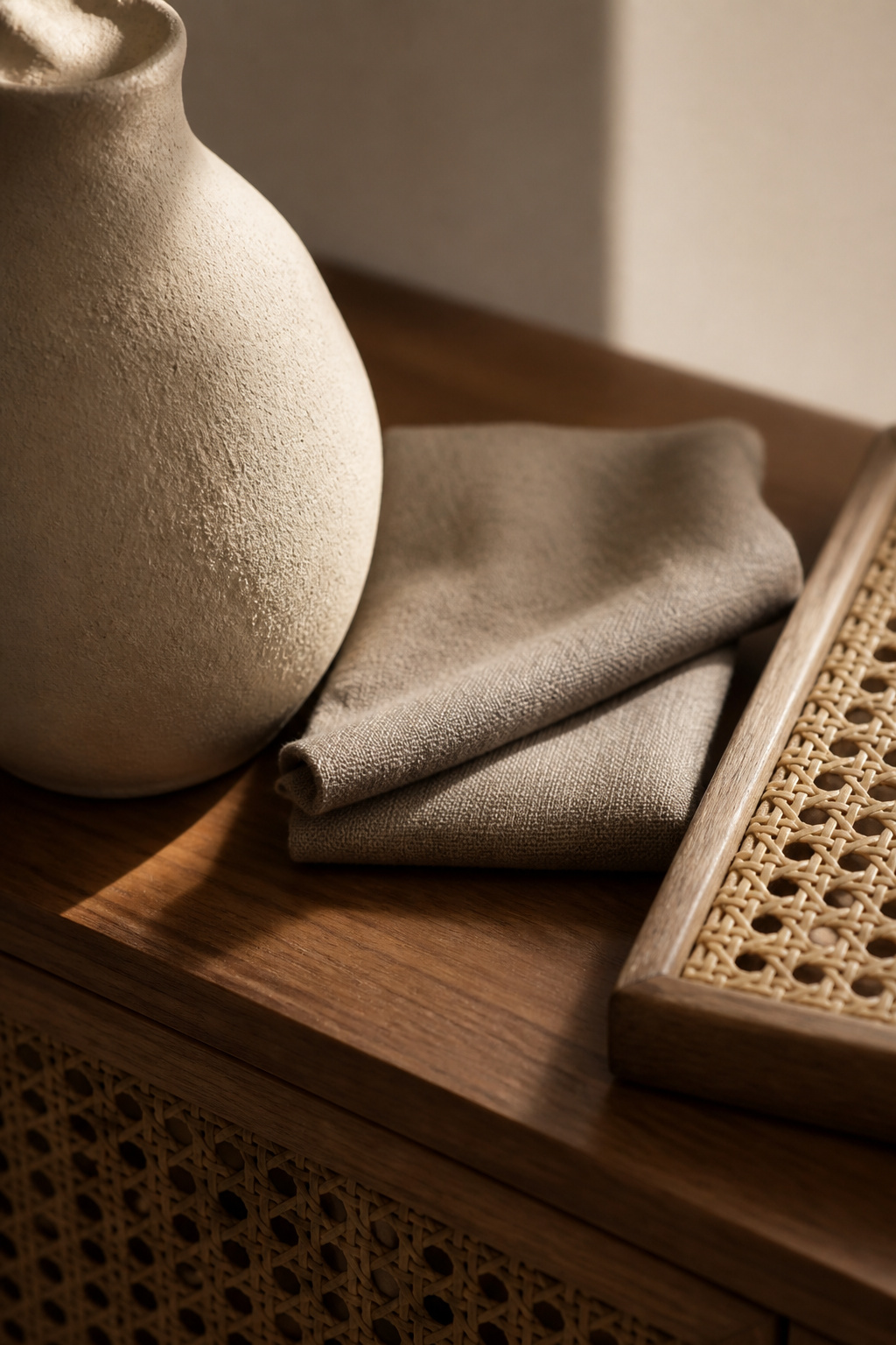
The four material categories that carry the display
Four material families do most of the work.
- Wood — the structural, warm base, usually the sideboard itself.
- Stoneware — thick, matte and earthy; minerals in the clay give it natural brown, grey and green tones.
- Cane or rattan — woven and light, it filters daylight rather than blocking it.
- Linen and natural fibre — soft and tonal, the counterweight to harder objects.
Two or three of these in one display is plenty; the discipline is in the pairing.
Mixing texture without pattern
The trick is contrast, not similarity: smooth ceramic beside woven cane, soft linen beside hard stone. That contrast is what makes a display look composed rather than thrown together. Cane is the most forgiving of the four — it sits happily next to warm wood and a cool black metal lamp base alike. But on its own it goes soft and purely decorative; it needs a harder counterpoint, a stone or a ceramic, to read as deliberate. These are pairings I have settled on over years, not catalogue rules.
Which finishes belong
Matte and satin, almost always. Matte stoneware absorbs and diffuses light instead of bouncing it, giving it that soft, considered look minimalists are after. High-gloss does the opposite — a glossy white object reads hard and graphic, and fights the warmth of the wood underneath. Metallics earn a place only as a small accent — a thin brass edge, a single dark candle holder — never as the primary texture.
Three Objects: The Composition Rule for a Modern Surface
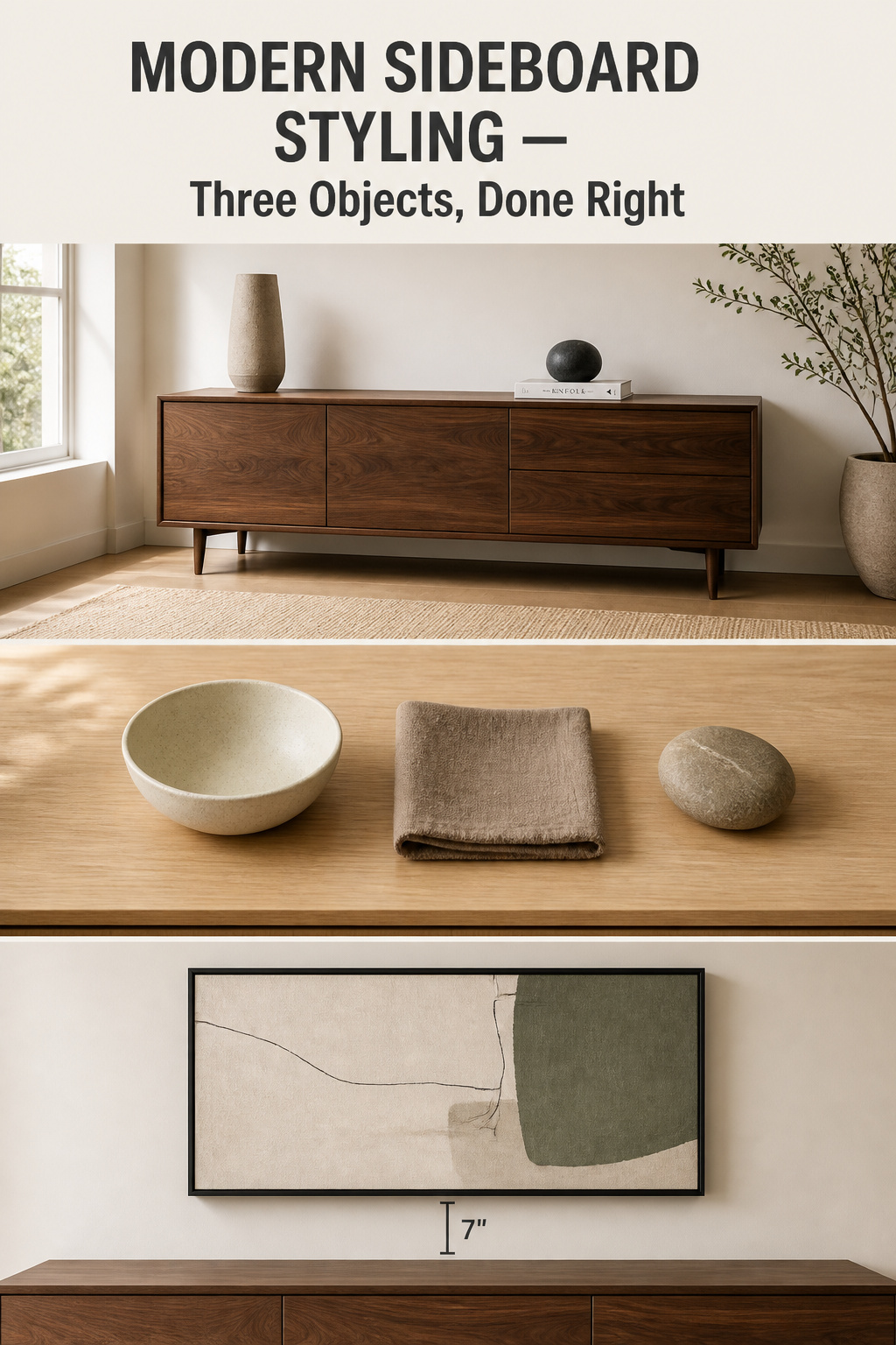
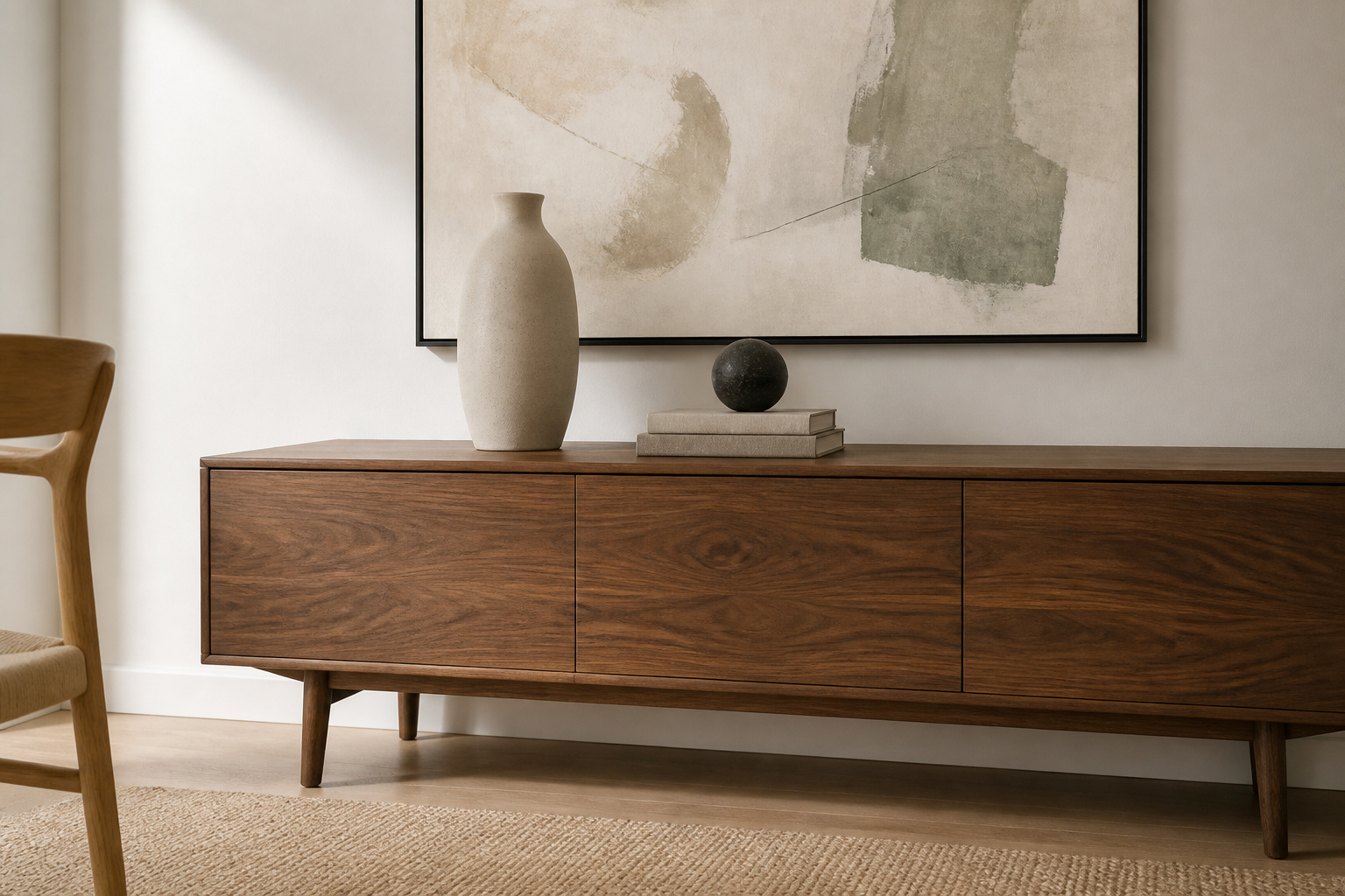
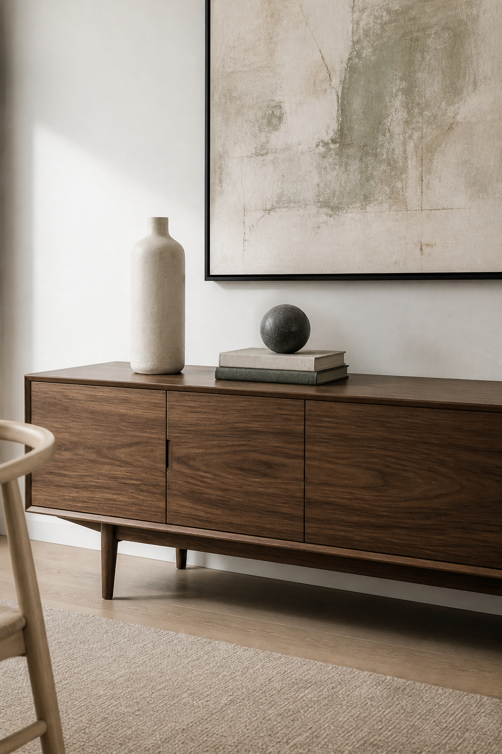
Here is the one number to commit to: three. Not “a few,” not “keep it simple” — three objects, then stop. Three is the smallest group that forms a real composition. A pair reads as symmetry, a single object has nowhere for the eye to travel; three keeps it moving.
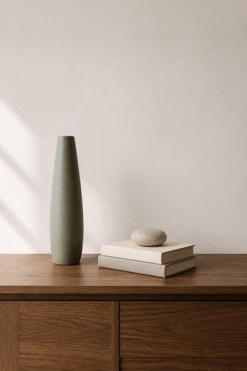
Why three and not four
Odd numbers resist being split into matching pairs, so the eye keeps wandering between elements instead of settling. Four objects pull toward symmetry, which on a casual surface reads as static and faintly formal. When you feel the urge to add a fourth thing to fill a gap, stop — the gap is the composition.
Height: a narrower range than you think
Give the three objects clearly different heights — one tall, one medium, one low — so they form an implied triangle the eye can climb. But modern styling wants a tighter range than maximalist styling. The tall element should sit at roughly one-third of the sideboard’s height, the largest object at around one-third of its length. Push the scale to extremes and the display turns theatrical.
Negative space as the fourth object
Treat the empty surface as something you are placing, not space you failed to use. Designers routinely leave 30–40% of a sideboard bare; on a minimalist surface I push that toward 40–50%. You need not spread the objects evenly: grouping all three to one side with a clear run of bare wood on the other is a fully intentional composition — often stronger than a centred, balanced one that looks staged.
Lighting the Minimalist Sideboard: One Lamp, Used on Purpose
Lighting is the facet most people get backwards. The traditional move is a matched pair of lamps, one at each end — and on a minimalist sideboard, that symmetry is exactly what you do not want.
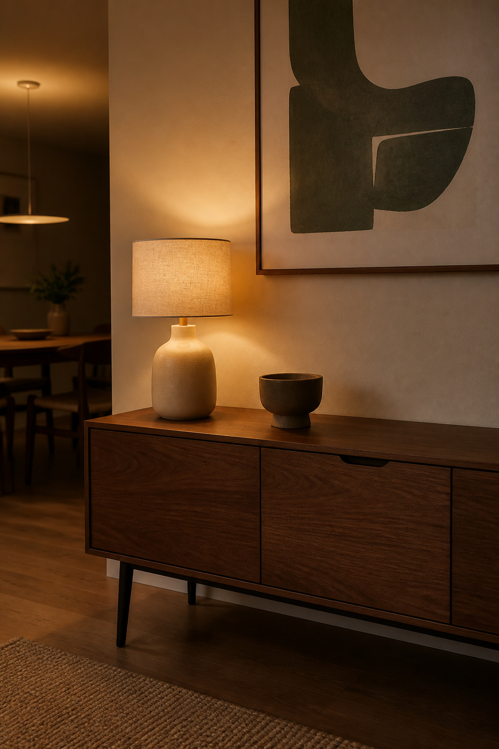
One lamp, off-centre
A single sculptural lamp set to one side gives the balanced-asymmetric look modern styling lives on — the same odd-number logic that governs the three objects. Because modern rooms usually carry recessed ceiling light for the ambient load, the lamp can be chosen for form over output. Designer Linda Merrill makes the principle clear: in a modern space, the lamp is “placed to the side,” with “form taking precedence over function.” A strongly shaped lamp doubled into a pair becomes lamps on parade; alone, it is the tallest element and counts as one of your three objects.
Shades and bases that fit
Keep the lamp inside the palette. A linen drum shade weaves in the same natural-fibre texture as the surface and softens a single bulb. A matte ceramic base in cream, sage or warm grey echoes the stoneware beside it, so the lamp reads as part of the family rather than an intruder — not a patterned shade or an ornate base that tells its own story.
Evening mood
Fit a warm bulb — 2700K is the practical minimum for warm white — on a dimmer. By daylight the lamp is a sculptural object; switched on in the evening it becomes the warm centre of the zone, activating the warm undertones in the wood and clay. That shift is most of what makes a minimal surface feel lived-in rather than staged. For the full treatment, our guide to sideboard lighting goes deeper than I can here.
One Large Artwork: The Wall Decision That Completes the Modern Vignette
The surface is not finished until the wall above agrees. For a modern sideboard, the answer is almost always one large piece — or, deliberately, nothing.
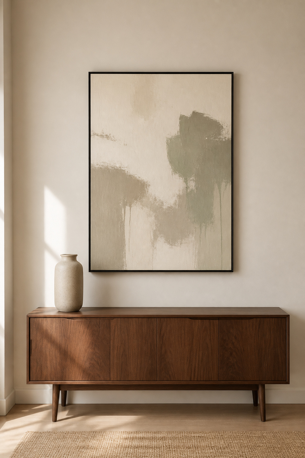
One large piece, not a gallery
A single oversized canvas keeps the wall clean and makes one strong focal point; a gallery wall reintroduces the complexity — frame choice, spacing, subject variety — that the surface styling worked to remove. The piece should span two-thirds to three-quarters of the sideboard’s width, never more: a 60-inch sideboard wants a 40–45-inch piece. The full hanging mathematics live in our guide to art above the sideboard.
Scale, frame and subject
Modern dining rooms take abstract marks, line drawings or large-scale photography — muted earth tones in off-white, cream and pale sage suit a quiet surface best. A narrow black frame reads graphic against a warm white wall; a thin oak frame reads warmer and sits closer to the material palette. Set the bottom edge 6–12 inches above the surface — eight to ten is the comfortable midpoint — so the wall and surface read as one vignette, not two zones.
When to leave the wall empty
An empty wall behind a composed surface is a real choice, not a gap you ran out of budget to fill. The same negative-space logic works vertically: with nothing above, attention drops to your three objects and the sideboard becomes the focal point. This is my own position rather than a hung rule, and it asks something of the piece — leave the wall bare only when the sideboard has the material presence to carry the room alone, a strong walnut grain or a cane front that holds the eye unaided.
A modern sideboard, then, is not a surface you decorate but one you compose, then edit back: a three-tone palette, texture in place of pattern, three objects with the rest of the wood showing, one lamp, and one artwork or none. Do that and the surface stops looking busy and starts looking decided. Start tonight by clearing it completely; you will see what it wants before you put anything back.
FAQ
How do you style a modern sideboard without it looking bare?
The line between bare and minimalist is intention. One object chosen on purpose — a tall stoneware vessel or a lamp — beside visible bare wood reads as designed, while an empty surface reads as forgotten. Use three objects at varied heights in a tight neutral palette, and let a lamp at 2700K turn the surface into a lit vignette.
What goes on a minimalist credenza in a dining room?
Three objects from the same material family: one tall matte ceramic vessel, one medium textural element such as a stone or folded linen, and one low piece like a small tray. Keep the palette to cream, warm grey and natural wood. A single plant — a slim stem or small pothos — adds a living note plus easy height.
How many decorative objects should be on a modern sideboard?
Three is the consistent recommendation: a tall, a medium and a low object. Three is the smallest odd number that forms a dynamic composition, where two reads as a pair and four tips into clutter. Leave 40–50% of the surface deliberately empty. A lamp counts as one of the three and doubles as the tallest element.