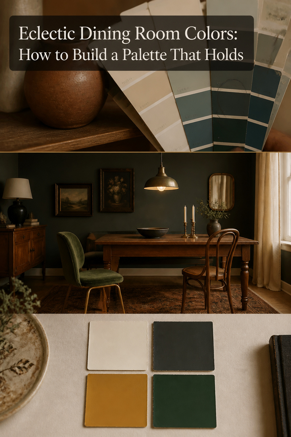
Here is the part nobody tells you about eclectic dining room colors: rooms that feel chaotic almost never have too many objects. They have too many colours. You do not calm a busy room by removing the mismatched chair — you calm it by editing the palette down to three colours that share one undertone.
TL;DR
- Limit an eclectic dining room to three to five colours including neutrals; past five, the room reads as noise no matter how good the individual pieces are.
- Pick one shared hue and repeat it in at least three different items — a ceramic, a chair, a small painted detail — so the eye reads it as intention, not accident.
- Keep every colour in the same undertone temperature (all warm or all cool); mismatched undertones are the reason a room feels wrong even when each colour looks fine on its own.
The Counterintuitive Rule: Fewer Colors, Not More
The word eclectic sounds like permission to use any colour you like. It is the reverse. The more sources your objects come from, the tighter your colour control has to be — the room is already carrying variety in shape, age and material, and colour is the one thread holding all of it together. This is the principle that runs underneath every other choice on the eclectic dining room styles and options we cover on this site.
Why noisy rooms have too many colors, not too many objects
The standard design prescription is plain: hold the working palette to three to five main colours, neutrals included. Beyond five, visual chaos is the usual result. So before you remove a single chair, count the colours. The problem is almost always there.
The lagom principle applied to palette selection
In Sweden we have a word, lagom — not too much, not too little, just right. Applied to colour, it does not mean a beige room. Build warmth through tone and texture rather than more hues: the depth of a velvet, the grain of oak, the matte of a glazed pot — not another paint colour.
What “one shared hue across every element” actually means
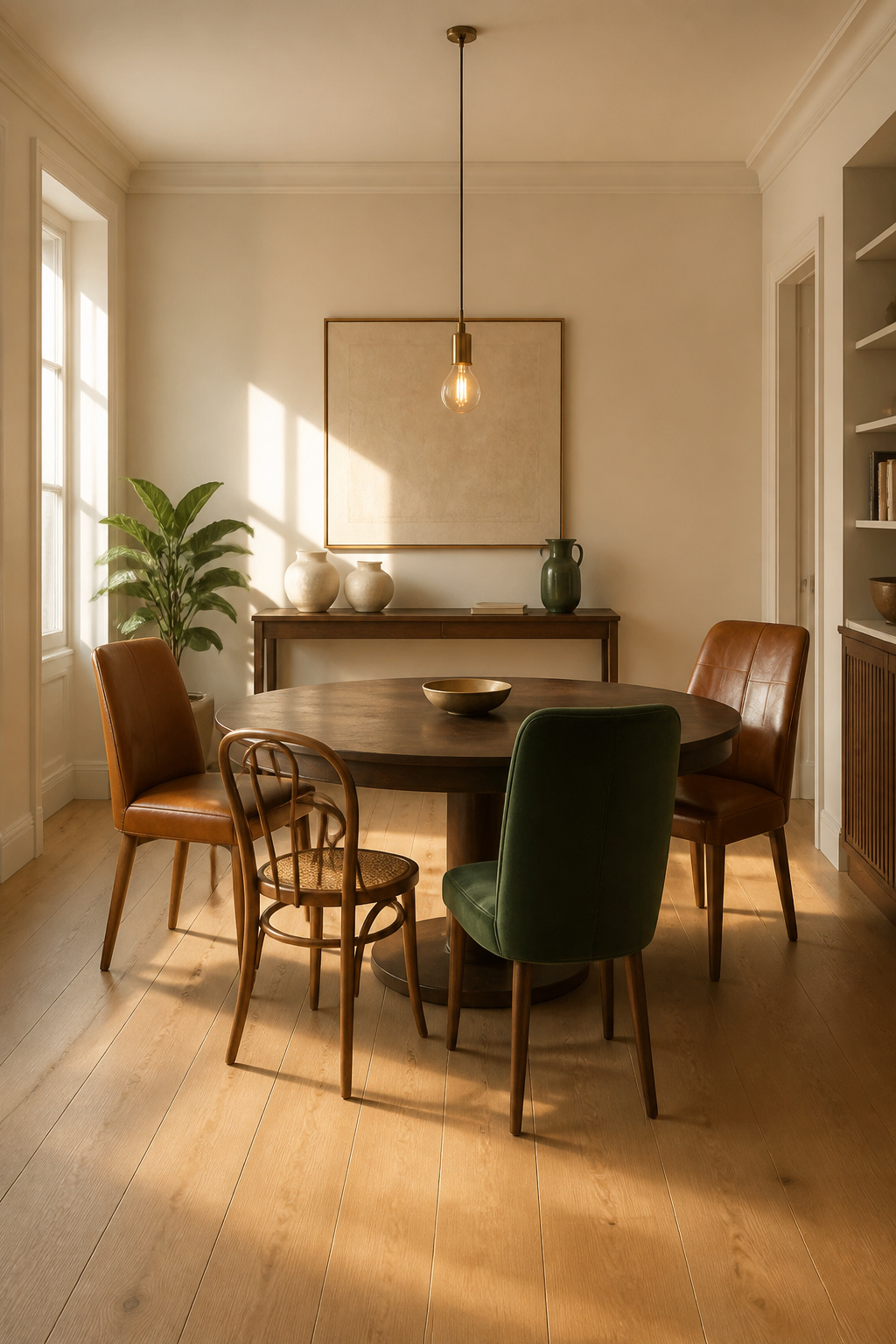
Take one hue and place it in three or more different items — a vase, a chair seat, a painted detail inside one alcove. Its presence in three separate places is enough for the eye to register it as deliberate. The shared colour is what lets an antique and a modern chair agree without matching.
Picking the Shared Hue That Ties Every Element Together
Start with what you already own. If there is an heirloom rug, a chair you love, or a piece of art you would not part with, your dominant colour is already decided.
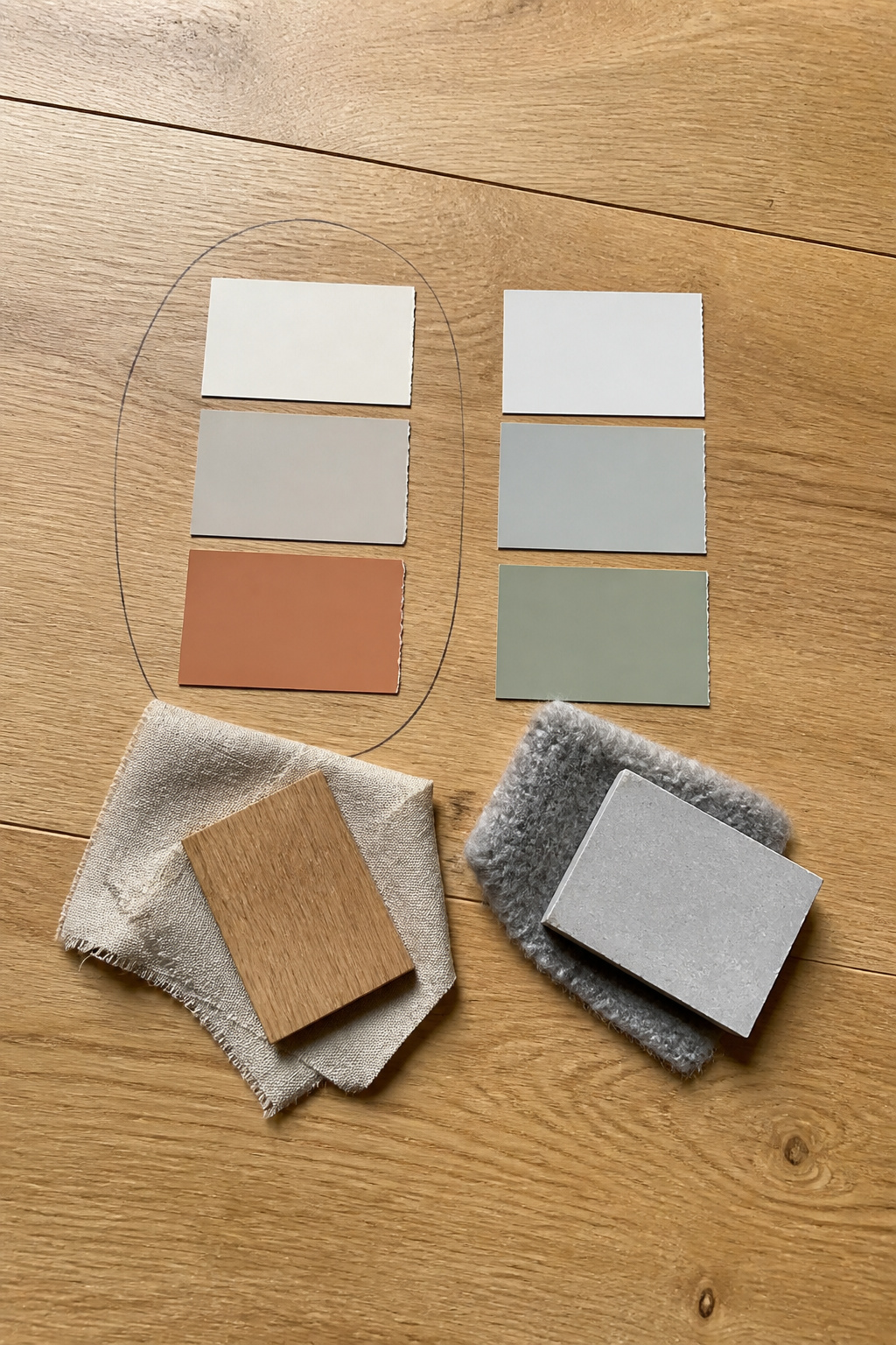
Pulling the connecting color from existing pieces
Start with the hero piece — a patterned rug or large artwork is especially useful because it has already proven which colours work together. Take its dominant colour and make sure it reappears in at least two other items. A paint fan deck helps: hold the strips against the piece to find the closest match, then read the undertone family. Emily Henderson’s studio recommends exactly this — the deck tells you the undertone, which is the decision that matters more than the colour name.
Warm versus cool undertones, and why a mismatch feels wrong
The usual cause of a room that feels faintly off is clashing undertones. Warm colours carry more red — pinkish, creamy. Cool colours carry more blue and green. The test is comparative: hold any two pieces side by side. The temperature difference is invisible in isolation and obvious the moment they touch. Keep roughly 60 percent of the room to one undertone temperature and the tension disappears.
The shared hue does not have to be a color
A warm neutral works as the thread as effectively as a saturated colour. Warm white, aged linen, greige — all carry a shared warm undertone without adding visual weight. White oak flooring with its honeyed undertone, an unfinished pine shelf, a linen runner: a dining room using all three has already set a shared hue without choosing a single paint colour. Let the materials do the unifying.
How Many Colors an Eclectic Dining Room Can Hold
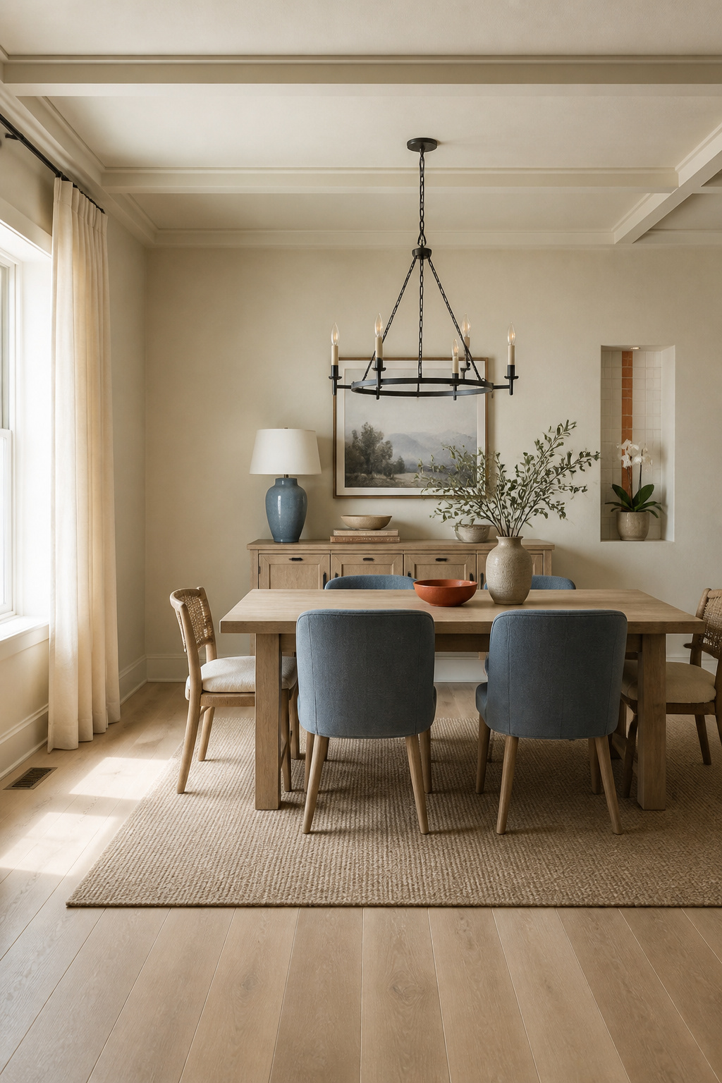
The industry standard is the 60-30-10 rule: 60 percent dominant colour (walls, floor, large furniture), 30 percent secondary (upholstery, rug, curtains), 10 percent accent (ceramics, art, small objects). Three percentages are more than most people can hold in their head while shopping, so I reduce it to two questions: what is my quiet colour, and what is my one speaking colour? Answer those and the proportions mostly take care of themselves.
| Palette type | Neutral base | Accent count | Risk level |
|---|---|---|---|
| One quiet, one speaking | Warm neutral (60%) | 1 | Low — the forgiving choice |
| Quiet plus two supporting | Warm neutral (60%) | 2 at 15% each | Medium — needs matched undertones |
| Dark base, warm metal | Charcoal (60%) | 1 + brass | Medium — commit fully or not at all |
If I had to commit you to one row, it is the first: one quiet colour, one speaking colour, proved before you add anything else.
The 60-30-10 rule, simplified to two decisions
The dominant 60 percent should almost always be a neutral. The 30 percent is where the room’s character lives — you can split it into two supporting colours of 15 percent each, but only if both share the same undertone temperature.
Anchor neutrals: the role of a dominant quiet color
Whites, beiges, soft greys and warm earth tones harmonise diverse pieces without competing. Broad neutral surfaces punctuated by concentrated moments of colour — that rhythm is what keeps the eye comfortable in a mixed space.
Accent colors: how many, how saturated, where to place them
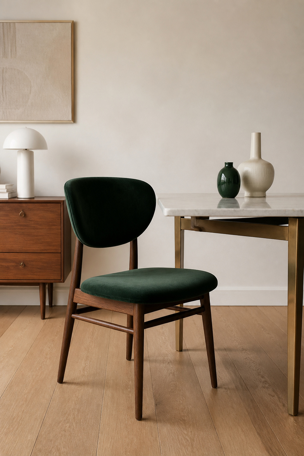
Use one accent at 10 percent — ceramics, art, a single upholstered chair. A common error is putting all the accent into one object: a single saturated velvet chair carries more visual tension than that chair plus two small pots in the same hue. Three placements at eye level read as intention; one reads as an outlier. Those same palette colours are what let you start mixing patterns within the palette without the room tipping into clutter.
Four Eclectic Color Palette Directions That Work
Warm neutrals with one deep accent is the most forgiving starting point. Ground the room in creamy white walls, warm oak or walnut, aged linen — then add one deep accent: forest green, burgundy, navy. The neutrals absorb any mismatch between furniture periods, and aged brass acts as a natural bridge between neutral and jewel tone.
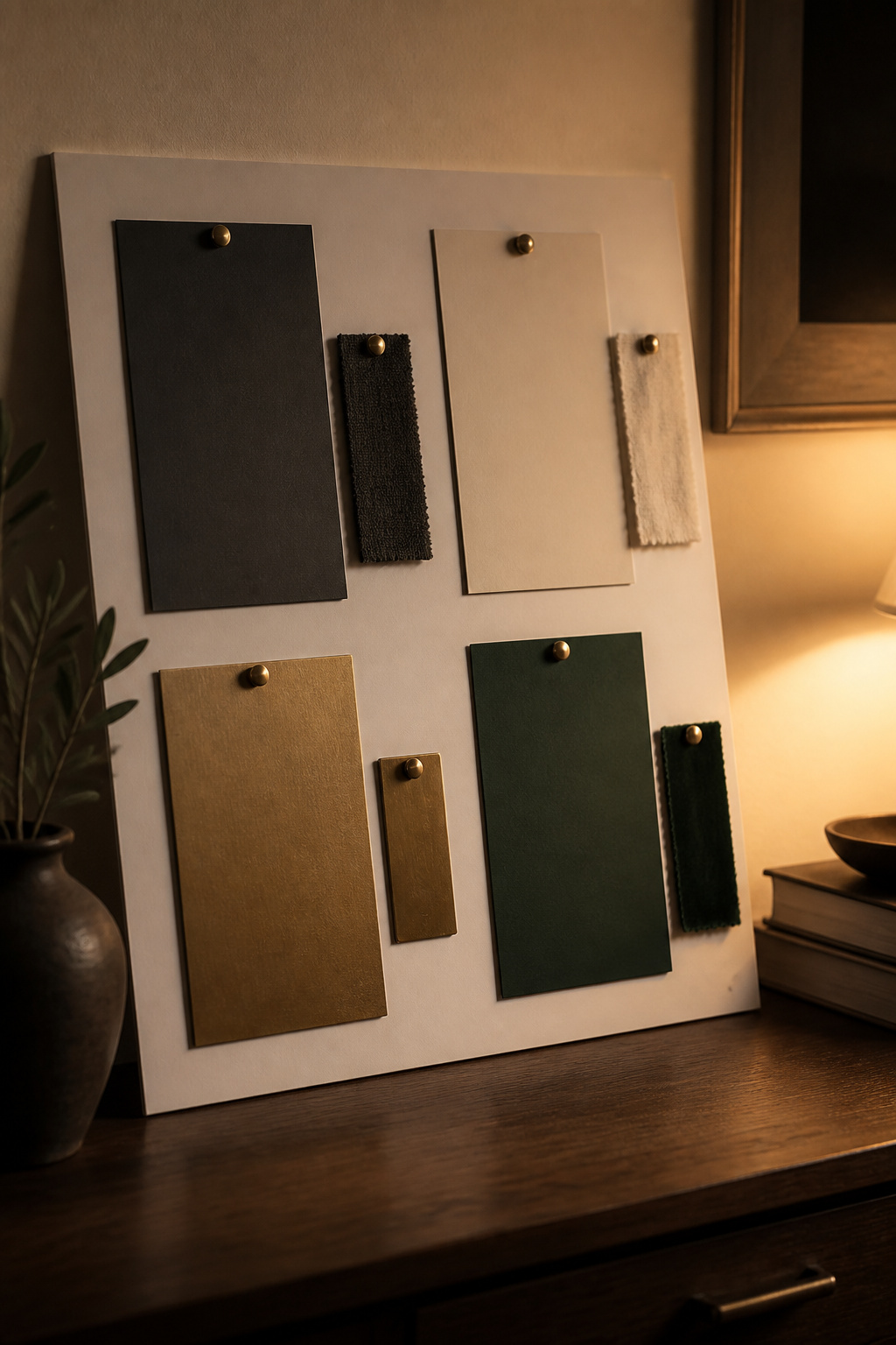
Dark and moody asks for nerve. Charcoal walls set an intimate tone the occasional-use dining room can carry, but only if you commit fully — a half-hearted dark wall against light furniture produces a muddy result. Pair with aged brass and warm wood, never chrome.
Earthy and global pairs terracotta, ochre and deep teal with rattan, ceramics and linen. Keep cream or ivory in the mix to stop terracotta reading heavy; ochre warms it while deep teal supplies complementary contrast.
Restrained and collected — ivory, black, and one botanical green — is the direction closest to my own eye. The green keeps the ivory-and-black base from reading graphic or cold. The one thing that collapses it: a green that goes bright. Choose muted forest, sage or deep olive — never lime or yellow-green.
Anchoring With Neutrals So Bold Accents Read Intentional
A neutral surface gives the eye somewhere to rest. That rest is what makes a bold colour read as chosen rather than as too much.
How much neutral surface area an eclectic room needs
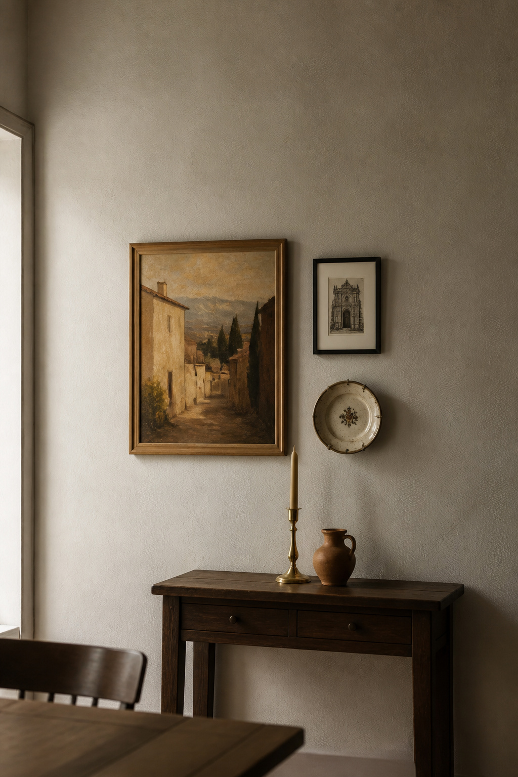
The working target is roughly 60 percent quiet surface — a dining room usually clears that mark if both walls and floor are neutral. Buy your big pieces in neutrals and let the small, swappable things carry the colour. When the palette evolves, you replace a few pots, not the furniture.
Walls, floor, or furniture: which surface carries the neutral
Walls hold the largest single neutral surface in a standard dining room. Paint them neutral before any eclectic piece arrives and the room’s structure is set. The floor is a permanent carrier — a warm wood, stone or tile floor locks in the room’s undertone temperature for the life of the space, so choose its warmth deliberately. If you have gone dark on the walls, the neutral field has to move to the furniture instead: light upholstery, a pale rug, cream linen. Those same neutral surfaces also set the stage for choosing light fixtures, whose finishes and bulb warmth read directly against the palette you have built.
Testing the Palette Before You Commit
I photograph rooms at 7am in February: if a space holds in the worst light of the year, it holds in every other light too.
The worst-light test, adapted for dining rooms
A dining room is used mostly in the evening, under warm artificial light — a completely different condition from morning sun. Test the palette at night, under its real fixtures. North-facing rooms get the coolest, bluest daylight, which dulls warm beiges and pushes greys toward blue — another reason to judge in the worst case.
Paint samples and fabric swatches placed together
Never assess a colour in isolation. Before you buy any fabric, paint or large piece:
- Paint two full coats onto white poster board and pin your fabric swatches beside the matching paint.
- Move the whole board around the room — morning, afternoon, and evening under the room’s actual artificial light.
- Leave paint samples on the wall for at least three days. First-day reactions are unreliable; you are judging against the old colour rather than with a fresh eye.
The difference between a warm white and a cool white is invisible on separate chips and immediately apparent the moment the two sit together.
When to stop adding
A finished scheme has a clear rest colour, a clear character colour, and a clear accent — and you can name all three in under ten seconds. If you cannot, the room is carrying too many competing hues. Every new object should pass one test: does its colour already live in the room?
Eclectic Dining Room Colors: What Holds
Choose three to five colours, neutrals included. Keep them all in one undertone temperature. Repeat one accent at least three times so the eye reads it as intention. Give the room a large quiet field to rest in, and test the palette in the light the room is actually used in. None of this limits the boldness of an eclectic dining room — it is what makes the boldness legible.
FAQ
What colors work best in an eclectic dining room?
Warm neutrals — creamy white, warm greige, natural oak — make the most reliable base. Proven accent combinations include forest green or teal with warm neutrals, charcoal with aged brass and warm wood, and terracotta with ochre and teal. Keep every colour in the same undertone temperature.
How many colors can you use in an eclectic room?
Three to five colours including neutrals is the standard professional limit; beyond five, visual chaos is the usual result. The 60-30-10 rule structures them: 60 percent dominant neutral, 30 percent secondary character colour, 10 percent accent. A room that feels overwhelming almost always has too many competing accents, not too many objects.
How do you choose a color palette for an eclectic space?
Start from what you already own. Identify the hero piece — a rug, a favourite chair, or art — and pull the palette from its dominant colours. Use a paint fan deck to find the undertone temperature, then keep every remaining colour in that same family. Test the palette under the room’s real evening light for at least three days before buying.