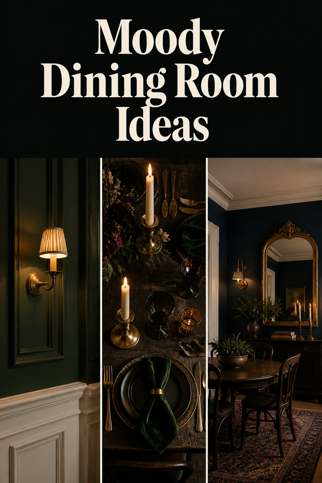
For about two decades, the aspirational dining room was white. White walls, white-painted trim, an open plan that let the kitchen, the table and the sofa share one bright, uninterrupted volume. Then, somewhere around the start of this decade, the mood turned. By 2025, design commentary from Sunset to Living Etc was naming deep, saturated colour as the dominant palette — not as a passing accent, but as a deliberate rejection of the over-lit, over-neutral open plan. The moody dining room ideas filling those pages are really one idea: that a room can be allowed personality, consequence and enclosure again. This guide is about how to translate that movement into your own home, decision by decision — because a dark dining room is a system, and the difference between drama and gloom lives in how the parts are made to work together.
That instinct is not new. It is a return. The Victorians and the Arts-and-Crafts makers who followed them understood dark rooms as a craft problem long before they were a trend, and the levers they used — saturated pigment, layered wall architecture, warm low light, surfaces chosen for how they hold a flame — are the same five you will pull today. What follows surveys all five at working depth, then points you toward the deeper guide on each.
Why the Moody Dining Room Has Come Back — and Why It Works
The all-white dining room was a product of its moment, and the moment has passed. To understand why dark rooms feel right again, it helps to know that they were the default for far longer than white ever was.
The Victorian and Arts-and-Crafts rooms that set the template
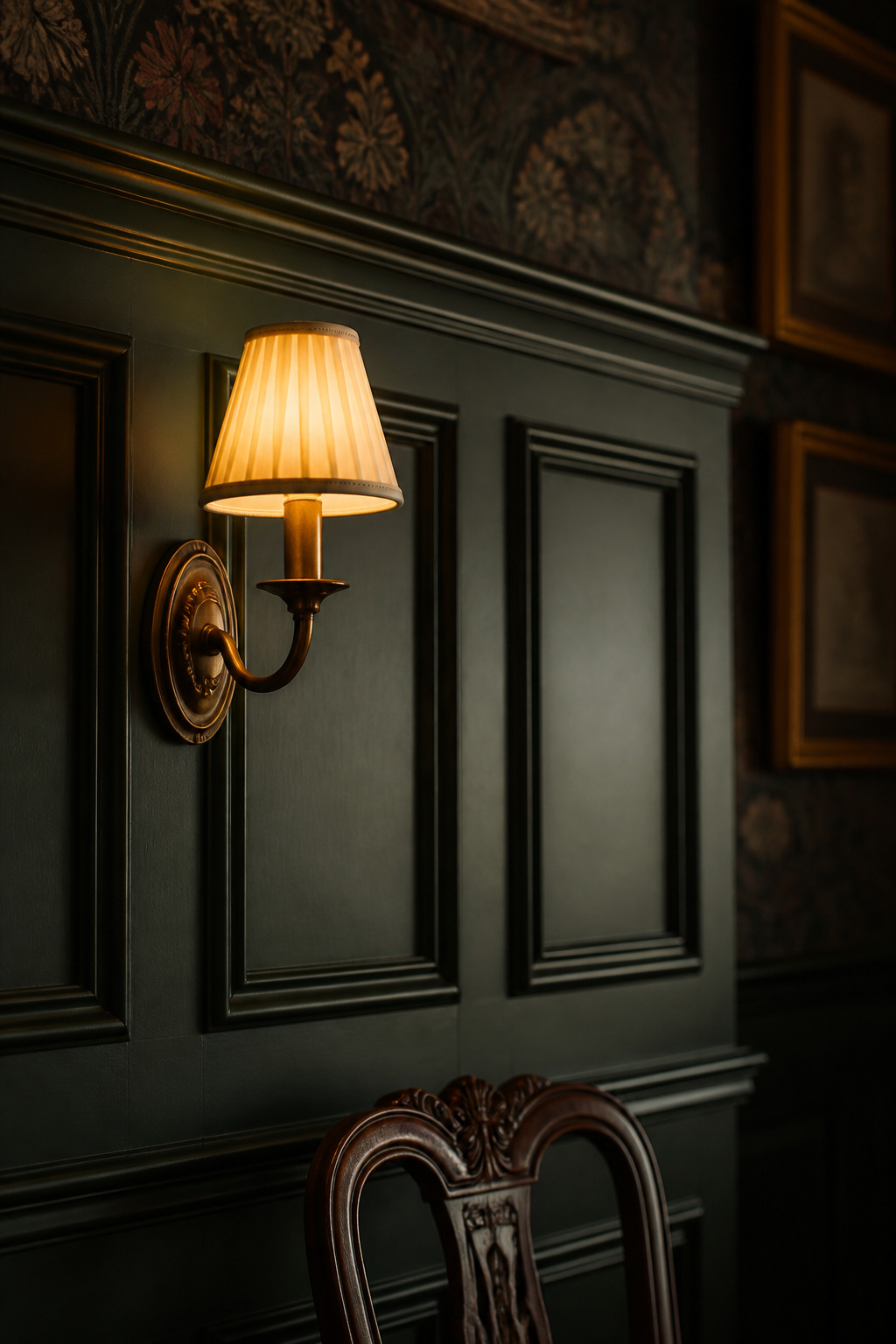
Victorian interiors (roughly 1837 to 1901) ran dark for reasons both practical and philosophical. Coal heat threw soot, and deep pigments hid the staining; but the deeper motive was social. An undecorated, un-coloured room read as a mark of poor taste, even a lack of individuality. The dining room, as the social heart of the home, was built to impress — rich velvets, heavy drapery, antique lighting and Gothic-inspired furnishings were standard rather than eccentric. Darkness there was a form of theatre.
The Arts-and-Crafts movement that followed, from around 1880 to 1920, kept the depth but changed its argument. Where late-Victorian taste leaned on industrially produced ornament, the Arts-and-Crafts makers championed crafted surfaces — dark panelling, hammered metals, earthy pigments — as a counter to over-lit, over-produced rooms. Read those two movements together and you have the whole vocabulary of the modern moody dining room: saturated colour, real wall architecture, warm metal, and light kept low on purpose.
What a dark room does to the people in it: intimacy, slowness, ceremony
The atmosphere is not only an aesthetic effect; it changes behaviour at the table. Darkness, well managed, signals intimacy and calm. It slows the pace of eating and encourages people to linger and talk — exactly the kind of curated, unhurried dining the experience economy has made people want again. Environmental psychology offers the underlying reason: restorative environments are the ones that reduce mental fatigue and let attention recover, not the ones that maximise brightness. As one design commentary citing APA guidance puts it, a dark interior done well “signals intimacy and calm” rather than draining the room of life.
This is why the dining room is arguably the single best room in the house to take dark. It is used mostly in the evening, when the light is already artificial and controlled. The intimacy that dark walls create is precisely what the space is for.
The case against the all-white dining room
A high-gloss white dining room has a specific failure in evening use: it amplifies glare rather than creating any sense of enclosure or ceremony. Under a chandelier at night, white-on-white reads as sterile, even slightly clinical. The colour families now reclaiming dining rooms — deep navy, forest green, charcoal, burgundy and aubergine — all share one behaviour that white lacks. They absorb light rather than reflect it. The warm glow of a chandelier or a candle registers as golden against them, where the same light washes out flat against white. That single physical difference is most of the reason the look works.
The Two Load-Bearing Decisions: Colour and Light
If you change nothing else, change these two. Colour and light are the foundation every other decision stands on, and they are inseparable: the wall hue determines how much work the light has to do, and the light’s warmth determines whether the hue reads rich or grey. Get this pairing right and a half-finished room still feels moody. Get it wrong and no amount of velvet or brass will save it.
Choosing a dark palette that holds up under warm dining light
The palette sorts into four reliable families. Deep navies — Benjamin Moore Hale Navy HC-154, Sherwin-Williams Naval SW 6244 — are the most recommended, carrying grey-green undertones that keep them from shifting purple under warm light. Forest and deep greens — Farrow & Ball Studio Green No.93, which reads almost black in low light, or Inchyra Blue No.289 — suit evening rooms because they deepen rather than grey as the light drops. Burgundies and aubergines like Farrow & Ball Brinjal 222 are the most historically Victorian of the groups. Charcoals and near-blacks — Railings No.31, Sherwin-Williams Caviar SW 6990 — are the boldest commitment and need confident warm light to carry them.
The technical thread running through all four is undertone and Light Reflectance Value. Moody colours get their depth from brown or grey undertones that mute the base hue, and an LRV in the 7 to 30 band gives genuinely atmospheric results; below 7, a colour risks reading flat and cave-like without meticulous lighting. This is the heart of choosing the right dark paint colour — and it is worth the time the spoke spends on it, because the wrong undertone is the most expensive mistake in the whole project to undo.
Layered lighting as the difference between cocooning and cave-like
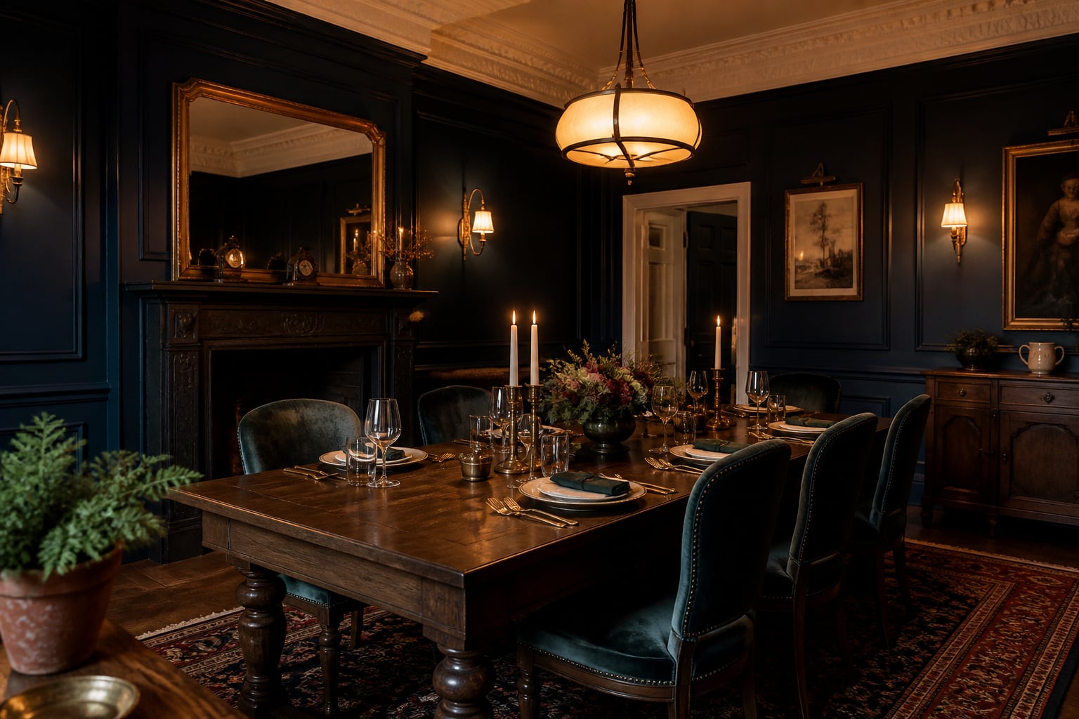
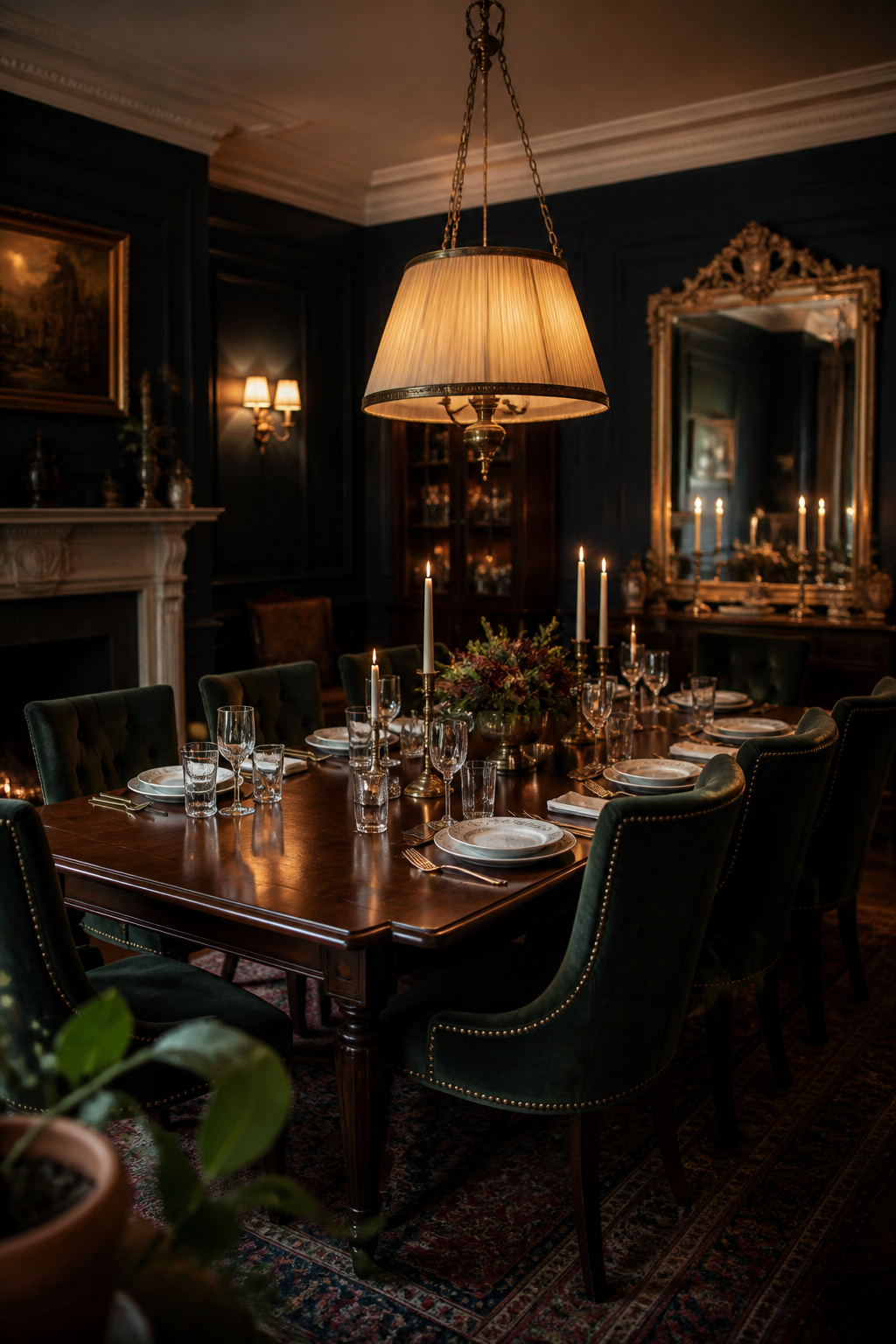
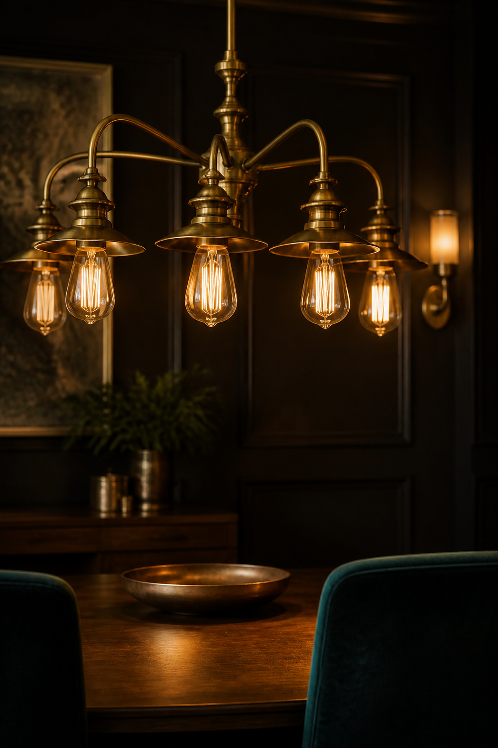
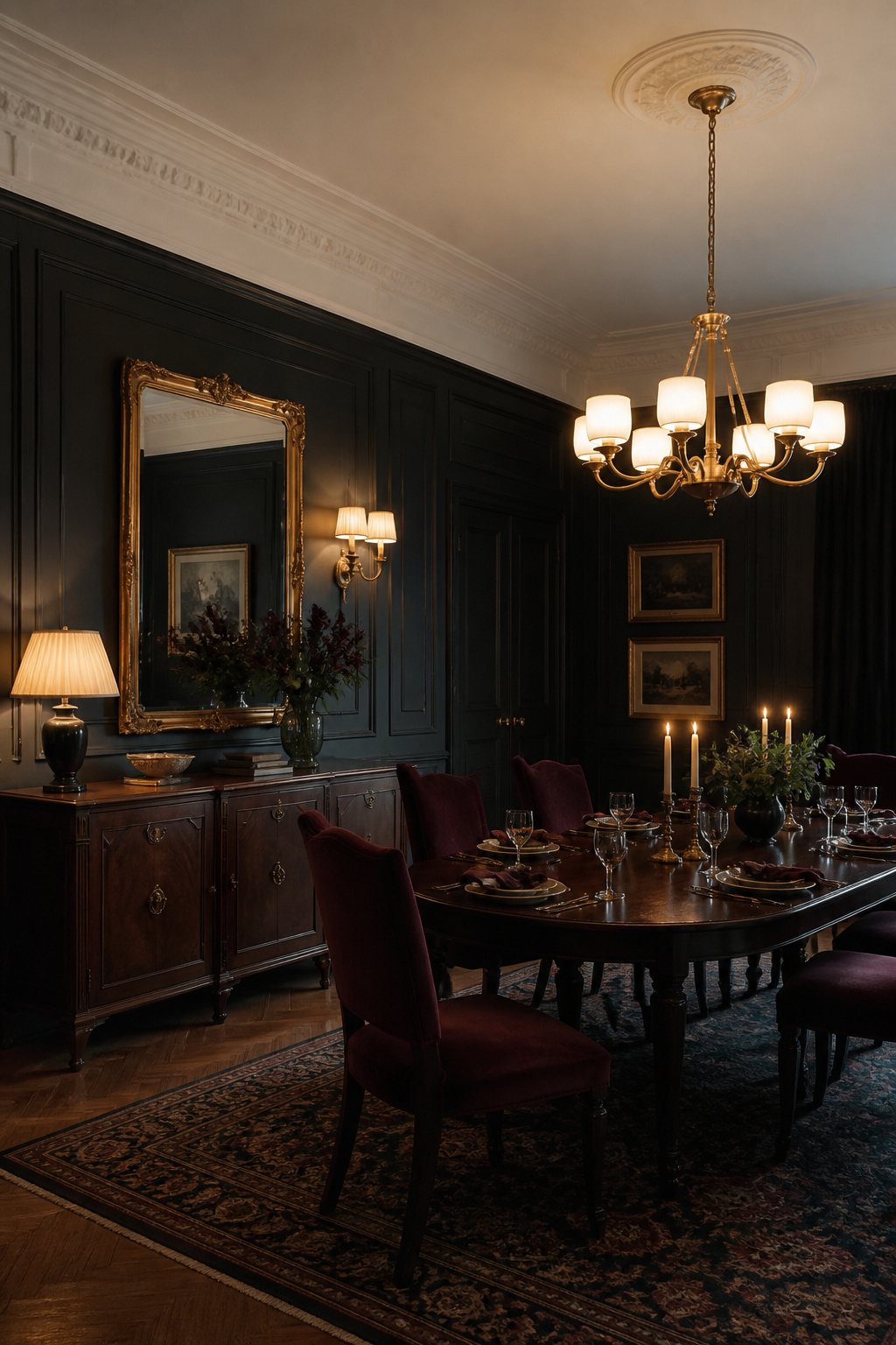
A single overhead fixture in a dark room produces a spotlight-in-a-cave effect: the table is lit, but the walls, the sideboard and the moulding drop to black. The look needs the opposite — a graded shadow, not a pool of brightness in a void. That comes from layers. The standard hierarchy runs from a statement chandelier for ambient light, down through wall sconces flanking art or a buffet, to sideboard lamps and finally candles for tabletop glow. Each layer lights a different plane of the room.
Two non-negotiables hold the layers together. The first is dimmers on every circuit, so the room can move from functional to atmospheric without changing a fixture. The second is accent and perimeter light — sconces, picture lights, cove strips — because those are what bring the dark walls themselves to life. The full plan, fixture by fixture, is the subject of layering the lighting.
How colour temperature and wall hue work together
Colour temperature is where the two load-bearing decisions physically meet. Warm light at 2700 to 3000K draws out the red and brown undertones in dark hues, enriching navies and greens and making aubergines glow; 2700K is the professional dining-room standard, and warm-dim LEDs drop toward 2200K candlelight as they dim. Push past 3500K into cool white, though, and the same light greys out those undertones — turning a rich navy or aubergine into a flat blue-grey. A stunning deep wall under cool 4000K bulbs reads like a corporate meeting room, not a dining room. The colour you choose and the bulb you pair with it are, in practice, one decision.
Wall Architecture That Creates Shadow and Depth
Colour decides the tone of the wall; architecture decides whether it has any depth. This is the most overlooked lever in the whole system, and the one that most separates a room that has been painted dark from a moody dining room.
What flat paint can and cannot do on its own
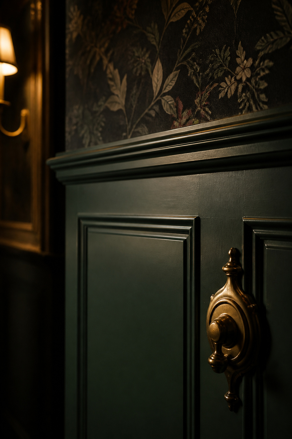
Flat or matte paint on smooth plasterboard gives you uniform colour and nothing else. Shadow requires a physical protrusion; a wall with no raised moulding casts none, so even the most saturated forest green reads as a single flat plane at any distance. Finish helps at the margins — eggshell, at 10 to 25 percent sheen, is the professional standard for dark dining walls, adding just enough reflectance for slight depth while staying below the glare threshold of satin. But finish alone cannot manufacture dimension. For that you need something for the light to catch and skip over.
Wainscoting, panel molding and wallpaper as depth-builders
The classic answer is to break the wall into horizontal bands. Standard dining-room wainscoting sits 32 to 36 inches off the floor, aligned with chair-back height, rising to 36 to 42 inches for nine to ten foot ceilings. The cap rail it creates divides a dark lower wall from an upper field that can carry a different treatment. The most accessible version skips structural joinery entirely: picture-frame or shadow-box moulding, thin decorative MDF applied to existing drywall, casts a real shadow line under low-angle dining light. Dark wallpaper — botanical or textural, in a deep ground — adds pattern and depth above the cap rail, and the well-documented move of papering the field inside each wainscot panel layers architecture and pattern at once.
The treatments differ in cost, effort and the rooms they suit. The table below surveys the four main approaches.
| Wall treatment | Depth it builds | Relative cost | Best suited to |
|---|---|---|---|
| Flat or eggshell paint only | Colour, no shadow | Low | Modern rooms with strong layered light |
| Picture-frame / shadow-box moulding | Real shadow lines, no structural work | Low to mid | Renters and DIY; most rooms |
| Raised-panel wainscoting | Strongest dimensional shadow | Mid to high | Traditional and heritage rooms |
| Dark wallpaper above a cap rail | Pattern plus texture | Mid | Rooms wanting colour and ornament together |
The accent-wall decision and when to commit to four walls
How many walls to take dark is a proportion question. In a small or low-light room, one dark accent wall delivers the drama without the enclosure of four; in a larger room with a confident lighting plan, four dark walls earn their keep, because the enveloping quality is the point. A useful rule of thumb: if the room has one obvious feature wall — behind the sideboard, or facing the head of the table — paint only that one. If it is square with no clear focal wall, go all four. Whichever you choose, keep the ceiling lighter and the trim a crisp white or warm cream; that built-in contrast is what stops the room closing in. The full treatment, from molding profiles to the wallpaper-inset technique, is the work of building depth into the walls.
Furniture and Textiles That Belong in a Dark Room
In a dark room every surface either absorbs the available light or bounces it, and the furniture is where you set that balance. The big pieces are not just functional choices; they are the difference between a room that reads as layered shadow and one that flattens into a single dark mass.
Material choices: dark wood, velvet, leather and what they do in low light
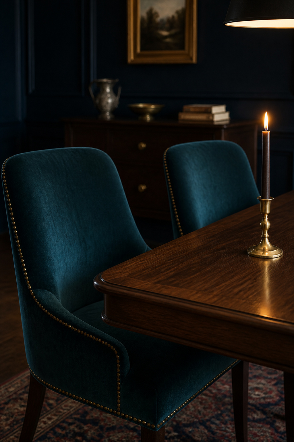
Matte velvet absorbs light almost completely, so an upholstered chair appears to recede into the wall rather than sit in front of it — exactly the right behaviour when the table is meant to be the focal plane. Dark wood with a matte or satin oil finish absorbs too, but lets the grain read through, adding texture even in dim light; a gloss-varnished tabletop, by contrast, throws the chandelier back as a distracting highlight. Leather sits in the middle, reflecting a soft sheen that defines its edges without glare. The point is not to make everything matte and dark — that loses all definition — but to mix behaviours so the eye can still tell mass from void.
A few material rules of thumb govern most of the choices:
- Choose matte or satin finishes over high gloss, so surfaces absorb light and keep their grain legible.
- Pick velvet for the most enveloping, light-drinking effect; leather where a soft reflective sheen and easy cleaning matter more.
- Upholster chairs in a saturated colour rather than matching the table wood, so the seating does not vanish into the table by candlelight.
- Carry one surface with slightly higher reflectance — leather, brass hardware, a stone top — to give the eye the contrast it needs.
Table, chairs, sideboard — the hierarchy of the big pieces
The table is the centrepiece and the only surface the chandelier is built to light directly, so it should be substantial: a thick top and sturdy base in dark wood, or stone for real visual weight. The chairs earn their contrast through upholstery rather than matching timber. The sideboard or buffet against the primary wall is the anchor that completes the room — it carries a lamp for the perimeter light layer, a mirror above, and the visual mass to balance the table. A dark-wood sideboard with brass hardware is the canonical choice.
Rugs and curtains as light absorbers and sound softeners
Soft furnishings finish the envelope acoustically as well as visually. Velvet curtains block 60 to 85 percent of incoming light while absorbing sound, cutting the echo a room of hard surfaces would otherwise throw. A wool rug under the table — deep charcoal, navy, or a pattern picking up the wall colour — does the same for chair-scrape, defines the dining zone, and resists the fade and abrasion a dining rug takes. Size it to extend 24 inches beyond the table on every side, so chairs stay on the rug when pulled back. The deeper treatment of every piece is in furniture and textiles for a dark room.
Decor, Contrast and the Styling Layer
Once the walls, furniture and floor are all dark, the room has a hidden problem: nothing pops and nothing recedes, so it reads as a uniform field of darkness. The styling layer is the cure, and it is not decorative afterthought — it is the mechanism that keeps the darkness reading as dramatic rather than gloomy.
Why a dark room needs high-contrast accents to avoid going flat
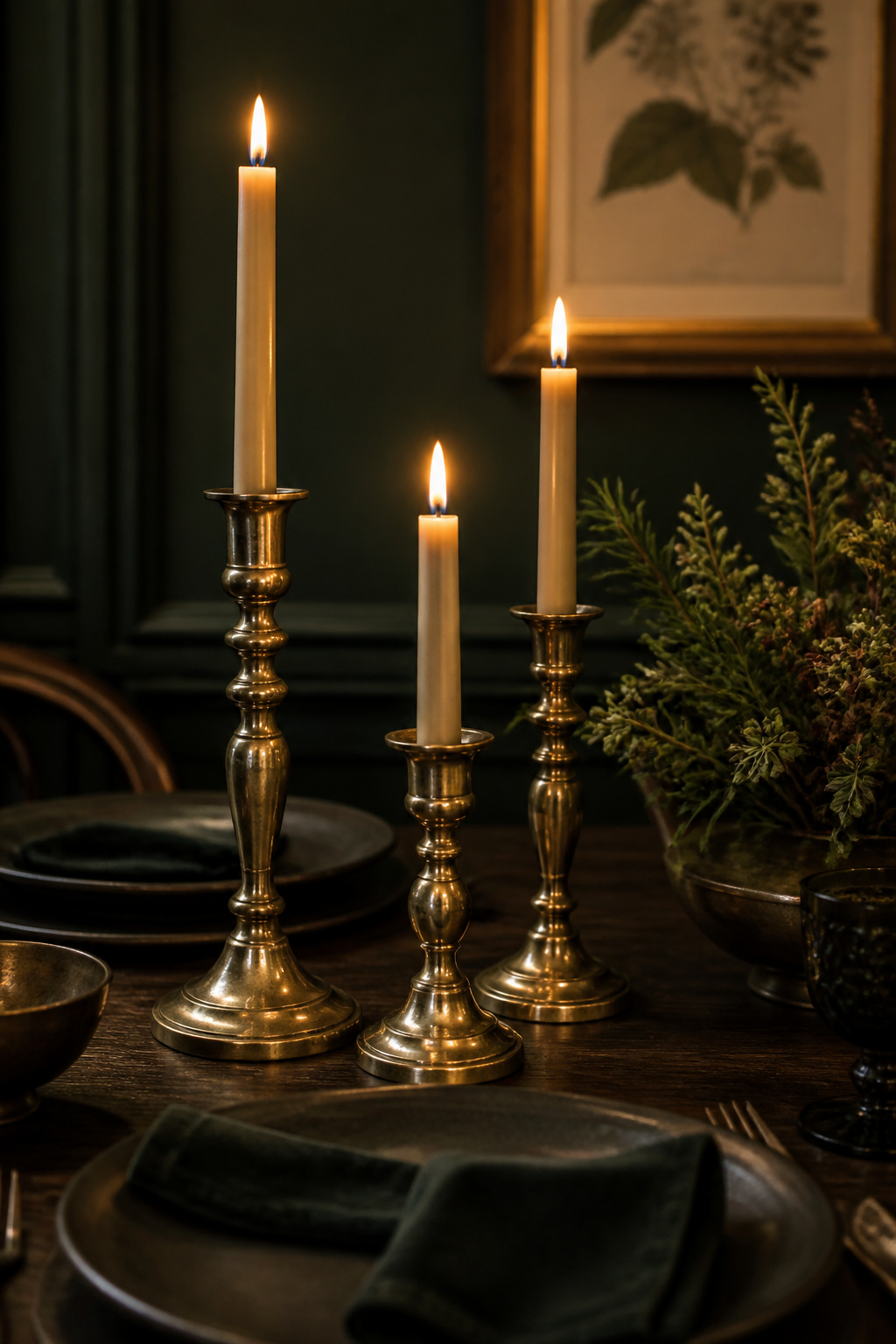
The fix is counterintuitive: a dark room needs lighter and warmer accents than instinct suggests. Metallic and glass elements do the heaviest lifting — gilt-framed mirrors, brass lamps, gold-toned hardware — because they catch and redistribute light rather than just sitting brightly against the dark. The single most powerful built-in contrast, though, is a crisp white or cream cornice and ceiling against the dark walls: it provides a brightening plane above, stops the room closing in, and makes the wall colour read richer by comparison.
Brass, gilt mirrors and botanical prints against deep walls
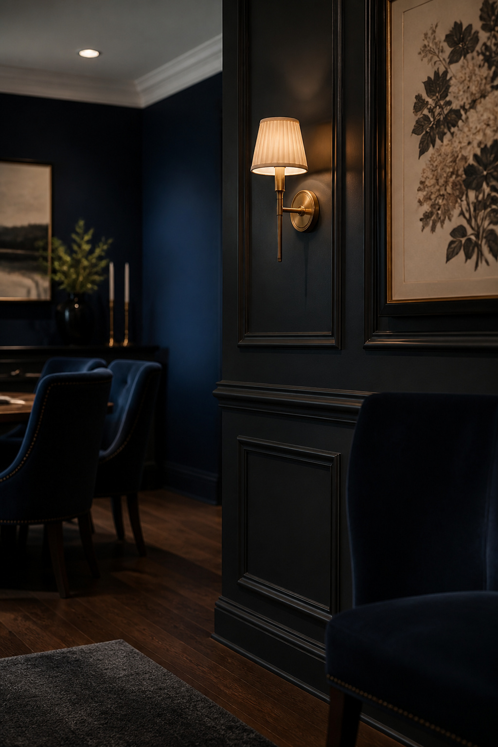
A large gilt-framed mirror above the sideboard works twice over — it bounces ambient light back into the room and reflects the candlelit table, making the table a focal point from several angles. Sized at roughly two-thirds the width of the sideboard below it, it never overwhelms. For art, the instinct to hang dark, dramatic pieces on dark walls is a trap: tonal match eliminates contrast. The successful moody rooms pair the dark envelope with art lighter in value or warmer in tone — botanical prints in cream and muted olive, gold-toned abstracts, warm still life. Botanicals work especially well because their colours sit on the complementary-warm side of navy and forest green.
Tablescaping and candlelight as finishing atmosphere
The finishing atmosphere is the table itself, lit. Turning off the overhead and relying on candlelight — tapers in brass holders at varying heights, pillars clustered at the centre — shifts the room from functional to ceremonial, and a nearby gilt mirror multiplies every flame. A considered tablescape echoes the room: a bare dark surface to show the material, jewel-toned napkins, aged-brass cutlery, dark ceramic plates. One living element completes it — dark-leaved greenery, the only thing in the room that reads as genuinely alive against the static envelope. The full styling system is in decor, art and table styling.
Execution by Situation: Small Rooms and Modern Tastes
The five levers are constant, but their settings change with the room. Two situations in particular call for genuinely different choices: the small or low-light room, and the modern-taste room that wants drama without the heritage ornament.
The small or low-light dining room: where different rules apply
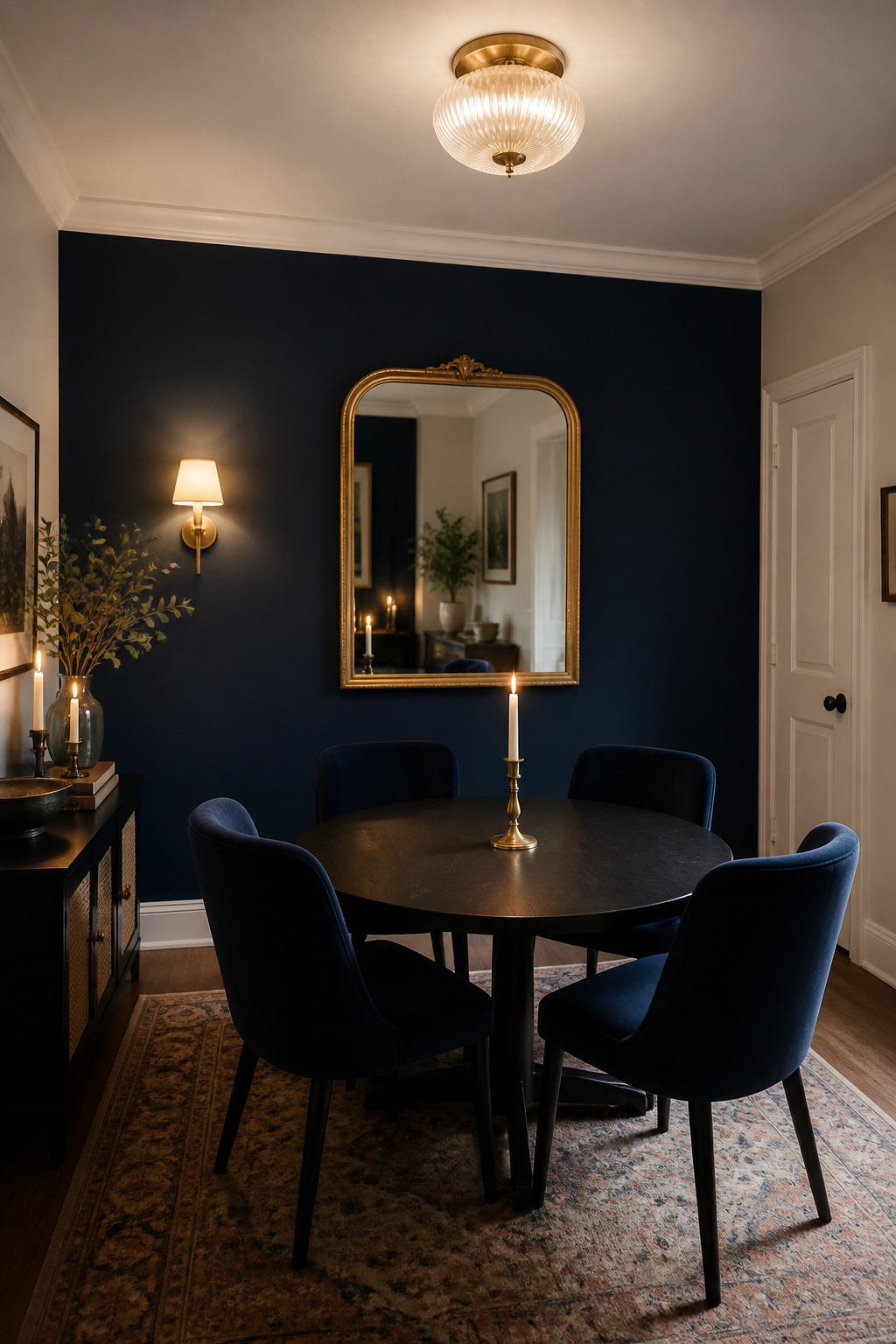
Once a dining room drops below roughly 100 square feet — or has little natural light to start with — the proportional logic shifts, and painting all four walls the same saturated dark risks a cave rather than a cocoon. The working approach is one accent wall in the dark colour, a white ceiling and trim for contrast, and a satin rather than matte finish so the wall bounces light instead of swallowing it. Mirrors do the most work here — a large gilt mirror visually doubles the room — and layered light on dimmers becomes mandatory rather than optional, because a single unlit corner is what makes a small dark room feel merely small. Lighter, leggier furniture and a round table that eliminates corner bulk all help. The full small-space playbook is making it work in a small room.
The modern-moody register: drama without the ornate
The modern register keeps the dark palette and changes the vocabulary around it. Fewer pieces, each with more weight: a single sculptural pendant rather than a multi-arm chandelier, a matte-black or smoked-finish table, linear seating without carved detail. Lighting finishes shift from heritage brass to matte black and smoked glass, which read moody without the warm-metal signal. Wall treatment moves from raised-panel wainscoting to flush Shaker panels or a single limewash texture — the same depth principle, a quieter accent. The risk to avoid is mixing registers: ornate Victorian detail on a modern-palette room reads as indecision. The full modern approach is a modern take on the moody look.
A comparison of approaches by room type
The two situational registers shift several levers at once. The table below sets the default moody room against its small-room and modern variants.
| Lever | Default moody room | Small / low-light room | Modern register |
|---|---|---|---|
| Walls | Four dark walls viable | One dark accent wall | Flat or limewash, flush panels |
| Finish | Matte or eggshell | Satin, to bounce light | Matte, smoked surfaces |
| Lighting | Four-layer plan ideal | Layered light mandatory | Single sculptural fixture |
| Metals | Brass and gilt | Mirror to amplify light | Matte black, smoked glass |
| Table | Substantial, rectangular | Round or compact | Linear, matte-black or stone |
How the Decisions Stack: A Moody Dining Room System
Here is the part no single spoke covers: how the five levers interact, and why the order you pull them in matters as much as the choices themselves. A moody dining room is not five separate decisions made in parallel. It is a sequence, and rooms that go wrong almost always went wrong on sequence, not on taste.
The order to make decisions in — and why sequence matters
Across every moody dining room project I have worked on, the sequence that avoids the most expensive mistakes runs in this order:
- Commit to the colour and undertone first — the palette sets the room’s LRV and therefore how much light everything else has to deliver.
- Plan the lighting before buying a single fixture — circuits, dimmer positions and chandelier wiring all need to be set before the walls are painted.
- Choose the wall treatment — wainscoting height and style are decided against the colour already chosen.
- Select furniture and textiles to suit the palette and the lighting plan.
- Add decor and contrast last — the styling layer is tuned to what the room already does.
The logic behind the order is physical. Colour comes first because a near-black LRV-3 wall absorbs far more light than an LRV-15 charcoal, and that gap dictates how many fixtures the room needs. Lighting comes before furniture because the chandelier position fixes the table position, which fixes the layout; buying furniture first and retrofitting light to it is the most common cause of the spotlight-in-a-cave result.
Where most rooms go wrong: one dramatic element without the others
Nearly every disappointing dark dining room is a single lever pulled alone. The classic version is dark paint on the walls with nothing else changed — builder’s-white trim left as a mismatched break, the original cool-temperature fixtures still in place, no textural contrast added. The result is a room that has been painted dark, not a moody dining room. A second version is all-dark furniture in a dark room with nothing to lift it, so the whole space disappears into itself. A third, specific to dining rooms, is the right deep wall under the wrong cool-white bulbs. As one designer puts it plainly, dark furniture in a dark room with dim, inadequate light “will just be depressing, as well as looking flat and boring.”
The minimum-viable moody room: what three changes make the biggest difference
You do not have to do all five at once. Three changes, in order, move a flat room most of the way. First, swap the bulbs throughout for warm 2700K LEDs and put the main circuit on a dimmer — a material cost under about £50, and the single change that shifts the whole atmosphere. Second, paint one or all walls a dark hue; this is the biggest visual change and the one that decides whether the warm bulbs read as glow or just as warm light. Third, add a large gilt or brass-framed mirror and one more light source on a separate circuit — the mirror amplifies everything already lit, and the second source kills the unlit corner. Done in that sequence, those three turn a flat dining room moody before you have touched the furniture.
Moody Dining Room Ideas at a Glance
A moody dining room rewards system thinking over single gestures. The whole look comes down to five levers, each doing one job the others cannot, and each with a guide that goes deeper than this survey can. The reference table below names what each lever does and where to read next.
| Lever | What it does | Key decision | Go deeper |
|---|---|---|---|
| Colour | Sets the tonal temperature; decides how much light is absorbed | Family (navy / green / charcoal / burgundy) and LRV | moody dining room paint colors |
| Light | The difference between cocooning and cave-like | 2700K bulbs, dimmers, a four-layer plan | moody dining room lighting |
| Wall architecture | Builds dimensional shadow flat paint cannot | Wainscoting vs moulding vs wallpaper; accent vs four walls | dark dining room wall ideas |
| Furniture & textiles | Every surface absorbs or bounces light | Matte velvet and dark wood absorb; mirrors and brass bounce | moody dining room furniture |
| Decor & contrast | Keeps the dark room from going flat | High-contrast gilt, brass and botanicals over dark-on-dark | moody dining room decor |
If you take one instruction from all of this, take the sequence: start with colour and lighting together, because the palette sets the light load and the light decides whether the palette glows or greys. Build the walls, furniture and decor onto that foundation, never the reverse. And watch for the three errors that sink most rooms — a dark palette with no warm lighting plan, an all-dark scheme with no contrast to lift it, and furniture chosen before the lighting that should have placed it. Avoid those, pull the levers in order, and the room does the rest: it slows everyone down, holds the candlelight, and gives dinner the ceremony the all-white years quietly took away. When your room asks for a different register, the situational guides have you covered — from small dark dining room ideas to a fully modern moody dining room.