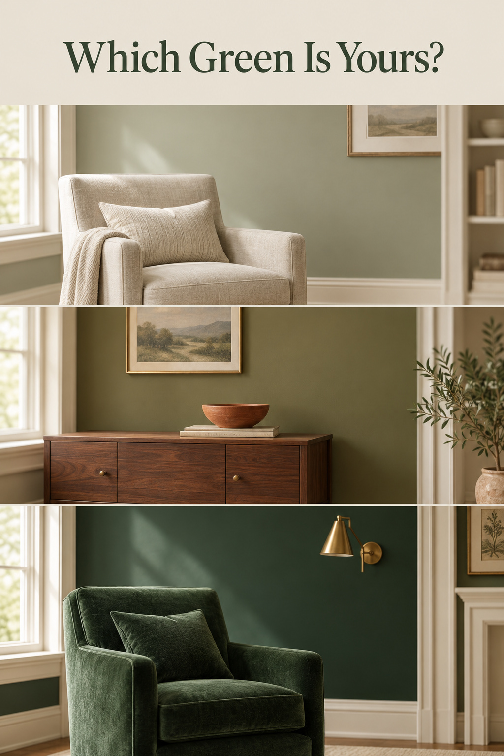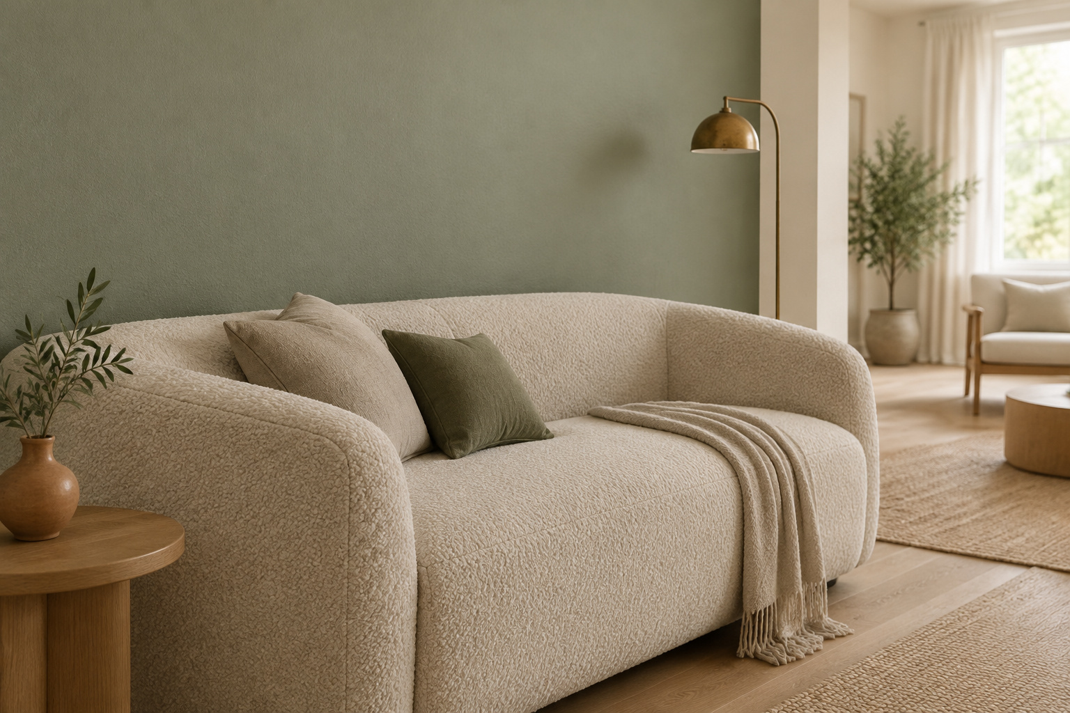
Sage, olive, emerald, forest, hunter, bottle. Each one photographed in somebody else’s light, and each one convincing. That is the trouble with most green living room ideas: the field is enormous and beautifully shot, and silent on the question you actually have, which is whether this green will still be green on your wall in November.
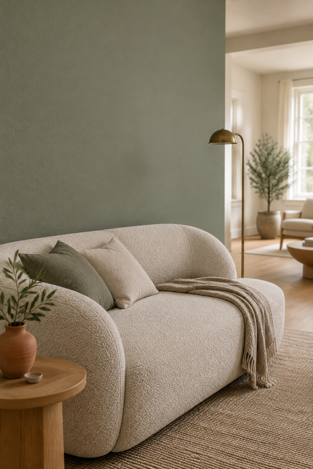
I don’t choose color by liking it. I choose in an order, because each decision closes off the next, and the order is the same in every room I work in — what light the room gets, then which way the green leans, then how much of the room it takes, then what everything else has to become.
By the end you won’t have a favorite. You’ll have two or three named shades for your room’s light, and one small job to do this week.
Green Living Room Ideas Aren’t One Decision — They’re Four, In Order
The gallery has never met your room.
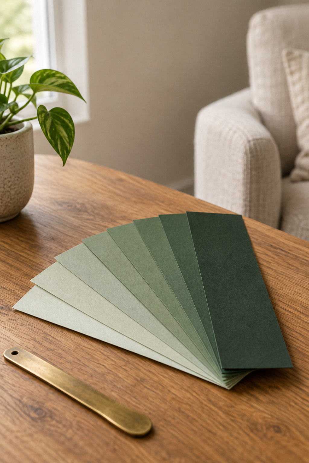
Why shade-by-shade galleries can’t answer ‘will this work in my room’
A paint chip gets judged at arm’s length under store lights, a few inches of paper at a time. A wall gets judged from across a room, in daylight that shifts all day, at a scale where the color saturates and doubles down on itself. The two conditions rarely agree, so the chip that convinced you in the aisle tells you very little. What green works in a north-facing living room? turns up almost verbatim across the pages that rank for these collections. They raise the question and never answer it.
The four decisions this guide walks through, in the order they actually happen
Light direction. Undertone. How much of the room. Then everything else. Each narrows what the next can be, so the order matters more than any single shade. A cool green chosen before you knew the room faced north was never a taste mistake. It was a sequence mistake.
What you’ll have chosen by the end: not a favorite, a shortlist
A shortlist is smaller and more provisional than a decision. Before you read on, write down which way your main window faces. Everything below hangs on it.
Start With the Light Your Room Actually Gets
Which way does your main window face? If you can’t answer that, fix it first, before you think about shade.
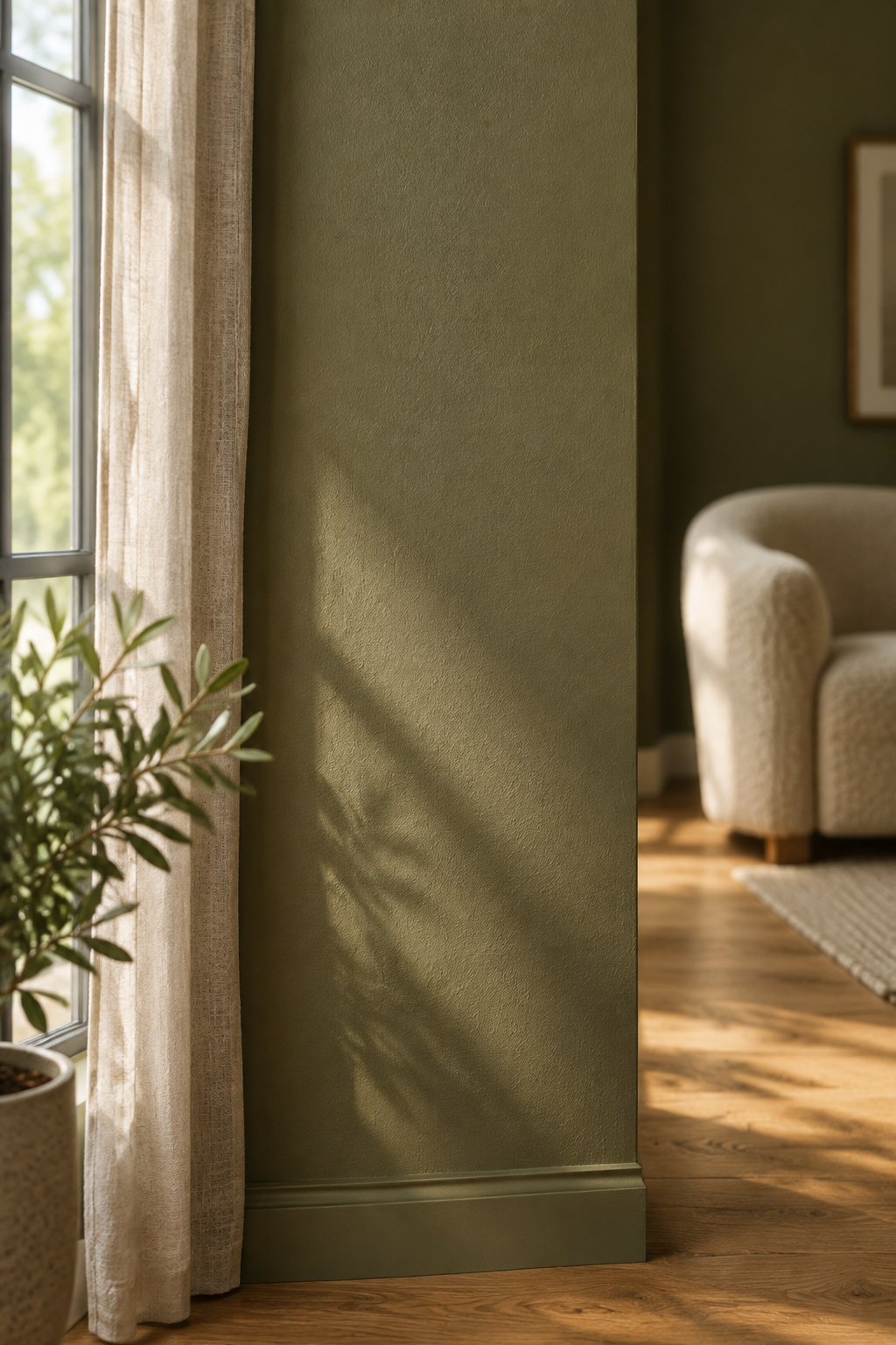
North, south, east and west light change a green before you change anything else
Sherwin-Williams’ own guidance by room orientation is blunt. North-facing rooms should avoid cool undertones and favor warm ones, because the light arriving is cool and steady and gives nothing back. South-facing rooms tolerate nearly any color, since their light stays warm and consistent through the day. East and west rooms flip, warm at one end of the day and cool at the other, so a green that settles beautifully at breakfast can go quiet and cold by evening in the same room.
Why the same paint can read as two different colors in two rooms
The name for this is metamerism: two colors that match under one light source and separate under another. Cool north light is low in the red and yellow wavelengths a warm green needs to reflect back, so the warmth in the pigment has nothing to work with and the color slides toward gray. A green with a strong enough warm base holds. An ambiguous one moves. The mechanism, the figures and what each orientation does belong to the light your room actually gets.
A quick way to identify your room’s light direction if you’ve never checked
Stand at the main window with a phone compass and read the direction the glass faces. Then confirm it by watching. Direct sun crossing the floor at some point in the day means south or west; flat, shadowless light that barely changes from morning to dusk means north. Do it today, because it decides which half of the range is yours.
Then Settle the Undertone: Warm Green or Cool Green
When a green disappoints, the usual cause is its temperature: the wrong one, in a room that was never going to support it.
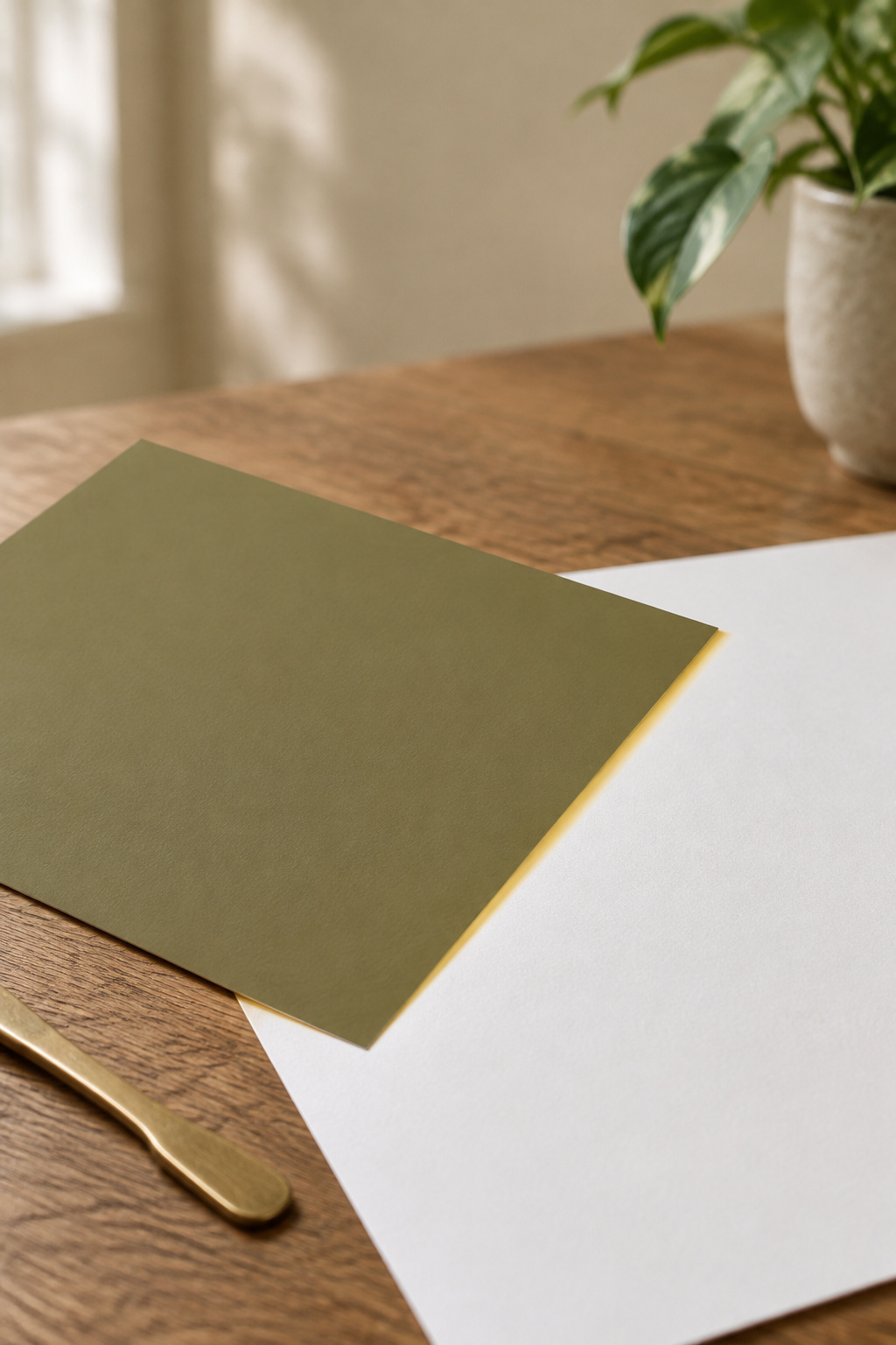
Reading a green’s undertone before it’s on your wall (yellow/warm vs. blue/cool)
Hold the chip against a sheet of plain white paper and the base underneath shows itself. A warm green shifts yellow or brown against true white and leans toward olive and moss. A cool one shifts blue or gray and comes out cleaner, closer to spa than to garden. That is the whole test, and it costs nothing.
How undertone and light direction interact — the pairing that decides everything
Cool room, warm green. Warm room, your choice. That one pairing resolves more color failures than any shade recommendation I could hand you, because it lets you use the light instead of fighting it. Among Benjamin Moore’s sages, the warmer, yellow-leaning Soft Fern 2144-40 is documented as holding its character in north-facing rooms. The grayer ones in the same family need warm oak and brass around them or they go flat.
The near-neutral, gray-leaning family that behaves almost like a warm gray
The far end of the range barely announces itself as color: the sages and silvery greens that sit so close to a warm gray that the room stays quiet either way. They are the easiest greens to live with and the easiest to get wrong, because gray is the first thing they give up. The failure mode, the named shades that resist it, and the trim and ceiling decisions a pale green forces are all handled at the quiet, near-neutral end of the range.
Your Provisional Shortlist, By Light and Undertone
Here I stop describing the field and start naming things. Four combinations, two shades each, enough to walk into a store with.
| Your room’s light | Undertone to sample | Two to start with | What you’re buying |
|---|---|---|---|
| North-facing | Cool | Sherwin-Williams Evergreen Fog SW 9130; Farrow & Ball Green Smoke No. 47 | Depth deliberate enough that cool light becomes mood |
| North-facing | Warm | Benjamin Moore Soft Fern 2144-40; Benjamin Moore Guilford Green HC-116 | A yellow base that survives light carrying no warmth of its own |
| South- or west-facing | Warm | Farrow & Ball Calke Green No. 34; Benjamin Moore Forest Green 2047-10 | Saturation that stays legible because the light is generous |
| South- or west-facing | Cool | Farrow & Ball Studio Green No. 93; Benjamin Moore Hunter Green 2041-10 | Green that appears only where bright light reaches it |
North-facing + cool undertone: the shades that hold their color
In cool light, a cool green only works if it is deep enough to look deliberate. Evergreen Fog SW 9130 is a smoky, blue-based sage with enough depth that north light lands as mood rather than drift. Green Smoke No. 47 goes further: cool light amplifies its blue-gray base, so it comes out moodier and less obviously green. Choose either for that register, not for brightness.
North-facing + warm undertone: what to sample instead
Soft Fern 2144-40 has a yellow-green base that pushes back against the cool cast. Guilford Green HC-116 is light-toned, and its own manufacturer documents warm undertones.
South- or west-facing + either undertone: where the range opens up
South and west rooms are where the deep end becomes possible. Calke Green No. 34, named for the breakfast room at Calke Abbey, is a deep botanical sage with warmth underneath. Studio Green No. 93 is its cool opposite, close to black until real daylight finds the green in it. Both need generous light to stay legible. Hunter Green 2041-10 is the one on this list its maker suggests keeping to an accent rather than a whole room. In an east-facing room, judge at the hour you actually use the space, since morning is the only time it gets any warmth. None of this replaces a sample.
How Much of the Room Should the Green Take?
How much? Most people settle it by not deciding: the walls go green and everything else stays exactly as it was.
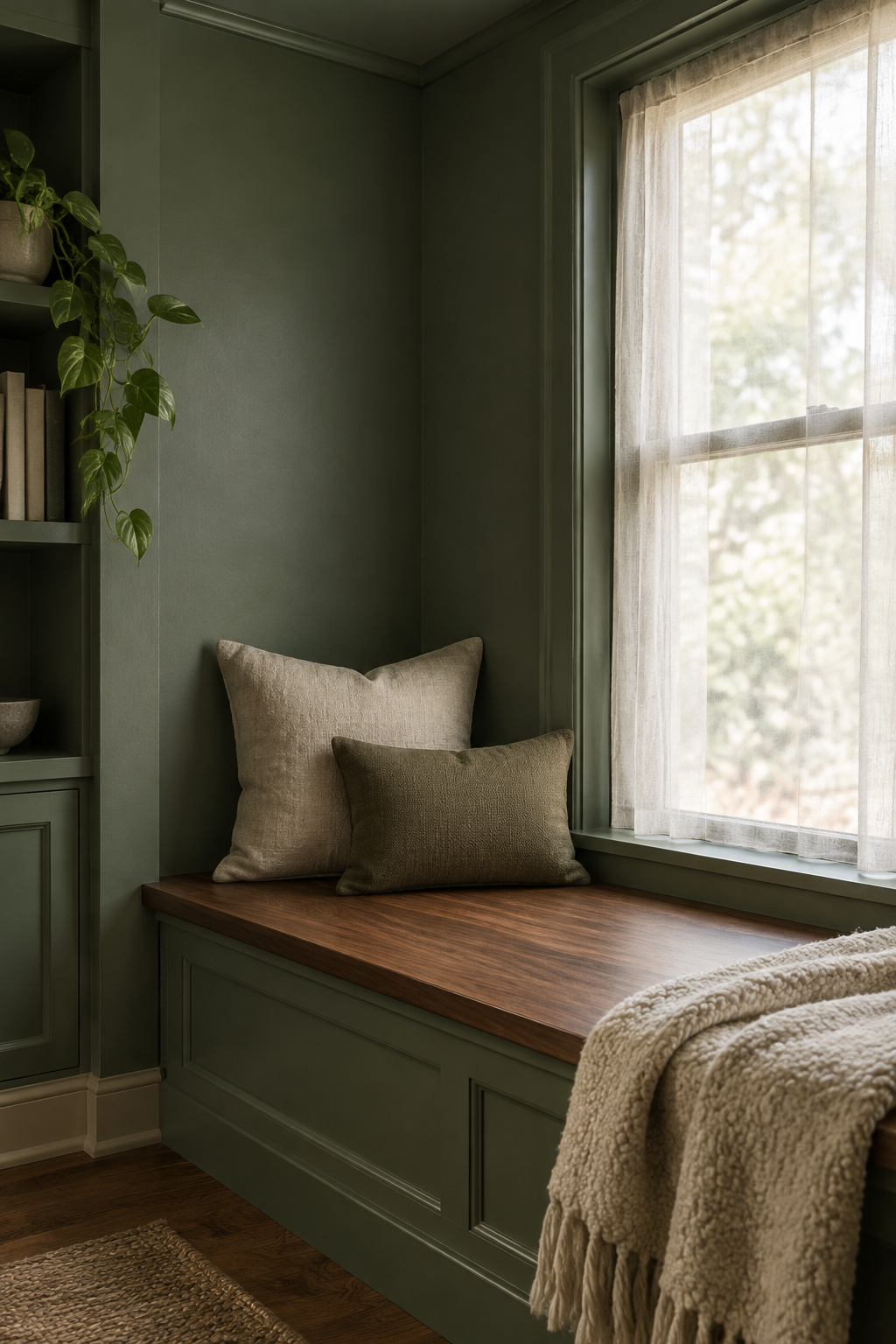
Drenching the whole room vs. holding the color to one plane
Color drenching means committing every surface: walls, ceiling, trim, doors, sometimes the built-ins, all in one hue, so the contrast lines that normally mark where a room ends stop existing. The alternative holds a single plane of color in an otherwise pale room, which keeps that boundary and makes a feature of it. The version in between fails, with walls done and ceiling and trim left white, because it draws the boundary harder than either.
What a low-reflectance deep green does to a room’s apparent size and light needs
A drenched room stops registering as separate surfaces, so it generally comes across as one continuous volume, which is to say larger. The effect trades away as the color deepens, though, and at the saturated end what you’re buying is envelopment rather than size. A deep green also hands back very little of the light reaching it, so you have to put light back into the room deliberately.
Why the honest answer is ‘it depends on the room,’ not a universal verdict
Sources genuinely disagree about whether a deep drenched green can make a room feel bigger, and I won’t flatten that for you. The trade above is the fuller version, and both cases are argued properly in how much of the room a deep green should take. What is settled: a room with real daylight can carry a drench, a large open-plan space loses the effect because four walls aren’t enclosing it, and half-measures disappoint.
The Deep End of the Range: Forest, Emerald, Hunter, Bottle
Benjamin Moore sells Forest Green 2047-10 and Black Forest Green HC-187, one word apart in the name and opposite in undertone.
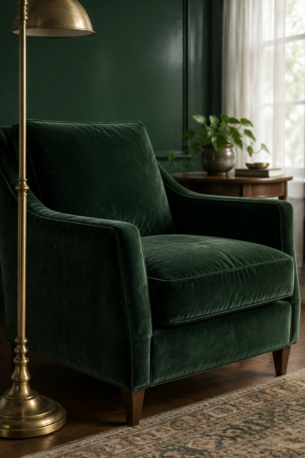
What separates a warm bottle green from a blue-leaning hunter green
Forest Green 2047-10 is the warm one, a yellow-green with distinctly golden undertones, recommended by its maker for whole rooms. Hunter Green 2041-10 is the cool one, blue-green, offered as an accent instead. Benjamin Moore’s published light reflectance values, a measure of how much light a color hands back, put them at 7.58 and 6.39: near-identical depth, opposite temperature. Never take a green’s undertone from its shade name. Take it from the brand, the product and the code. Half the internet has that pair backwards, and the deep-green guide takes apart why the names drifted.
Where a saturated green earns its place in a living room
A deep green needs abundant, warm light to show itself as green rather than as an absence. With that light it does something no pale color can: the walls stop asking for attention. The edges of the room soften, the few objects in it come forward, and a space you use in the evening becomes somewhere you settle rather than somewhere you pass through. Without that light, you are painting a dim room dimmer and calling it atmosphere.
The heritage greens that anchor this end of the family
Black Forest Green HC-187 is the darkest green Benjamin Moore makes, blue-green underneath, and it travels further than any shade in this article: teal in bright south light, near-black in a north room. The heritage names at this end carry real chemistry, and the pigments behind the heritage greens is the better read on where those colors came from.
What Everything Else in the Room Becomes
I finish a room by standing in its doorway and doing nothing for a moment. Where does the eye land first? If it lands on something that asks something of me, an object I have to think about or a color pulling against the one beside it, the room isn’t done, whatever the paint is doing. I’ve used this test for years, and it rarely flatters the last thing I bought.
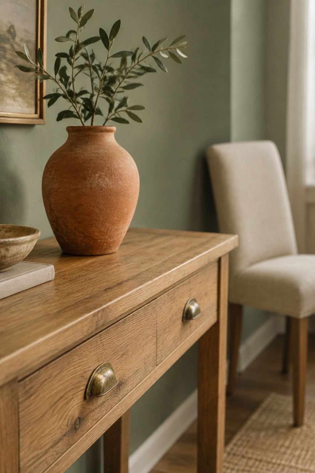
The palette that consistently works with a green wall: warm neutrals, terracotta, brass
A warm green settles into cream, warm white, oatmeal and warm woods, with one small warm accent: terracotta or clay, in ceramic or textile, at the scale of a bowl rather than a wall. Clay works because it sits near green’s opposite on the color wheel, pulled down into a muted register so the contrast whispers instead of announcing itself. Keep the room to roughly three material tones in one temperature family. Past that it fragments.
If your green arrived as a sofa instead of paint, the logic runs in reverse
Everything above assumes the green is paint, which makes it the room’s dominant surface. If your green showed up as furniture, the problem inverts: the object is fixed, the wall is the variable, and you choose the wall to suit the sofa’s own shade. That is a different article, when the green arrived as a sofa.
The two decisions that matter more than any accent color: wood tone and metal finish
Wood tone and metal finish are the two colored surfaces in most living rooms that nobody chose for their color, and they decide the room’s warmth long before a cushion gets a vote. Warm oak suits the yellow-leaning greens, walnut the deeper cool ones, and one metal family, brass or matte black, not both. The full pairing system, organized by undertone, is what everything else in the room becomes. Try taking one thing out of the room before you add anything new to it.
Where Green Shows Up as More Than Paint
Green doesn’t have to arrive in a can.
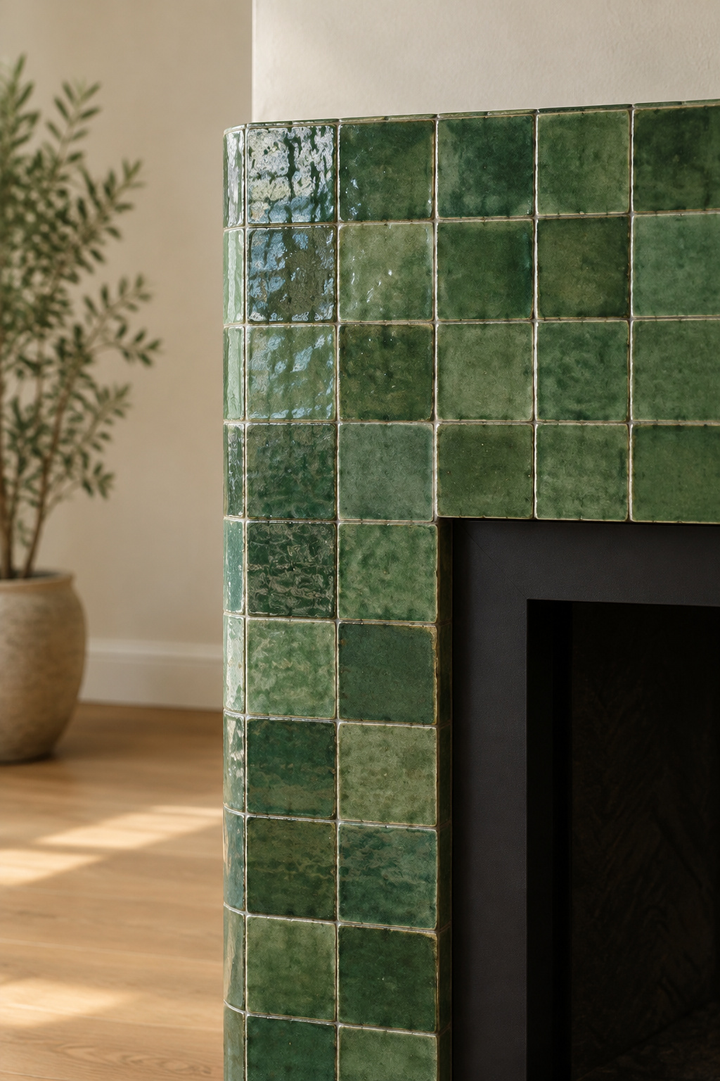
Green as a hard material: tiled fireplace surrounds and what they cost
A tiled surround brings green into a room as material rather than as a coat: glazed, uneven, catching the light differently at every hour in a way paint can’t. It is also the expensive way to bring green in, and handmade tile is the expensive end of that. What the material classes cost, how much variation to expect box to box, and how grout behaves against a green glaze are all in green bought by the square foot.
The lowest-commitment entry point: a single accent wall
Most houses have already nominated a wall: the chimney breast, an alcove, the plane the door faces. An accent wall that fails is usually one the architecture never emphasized in the first place. Which plane to choose, how many coats a deep color needs over a pale wall, and what one wall actually costs are covered in starting with one wall instead.
Choosing where to start if you’re not ready to commit the whole room
One plane keeps the boundary between color and no color, and that boundary is the feature, so a single wall is no compromise. A single wall done deliberately will beat a whole room done to somebody else’s photograph, every time. Start where the room already points.
Your Next Step: From Shortlist to Sample Pot
Almost everyone finishes this decision in the wrong building.
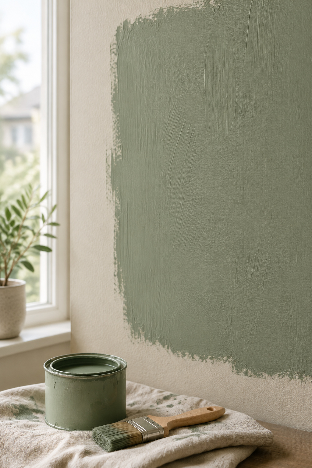
Why a chip in the store can’t finish this decision — only a sample on your wall can
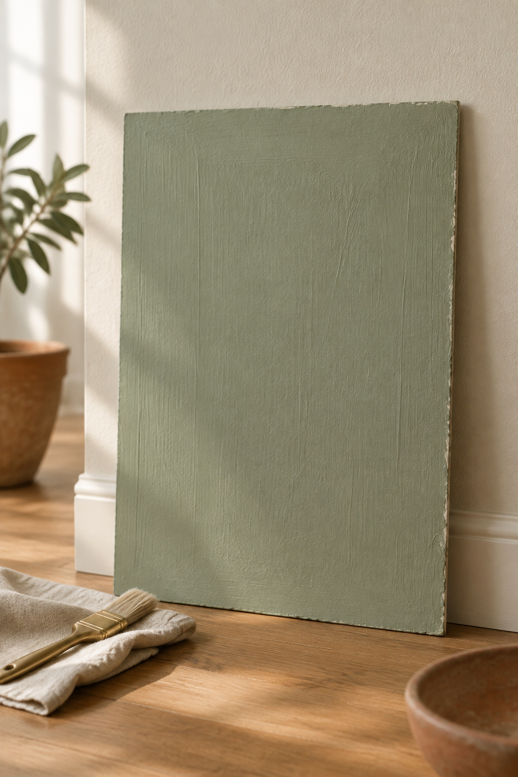
A chip is too small to saturate the way a wall does, and it carries none of the wall’s own texture. Give the sample board two full coats, never one, since a single coat shows you the board as much as the paint.
What to check for once the sample is up
Move it around. The room has a bright side and a dim one, and a green can pass on one and fail on the other. Look at it at more than one point across the day, especially the hours you actually use the room, and give it more than one day’s light before you decide. The full protocol, board size included, sits in the light-direction guide.
The one thing to do before you buy the first full can
Judge the sample against what’s already in the room, the floor, the metal, the fabric, and never on its own. Undertone dissonance only shows up in company. Interior designer Marcia Moore puts it this way: paint is the last choice rather than the first, since it can only be judged once the room’s light and finishes are settled.
So: name your light direction, name your undertone, take the matching row of the shortlist. Give the color as much of the room as that room’s light can support, and no more. Let the wood and the metal decide the warmth, keep the accent small and warm, and avoid the two failures behind most disappointing green rooms: choosing from a photograph taken in someone else’s light, and half-committing to a color you never tested.
Then stand in the doorway. If nothing in the room asks anything of you, the green was right.
Four decisions, made in order, and none of them left for later. This week: light noted, undertone read, row chosen. Go get the shade, not another photograph of somebody else’s room.