
Colour consultant Maria Killam puts it in one line: a light paint colour “can maximize the AVAILABLE light,” but “it can’t actually ADD light that is not there.” In a windowless half bath, the pale greige on the walls has almost nothing to work with. So the honest answer for a dark powder room is usually to stop fighting the dark and commit to it.
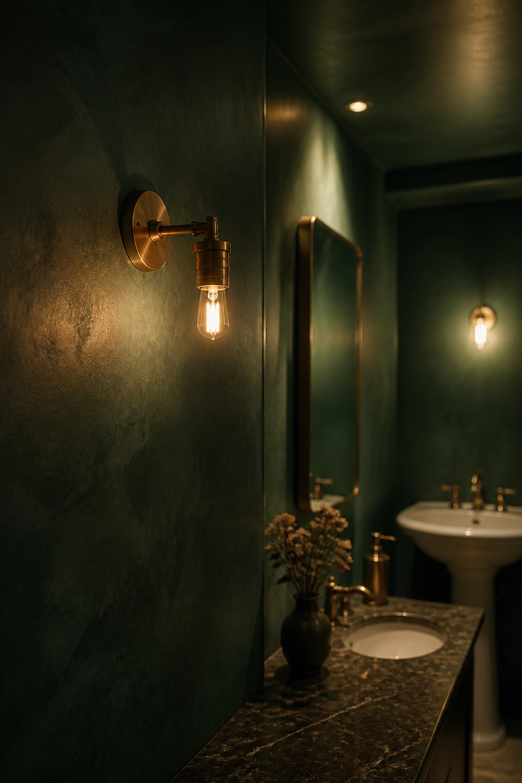
TL;DR
- Pale paint has no daylight to amplify in a windowless room, so it reads dingy. A saturated colour under one warm bulb reads deliberate.
- Undertone decides the result more than the swatch name does: Benjamin Moore’s Hale Navy HC-154 (LRV 8) has a green undertone that warms under a bulb.
- Over builder latex, prime with a primer tinted to 50–75% of the topcoat’s depth. That turns a three-coat colour into a two-coat job.
Why a dark powder room doesn’t need to be bright
Pale paint is not a light source. That sounds obvious written down, yet it’s the assumption under almost every beige half bath in the country.
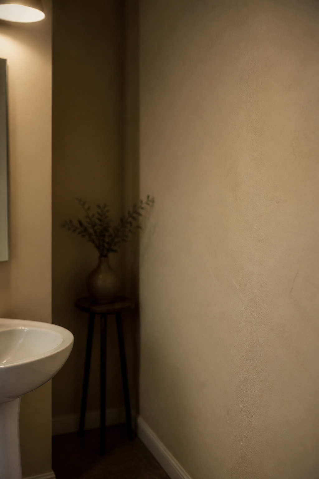
What a pale paint job in a windowless room is faking
A professional painting company’s colour guide names the result exactly: a low-light room in a pale cool neutral, lit by warm bulbs, comes out “dingy, yellow-gray, or vaguely dirty.” Its fix is to change category: in a saturated medium-deep tone, the eye stops expecting brightness at all, so a dim room no longer has to pretend otherwise.
The two-minute room vs the every-morning room
The opposite advice is also correct, just for a different room. What separates the two is how the room gets used, not how big it is. A full bath you stand in every morning has to render your own face accurately while you shave or put on makeup. That room should feel bright, and our own guide to lighting a small or windowless bathroom makes the case for layered light and reflective surfaces there. A powder room a guest occupies for two minutes carries no such duty, since nobody examines their pores in there, so you can decorate purely for effect.
What a saturated colour does under one warm source
A deep colour behaves differently when the only light in the room comes from one warm bulb.
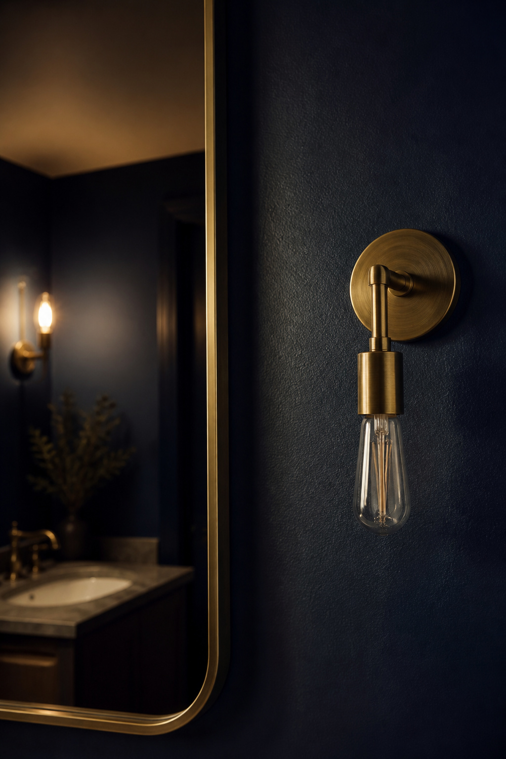
One warm source, no daylight to fight
Under warm artificial light, undertones take over: paint stops looking like the colour on the chip and starts looking like its undertone. Daylight dilutes that secondary hue, whereas a single bulb concentrates it. Farrow & Ball’s lighting guide gives the mechanism: yellow light from a halogen or incandescent bulb makes wall colours appear warmer. A windowless room has no daylight cycle to average either, so as Killam notes, the colour looks the same all day, and you only have to test it once.
Why undertones matter more than the swatch name
Benjamin Moore’s Hale Navy HC-154 is the example I keep returning to: an LRV of 8, with subtle green undertones that amplify pleasantly under a warm bulb. Two trade colour reviews give that reading. They agree with each other, but neither is Benjamin Moore’s own listing. Choose for the undertone family, then view the sample in the room under the fixture that will light it. While you’re at it, think about what the mirror has to do in a dark room, since it’s the one surface not wearing your colour.
Committing to the ceiling and trim
Years ago I talked a client into surrendering a hallway and turning it into a library corridor, 10-inch-deep shelving throughout. Everyone expected a tunnel. It worked because we treated the whole envelope as one surface instead of a set of leftover planes, and a powder room needs the same treatment.
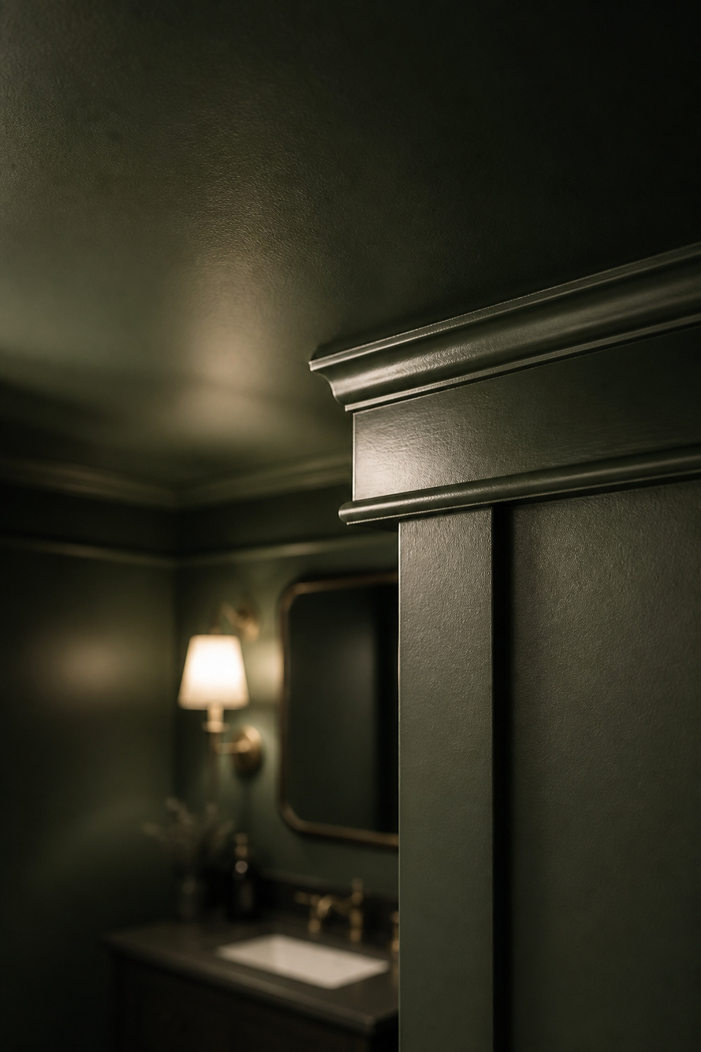
Why the ceiling usually has to come with it
Leaving the ceiling white “to keep it light” is the instinct to resist. There is no light up there to keep, and the white plane tells the eye exactly where the room stops. Designer Naomi Astley Clarke puts the alternative flatly: “Painting the ceiling of a small room in the same dark color as the walls will make a small room feel larger.”
Trim: matching sheen vs deliberate contrast
Trim is a sheen decision before it is a colour decision. Sherwin-Williams documents a “one colour, two sheens” approach (matte walls, semi-gloss trim in the same hue) for a monochromatic look that still feels layered, and recommends it for small rooms. Designer Sarah Gibson warns against the middle of the sheen chart, where everything reads undifferentiated. Either way trim goes glossier, because trim gets handled and has to wash.
Prepping and painting over builder latex
The usual failure here is two coats of a saturated tone rolled straight onto builder-grade flat latex and expected to hide beige.
Undercoat before any deep tone
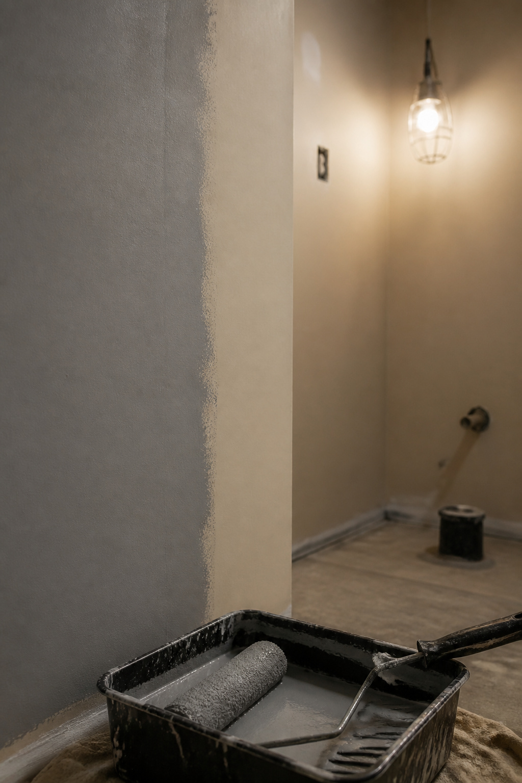
Tint the primer. Mixed to roughly 50–75% of the final colour’s depth, it improves coverage, cuts topcoats and stops the old colour bleeding through. The saving comes from the tint: white primer under a deep base typically costs an extra coat. Rick Watson of Sherwin-Williams sets the bar underneath it: “the surface to be primed has to be clean, dry, dull, and sound.”
First and second coats
Two coats is the baseline on a sound wall. A pale-to-deep change needs three without intervention; a halfway-tinted primer brings it back to two. Benjamin Moore lists Aura Interior at 350–400 sq ft per gallon in matte, eggshell and satin, so one gallon comfortably covers a room this size. Aura runs $46.99–$108.99 per gallon by sheen; Farrow & Ball, the heritage option, runs $120–175. I would rather buy the better gallon once than roll a third coat rescuing a cheap one.
Ceiling in full-formula paint, not a tinted ceiling flat
Standard ceiling paint cannot tint that deep, so use full-formula wall paint overhead, in flat. Ceilings are rarely physically flat, and any sheen above dead flat shows every tape joint and roller mark under raking light, and it gets worse once the colour is deep.
Trim and sheen last
Sherwin-Williams’s painting order (ceiling, then walls, then trim) exists to keep drips off finished work. In practice:
- Wash the walls, dull any existing gloss, and confirm the surface is sound and dry.
- Prime everything with a primer tinted to 50–75% of the topcoat’s depth.
- Cut in and roll the ceiling first, in full-formula wall paint, flat sheen.
- Roll two finish coats on the walls, letting each dry fully before the next.
- Paint the trim last, in a higher sheen than the walls.
None of that is difficult, but skipping step two will cost you a weekend.
What fails in a dark half bath
A rushed dark paint job starts telling on itself within months, always in the same four places:
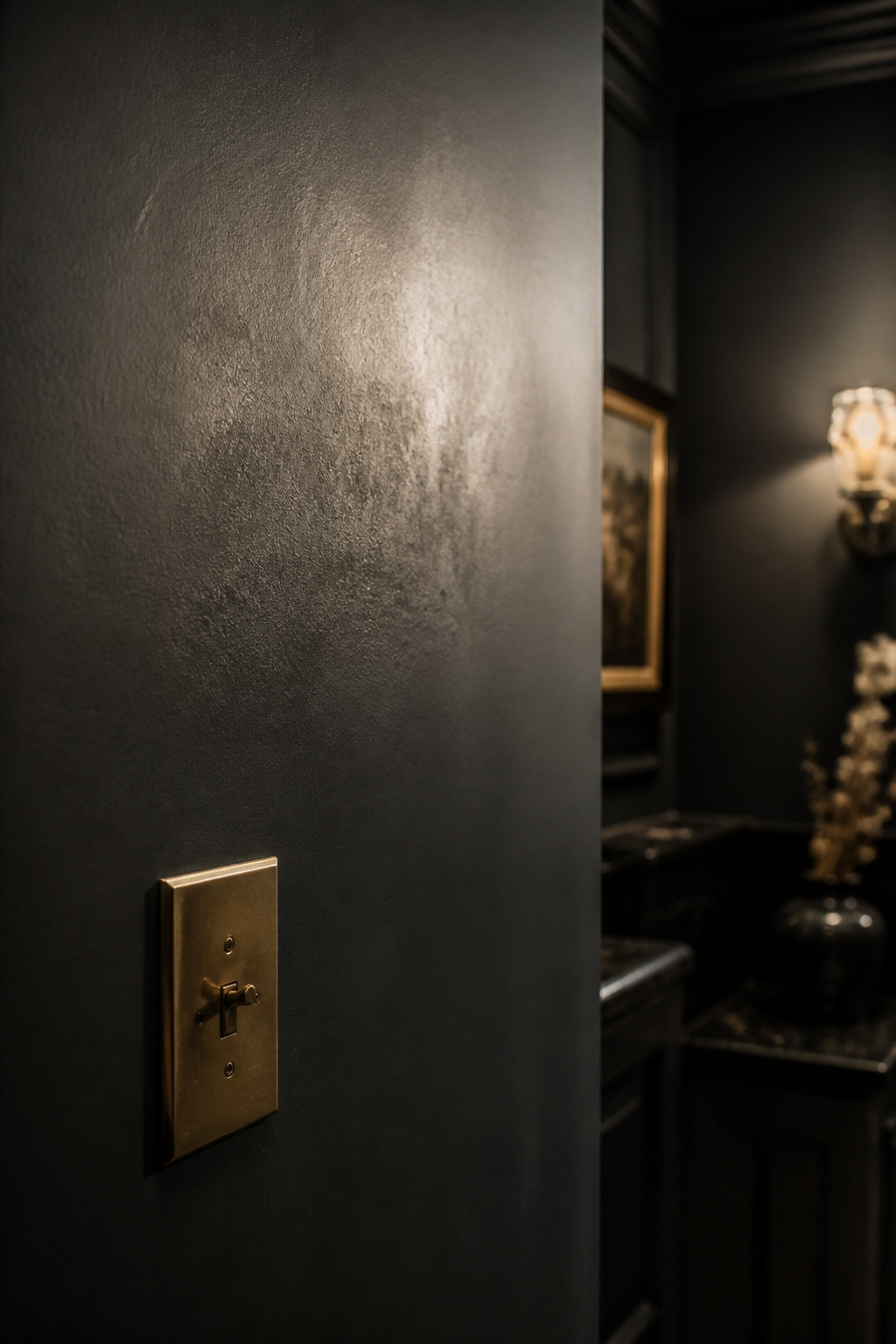
- A faintly shinier patch beside the switch plate, at hand height.
- A dull, rubbed band at elbow height where the wall gets brushed past.
- A wavering line where the wall colour meets the cap rail.
- Dark topcoat lifting in flakes, showing pale substrate underneath.
Each has a different cause, and each is preventable during prep.
Touch marks near the light switch
Sherwin-Williams recommends satin or semi-gloss for frequently handled areas, naming bathrooms directly. Benjamin Moore explains why: stains are harder to remove from low-sheen paint, and constant rubbing causes burnishing. My fix is narrow: take the sheen up in that one band around the switch and leave the rest of the walls alone.
Flat sheen at elbow height
Flat and matte are the least scrub-resistant finishes made, and budget mattes can burnish under a single damp wipe. ASTM does have a test method for scrub resistance, D2486. The tidy “Class 1 / Class 2” cycle counts quoted beside it across the trade press don’t appear in the standard’s own published scope, though, so I won’t put a number on it.
Missed cut lines at the cap rail
Benjamin Moore’s troubleshooting guide says bad cut-ins produce crooked lines and uneven edges. Its remedy: load the brush 1–1.5 inches back from the line, feather up to the edge with the tip, then repeat. My own read (an inference, not a published finding) is that a cap-rail line is punished harder than a wall-to-ceiling line, because an angled fixture rakes across it.
Chalking primer under a deep tone
Old gloss alkyd chalks as it wears, leaving a powdery film nothing will grip. Sherwin-Williams’s guidance: wash the loose chalk off before applying an acrylic topcoat, and on badly chalked walls use a primer engineered for chalky-surface adhesion, then two finish coats. Dark paint punishes the shortcut hardest, because failure shows in sharp contrast against the pale substrate underneath.
Done this way, the room stops apologising for having no window. If pattern appeals more than pigment, there’s also a guide to getting the same drama with pattern. Once the walls are dry, look at how the rest of the room comes together around a dark colour.
FAQ
Will a dark powder room feel smaller than a light one?
Designers report the opposite. Lichelle Silvestry says dark paint lets a room appear larger and taller by minimising the delineation between walls, ceiling and baseboard. Julia Dempster describes a nest-like effect, intimate and grand at once. It depends on commitment, though: one dark feature wall reintroduces that delineation.
How many coats of deep paint colour do you actually need over a white builder wall?
Two coats covers a routine colour change. A deep tone over white builder latex is never routine, so plan on three unless you intervene. The intervention is a primer tinted to roughly 50–75% of the topcoat’s depth, which removes the contrast the finish paint must fight.
Does dark paint hide bathroom imperfections or make them more obvious?
It hides them, provided the sheen stays low. Flat and matte finishes bounce less light, and less bounce conceals dents and drywall flaws. Benjamin Moore notes that flat paint is forgiving and hides well, while gloss accentuates blemishes. Raising sheen for washability trades some forgiveness back.