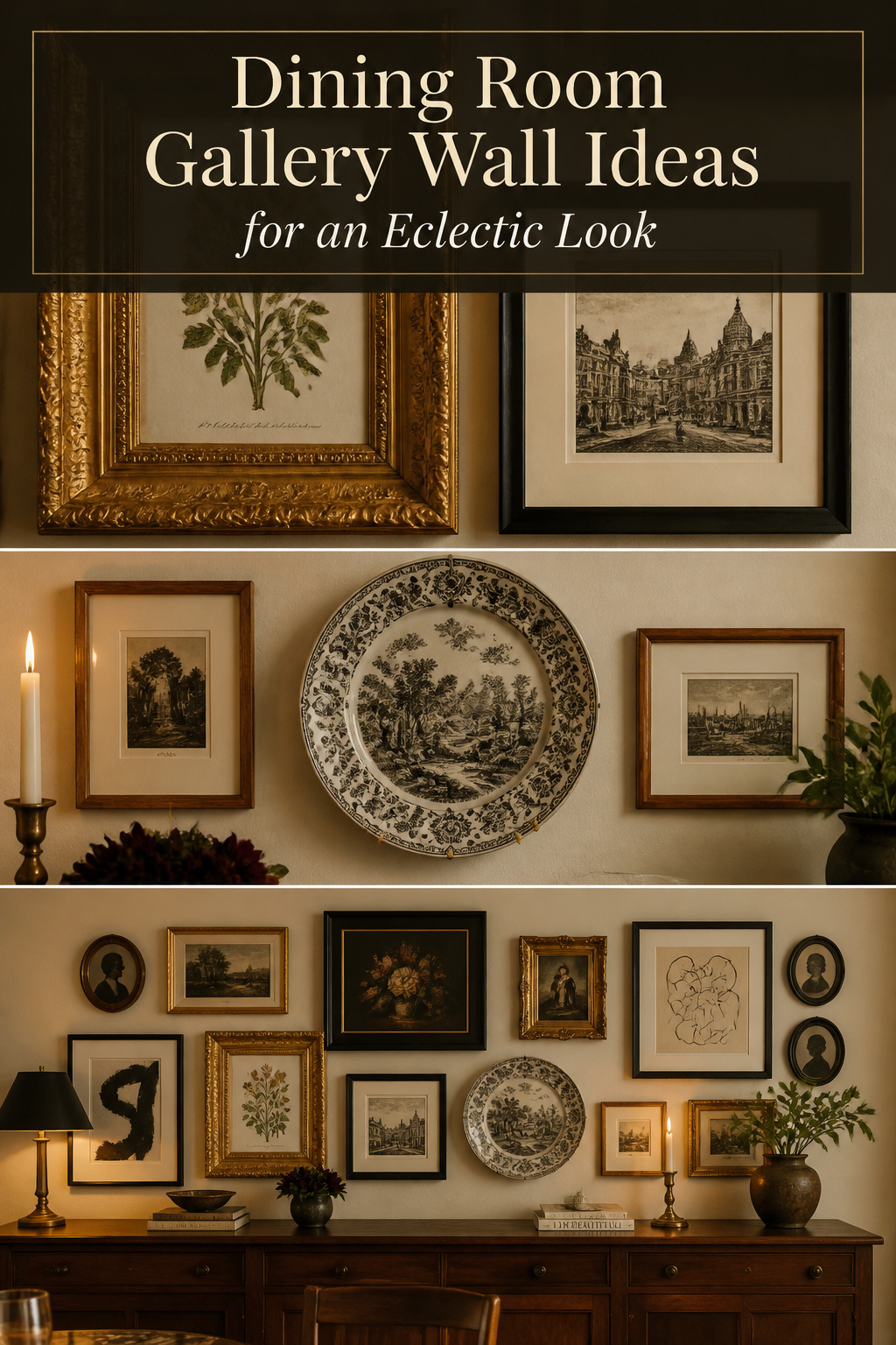
A dining room gallery wall asks for one connecting thread, not perfect taste. Settle the thread first and every other decision answers itself.
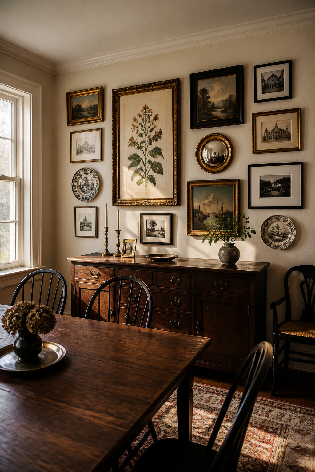
TL;DR
- Pick one connecting thread first — a repeated colour pulled from the anchor into at least three other pieces, or a shared subject like botanicals — and let it govern every later choice.
- Limit the wall to three frame finishes, one dominant on roughly 50% of frames; vary only one attribute at a time, colour or profile, never both at once.
- Hang the lowest frame 8–10 inches above a buffet, keep 2–3 inches between neighbours, and arrange the paper templates on the floor before a single nail goes in.
The Connecting Thread: What Holds a Mixed Gallery Wall Together
The difference between a curated gallery wall and a random wall of art is one element repeated through every piece — the red thread, as the Olive et Oriel framing guide puts it. Settle it first; it lets you reject the piece that does not belong. For the wider scheme, see how to style an eclectic dining room.
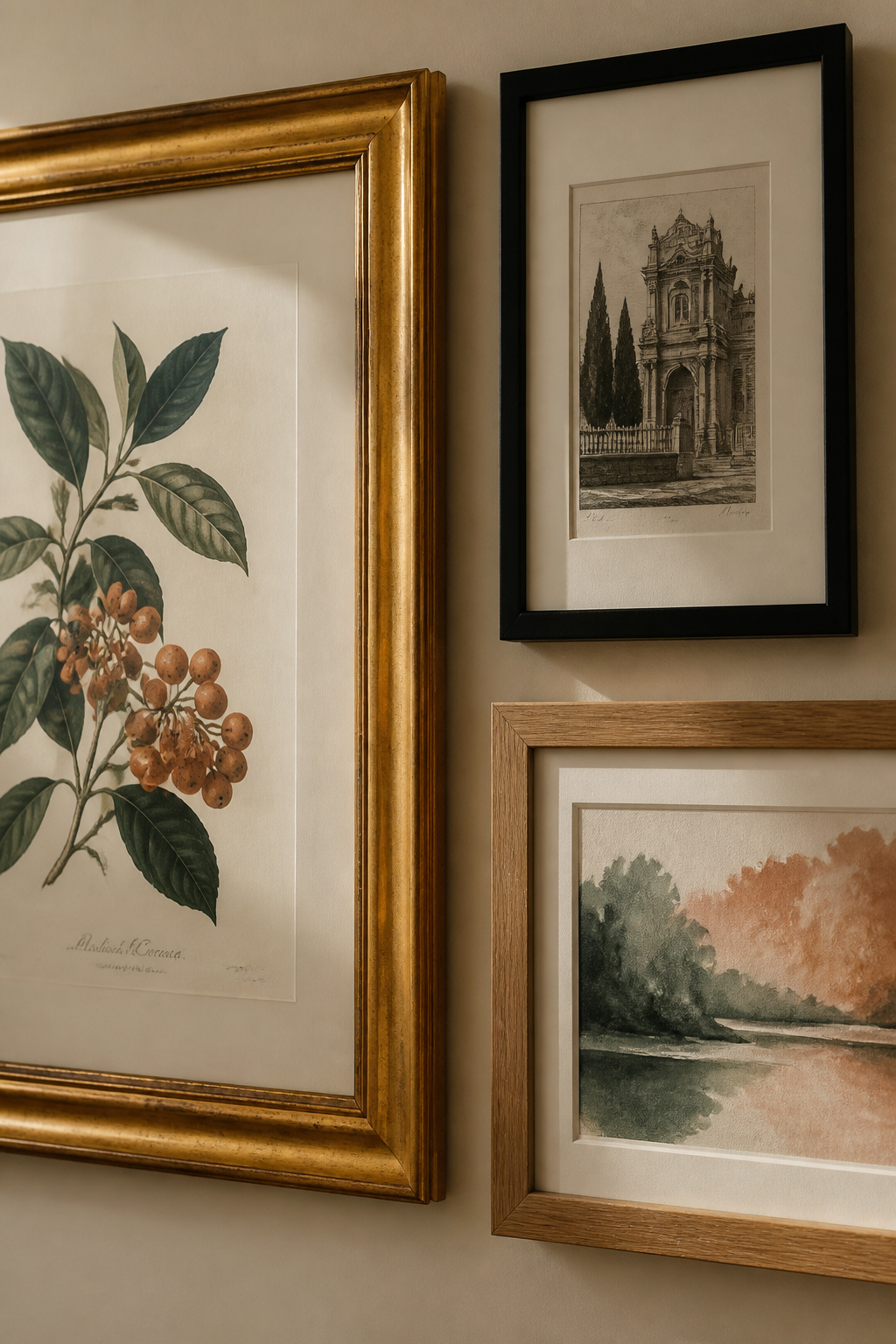
Color as the connecting thread across different frame styles and art types
Colour is the most forgiving thread because it works even when nothing else agrees. Pull one or two colours from the anchor and make sure they reappear in at least three other works. Warm muted tones — burnt sienna, sepia, olive green, antique white — are the dining room’s most reliable palette.
Subject as an alternative thread: botanicals, architectural prints, portraits
When colour will not cooperate, let subject carry the wall. Thematic unity — all botanical illustrations, all architectural drawings, all antique maps — reads as intentional however wildly the frames differ. Botanicals, engravings and old maps suit a dining room well; each connects to food, growth, and the history of the table.
Why one large anchor piece is the curator’s first move
Before any small pieces, choose the anchor. Emily Henderson’s rule is blunt: “If you have one million smaller pieces it will look bitsy and messy.” Over a 72-inch buffet, aim for about 48 inches wide.
Mixing Frame Styles Without Losing Coherence
Frames are where most eclectic walls tip from collected into chaotic — too many finishes bought one at a time. The professional fix is simple: vary only colour or profile width, never both at once.
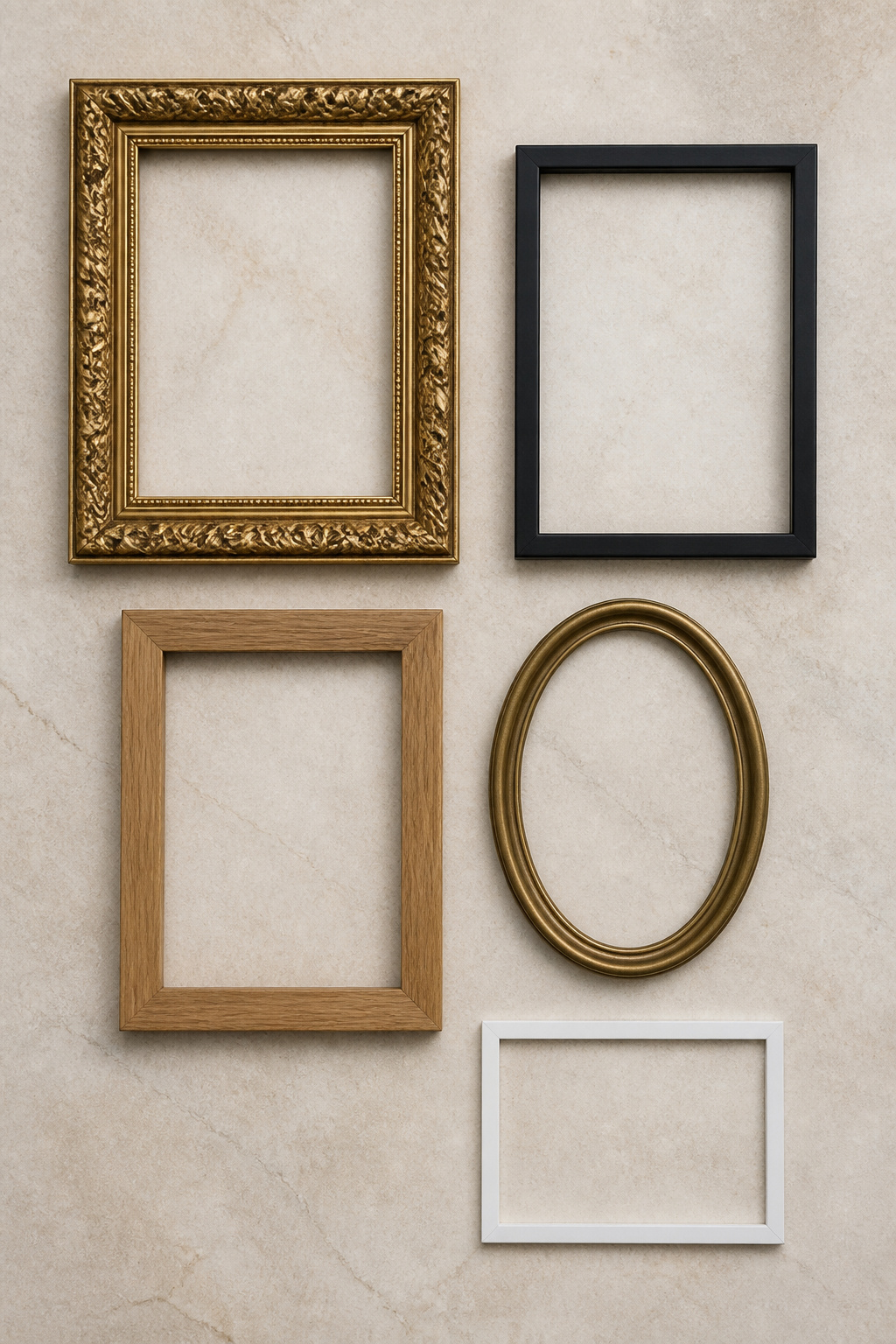
The table below maps the finishes that coexist in a warm eclectic wall, and what each pairing communicates.
| Frame finish pairing | Compatibility | What it communicates |
|---|---|---|
| Ornate gilt + matte black | Strong; classic eclectic contrast | Period drama held in check by modern restraint |
| Natural oak + aged brass | Excellent; shared warm undertone | Collected-over-time, the most forgiving era mix |
| Black-dominant + oak accent (70:30) | Reliable; modern-eclectic | A contemporary room with vintage warmth threaded in |
| Warm metallics + painted white/cream | Risky; cool tone breaks the warmth | Reads as a mistake unless repeated two or three times |
Gilt, black, natural wood, and painted: which combinations coexist
The classic eclectic trio is natural wood, a warm metal (brass or gold), and matte black — mixed at roughly 70:30. Warm matte gold beside wood is the most forgiving across eras: the undertone in aged brass echoes oak, and shared undertone prevents the jarring note.
The one-finish anchor rule: one dominant frame finish keeps the wall readable
Hold the wall to three finishes: one dominant on roughly half the frames, a supporting finish at 30 percent in the same warm or cool family, and an accent at 20 percent. Past three finishes, the wall reads as noise.
Period frames beside modern minimal frames: when provenance earns the pairing
A period gilded frame earns its place beside a slim modern one only when the art has genuine weight — a real nineteenth-century print, an original oil, a numbered edition; without that quality it reads as pastiche, not provenance.
Mixing Art Types: Prints, Paintings, Photography, and Objects
Layering dimensional objects is the textile cousin of mixing patterns elsewhere in the room — the same connecting thread that governs the frames governs the objects.
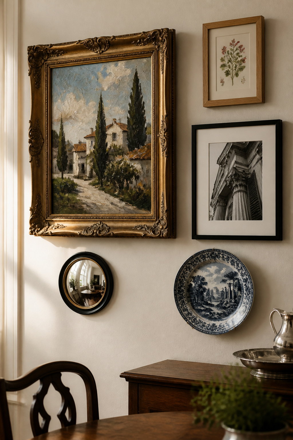
Framed works versus dimensional objects: plates, mounted shelves, mirrors
Objects with depth — decorative plates, a small convex mirror, a mounted shelf, candle sconces — give a wall texture flat frames cannot. A convex mirror reads as both frame and object, throws reflected light into the room, and takes less wall space than a canvas of the same diameter.
Scale variation within a gallery wall: the large-medium-small rhythm
Professional walls follow a clear hierarchy: one dominant piece, two or three medium pieces at 50 to 75 percent of that size, and several small pieces at 25 to 40 percent. Leave out the medium tier and you get a statement piece surrounded by trinkets, with nothing to bridge the jump in scale.
Photography alongside original art: how to make different media agree
When combining three or more media, Framebridge’s design team recommends matching the frame styles — consistent framing lets the content differences carry the interest. Black-and-white photography acts as a visual neutral beside original paintings; position the oil or watercolour as the anchor.
Laying Out the Gallery Wall Before Committing a Nail
The paper template method lets you rearrange a twelve-frame composition without leaving a hole you regret — all on the floor before any nail is driven.
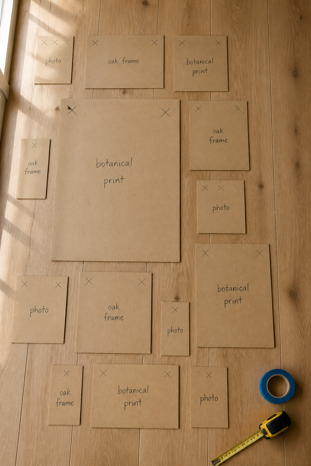
- Trace each frame onto brown kraft paper. Label every template with the artwork, the frame finish, and the orientation — portrait or landscape.
- Mark the hanger position on each template. Measure where the hanger sits on the back of the frame and transfer that point to the paper, so the nail lands in the right place later.
- Lay the templates on the floor within the target wall footprint. Start with the anchor, then move the rest freely until the composition satisfies you.
- Tape the templates to the wall in that exact arrangement. Use painter’s tape, step back to normal viewing distance, and adjust.
- Drive the nails straight through the paper at the marked hanger points, then tear each template away as you hang its frame.
Arranging around the anchor and filling outward organically
Hang the anchor first — everything else builds from it. Fill outward in a loose pinwheel, alternating large and small, and tape the footprint first so the composition never overruns the available width.
Spacing: the 2–3 inch gap rule and when to vary it
Two to three inches between neighbouring frames is the professional standard — 2 inches for a formal grid, up to 4 for a salon arrangement. Below an inch they merge into one block; above 4 or 5 the wall loses its group identity. Leave 3 to 6 inches of clear wall around the whole arrangement as a negative border.
Hanging Height Over a Table or Buffet
The lowest frame should sit 6 to 12 inches above the furniture’s highest point — 8 to 10 inches the comfortable midpoint — superseding the museum standard of centring at 57 inches.
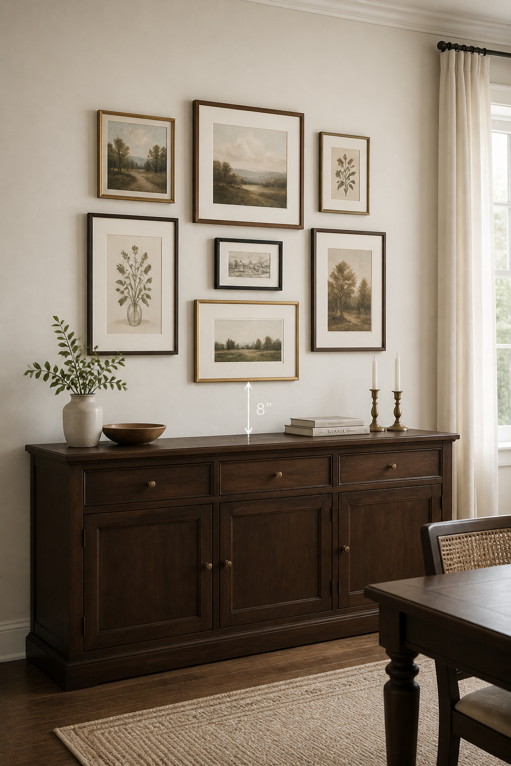
The 8–10 inch rule from the top of the furniture to the bottom of the lowest frame
Measure the clearance from the buffet’s surface with the styling in place — candlesticks and a tall vase eat into the 8-to-10-inch zone. Over a 60-inch buffet, target a 40-to-45-inch spread. As Laboo Studio’s Tony Musso advises, centre the art to the furniture, not the wall — following the wall in an open-plan room leaves the art visibly adrift.
Adjusting for high ceilings: when to let the wall breathe above the arrangement
A 10-foot ceiling changes the maths. Raise the centre point to 60 inches and leave 24 to 30 inches of empty wall above the top frame — scale the art up to meet the room, not float upward.
A vertical gallery wall in a narrow dining space: using height as the axis
When the wall offers more height than width, stack vertically — a column of differently sized pieces draws the eye upward and adds apparent ceiling height. Drop one larger frame into the centre to anchor it; shift the cluster to 54–57 inches to meet the eye from the chair. The vertical stack recurs in our small dining room ideas.
Sourcing Art for a Dining Room Gallery Wall
The most collected-looking walls are rarely sourced from a print shop. Estate sales, antique fairs and thrift stores hold better frames and more interesting art at the same price — with a provenance no matching set can fake. Before you carry anything home, run through the same checks I use on arrival:
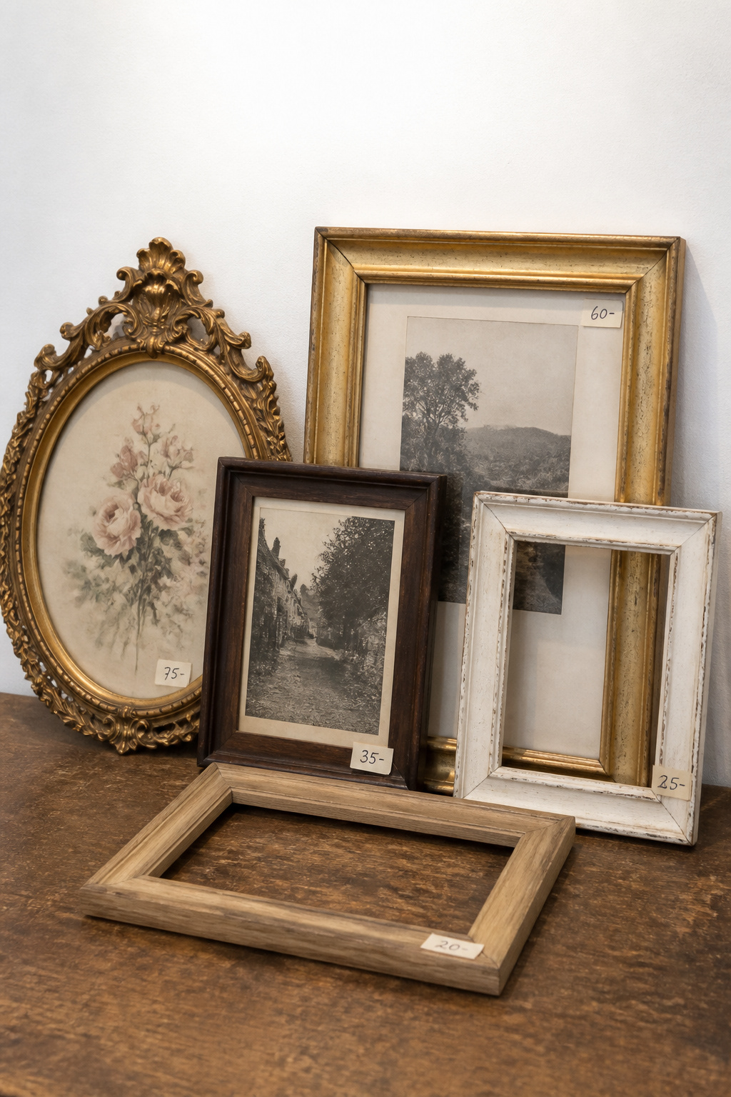
- Condition before price. Look for foxing (the small brown age spots on paper), fading visible just outside the frame reveal, tears, cockling, and whether the frame itself is structurally sound.
- Frame first, art second. A poor painting in an exceptional frame is often the better buy — the frame can be re-filled, and the moulding is the part that holds the wall together.
- The back tells the story. Check for a gallery label, an exhibition stamp, or even an old price sticker; any documented history adds the biographical weight that earns an ornate frame its place beside newer pieces.
- Does it share the thread? Hold the piece against the colours already in your collection. Bought for size alone, it will always read as a late addition.
Estate sales, antique fairs, and what Rachel looks for on arrival
The first thing I assess is condition under honest light — foxing and fading that look minor in a dim sale become conspicuous under a dining room’s direct fixtures. The second is the frame’s integrity: a sound rabbet and stable joints matter more than the art inside. As Blue Moon Estate Sales notes, even one recorded exhibition turns a $20 painting into a piece with biographical weight; when local sales run dry, Habitat for Humanity ReStores and EstateSales.net are documented secondary sources.
Mixing originals and quality prints without apology
Mixing original oils with high-quality giclée prints needs no apology when the framing unifies the group. Quality giclée on archival paper is indistinguishable from an original at normal viewing distance. Historical botanicals, architectural engravings and antique maps are widely available as public-domain prints — framing them on archival stock is established practice.
Set the thread first — colour or subject. Hold the finishes to three with one dominant, vary only one attribute at a time, and plan it on the floor before a nail goes in. Done well, the wall reads as a collection assembled over time, not a set bought in an afternoon.
FAQ
How do you arrange a gallery wall in a dining room?
Trace each frame onto kraft paper, label it, and arrange the templates on the floor first — start with the largest anchor piece, then build outward, alternating large and small until the composition satisfies you. Tape the confirmed templates to the wall, assess from a normal distance, then drive nails directly through the paper. Keep 2–3 inches between frames.
How high should artwork be hung above a dining table?
Leave 6 to 12 inches between the bottom of the lowest frame and the top of the dining table or buffet, with 8 to 10 inches the practical midpoint that keeps art connected to the furniture without crowding it. Centre the arrangement at 57–60 inches from the floor, shifting slightly lower to 54–57 inches where the primary viewer is seated.
Can you mix different frame styles on a gallery wall?
Yes, but limit the wall to three finishes, with one dominant finish on roughly 50% of frames — usually the largest pieces. The dominant finish carries the visual weight and makes the mixing read as intentional. The safest rule is to vary only one attribute at a time: change colour or change profile width, but never both at once.