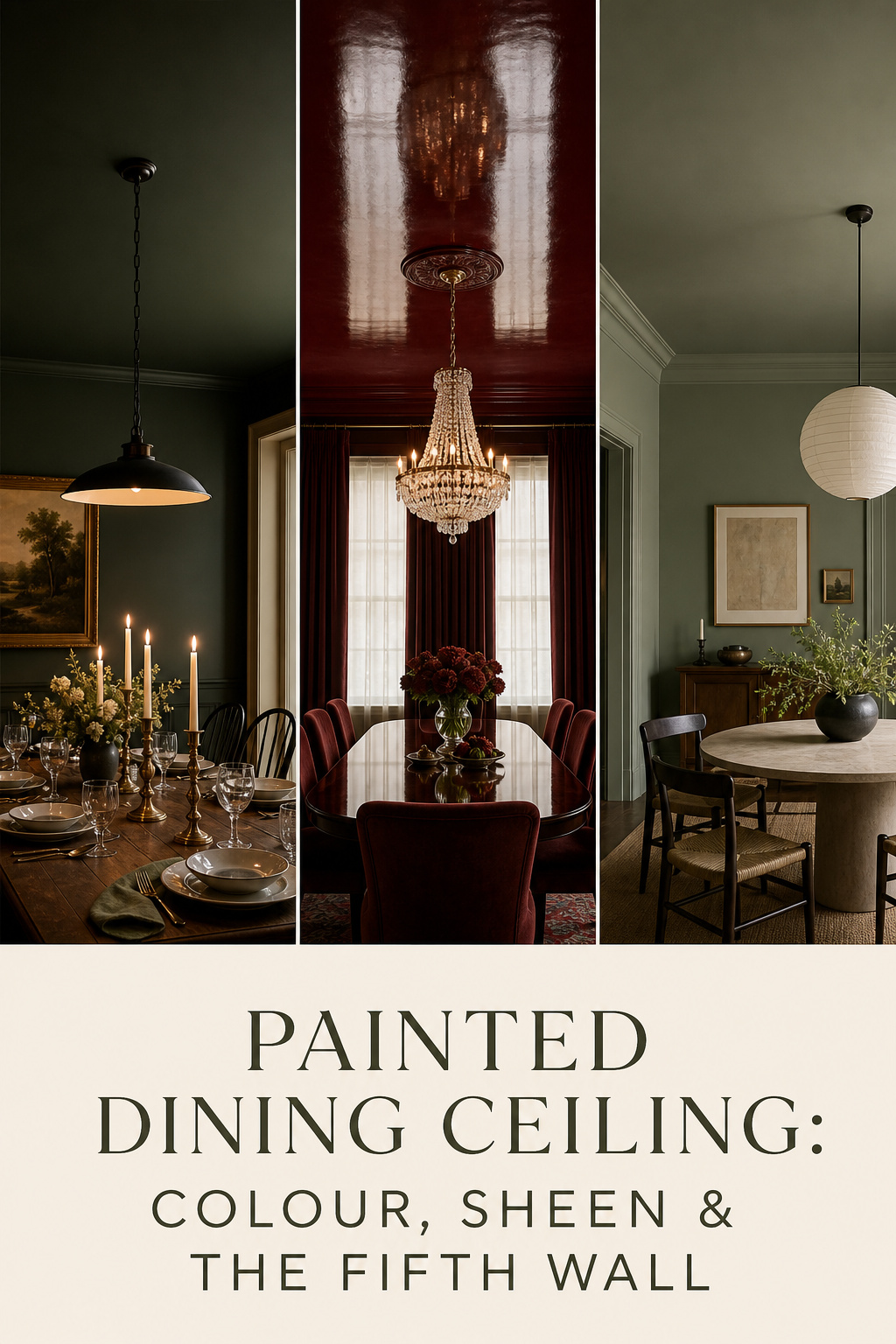

For most of the last century the ceiling was the one surface nobody decided anything about — white by default, because a flat white reflects light evenly and asks no questions. In 2026 that default has quietly broken. Homes & Gardens, Livingetc and 1stDibs now treat the ceiling as the “fifth wall,” a surface with the same design weight as the four upright ones, and the painted dining room ceiling is the clearest expression of the idea. Before a colour, though, ask the only question that matters: what do you want this room to feel like when the candles are lit?
TL;DR
- Flat or matte is the right default for a dining ceiling: it hides drywall flaws, deepens dark colour, and is the easiest finish to touch up; any sheen above flat needs a near-perfect surface first.
- A dark ceiling does not automatically shrink a room — over light walls it recedes like a night sky, and in a dining room the enveloped feeling is usually the point.
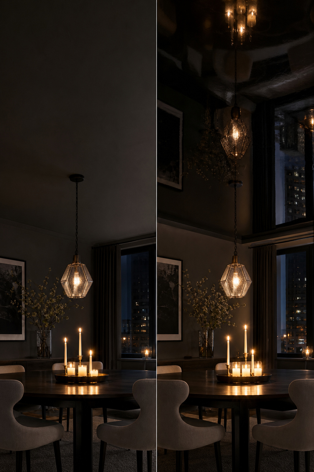
- High-gloss reflects the chandelier and candles like a mirror, but only over a Level 5 (fully skim-coated) ceiling; over anything less it reveals every seam and disappoints.
Why the Ceiling Is the Room’s Most Neglected Light Surface
A white ceiling is not neutral. It is a decision to bounce scattered light back down and keep the room bright and even. That suits a kitchen. A dining room often wants the opposite — light gathered at the table, the chandelier working against a quieter surround. The painted ceiling changes that equation without touching a single wall.
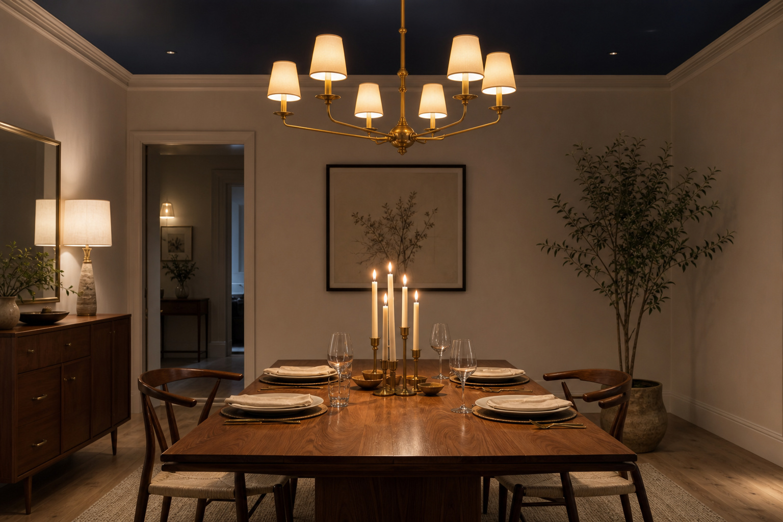
In a dining room the ceiling sits directly above the primary light source and catches every bounce of candlelight below it, which is why its finish matters more here than anywhere else. A pale ceiling raises the apparent brightness; a dark one absorbs most of that reflected light and concentrates illumination at the table. At a warm 2200K candlelight temperature, it removes the bright “lid” overhead and lets the table become the focal point.
The 2026 shift is real, not marketing. Andy Greenall, creative director of Paint & Paper Library, puts it plainly: “Most of us default to a white ceiling, but this can be a missed opportunity to add another layer of design to a room.” Colour drenching — walls, trim and ceiling in one shade — and colour capping — only the ceiling in a bold contrasting tone — are both named trends now, and a deep indigo dining ceiling is cited for adding “a layer of luxury that walls alone cannot achieve.” This is the broadest of the dining room ceiling treatment options, and the least structural: paint and colour alone.
Sheen: What Matte, Eggshell and High Gloss Each Do to Light
Sheen is the most technically consequential choice in painted ceiling work, and it is not a matter of taste — it is a measurement. Paint is graded by gloss units (GU): flat sits below 10, eggshell at 10–15, satin at 26–40, semi-gloss at 41–69 and high-gloss at 70 and above. The lower the number, the more the surface scatters light and hides its flaws; the higher, the more it reflects directionally and shows everything beneath it.
Here is what each level does on a dining ceiling, and where it earns its place:
| Sheen | Gloss units (GU) | Effect on light & height | Flaw-hiding | Best use in a dining room |
|---|---|---|---|---|
| Flat / matte | below 10 | Diffuses light; deepens dark colour; no glare | Excellent — hides seams and roller marks | The safe default in any colour, especially dark |
| Eggshell | 10–15 | Faint luminosity; slight chandelier catch | Fair — needs a smooth, prepared surface | A dark accent ceiling where subtle richness is wanted |
| Satin | 26–40 | Gentle sheen; more chandelier catch than eggshell | Fair to poor — surface prep essential | Bold accent ceiling on a well-prepared surface |
| High-gloss | 70+ | Mirror-like; reflects chandelier and candles | Poor — amplifies every imperfection | A statement ceiling, only over a Level 5 surface |
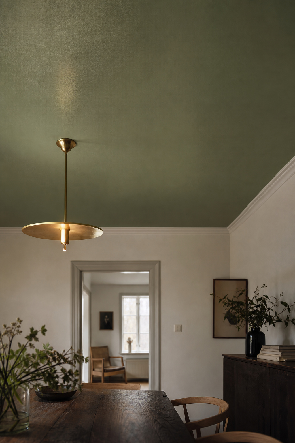
If you want one row to commit to, it is flat. Most professional painters specify it as the ceiling default: it hides seams and roller marks, absorbs glare, and touches up invisibly — which matters on a surface you cannot wipe clean. For dark colours flat does something extra; the light-absorbing finish and the light-absorbing pigment compound, giving a richer, more enveloping result than the same colour in any sheen.
Eggshell and satin are the considered middle ground — a slight luminosity that catches the chandelier without becoming a mirror — but only on a surface smooth enough to deserve them. Eggshell on a rough ceiling reads worse than flat on the same ceiling, because it reflects just enough light to highlight the flaws flat would have hidden.
High-gloss is the maximalist end: it reflects specularly, so the chandelier, the candles and even the table appear in the ceiling. The effect can be magical in the evening, and it carries a hard condition. High-gloss demands a Level 5 drywall finish: a full skim coat of joint compound over the entire ceiling, sanded with 220- then 400-grit. State this plainly before committing — without that near-perfect surface, gloss exposes every seam and nail pop, and Level 5 prep adds 30–60% to the labour over a standard finish.
Dark Ceilings: How Dark Is Right
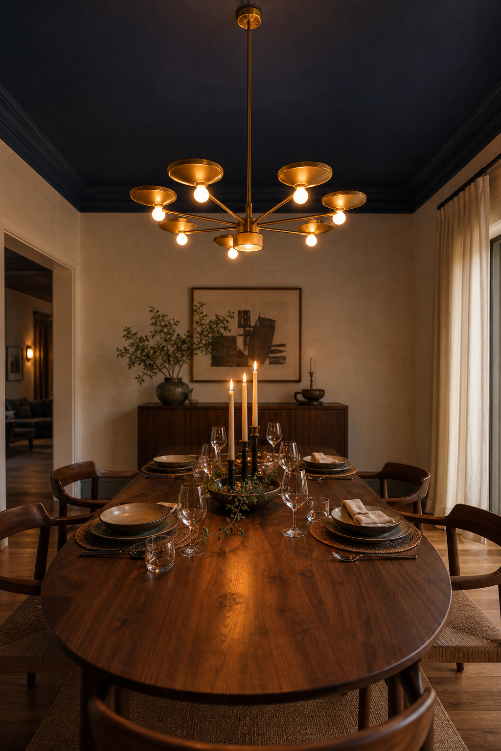
The rule that dark ceilings shrink a room is half true, and the missing half is the interesting one. Certified designer Kristie Barnett, the Decorologist, observes that “in a relatively small room, when the walls are painted light or neutral, a dark painted ceiling actually recedes, like a night sky that goes on and on.” The contrast reads as recession, not compression — and in a dining room, where intimacy is the goal, that is exactly what you want.
The effect has conditions. A dark ceiling compresses height when the room is already small, low and short of natural light; there it needs lighter walls and a strong chandelier to compensate. Rooms with good daylight absorb a dark ceiling easily — dramatic by day, intimate by night. Either way, test it: a colour that photographs beautifully can look oppressive in person, because a camera compensates for low light in a way the eye does not. Paint a full swatch on the actual ceiling and live with it for at least 48 hours.
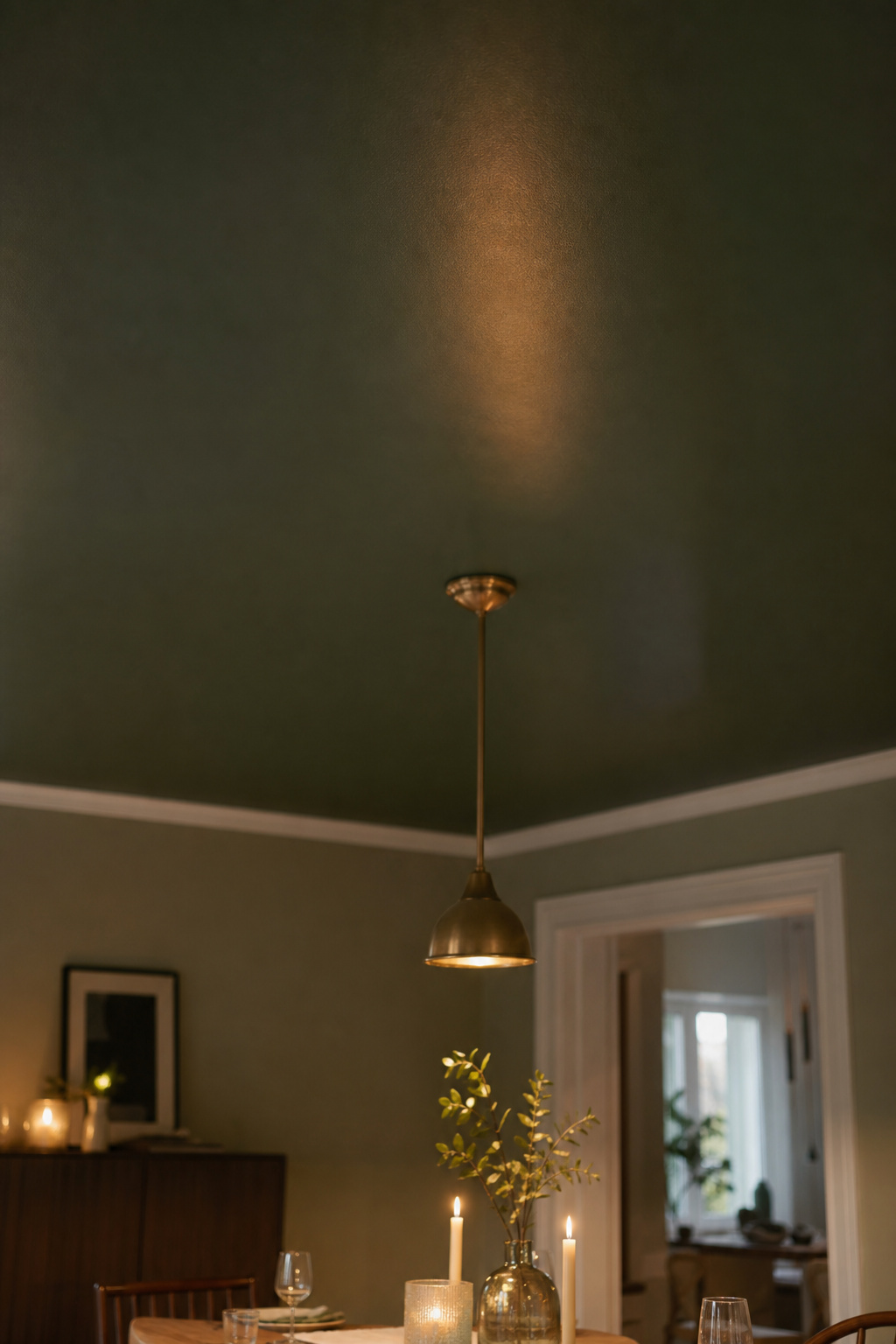
Warm darks and cool darks behave differently at the table. Warm tones return a slightly warmer cast under candlelight, flattering to skin and food. Cool darks — blue-undertoned navy, slate, cool grey — set the flame off vividly but can leave food and skin looking faintly grey, so pair them with genuinely warm light. Whichever you take, keep the trim and cornice in the same dark family; a stark white edge breaks the envelopment and turns the ceiling into a heavy lid.
Tones that suit dining ceilings well include:
- Farrow & Ball Hague Blue (No. 30) — a deep blue-green that reads warm in incandescent light
- Farrow & Ball Pitch Black (No. 256) — a velvet true black available in Estate Emulsion for ceilings
- Benjamin Moore Savannah Green — a deep yellow-green shown in colour-drenched dining applications
All three want a tinted dark undercoat — Farrow & Ball’s Dark Tones Primer, based on Down Pipe — to reach full saturation in two coats rather than three patchy ones.
Matching Ceiling Colour to Walls, Trim and the Table Below
A ceiling colour is never chosen alone. It is always in conversation with the walls below it, the trim that frames it and the table it looks down on. Three relationships are worth knowing, and each produces a different room.
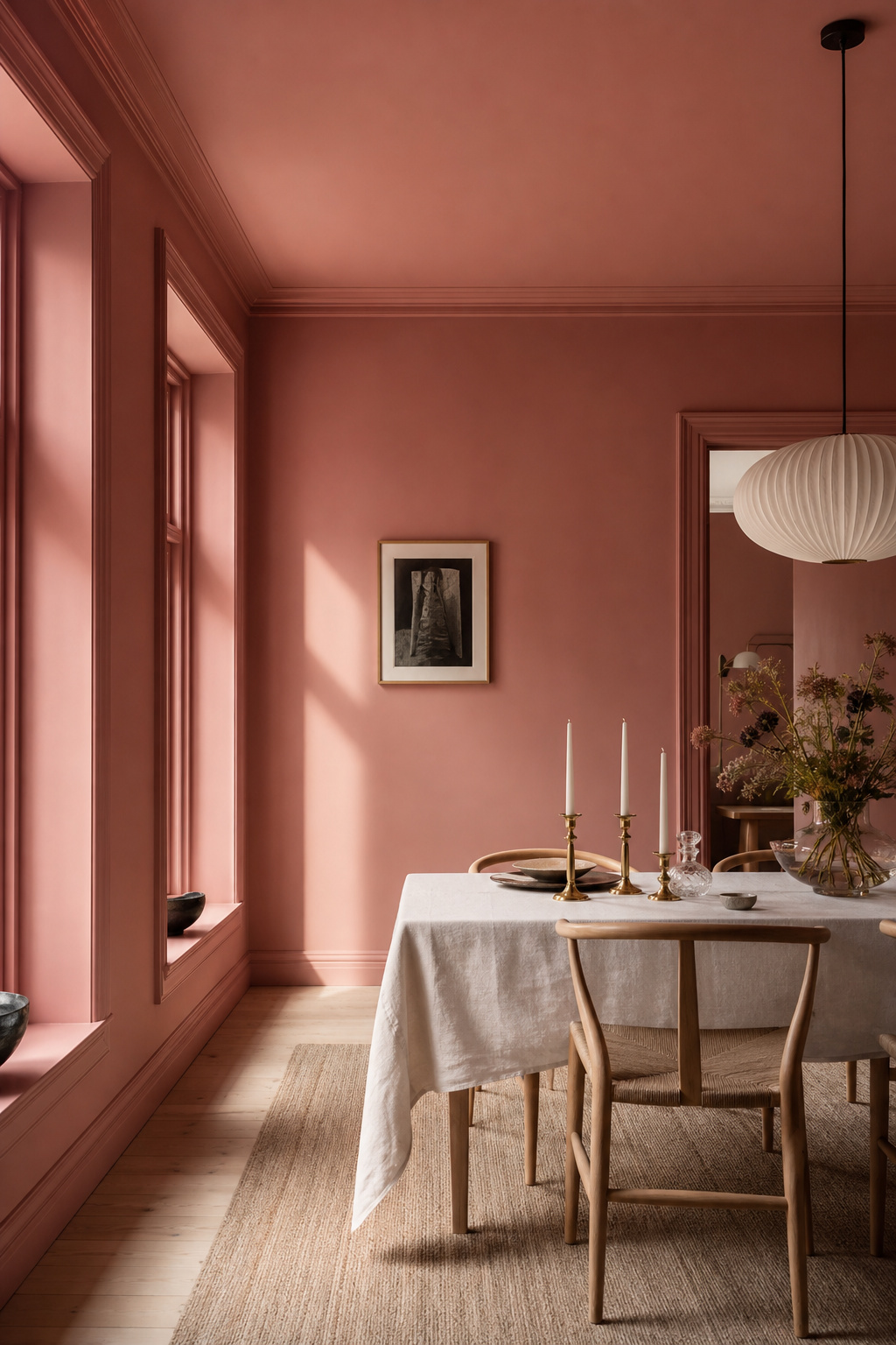
The first is continuity — taking the wall colour straight overhead. This is colour drenching, and Little Greene’s Ruth Mottershead describes its result well: “Create a blanketed and intimate feel by painting your doors, woodwork, walls and the ceiling in a single colour… a contemporary and cocooning finish.” It softens corners and suits a dining room precisely because mood matters here more than the illusion of size. It also quietly hides awkward features — skinny trim, an exposed pipe — by removing the contrast that would advertise them.
The second is tonal contrast: the same colour family, different value. Andy Greenall recommends “introducing shades of differing strengths… particularly effective when walls are painted in a slightly darker pigment and the ceiling in a tonal but lighter pigment, as this creates a feeling of height.” It is the most forgiving way to make a ceiling read as deliberate without full commitment. The third is true accent — the ceiling as a distinct fifth colour, best drawn from something already in the room (the curtain fabric, the floor) so it stays anchored rather than floating.
The cornice is the hinge between all three. Painted in the ceiling colour, it pulls the ceiling visually lower; painted in the wall colour, it lifts the plane and keeps a dark ceiling crisply capped. One rule overrides the colour choice: paint trim and moulding in satin or semi-gloss whatever the colour, for durability and because the sheen difference alone separates the surfaces even when the colours nearly match.
When Paint Is Not Enough — and When It Is
Paint occupies a specific, valuable place among ceiling treatments: it is the fastest, the most reversible and the least structurally demanding. A painted ceiling goes up in a day and can be undone over a weekend, where coffering, planking or paper each cost more in labour and commitment. Paint is also the only treatment where sheen is itself the design variable, and the only practical way to colour-drench, since matching a wallpaper pattern across a ceiling rarely aligns at the corners. On a sound ceiling the materials run roughly $1–3 per square foot, with application adding $2–4 — treat those as indicative ranges, not a quote, but they sit far below any structural alternative.
Paint reaches its limit at pattern and texture. When a botanical print or a painted sky is what the room wants, that is the moment for pattern instead of flat colour — paper does what paint cannot, and sits most comfortably inside a defined boundary like a tray recess where the repeats can be controlled. Where the ceiling needs physical depth rather than colour, the answer is cladding the ceiling instead with boards. Even then paint stays in play: a coffered grid painted monochrome, the beams in a slightly higher sheen than the panels, lets light and shadow reveal the structure without dark-on-light contrast. For most dining rooms, the honest verdict is that paint alone — the right colour at the right sheen — is enough.
The Professional Position on Painted Dining Room Ceilings
There is a hierarchy to this, and getting the order right is most of the job. Decide the feeling first, the colour second, the sheen third, and only then the surface preparation — though prep is where most painted ceilings actually fail.
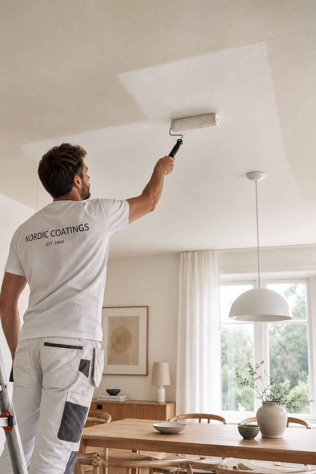
The first decision is always the same: what is this room for? Colour consultant Maria Killam reduces it to one line — “cozy means a darker colour.” Settle the atmosphere and the value of the colour follows. The second decision is the light source: a 2200K candlelit room and a 4000K daylight-bulb room want different ceilings, because a warm dark that glows under candlelight turns oppressive under cool white LED. Then preparation. A flat white forgives almost anything; any sheen above flat, or any colour over an unrepaired surface, reveals every joint and roller mark. Flat in any colour needs the ceiling cleaned, cracks filled, a light 150-grit sand and two coats rolled in a W-pattern — three for dark colours. Anything glossier needs a Level 4 surface minimum, a full Level 5 skim coat for gloss.
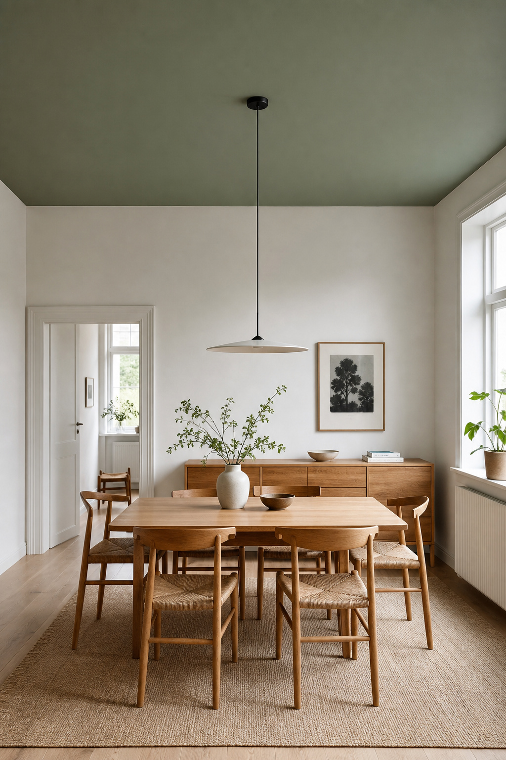
If you are unsure where to begin, the professional first move is the least dramatic: take the wall colour overhead in flat finish. It is the simplest colour-drench, fully reversible, the safest way to start a relationship between ceiling and room. For a Nordic register, a quiet greyed tone — sage, greyed blue, a warm greige — carried up in flat reads as intentional without drama. That is where I would tell anyone to start. The bolder moves stay available afterwards, but a calm ceiling you chose on purpose is already the whole idea: the fifth wall, used with restraint, is rest for the eye.
FAQ
Does a dark ceiling make a dining room feel smaller?
Not necessarily. In a small dining room with light or neutral walls, a dark ceiling often recedes overhead like a night sky, and the room can feel larger and more intimate rather than smaller. It only compresses height when the ceiling is low, the room small and natural light limited — conditions that call for lighter walls and a strong chandelier.
What sheen should I use for dining room ceiling paint?
Flat or matte is the professional default: it hides drywall imperfections, deepens colour and is the easiest to apply and touch up. Eggshell or satin suits a dark accent ceiling where you want a faint chandelier catch, but only on a smooth, well-prepared surface. High-gloss demands a Level 5 skim-coated ceiling, or every flaw shows.
Should the ceiling be the same colour as the walls in a dining room?
Often, yes. Taking the wall colour overhead — colour drenching — creates a seamless, cocooning effect that suits dining rooms particularly well, and is the 2026 trend most cited for them. A safe variant is the wall colour one shade lighter on the ceiling, which adds a feeling of height. Choose a distinct accent colour only when deliberate contrast is the goal.