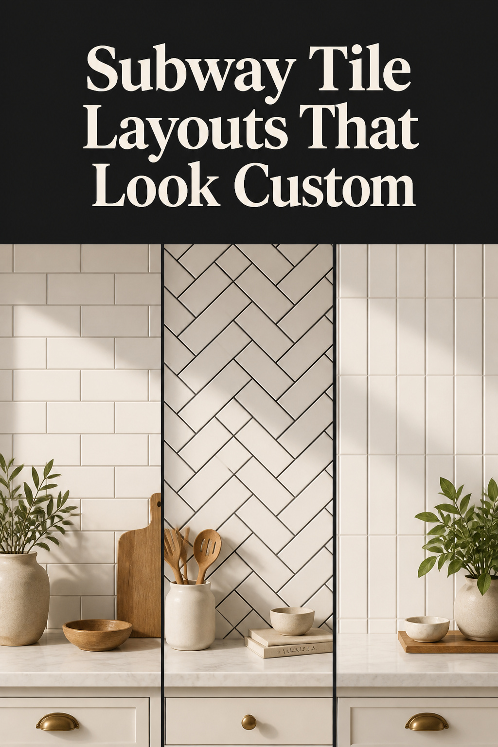
The tile behind your cooktop was designed for a train station. In October 1904, architects George C. Heins and Christopher Grant La Farge specified bright white 3×6-inch glazed ceramic for New York City’s first subway platforms — chosen to bounce light through the dark and signal a surface clean enough to lean against. That same rectangle is now the most-installed kitchen backsplash in America, and most of the time it goes up without a decision being made. That is the whole problem. The subway tile backsplash everyone calls “safe” sits only a few choices away from reading builder-grade or genuinely custom, and those choices cost nothing.
TL;DR
- The 3×6 subway tile dates to a 1904 spec with a 2:1 ratio and grey contrast grout — “classic” was never plain white-on-white running bond.
- Layout does the heavy lifting: vertical stack adds height under low ceilings, herringbone reads custom but runs 15-30% more in labour and needs 15-20% overage tile.
- Grout colour is the cheapest lever — matched grout quiets the wall, charcoal defines every tile; specify layout, grout and finish together before you order.
Why a 1904 Subway Tile Backsplash Still Belongs in Your Kitchen
Most building materials get replaced every generation; subway tile has outlasted five. Understanding why tells you which version reads considered and which reads as filler.
From the New York subway to the home kitchen
Heins and La Farge weren’t decorating when they chose that tile for City Hall Station. The glossy white glaze reflected light underground; its smooth, stain-resistant surface answered a public newly anxious about germ theory — the same hygienic logic that, by the late 1920s, carried the tile into domestic kitchens. The 1904 specification is a 3×6-inch white-glazed ceramic rectangle, 2:1 in ratio, laid in running bond with grey cement grout — and it was never white-on-white.
What makes the proportion timeless
Strip away the colour and finish, and what remains is the ratio. A 2:1 length-to-width rectangle gives a wall horizontal movement without busyness — wide enough to feel deliberate, short enough to stagger without distorting the surface. Over a century, subway tile has migrated through glass, porcelain, handmade ceramic and elongated formats; the one constant is that proportion.
The difference between classic and default
Here is where most kitchens go wrong. Running bond — the 50% brick-lay offset — was the historic standard, which is exactly why it now reads as builder-grade: it needs no layout decision, so it became the spec choice. The builder-grade trap is white 3×6 in running bond with near-matched grout, installed without choosing a single variable. The same tile in herringbone or vertical stack with contrast grout reads as a deliberate decision — for no more money. Joanna Gaines, who calls subway tile her favourite, points to grout as the decision that separates a considered backsplash from a forgettable one. She is right, but grout is the second lever. The first is layout — and it sits inside the broader set of kitchen backsplash ideas every kitchen decision starts from.
The Layout Is the Whole Game
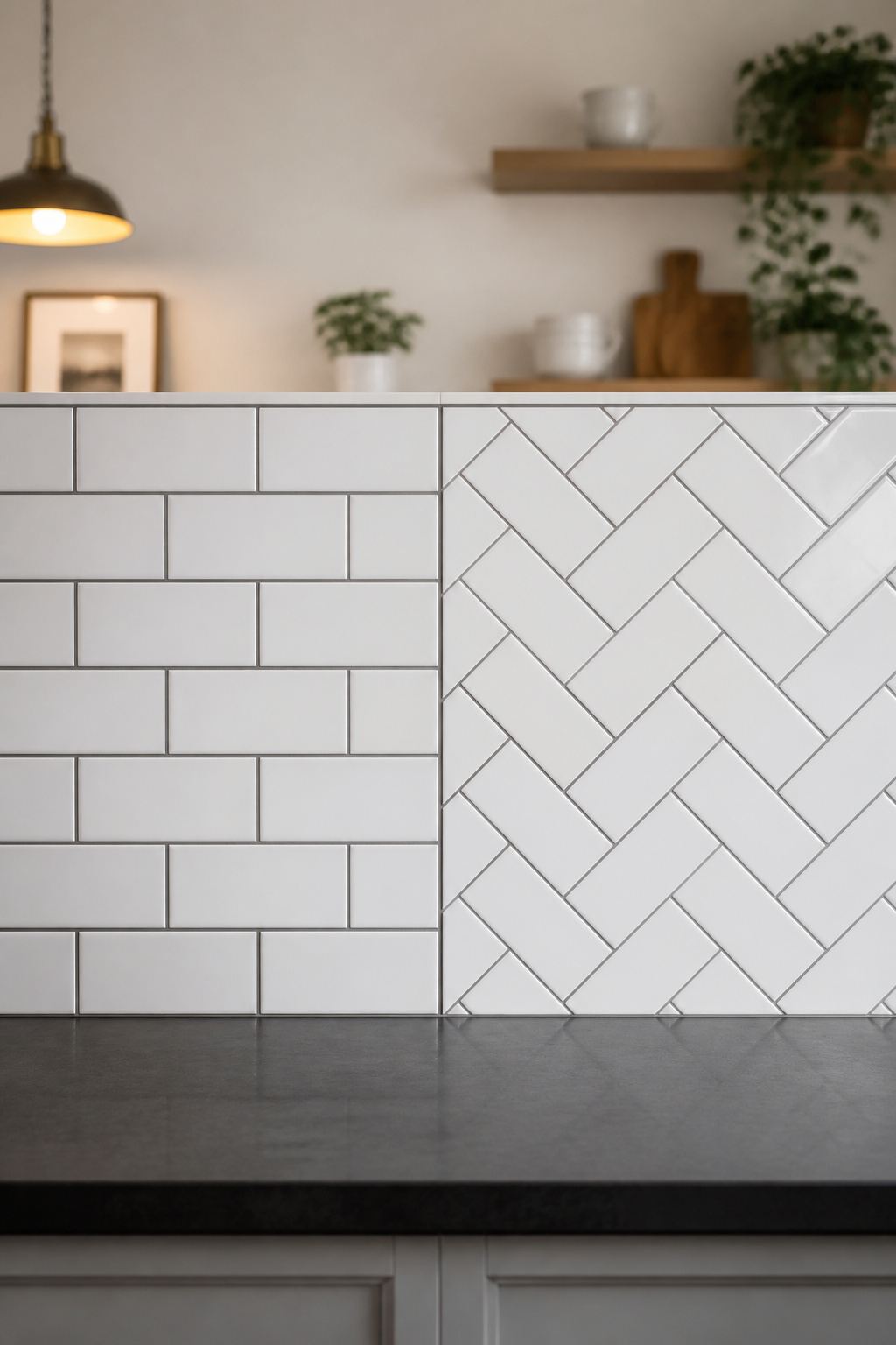
Layout is free and sets visual weight, directional movement and perceived room size. Four layouts cover almost every subway backsplash, and they sit far apart on effect and difficulty.
| Layout | Visual effect | Difficulty |
|---|---|---|
| Running bond | Horizontal movement, classic, emphasises width | Beginner-friendly — predictable cuts, simple alignment |
| Stacked (grid) | Contemporary, minimal, rigid grid | Demands a perfectly level install — continuous grout lines show error |
| Vertical stack | Draws the eye up, adds perceived ceiling height | Moderate — same tile, vertical alignment |
| Herringbone | Dynamic, sophisticated, the strongest statement | Skilled work — angled cuts, 15-20% overage, 15-30% more labour |
Running bond, stacked and vertical stack
Running bond is the most forgiving pattern — predictable cuts, simple alignment, suits any kitchen style and any skill level. Stacked bond aligns every grout line into a perfect grid and reads contemporary, but continuous vertical joints punish any install that isn’t dead level. Vertical stack is the quiet overachiever: turn the tile so its long dimension runs up the wall and the eye follows, lifting the perceived ceiling — the most transformative layout for a low or narrow room, at no extra material cost.
Herringbone and the 90-degree turn
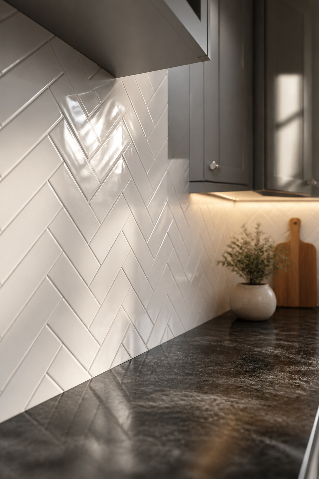
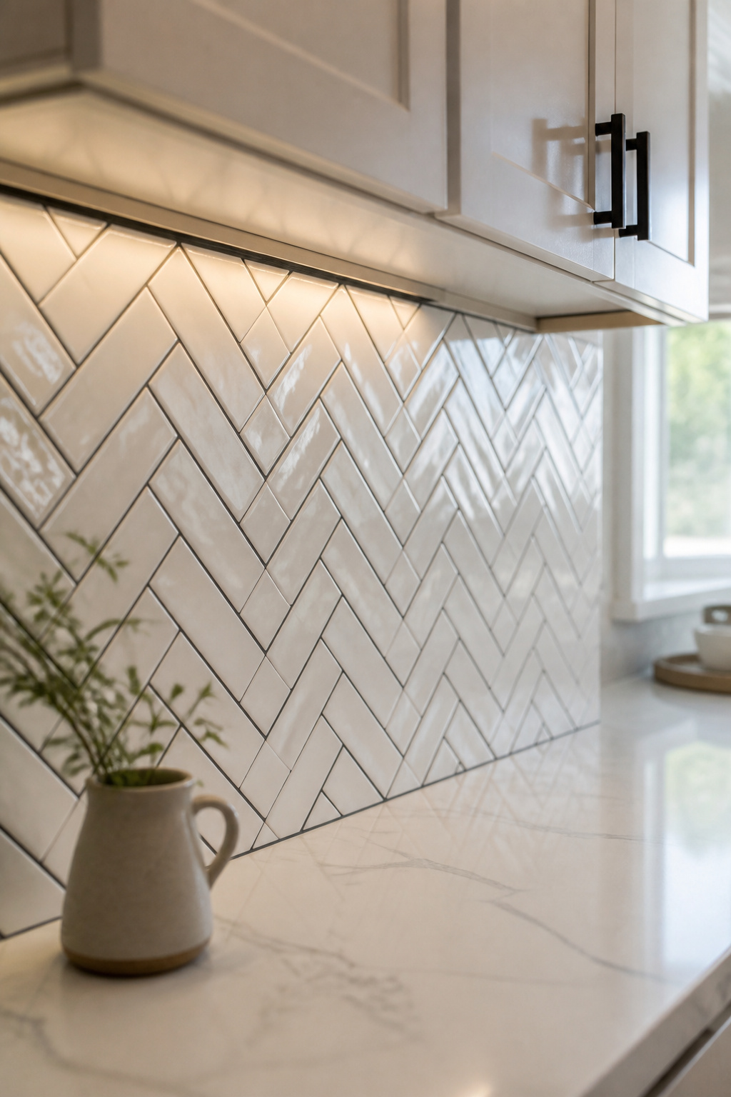
Herringbone sets the rectangles at 45 degrees into an interlocking V — the boldest statement subway tile makes without changing material, and a pattern that “immediately draws the eye and makes your backsplash impossible to ignore” (Nova Tile and Stone). The impact has a price: herringbone runs 15-30% more than running bond on labour — roughly $10-$15 per square foot against $4-$7 — and requires 15-20% more tile to cover angled-edge waste, versus 10% for running bond. A 90-degree version softens the effect. Neither is a first-time DIY job.
What each layout does to a small kitchen
The layout should answer the room. Running bond emphasises width, which can make a low kitchen feel squat under an 8-foot ceiling; vertical stack is the better answer there. Herringbone makes a small room feel larger, at higher cost, while stacked grid reads institutional in a tight space. How far the tile runs up the wall also changes which layout pays off — worth settling on how high to take the tile before you commit.
Grout: The Cheapest Way to Change Everything
If layout is the first lever, grout changes everything for nothing — decided at install, no costlier in any shade, and the single choice that most shifts how the finished wall reads.
Matched grout for a quiet wall
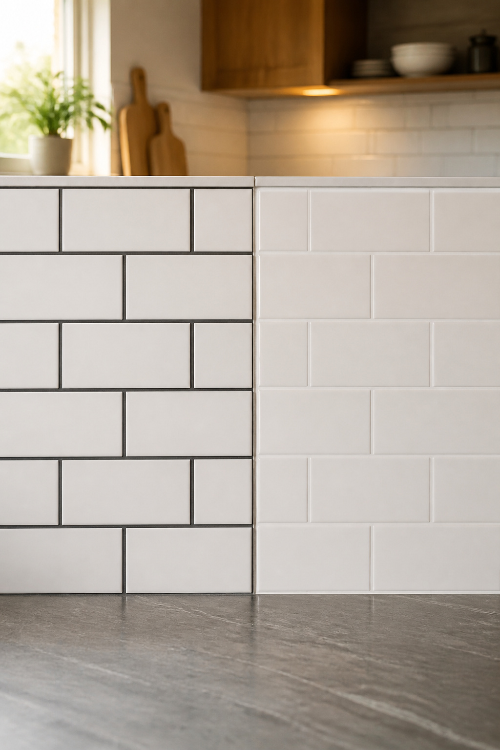
Pair white tile with closely matched grout and the wall becomes one expansive plane: the glossy face bounces light and the eye registers texture rather than a field of separate tiles. This is the right choice when the backsplash should recede and let the cabinets, counter or hardware carry the weight. Matched grout is not the safe default — it is an active decision to create calm, cleanest in a 1/16-inch joint.
Contrast grout to define the pattern
Contrast does the opposite: it draws every tile and hands the layout its full weight. Joanna Gaines recommends dark grey grout with white subway tile because it “highlights the tile, making the backsplash stand out” — the same grey-on-white pairing the 1904 platforms used. For most working kitchens, mid-tone grey is the wiser middle: enough contrast to show the pattern without the severity of black. Joint width tunes it too — a 1/8-inch joint emphasises the pattern, 1/16 inch recedes; both sit inside the standard range trade installers use for a 3×6 backsplash.
Grout colour and upkeep reality
Weigh aesthetics and maintenance together. Dark charcoal or black grout hides cooking grease better than any other tone — a real advantage behind the cooktop — but shows limescale as pale streaks in hard-water regions. Specify the grout type alongside the colour: epoxy holds its colour, needs no sealing and resists stains; cement-based grout needs resealing every 12-24 months, and an unsealed contrast joint will absorb grease and discolour within months.
Shape, Bevel and Finish Variations
Beyond layout and grout sits a third layer — edge, finish and format — that separates a considered subway wall from a stock one.
Bevelled vs flat edges
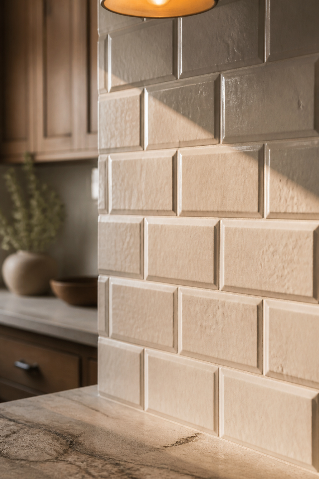
A bevelled tile slopes gently to its edges, throwing a soft shadow line at every joint that adds dimension and catches light — most visibly under recessed LED or under-cabinet lighting. Bevelling was one of subway tile’s earliest evolutions after 1904, and the edge I reach for in a heritage kitchen. A flat edge holds flush transitions for a seamless, minimalist plane.
Glossy, matte and handmade-look glaze
The original glossy glaze still earns its place: it reflects light, brightens a dark kitchen, and wipes clean. Matte trades shine for forgiveness — water spots and fingerprints vanish into the textured surface. But the finish I’d specify first for warmth is handmade-look glaze. Its slight surface irregularity and faint colour variation make each tile catch light differently, giving a wall warmth that uniform factory tile cannot replicate, at a mass-produced price.
Elongated and picket twists on the rectangle
The rectangle stretches. Elongated formats — 3×9 and 4×12 — cut grout lines per square foot, producing cleaner sight lines; they suit larger kitchens with flat cabinet panels and are predicted to appear in 60% more backsplash projects in 2026 than standard sizes. Picket — the elongated hexagon — offers a softer departure, its long centre reading like an extended horizontal run while the pointed ends add a gentle geometric note. All keep the basic rectangular proportion, which is why they still read as subway.
Putting It Together: Custom, Not Builder-Grade
A custom-looking backsplash is when all three levers — layout, grout, finish — are chosen on purpose, not left to the installer’s default.
Three combinations that always read intentional
Some pairings reinforce each other so reliably I treat them as recipes. The first: herringbone with charcoal grout and flat gloss tile — maximum movement and contrast, best behind a simple stainless or dark appliance. The second: vertical stack with mid-grey grout and matte or handmade-look tile — the run adds height, the mid-grey defines the grid without severity, the softer finish keeps it warm. The third: running bond with matched cream grout and a handmade-look glaze — the quietest option, where character comes from the tile’s irregular surface, right where stone counters or wood shelves are already doing the visual work.
Matching the choice to your cabinets
The cabinet face decides which recipe fits. Large flat-panel doors pair naturally with elongated 4×12 or 3×9 tile. Shaker cabinets suit both running bond and herringbone, and contrast grout reads especially well against their simple lines. Ornate or raised-panel doors want the backsplash to recede — running bond in a matching grout. White cabinets support any recipe, though herringbone with charcoal grout is the most distinctive against them — worth working through on subway against white cabinets once you’ve settled the layout.
The one-line test before you order
Before you order, describe your backsplash in one sentence: layout, grout colour, tile finish. If any one is still “I haven’t decided,” the combination isn’t finished — grout belongs in the spec from the start, since epoxy versus cement changes maintenance, not just colour. Then prove it: set a sample tile and grout against the cabinet and live with them for a week under real kitchen light. The wall you can name in one line, and have watched in your own light, reads custom because it was decided, not defaulted.
FAQ
Is subway tile still in style for kitchens in 2026?
Yes — subway tile remains the most widely installed kitchen backsplash in 2026 and is repeatedly named the most timeless option. What has shifted is the install: herringbone, vertical stack and elongated formats are replacing default horizontal running bond, and bold colours like sage green and dusty blue are restoring its design relevance.
What size subway tile is best for a kitchen backsplash?
The classic 3×6-inch tile suits most kitchens — its 2:1 proportion works across small to mid-sized spaces, takes every layout, and offers the widest colour and finish range. Larger kitchens with flat-panel cabinets read well in 4×12 or 3×9 elongated formats, while compact kitchens should avoid very large tiles that feel out of scale.
Should a subway tile backsplash be glossy or matte?
Glossy is the historically correct finish — the 1904 spec was white-glazed ceramic — and it brightens small or dark kitchens by reflecting light while cleaning easily. Matte reads more contemporary and hides water spots and fingerprints far better. The 2026 direction mixes them: a glossy backsplash with matte floor tile, or glossy white with matte colour accents.