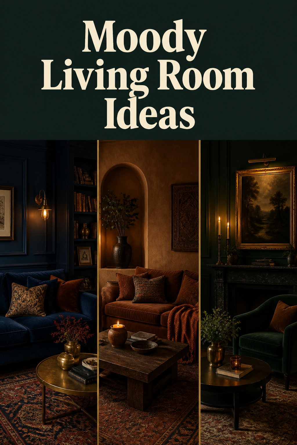

For roughly a decade, the dominant instruction in interior design was to add more light. White walls, white shiplap, grey-washed floors, recessed downlights in a grid — the brief was brightness. That consensus has broken. Entering 2025, Sunset magazine described a “seismic shift to the dark side,” and Pantone named Mocha Mousse (PANTONE 17-1230), a warm muted brown, its Colour of the Year — the first brown ever to hold the title. The best moody living room ideas are not a rejection of comfort in favour of drama. They are a return to something older: the conviction that a room can hold you in the evening rather than merely illuminate you.
That conviction rewards the homeowner who treats it as a system rather than a paint colour. A moody room is built from at least six interlocking decisions — colour, light, scale, texture, styling and palette temperature — and the difference between a room that reads collected and one that reads gloomy lives in how those decisions answer to each other. This guide surveys all of them, then hands each to a dedicated companion article for the depth a single page cannot carry.
What Makes a Living Room Moody (and Why It Works)
Before any colour goes on a wall, it helps to be precise about what the word promises. Moody is not a synonym for dark. It is a quality of atmosphere — depth, intimacy, a sense of enclosure — and darkness is only one of the means to it.
Intimacy versus gloom: the distinction that matters
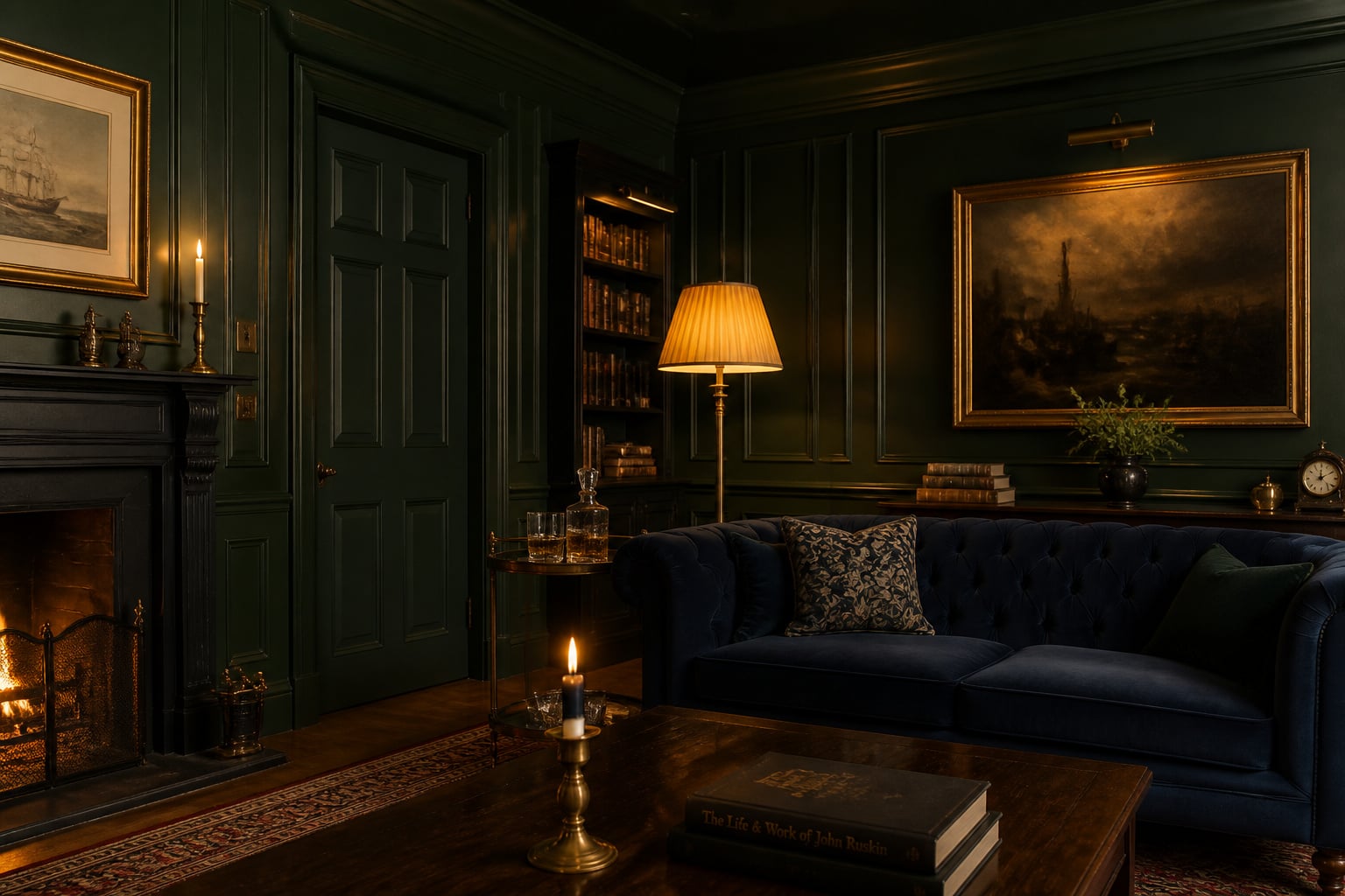
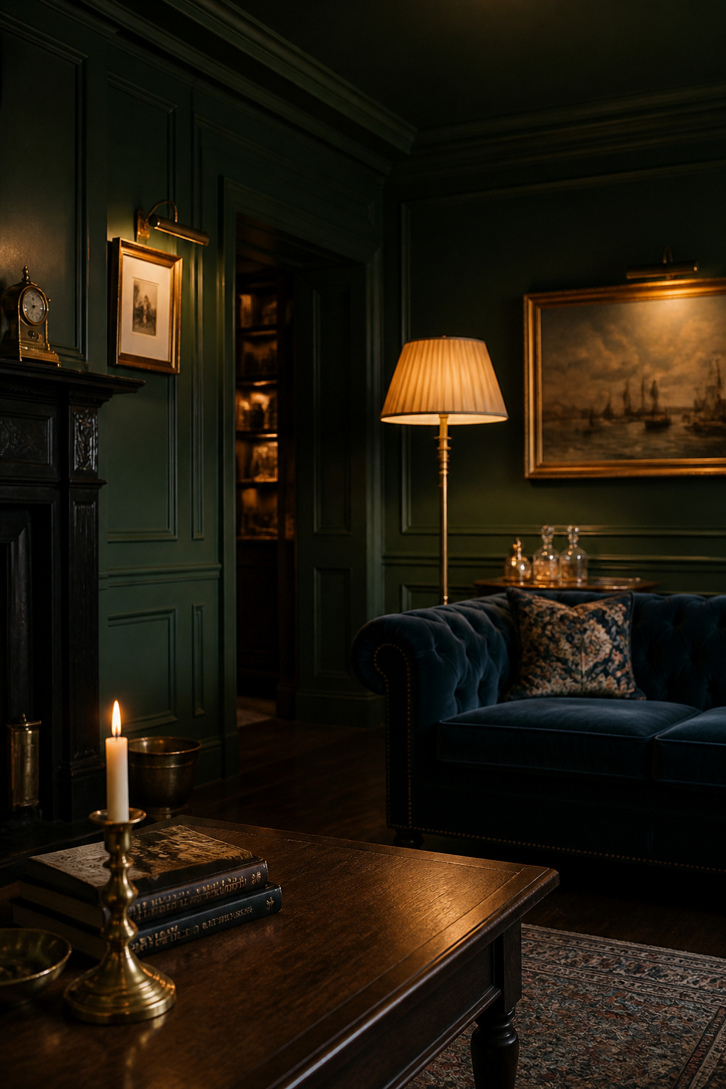
The line between an intimate room and a gloomy one is almost never a question of how dark the walls are. It is a question of light. A deep green room lit by a single overhead bulb reads as neglected; the identical room lit by warm lamps at three different heights reads as deliberate and rich. Darkness sets the stage, but layered light is what makes the room feel chosen rather than accidental. Reflective accents — a mirror, brass fittings, glazed ceramic — do the complementary work, bouncing that light back so the dark surfaces never collapse into a flat void.
The emotional goal is what matters here. As Denver designer Nadia Watts puts it, dark colours “ground a room. They make a space feel cozy and enveloping, which creates that sense of peace we are all looking for.” A moody room aims at coziness, introspection and a quiet romance — never at the literal gloom that the careless version produces.
The design lineage behind the moody interior
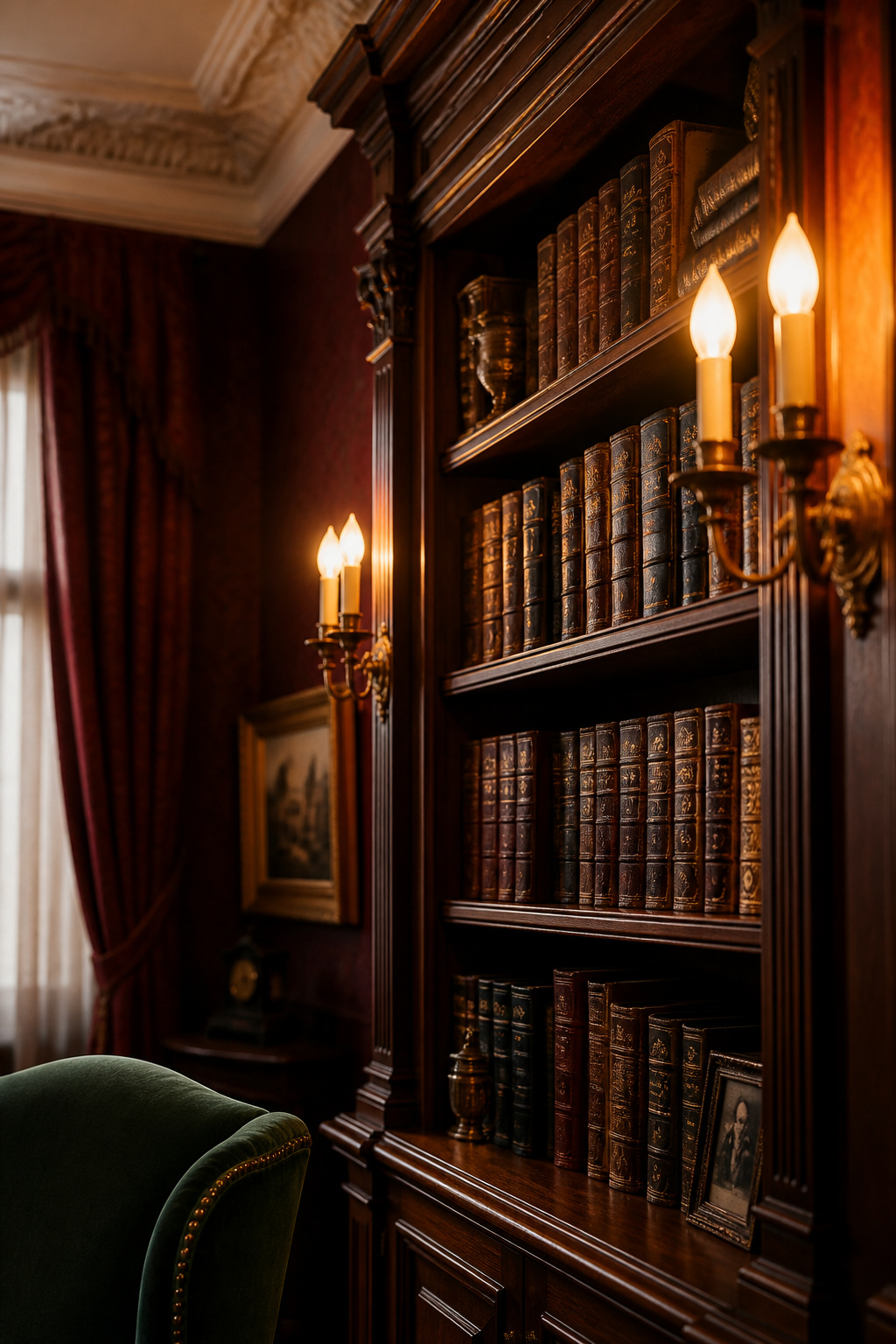
This is not a trend without ancestors. The Victorian parlour, built between the 1830s and 1900s, was a moody room by necessity: heavy drapes, dark woods, deep-toned wallpapers and candlelight as the primary source of illumination — the exact layered, shadowed atmosphere designers chase today. The Arts and Crafts movement carried the instinct forward, placing hand-craftsmanship and honest natural materials at the centre of the home: fumed oak, hand-blocked botanical papers, exposed joinery.
Gustav Stickley’s American Craftsman furniture achieved its rich finish through fuming — exposing quarter-sawn oak to ammonia, which reacted with the wood’s own tannins to deepen the colour from within rather than on the surface. That process is the direct ancestor of the dark, grained timber a moody living room still depends on. The mid-century scholarly den — dark shelving, leather chairs, pools of task light — completes the lineage and gives us the “dark academia” look that currently leads the searches.
Why the trend is resurging — and built to last
The return is part cultural reaction and part something more primal. Watts is blunt about the first: “Unlike the Apple Store white-wall interiors of yesteryear, dimmer hues can provide a sense of comfort and peace.” San Francisco designer Alicia Cheung names the second: the appeal, she suggests, is a kind of regression — “it’s embracing the darkness or lack of light, instead of feeling like it’s missing something.” A 2023 survey found over 45% of homeowners now lean toward darker, more atmospheric interiors, up sharply from the decade before. What makes this more durable than a paint fad is that it is architectural: a moody room changes how light behaves in a space, permanently, rather than simply swapping one surface colour for another.
Moody Living Room Ideas: Choosing the Right Dark Paint Colors
Paint is the foundation, and the single most consequential decision in the room. Every later choice — the lamp shades, the metal finishes, the upholstery — responds to the colour on the walls, so it pays to choose deliberately.
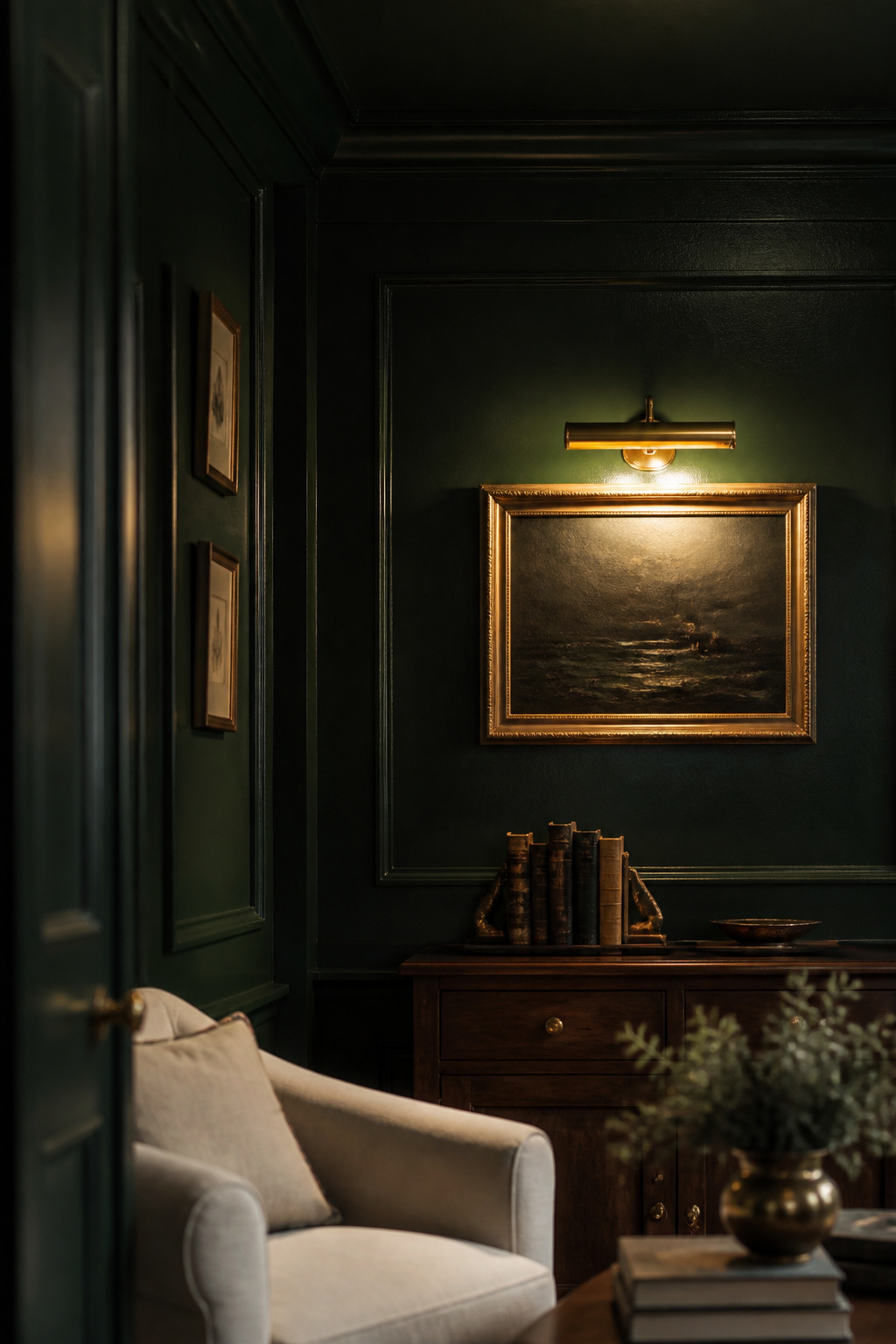
Deep greens, navies, charcoals and warm browns: which reads which
Four colour families do almost all the work, and the way to tell them apart is by undertone and by Light Reflectance Value (LRV), the measure of how much light a colour returns. The lower the LRV, the deeper the colour reads. Warm undertones — red, brown, green — come alive under evening lamplight; cool undertones — blue, grey — hold a crisper, more contemporary darkness.
| Color family | Example & LRV | Mood character | Light-orientation caveat |
|---|---|---|---|
| Deep green | Farrow & Ball Studio Green No. 93 (LRV ~7.2) | Grounded, natural, the most forgiving dark | Reads near-black in low light; reveals green in brighter natural light |
| Inky navy | Benjamin Moore Hale Navy HC-154 (LRV 8) | Architectural; warms under 2700K thanks to green undertone | Avoid blue-purple navies in north light — they read cold |
| Charcoal / near-black | Benjamin Moore Kendall Charcoal HC-166 (LRV 13–14) | Stormy depth without harsh black | Mild green-brown undertone keeps it from going icy |
| Warm brown / aubergine | Farrow & Ball Brinjal No. 222 (LRV ~6–7) | Enveloping, jewel-like | Red undertone emerges in west sun; reads purple in cool north light |
The colour you fall for in the showroom is not the colour you will live with. Sampling in the actual room, at the actual times you use it, is the only reliable method — a point the guide to moody living room paint colors treats in full, including the testing ritual that saves a costly mistake.
Color-drenching walls and ceilings for full immersion
The technique that separates a dark room from a genuinely moody one is colour-drenching: painting walls, ceiling and trim in the same deep hue so that every contrast boundary disappears. Unlike a feature wall, drenching turns the room into a jewel box rather than a room with one dark wall — there is no white plane left to puncture the effect. A dark ceiling in particular lowers the space visually and creates the warm sense of enclosure that a white ceiling always undermines.
One practical caution from the trade: dark pigment over unsealed plaster adheres patchily, so Farrow & Ball recommends applying their Full Gloss primer-undercoat before any deep tone goes on a ceiling. Architect Anand Sheth pushes the idea further — bring the colour into “as many materials as possible, not just paint,” from light fixtures to ceramics, so the palette reads intentional rather than simply dark.
How light orientation changes how a dark color behaves
A room’s aspect changes everything. South-facing rooms receive consistent warm light all day and forgive any dark colour, even cool-undertoned navies and charcoals. North-facing rooms are the trap: their cool blue light exaggerates any cool undertone, so a blue-grey dark reads cold and heavy — while a warm-undertoned dark, a forest green or a green-leaning navy, transforms the same room into something deliberately intimate. West-facing rooms may be the quiet favourite, because their golden late-afternoon light warms a dark colour precisely when the room is most used. For finish, eggshell (10–25% sheen) is the professional standard: enough reflectance for depth, cleanable, and below the glare threshold of satin.
Layered Moody Living Room Lighting: The Make-or-Break Variable
If paint is the foundation, light is what either realises it or ruins it. Of every subtopic in this guide, lighting is the one that appears in nearly every expert source as the deciding factor — and the one most commonly handled wrong.
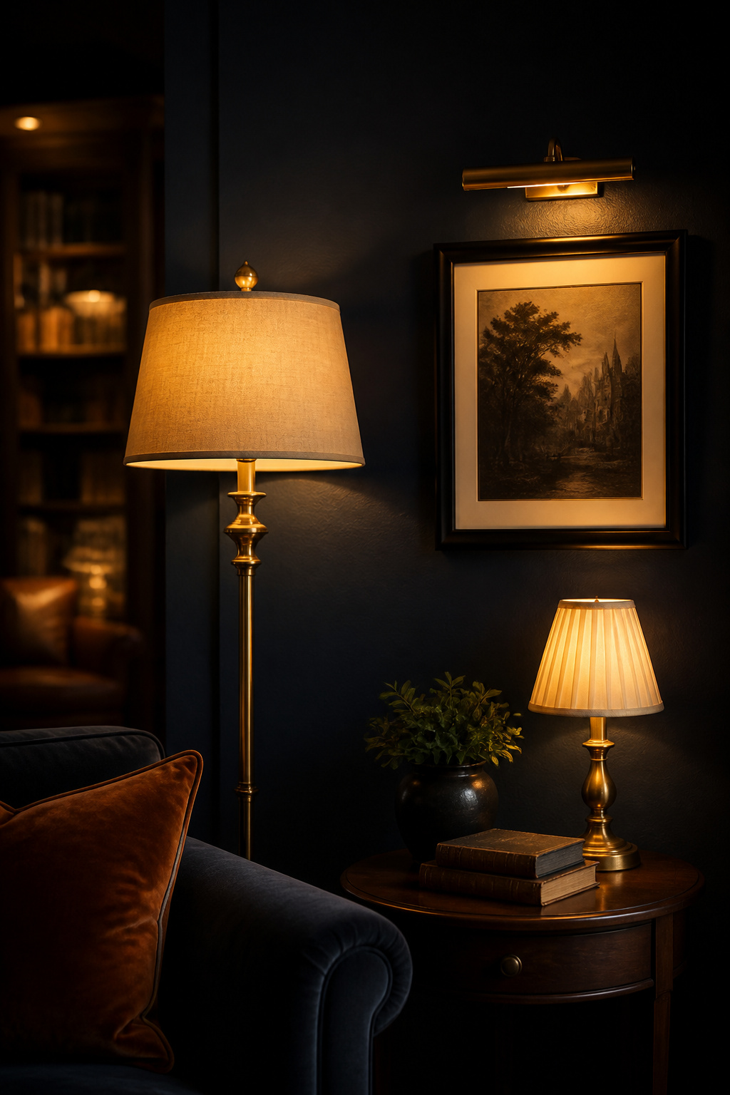
Why overhead lighting kills the mood
A single ceiling fixture lights a room from one direction, flattening every texture and erasing the shadows a moody room lives on. In a dark-walled room the effect is worse: bright in the centre, gloomy at the edges. The fix is not a brighter bulb. Dark walls absorb more light than pale ones and need roughly 10–30% more total output — but that increase should come from more sources, not one stronger fixture. The overhead can stay for tasks; it should never be the mood-defining source.
Warm bulb temperature (2200–2700K) as the single most impactful change
If you change one specification, change colour temperature. The useful range for a moody room is narrow: 2700K produces an amber warmth that animates the warm undertones in dark walls, while 2200K drops toward the candlelit end for the dimmest evenings. Cross 3000K and warm materials begin to grey out; above 3500K they wash out entirely. Mixing temperatures across sources is a silent mood-killer — a 2700K lamp beside a 4000K fixture splits the wall warm-and-cool in a way the eye reads as wrong even when each source looks fine alone. Real candlelight, at roughly 1800K, sits warmer than any LED and adds a tier no bulb fully replicates.
Lamps, sconces and picture lights: a layering order
The reliable structure builds upward from a base coat of soft glow:
- Ambient: two warm floor or table lamps on opposite sides of the room — the layer that lets you switch the overhead off entirely.
- Task: one focused reading lamp behind and to the side of the main seat, its shade roughly at shoulder height when seated.
- Accent: a picture light over art, a small shelf lamp, or hidden LED in the darkest corner — the single fastest fix for a flat room.
Put every source on a dimmer so the whole room drops to one “evening scene” at a touch; that simultaneous control is what makes a room feel designed rather than assembled. The full placement logic, fixture choices and dimmer specifics belong to the guide on layered moody living room lighting.
Moody Living Rooms in Small Spaces: Beating the Cave Problem
No anxiety comes up more often than this one: won’t dark make my small room feel like a cave? The honest answer surprises most people — it will not, provided two or three conditions are met.
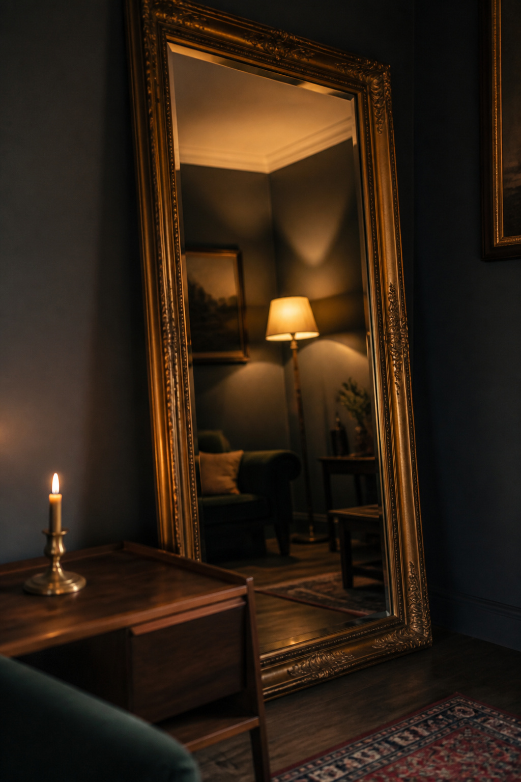
The misconception that dark rooms shrink small spaces
Dark paint absorbs light rather than reflecting it, and that absorption creates a sense of depth. Used well, a dark colour can make a wall feel farther away than it is — the opposite of the cramping most people expect. Small rooms in particular take well to the cocooning, jewel-box quality of a dark palette. The cave feeling is real, but it is not caused by the colour. It is caused by dark walls combined with inadequate light and no reflective surfaces. As Sherwin-Williams’ design team puts it, “It’s a common misconception that deep colors are only suitable for large, brightly lit spaces… The key lies in achieving balance.”
Scale, placement and where dark surfaces actually help
A small dark room suffers far more from competing furniture than from darkness. The discipline that rescues it is mostly about the floor: choose fewer, larger pieces on legs so light and floor tone run continuously beneath each one, lifting the room’s visual weight. Curtains hung at ceiling height draw the eye up and add perceived vertical space. And a subtle satin finish, rather than flat matte, bounces a little more lamplight back into a tight room.
Mirrors and reflective finishes as light-redistribution tools
A mirror is the most effective single tool for redistributing light in a dark room. Placed opposite a window — or, better in an evening room, facing a lamp — it bounces light around the space without diluting the palette. A large mirror (48×36 inches or more) opposite the main light source in a small room can produce a perceived depth gain of around 25–35% simply by reflecting the room and dissolving the wall boundary. Metallic and glass accents compound the effect at smaller scale. The full treatment of scale, placement and restraint lives in the guide to moody living rooms in small spaces.
Layering Texture in a Moody Living Room
Texture is the mechanism that separates a flat dark room from a rich one. In a bright room, pale walls supply variation automatically through reflectance; dark walls do not, so the variation has to come from physical surface variety instead.
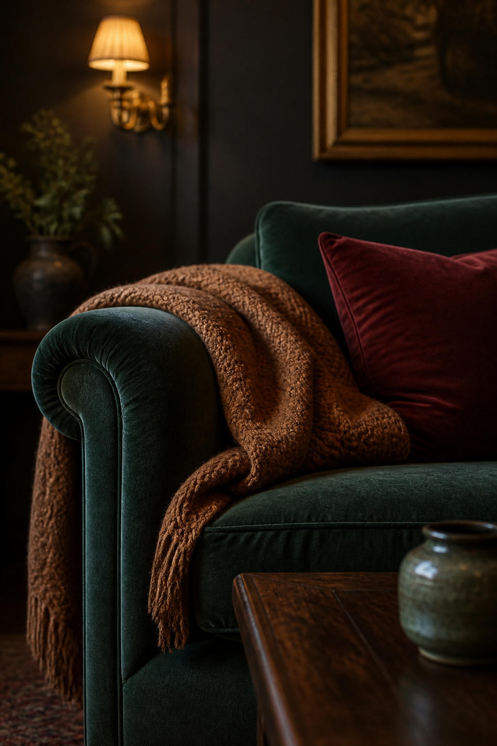
Velvet, wood, leather and wool: the material palette that creates warmth
Velvet is the signature material, for a reason rooted in its construction: the pile catches and absorbs light at different angles, giving dark velvet a dimensional quality flat fabrics cannot reach. A deep forest-green or oxblood velvet sofa reads luminous where the same colour in plain weave would read muddy. Around it, walnut and dark oak anchor the room with warm, quiet grain; aged leather adds a slight sheen and a sense of earned luxury; and wool — in a rug or a throw — absorbs both light and sound, giving moody rooms their characteristic hush.
Contrast logic: why mixing opulent and natural textures works
The trick is to think in opposites. A sleek leather sofa gains from a plush wool rug beneath it; a linen throw makes a velvet cushion look more opulent, and the velvet makes the linen look more honest. As one design source frames it, combine matte wall finishes with absorbing fabrics, then “break the density with natural wood tones… to ensure the space feels sophisticated and tactile, not flat.” Exposed brick or rough plaster — often a gift in a period property — supplies a raw contrast no manufactured surface can fake.
The surfaces that absorb versus reflect light — and why both are needed
A moody room needs both kinds of surface in deliberate balance. Light-absorbing materials — matte velvet, raw wool, unfinished wood — deepen the darkness and give the room its richness. Light-reflecting ones — polished brass, glazed ceramic, glass, lacquered wood — catch lamplight and hand it back as warmth, keeping the absorbers from making the room feel dead. Tip too far toward reflection and you erase the very darkness that defines the style; tip too far toward absorption and the room goes lifeless. The companion piece on layering texture in a moody living room sets out the working proportion and the floor-up assembly order.
Styling and Decorating a Moody Living Room: The Finishing Layer
With paint, light and texture settled, accessories are what distinguish a moody room from a merely dark one. This is the layer most people rush — and the one where a dark wall is least forgiving: it behaves like a stage, so every object is either performing or sitting in the dark.
Brass, bronze and dark metal accents against dark walls
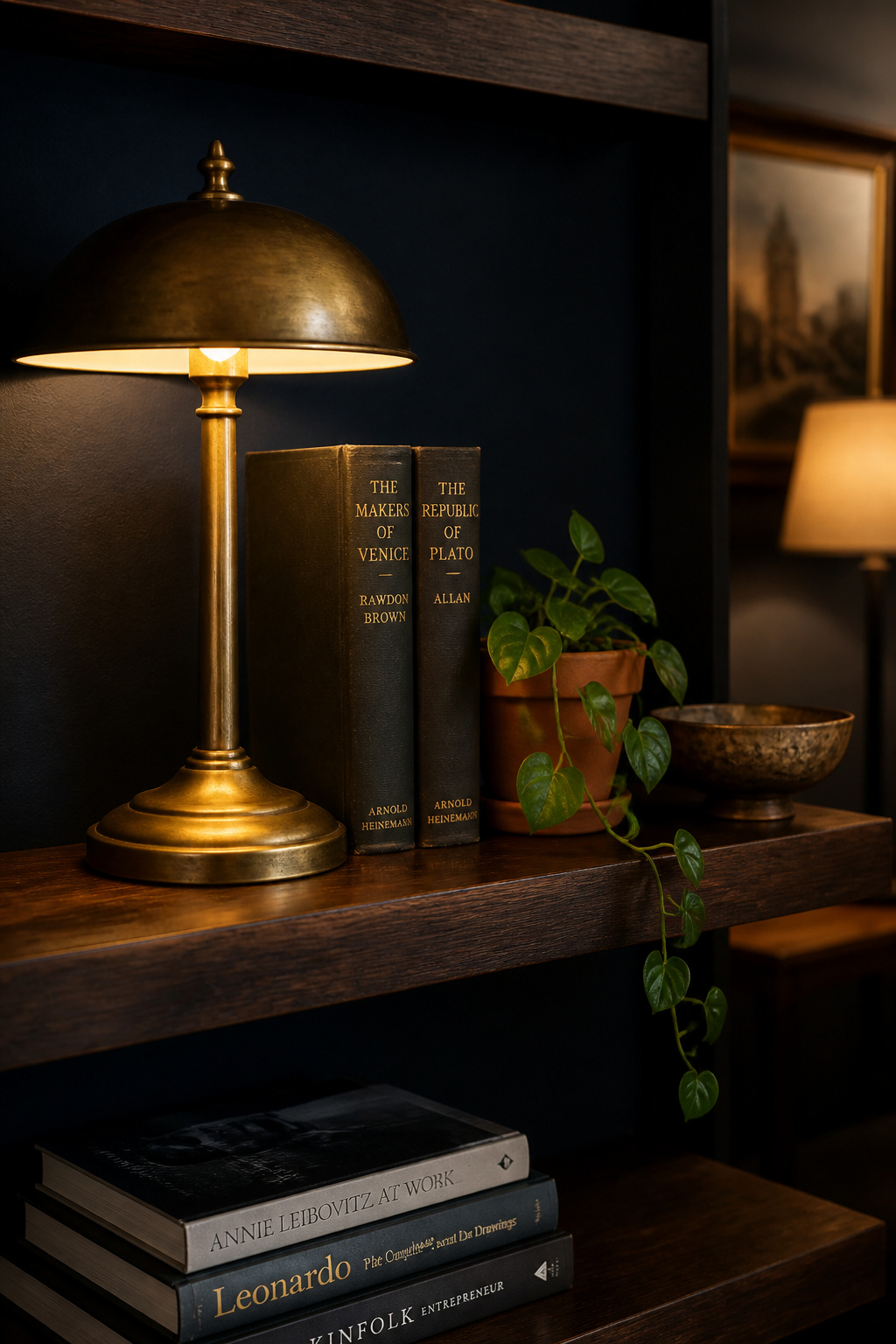
Warm metal is the highest-impact move on the list, because brass hands back the very light the walls absorb. Its amber tone mirrors the colour of 2700K lamplight, so the two reinforce each other rather than competing — and dark green walls in particular amplify bronze’s warm shimmer. Aged or oil-rubbed finishes work better than bright polish, appearing to recede into the dark while still glinting. Concentrate the metal at eye level — lamp bases, picture lights, hardware — where the room’s drama is strongest, and repeat each finish so it reads as a thread rather than an accident.
Art, mirrors and greenery: what pops and what disappears
Art on dark walls needs scale. Small prints vanish unless clustered, while a single large canvas — a minimum of 24×30 inches for a standard wall — registers as one bold object. Pieces with internal contrast or bright passages pop; uniformly dark or greyscale works disappear. Mirrors do double duty as decorative objects and light redistributors, a gilt-framed mirror reading as art while bouncing lamplight back. And living plants intensify against dark walls rather than being lost — the darker the wall, the more a glossy-leaved plant glows.
Styling for collected and lived-in rather than showroom-dark
The aesthetic to aim for is collected: objects that look chosen over time rather than bought as a set. Mixing periods, materials and provenance is what produces it, and vintage pieces outperform modern equivalents at the job. Stack a coffee table with a candle, a low vase, books with interesting spines and one textured object; leave deliberate gaps, because the shadows between things are part of the composition. The full discipline of styling and decorating a moody living room — from frame finishes to shelf negative space — is its own art.
Warm Moody Living Room Palettes: Earthy, Cocooning and Distinct
A common mistake is to treat “moody” as a single thing. The style splits cleanly into two branches with genuinely different rules, and choosing the right one matters as much as choosing the colour within it.
Warm moody versus cool dark: a real distinction with different rules
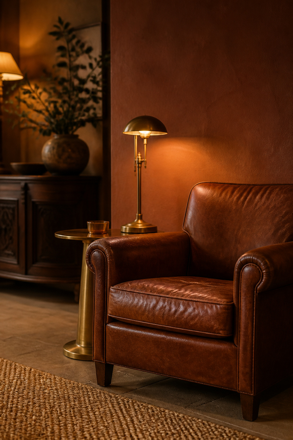
Warm moody draws on browns, rust, terracotta, caramel and ochre, using the warmth of the colour itself as the primary source of coziness. Cool dark — navy, charcoal, deep grey-green — reads precise and composed, but depends more heavily on warm lamplight to keep from reading cold, and calls for warmer accent materials to soften it. The two are different temperaments answering different questions, and they suit different rooms.
| Warm moody | Cool dark | |
|---|---|---|
| Palette anchors | Terracotta, rust, caramel, tobacco-brown (Pantone Mocha Mousse) | Navy, charcoal, deep grey-green, near-black |
| Lighting requirement | Warm pigment carries the heat; 2200–2700K confirms it | More dependent on 2700K light to avoid reading cold |
| Best-fit rooms | North- and west-facing; rooms with existing warm materials | South- and east-facing; rooms with cool materials or ample daylight |
Browns, rust, terracotta and caramel as the palette backbone
The warm branch is the dominant trend direction, anchored by Pantone’s Mocha Mousse — and 22% of designers named a deep earthy brown their top colour pick for 2025, ahead of both navy and forest green. Deep terracotta pairs naturally with cognac and chestnut leather, building a palette that is entirely warm-toned and needs no cool counterweight. Ochre and caramel mid-tones do the connective work, transitioning between the darkest browns and the natural accents so the palette never reads uniformly muddy.
When to choose warm versus cool moody for your space
Choose warm moody when the room already carries warm undertones in floor or furniture, when it faces north or west and needs warmth injected through the palette rather than the light, or when cocooning comfort matters more than dramatic statement. Choose cool dark when the room has ample natural light, when the existing materials skew cool, or when you want architectural drama over warmth. Combining the two is viable but demands one clear dominant temperature. The full earthy direction — colours, materials and the cultural roots behind it — lives in the guide to warm moody living room palettes.
Creating a Moody Living Room on a Budget (and Without Painting)
The moody look does not require a renovation budget — or even a paintbrush. Its most powerful levers happen to be its cheapest, which makes the style unusually friendly to renters.
Where a small budget buys the most mood
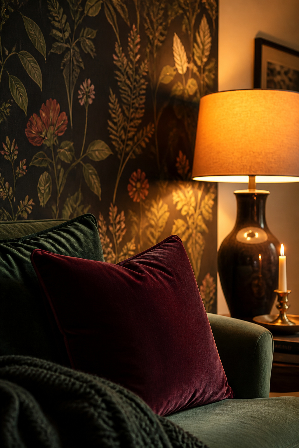
The highest-impact-per-dollar change is also nearly the cheapest: swapping every bulb to 2700K warm-white LED, an under-$20 job that takes an hour and changes how every surface in the room reads. After that, dark velvet cushion covers in deep jewel tones — forest green, burgundy, ink blue — deliver the fastest textile shift, at $15–$30 new or $2–$8 thrifted. Ceiling-height dark curtains, hung wide, make a room read architecturally darker without a drop of paint. None of these touches the lease.
Renter-friendly tactics: removable, thrifted, swappable
For a dark surface without painting, peel-and-stick wallpaper on a single accent wall is the renter-safe route — repositionable, residue-free on properly painted walls, and roughly $80–$150 to cover an accent wall. Thrift stores reliably stock the exact materials the palette depends on: brass lamps, dark-wood side tables, velvet cushions and wool throws, with secondhand brass reading more authentically than new polish. A smart plug with a dimmer (under $25) gives any existing lamp the “evening scene” control that separates moody from merely dark.
The honest splurge-versus-save breakdown
The one place worth spending is lighting: a quality floor lamp and a good fabric shade are on every evening, and their quality directly shapes the warmth of the light. Everything else is safe to save — dark cushions, wool throws, curtain panels and candles all come from IKEA, HomeGoods or thrift for a fraction of boutique prices, with no visible difference once styled. A realistic full renter-safe transformation lands around $485, though treat that as an indicative figure rather than a quoted one, since stock and choices vary widely. The full costed playbook is the guide to create a moody living room on a budget.
The Order of Operations: How to Build a Moody Living Room
The most common way these rooms fail is sequence — buying dark accessories before the wall colour is settled, or choosing furniture before the light is planned. The logic below is practitioner reasoning rather than a single cited standard, but it is consistent across the trade: each step depends on the one before it, and doing them out of order forces expensive corrections.
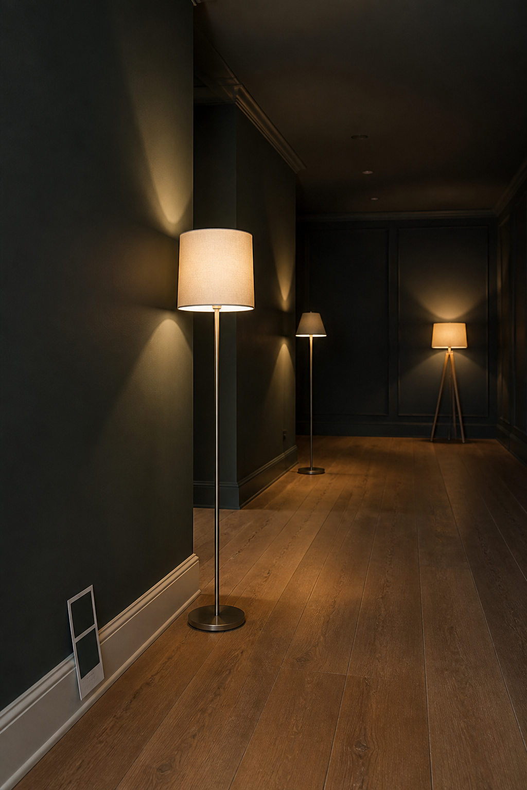
- Start with paint, and commit. Every later decision — furniture colour, shade material, metal finish, textile tone — responds to the walls, so the wall colour comes first. A provisional half-measure undoes the effect: one dark wall against white walls reads as a colour statement, not an atmosphere. Test the colour in situ for 48 hours, in both daylight and lamplight, before committing.
- Layer light before buying furniture. Rough in the lighting — even with temporary lamps — before the sofa arrives, because the distribution of lamplight decides which walls are highlighted, where the dark corners fall, and what scale of furniture will read correctly. Reverse this and you end up moving costly pieces out of dark corners. Buying quality lamps early is the designer’s actual sequence: a $250 floor lamp transforms more than $500 of cushions.
- Add texture and decor as the final calibration. Bring in textiles, accessories and plants only after the room has a week of lived-in experience with paint and light in place. That week reveals where it still reads flat or cold — and those exact spots are where a mirror, a brass lamp or a layered throw will do the most. Resist over-filling: a moody room reads richest with deliberate gaps, the shadows between objects doing real work.
That sequence is the pillar’s one job no single spoke can do: the thread that turns six separate decisions into one coherent room. A moody living room is not a dark paint colour — it is a system in which colour, warm layered light, balanced texture and collected styling answer to one another. Get the order right, and the result is the room those Victorian parlours and Craftsman dens understood all along: one that comes alive after dark, in the hours you actually live in it.