
Something has shifted in the way we furnish rooms, and the search data shows it plainly. In the year to April 2025, monthly searches for “vintage interiors” reached roughly 521,500, a jump of nearly fourteen percent. By 2025, interior designers were pulling about a third of everything they sourced from vintage or antique stock — the highest share since 2021. Read together, those numbers describe a quiet revolt against fast furniture and sterile minimalism: people want rooms that feel lived in rather than ordered in a single afternoon. The trouble is that the look sells faster than it explains itself. Walk through enough vintage bedroom decor and you start to see two very different rooms wearing the same name — one that feels genuinely collected over decades, and one that feels like a themed hotel suite assembled from a single catalogue. This guide is about telling them apart, and then building the first kind on purpose.
What Makes a Bedroom Feel Genuinely Vintage (Not Themed)
The difference between the two rooms is not budget, and it is rarely taste. It is a philosophy, held consciously or not, about where character comes from. Get that philosophy right and even a modest room reads as authentic; get it wrong and a room full of expensive antiques can still read as costume. So before any product advice, the lens.
The gathered-over-time principle: why the best vintage rooms look unstyled
The strongest vintage bedrooms look as though nobody styled them at all. That is the trick, and it is not an accident. In 2025, around 85 percent of designers sourcing vintage chose pieces made anywhere between the 1920s and 2000 — a span so wide that no single decade governs the result. The breadth is the whole point. When the bed, the dresser and the lamp each come from a different moment, the room reads as accumulated rather than purchased, and accumulation is what we recognise as home.
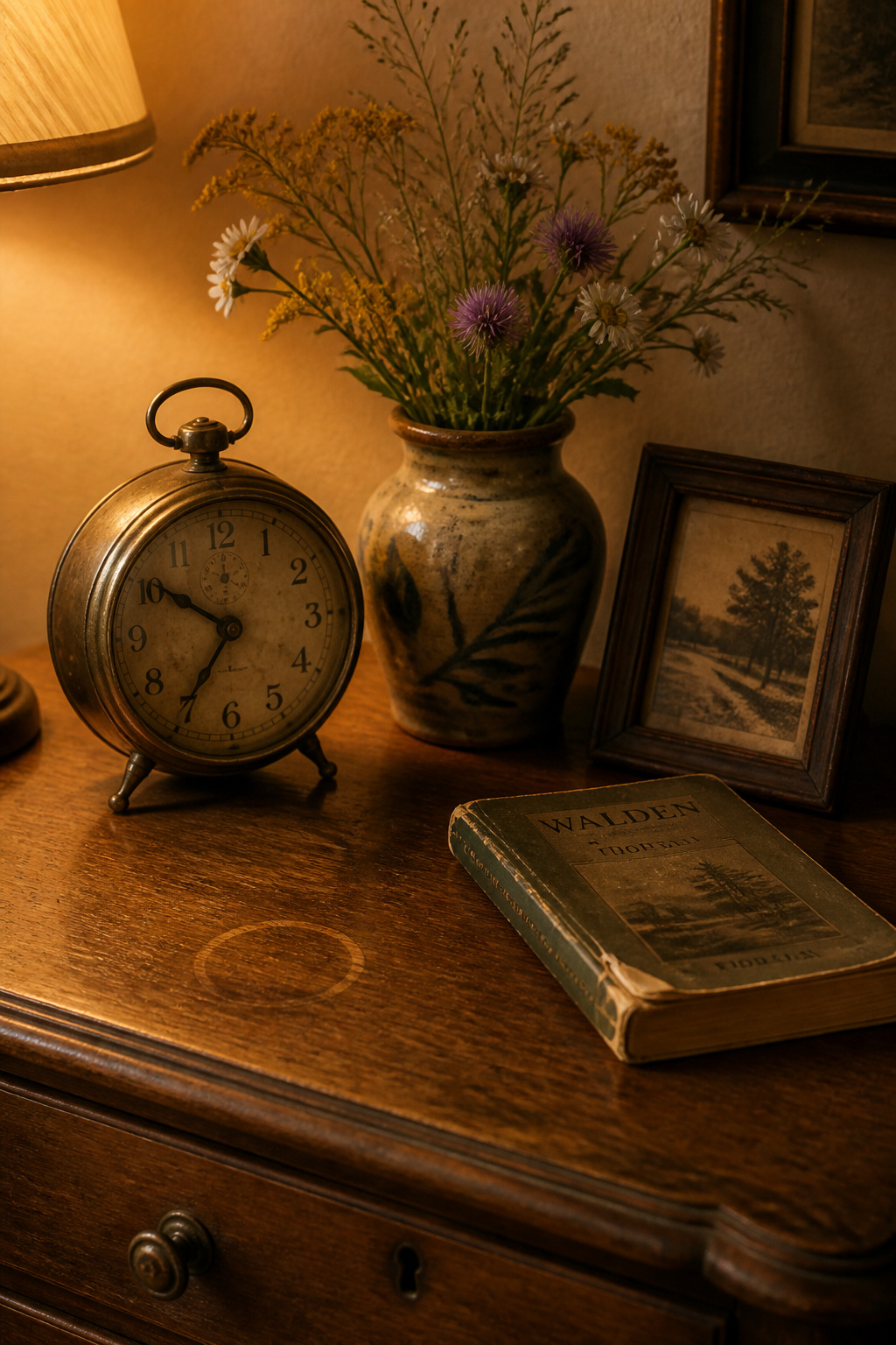
Authenticity also shows in composition. Leaning books, an asymmetric cluster of clay pots, dried flowers that nobody arranged for symmetry — these signals are hard to fake precisely because they look unconsidered. The discipline, oddly, is restraint with the matching impulse: avoid the matched vintage textile set, avoid the big-box “vintage-style” suite. A room can only hold so many bold moments before it tips into chaos. A genuinely old piece does its best work when something plainly contemporary grounds it — simple linen, bare plaster, an unfussy table — because the contrast keeps the room feeling inhabited rather than preserved behind glass.
Authentic character vs applied distressing: a material-truth test
Here is where the eye has to get educated, because the market is full of furniture sold as old that was distressed last Tuesday. The tell is logical wear. Genuine wear lands where hands and feet actually went: armrests rubbed smooth, a stretcher rail polished where heels rested on it, feet nicked from the piece being dragged across floors. Applied distressing is random — it shows up on protected surfaces real life never touches, in decorative scuffs and tidy little paint chips tucked into corners no knee ever met.
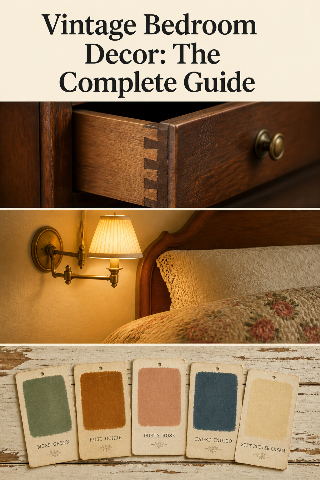
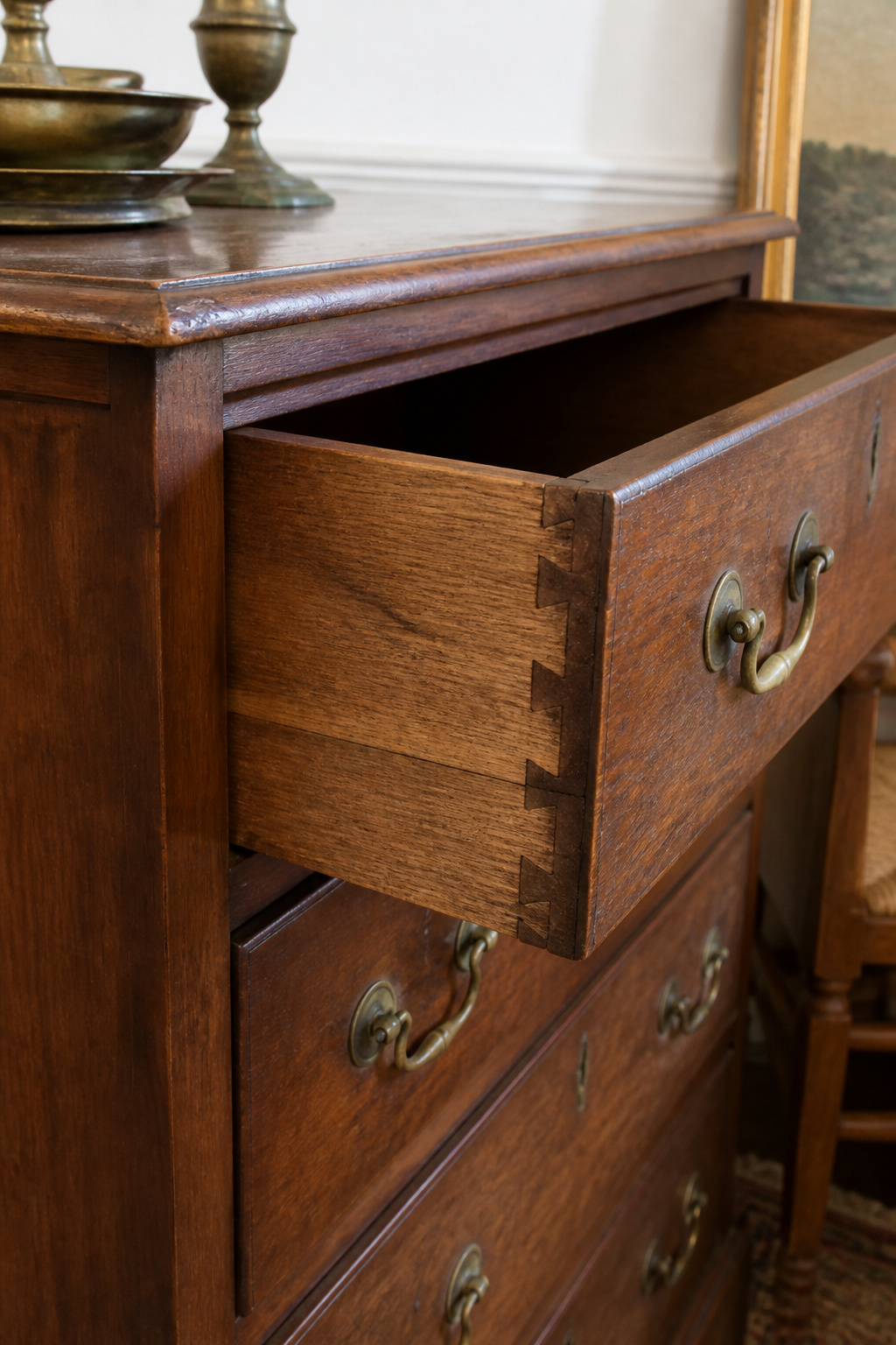
Patina behaves the same way. Real patina is layered and multi-toned, a soft glow built from decades of polishing and slow oxidation; old wood feels silky under the hand because handling closed its pores. Factory “aging” reads flat and sprayed-on, and the wood underneath feels dry and open-grained. When the surface evidence is ambiguous, the fastest verdict comes from the joinery: pull a drawer all the way out and look at the corners. Hand-cut dovetails, with their slightly uneven spacing, point to pre-1860 American or pre-1930 European construction. Machine-cut dovetails are uniform and precise, the signature of post-industrial manufacture. The style of a piece can lie; the joinery rarely does.
The modern-vintage mix: why a pure period room is a museum, not a bedroom
The instinct, once you fall for old things, is to go all the way — match the era, match the suite, recreate a moment exactly. Resist it. The more contrived a room is, the less it works, and the last thing anyone wants is to live in a museum. A matching vintage suite from a single decade produces precisely the stiffness the look is trying to escape; visual uniformity reads as commercial, not collected.
I hold this firmly, and not for sentimental reasons: modern function belongs inside old rooms. I learned that lesson in an 1890s farmhouse kitchen, where the owners had already booked the skip. They wanted a deteriorated built-in dresser torn out — the doors hung wrong, the back had rotted, and to them it read as the one thing standing between them and a usable kitchen. I asked for a week before anyone swung a crowbar. Under the failed paint and the sagging shelf was old-growth pine and a carcase still square after a hundred years; what had failed was the hardware and the back board, not the cabinet. We rebuilt it as the island — same timber, same face, plumbed and wired for the way they actually cooked. The piece they were ready to demolish became the thing the room is now built around. That is the whole argument in one project: purism that makes a house unliveable kills more heritage than any sensitive renovation does, because the unliveable room eventually gets gutted, and the good bones go in the skip with the bad. Look twice before you demolish. Modern vintage design is about blending periods and uses until the space comes alive, not embalming an era. The room should express a living person’s taste — yours. Keep that in mind and the rest of this guide is just five decisions made in the same spirit.
Anchor Furniture: The Pieces That Date and Ground the Room
Every vintage bedroom is built around furniture, because furniture carries the most visible dating evidence and the most physical weight. Three categories do the heavy lifting, and the room reads vintage the instant they are right.
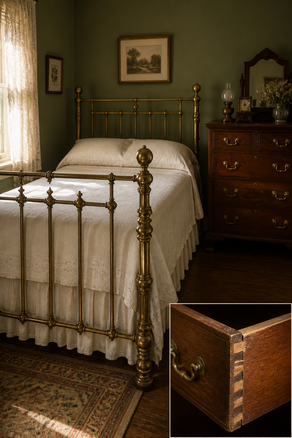
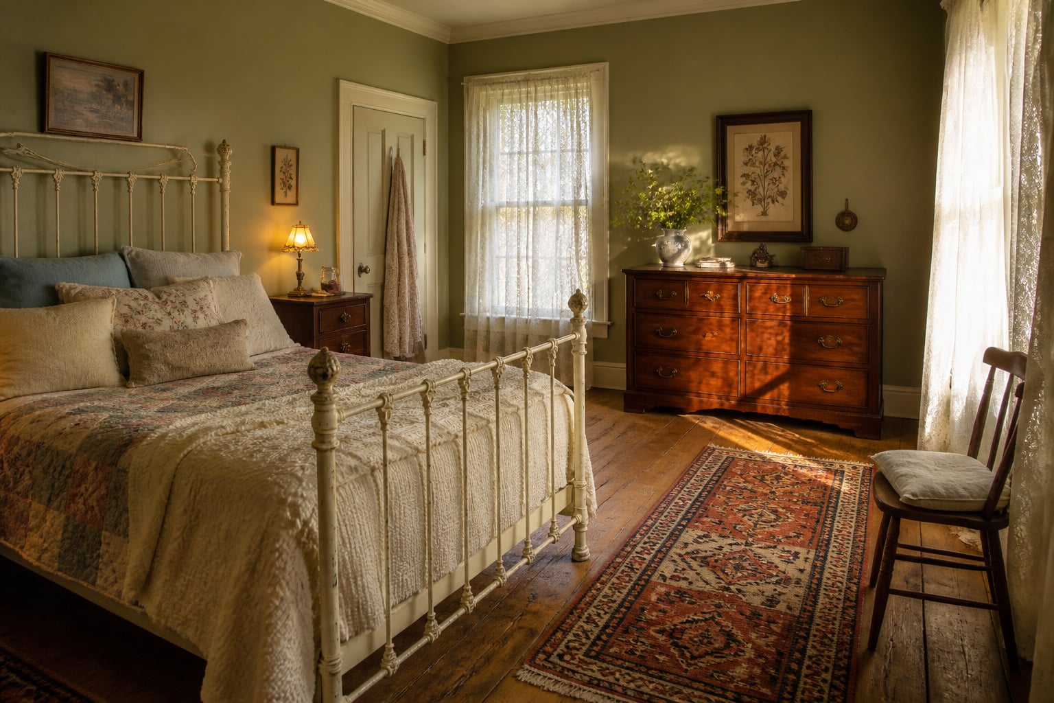
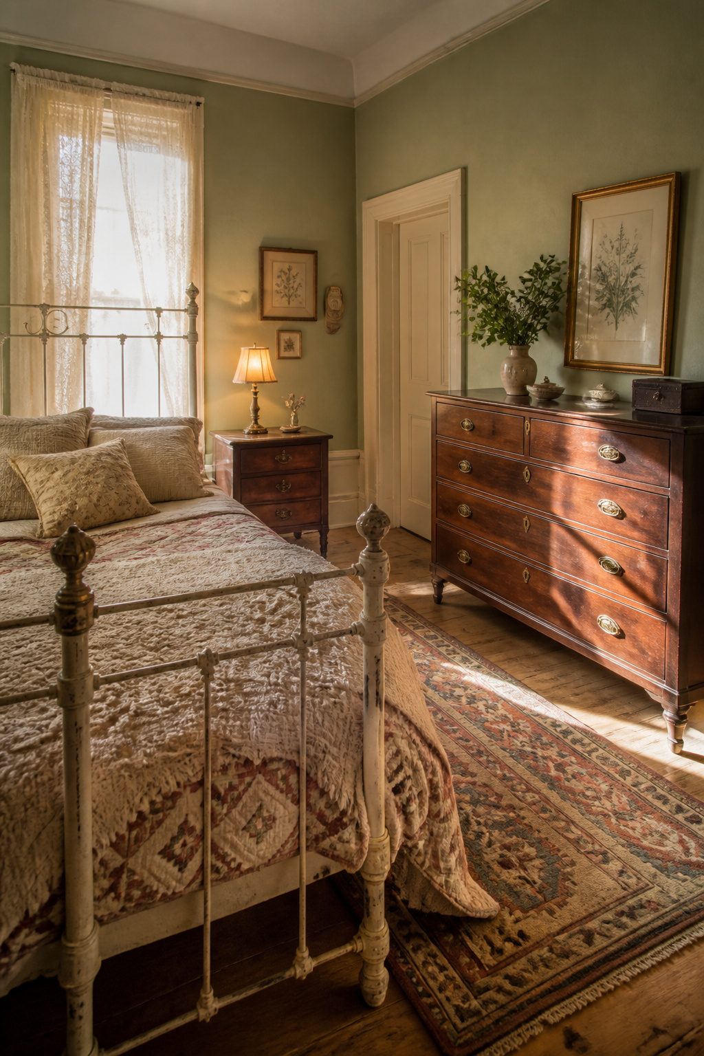
A Victorian iron bed with scrollwork, or a brass bed with turned finials, dates itself from across the room — the silhouette alone places it, before you inspect a single detail. A wide walnut or mahogany dresser with brass hardware is the most useful anchor of all: it offers real surface area to live on, and its figured grain and period pulls broadcast age clearly. Antique nightstands in walnut or mahogany complete the core and frame the bed, and a deliberately mismatched pair — different woods, roughly the same era — reads more honestly than a bought set. Pairing a dark walnut dresser against a black iron bed creates a material tension that matched suites can never manufacture.
The categories sort cleanly by what each one does for the room:
| Furniture category | Era signal it carries | What it anchors |
|---|---|---|
| Iron or brass bed frame | Victorian scrollwork; turned brass finials | The room’s primary focal point and scale |
| Walnut/mahogany dresser | Figured grain; brass bail-pull hardware | The functional centre and the surface that holds objects |
| Mismatched nightstands | Detailed hardware; near-era pairing | The bed’s frame and the room’s sense of being collected |
| Vintage-inspired reproduction | Classic silhouette, modern build | A budget or availability stand-in, grounded by one genuine accent |
To date a piece in the field, you need no tools — only the willingness to pull the drawer most buyers leave shut. Hand-cut dovetails place a piece pre-1860 in America or pre-1930 in Europe. The round “pin-and-cove” dovetail, introduced in 1871, was used almost exclusively from 1871 to 1900 on Victorian and Eastlake furniture — a half-circle joint that dates tightly. Solid hardwood sides at least 5/8-inch thick signal quality; particle board and MDF appeared after the 1960s and mark mass manufacture. Scribe marks and saw overcuts inside a drawer box are not defects — they are evidence of hand work. The joinery is the first thing I read after lifting a drawer, because it is far harder to fake than a finish.
On placement, choose the bed first and let everything answer to it. Two equally strong focal pieces in one room destroy its hierarchy and leave the eye nowhere to rest. One genuine anchor surrounded by simpler, more contemporary supports reads more powerfully than a room crowded with antiques competing for attention. And a quality reproduction is a legitimate move when genuine pieces are out of budget or reach — provided you pair it with at least one real vintage accent, so the silhouette comes from the new piece and the material truth comes from the old one. This is orientation only; the deeper field guide to grading, prioritising and arranging the pieces lives in the dedicated guide to choosing and styling vintage bedroom furniture.
Walls and Color: Setting the Vintage Backdrop
Walls do more vintage work than any single object, and they do it cheaply. The right backdrop makes a few honest pieces look like a collection; the wrong one — a bright builder’s white — makes genuine antiques look stranded and faintly modern.
Heritage paint palettes that read as period without overwhelming the room
Five colour families carry the period feeling without darkening a bedroom into a study. They are worth naming as a set:
- Moss green — grubby Victorian greens carrying black and umber undertones; period depth without full library darkness.
- Rust and ochre — terracotta and golden mustard, at home from colonial through Arts and Crafts rooms.
- Dusty rose — the muted, greyed pink of Victorian bedrooms, not the bright pinks of later decades.
- Faded indigo — the soft, washed blue of Colonial and Federal interiors.
- Soft butter cream — the universal period foil that lets the others breathe and reads pre-industrial in a way crisp white never will.
These mossy, umber-shadowed greens are in genuine revival, and they conjure the Victorian interiors they came from better than any modern neutral. For citable accuracy, the historic ranges from Farrow & Ball, Sherwin-Williams and Little Greene are reconstructed from real period archives rather than trend approximations — Farrow & Ball’s Card Room Green No. 79, for instance, is named for exactly the Victorian study rooms it suits.
Vintage floral wallpaper: scale, pattern and the trim-color decision
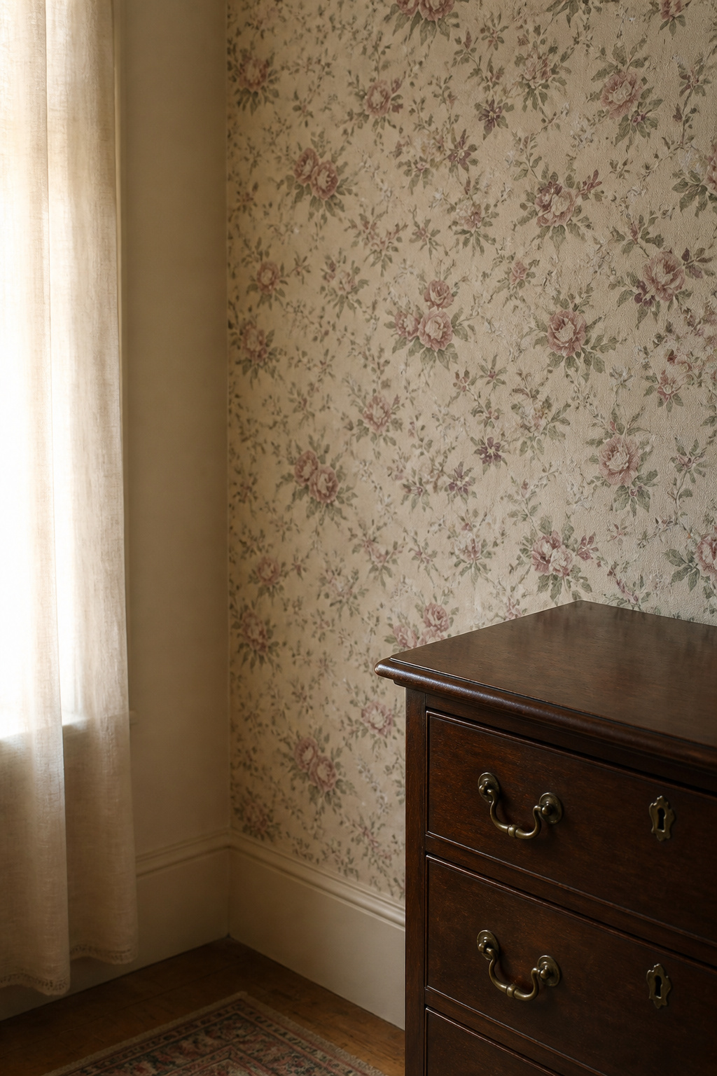
Pattern reads vintage when it is small. Period English florals — roses, violets, poppies, honeysuckle and jasmine scattered on pale grounds — are the accurate choice; the oversized chintz most people picture is a 1980s scale, not a Victorian one. Genuine vintage papers also read slightly faded, because early dyes shifted in sunlight, so a fresh, fully saturated print looks anachronistically modern beside real antiques. A matte finish, not a sheen, completes the period effect.
The decision people get wrong is trim colour. Pull the adjacent wall colour from the wallpaper’s ground, not its dominant pattern. A paper with sage foliage and blush blooms on a cream ground wants warm cream on the surrounding walls — not sage, not blush, which would double the pattern’s visual weight.
Mixing wallpaper with paint — feature wall vs full-room approaches
The most forgiving approach papers only the wall behind the headboard and surrounds it with a coordinating paint tone, which delivers strong character without overwhelming the room. Full-room papering works too, but only when the print is small-scale and the furnishings stay simple — plain bedding, quiet curtains, very little surface clutter. Either way the governing rule is the same: choose a paint that picks up one tone already in the paper, so the eye has a colour relationship to follow across the room. The full palette work — exact tones, sheen, and pattern-mixing decisions — is covered in the deep dive on vintage paint colors and wallpaper.
Vintage Lighting: Warmth Over Brightness
Walls set the colour; light decides whether you ever see it as intended. Cool light greys out everything a heritage palette is trying to do — the patina on brass, the honey in aged oak, the depth in a moss green — which is why so many rooms full of lovely fixtures still feel wrong.
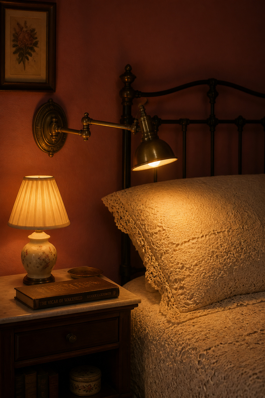
Colour temperature is the one decision that changes everything else. Warm LEDs in the 2700–3000K range are the professional standard for rooms with period materials; anything above 3500K flattens warm surfaces toward grey. For a more candle-like, pre-electric mood, 2200K is the alternative, especially on a dimmer — so the 2200–2700K window is the right target for a bedroom. One caveat for readers: warm light alone can muddy print, so for a bedside reading lamp choose a 2700K bulb with a Colour Rendering Index of 90 or above, which gives both the warmth and the accuracy the page needs.
The fixtures that read vintage are a small, reliable set. Brass swing-arm wall sconces are the classic bedside choice — they extend over the pillow when you read (more than 22 inches on some models) and fold flush by day, with dimming as standard. Ceramic-base table lamps with pleated fabric shades reference 1920s–1950s bedrooms immediately. Pendant shades in aged brass, frosted glass or enamel point back to Art Deco and earlier. None of this needs modern recessed cans: the familiar three-layer system works entirely on lamps and sconces — ambient from a pendant or a pair of dresser lamps, task from the bedside sconces, accent from a small nightstand lamp. Vary their heights and the light feels alive rather than flat, and the shadows it throws are exactly what reveal the depth in your wall colour. The placement specifics — exact sconce heights, reading lumens, dimmer compatibility — belong to the dedicated guide to vintage bedroom lighting ideas.
Layered Textiles: Where Vintage Feel Lives Most Affordably
If furniture is the slow, expensive layer, textiles are the fast and cheap one — and they may be where the most vintage feeling actually lives. They are also the easiest place to read the gathered-over-time principle, because each fabric carries its own decade.
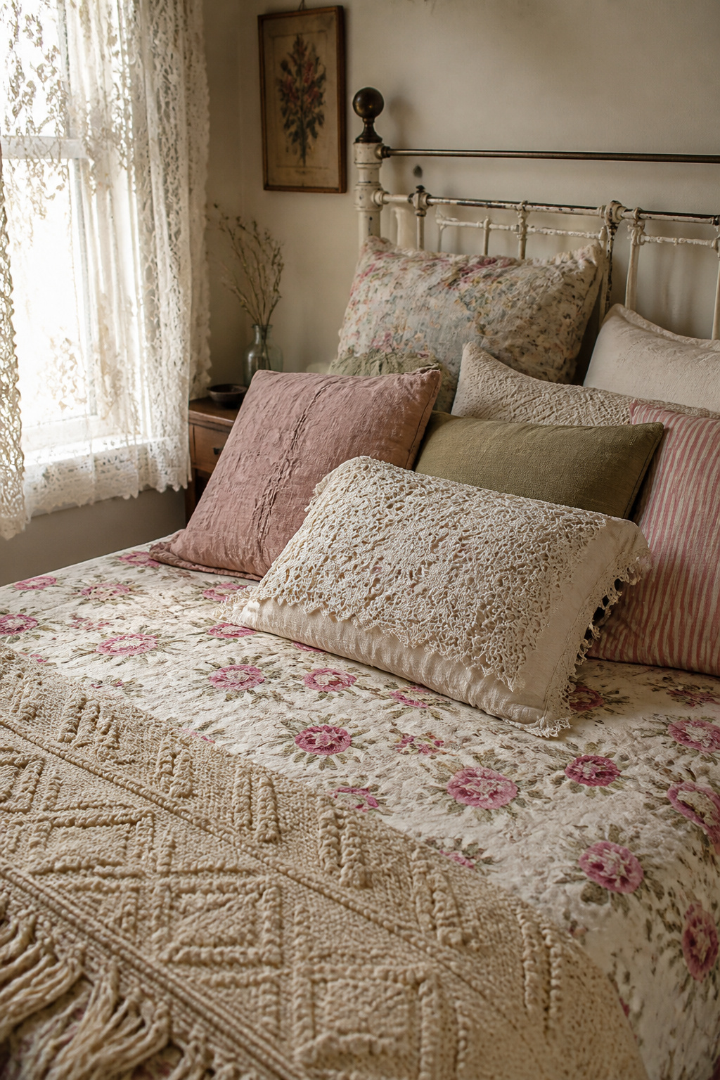
The layering logic runs in three steps. A quilt or coverlet forms the base — reversible floral quilts with small scattered blooms are the most versatile, light enough to layer and period-appropriate in motif. A chenille or linen mid-layer comes next; chenille peaked in the 1940s and 50s, and its dense, raised pile is the tell, so let texture, not price, be your guide. Lace or crochet supplies the Victorian and Edwardian accent — pillowcases, throws, a coverlet edge — its openwork adding depth without colour weight. Natural fibres are essential throughout: cotton, linen and wool drape and age in ways polyester simply cannot mimic, whatever its print.
Mixing old and new without visual noise comes down to a single discipline: hold the colour range tight and let the patterns vary. A gingham check, a floral and a solid linen will read as collected — not chaotic — as long as all three share at least one colour. One genuinely old piece in the mix lifts everything around it, because its slight irregularities of weave and saturation make the newer pieces read better by contrast. Finish the atmosphere from the edges of the room: sheer lace panels diffuse daylight into that golden, pre-electric glow, and layering a heavier velvet or cotton panel behind them buys blackout without losing the look. Underfoot, a hand-woven Persian or kilim runner — typically 2 to 3 feet wide and 6 to 14 feet long — grounds the bed with pattern and warmth. The full layering method, plus how to care for genuine vintage fabric, is the subject of the guide to layering vintage bedding and textiles.
Sourcing Vintage Pieces: Where to Look and What to Avoid
None of this happens without finding the pieces, and sourcing is its own skill — part geography, part on-the-spot judgement. The good news is that the judgement compresses into a few checks anyone can run.
There is a rough hierarchy of where to look. Estate sales offer the best odds of genuine bedroom furniture in original condition, often with provenance and negotiable prices, though the anchor pieces sell in the first hour, so regulars queue before opening. Flea markets reward knowing what you want before you arrive, because poor lighting hides damage. For thrift stores, skip the big national chains the resellers have already combed and favour small church and charity shops with fresh stock. Online, Facebook Marketplace wins for large local pieces with no shipping; Chairish and 1stDibs offer curated quality at higher prices; Etsy covers the smaller accessories. And do not overlook architectural salvage yards — original brass pulls, escutcheons and hinges rescued from demolished period homes are among the most reliably authentic hardware you can buy.
On the spot, three checks settle most decisions:
- Construction material — look at an unfinished surface, inside a drawer or behind the back panel. Solid hardwood grain is good; particle board or MDF reveals itself at once.
- Joinery — pull a drawer and read the corners, as in the furniture section above. Hand-cut dovetails mean quality and age; absent or crudely nailed joints mean the opposite, whatever the price tag says.
- Condition pattern — decide whether the wear is logical (edges, high-touch surfaces) or applied (uniform scuffing on protected faces). Logical wear is character; applied distressing is a reproduction tell.
Then the refinishing question. Pieces over 100 years old generally lose value from refinishing — the original finish and patina are part of the object’s record, and as Antique Trader notes, removing them makes a piece “less desirable to collectors.” Solid-wood factory pieces from the 1850s to 1960s are the better refinishing candidates: old enough for good bones, not so old that work destroys value, especially where damage or a bad prior repaint already settled the question. My own rule is reversibility — if the next owner can undo what you do, it is fair; if they cannot, think harder. Wax over an original finish is reversible; chemical stripping is not. This pillar deliberately splits the next step in two: the buyer’s playbook for where to find vintage furniture is Tess Carver’s hunting guide, while the honest, weekend-real walkthrough of painting and upcycling old furniture — including the one piece you should never touch — is hers as well.
Vintage Beyond the Adult Bedroom: Adapting the Style for a Nursery
The same philosophy adapts to a child’s room, but the rules change in one direction that is not negotiable: safety overrides aesthetics every time. The visual appeal of an old crib does not make its design safe.
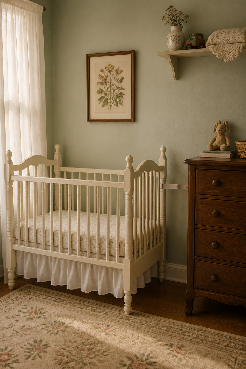
The hard facts come straight from the regulator. The US CPSC banned the manufacture and sale of drop-side rail cribs in June 2011, having linked the design to at least 32 infant deaths between 2000 and 2010, and it recommends against using any crib older than ten years. Mandatory standards require slat spacing of no more than 2 3/8 inches — wider gaps can trap a baby’s head — and many pre-2011 cribs fail it. Cribs made before 1978 may carry lead-based paint, a real risk to a child who chews the rails. The Cleveland Clinic’s guidance is plain: avoid any crib produced before 2011.
The vintage look survives all of this intact. JPMA-certified convertible cribs in period silhouettes — turned spindles, Queen Anne feet on a modern, lab-tested frame — deliver the aesthetic safely, and their 5-in-1 and 7-in-1 formats convert through toddler bed and beyond, so the period frame stays in the room for years. Genuine old pieces still belong, just repositioned: a solid-wood dresser (anchored to the wall), a sound rocking chair, and decorative antiques placed well out of reach. An antique crib frame, mattress removed, can serve as a bench or storage and contribute its visual language without any sleep-safety risk. The full safe-and-adaptive treatment — which pieces work, the washable-basics look, and how the room grows — is Sofia Martinez-Chen’s specialist guide to vintage nursery ideas.
Pulling It Together: The Vintage Bedroom Decision Checklist
By now the loop the article opened should be closing: the difference between the collected room and the costume one was never about how much you spent, but about whether each decision served a single coherent idea. Here is that idea, distilled into how to actually proceed.
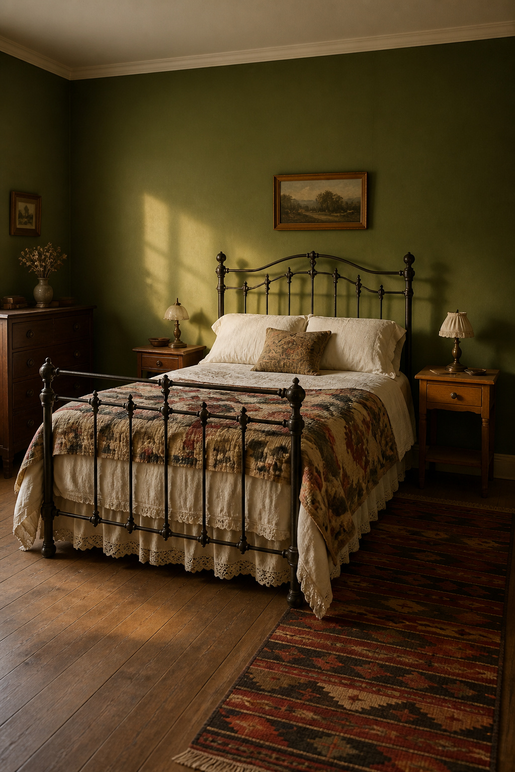
Start with one anchor piece, not a whole room. The bed sets scale, material and era signal, and every later choice is tested against it rather than against an abstract notion of “vintage.” Buying several anchor-level pieces at once removes the slow editing that produces a genuinely collected feel — and it crowds out the breathing room each old piece needs to perform.
Before any purchase, ask three questions:
- Does this piece have a clear role? Beauty is not enough; each thing should anchor, support or punctuate. If everything in a room is merely nice, nothing stands out.
- Can I verify what this is? Pull the drawer, read the joinery, check that the wear is logical. A piece you cannot roughly date, or whose distressing is uniform across protected surfaces, is a reproduction or an over-restored shell.
- Does this add to the room or compete with it? When every element fights to be the focal point, the space loses its ease. The test is whether the piece reinforces the material vocabulary already in the room or starts a rival conversation.
Knowing when a room is done is the last skill, and it has a physical test. Stand in the doorway and notice where your eye lands first. If it settles on the anchor — the bed, the dresser — the hierarchy is working. If it lands on a crowded surface or a knot of competing objects, the room has crossed from layered into busy, and the fix is subtraction, not another purchase. Restraint here is not minimalism; a vintage room can hold a great many objects. It only asks that every one of them earned its place. Do that, and you will not have decorated a theme. You will have built a room that looks as though it gathered itself over decades — which, decision by decision, is exactly what happened.