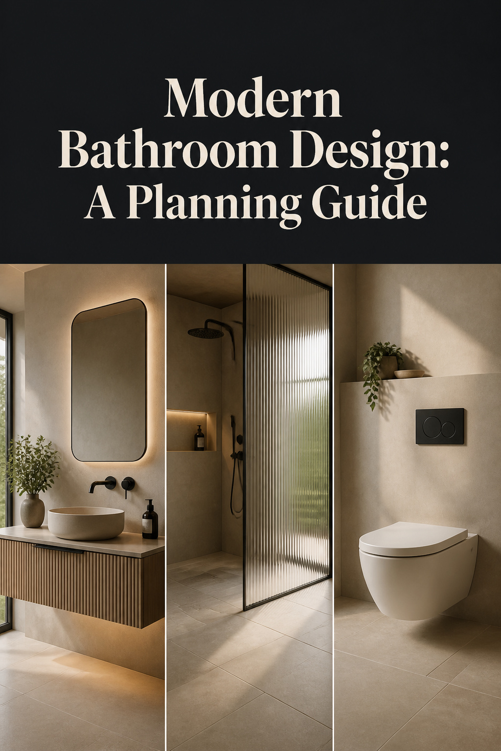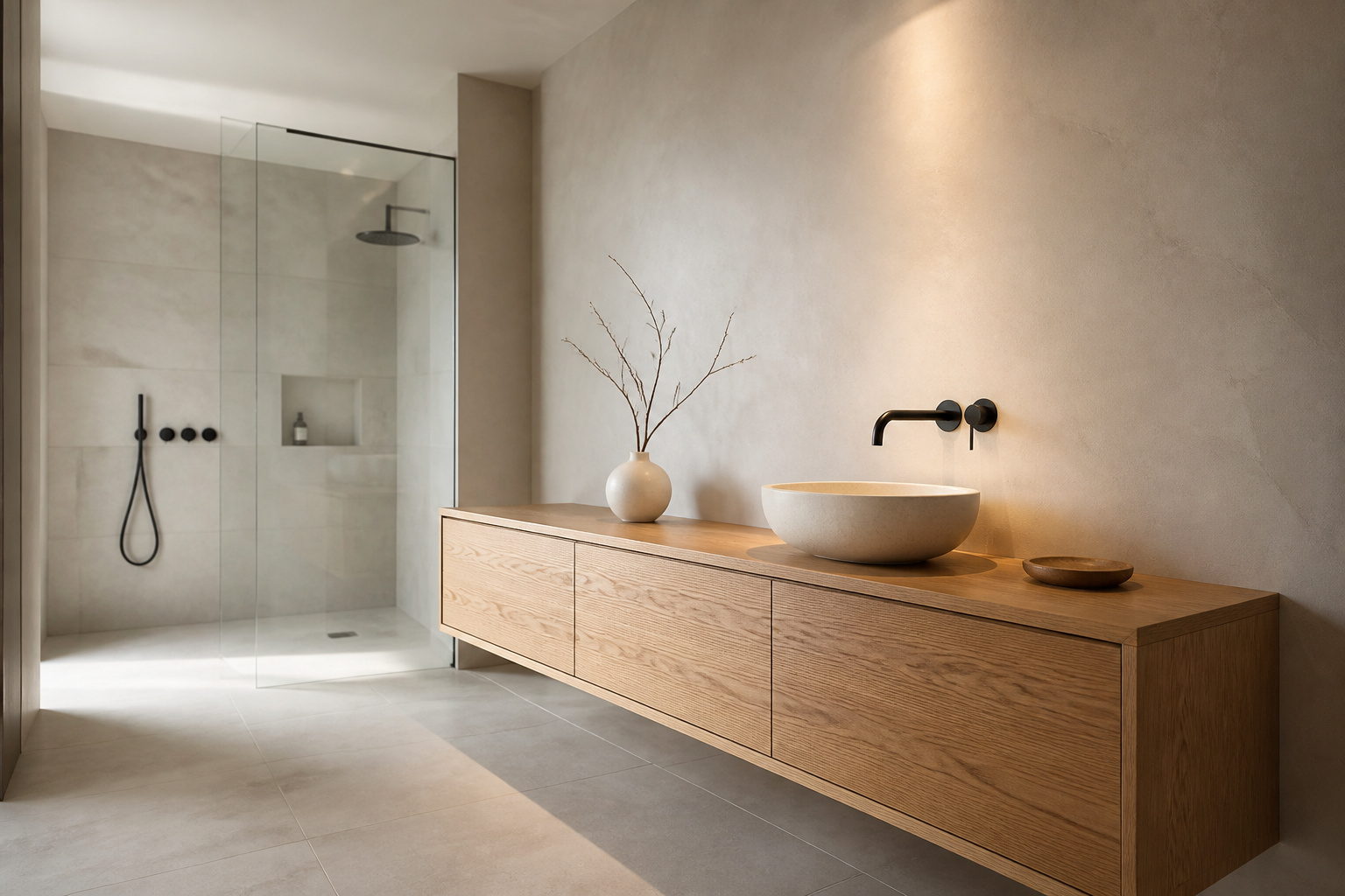

Somewhere in the last few years the bathroom stopped being the room you tiled white and then stopped thinking about. It became the room people renovate first, and the vocabulary moved with it: retreat, calm, wellness. The advice still arrives the way it always did, as a thousand photographs of finished rooms, none of which say what was decided first. So modern bathroom design has come to mean a mood board more than a method.
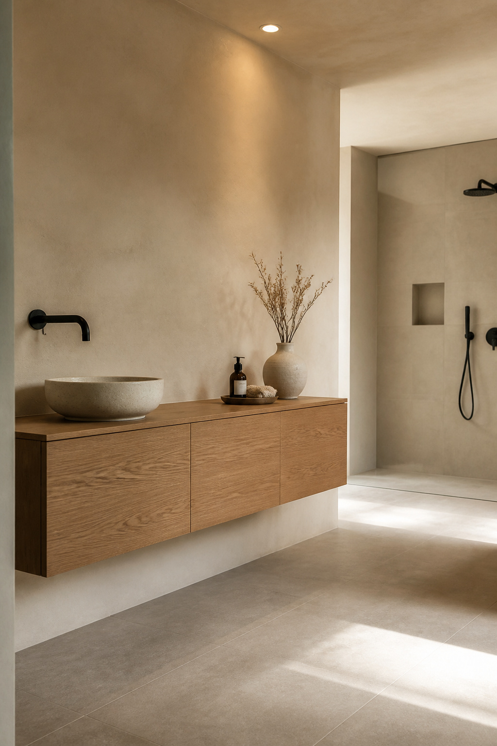
This guide sets out a method, but it starts with a definition worth using, because for most people the word still calls up a cold white box, and that box is a decade out of date. Modern now is warmer, quieter and more continuous: earth tones instead of clinical white, surfaces without grid lines, fixtures lifted clear of the floor.
Then the order: layout, surfaces, fixtures, hardware, decided in that sequence, because each one narrows the next and reversing them is what makes a renovation expensive. That sequence is my own argued position; nobody has published it as a rule. I will defend it as we go, and hand you to a deeper article at every step.
What “modern” means in a bathroom now
Modern is a moving word, and in bathrooms it has moved a long way from where most people left it.
Warm minimalism instead of the cold white box
The room I measure restraint against has no bathroom in it at all. My grandparents kept a summer cottage on the Stockholm archipelago: unpainted pine, oil lamps, and one open shelf holding every plate and cup in the house. Nobody there would have used the word minimal. Everything in the place had simply been chosen once and then kept for thirty years. That is the idea to bring into this room. You get to a modern bathroom by subtracting, on purpose, and then warming the room back up, rather than by adding modern things to it.
Current coverage has arrived at the same place by a different road. Porcelanosa’s 2026 trend book frames the bathroom as a personalised wellness space, a warm retreat inside the home, rather than a functional white one. The palettes follow: beige, brown, terracotta and a range of greens, with Pantone’s 2026 Cloud Dancer (a weightless, whitish shade) sitting where stark white used to sit. Untreated-looking natural finishes are back, limestone and travertine among them, alongside brushed copper, graphite and bronze. Mediterranean and Japandi influences share the year, and both are organised around natural material and restraint, with little room for ornament.
Warm minimalism is the working name for all of that: the same reduction the old cold-white version asked for, with the temperature put back.
Seamless surfaces as the new baseline
Ask designers what dates a bathroom fastest and they name grout ahead of any colour.
“Grout is the part of the bathroom that generates the most angst and dissatisfaction,” says interior designer Caroline Kopp. Julie Beuerlein, founder of JKB Home Design, puts the same shift in maintenance terms: “Less grout means less maintenance, which feels right for how people live today.” Nureed Saeed, an interior designer and NKBA Northern California chapter member, ties the move to larger formats directly to how little time people want to spend cleaning a bathroom.
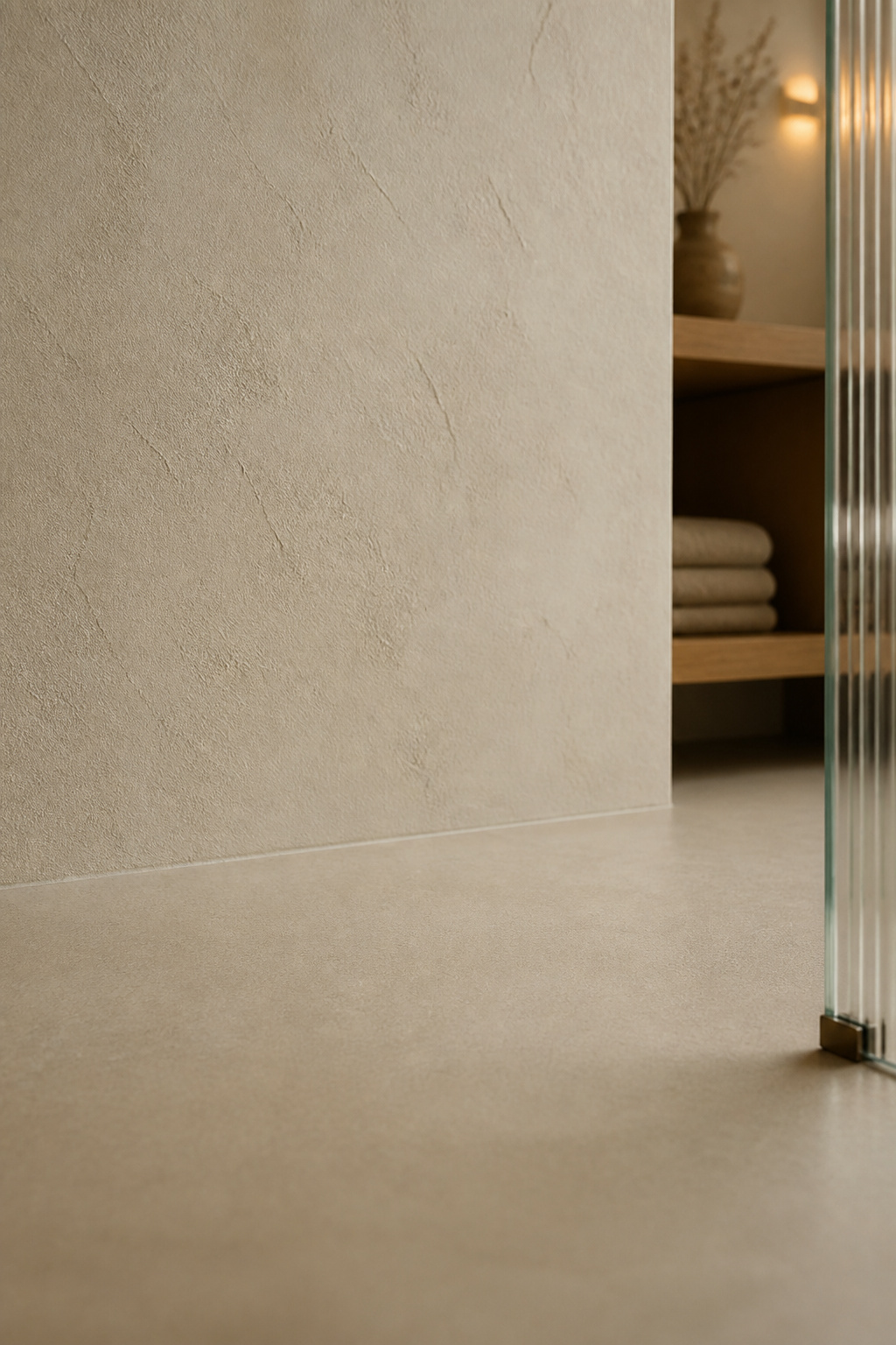
Several materials are replacing the grid, all heading the same way: large-format tile in 24×24, 18×36 and 13×30-inch sizes, or full-slab porcelain and quartz that removes the seams altogether. Larger pieces mean fewer lines and less to scrub, and every one of those options is after the same thing, a surface the eye crosses without being interrupted.
Floating fixtures as the signature move
Homes & Gardens calls floating vanities 2026’s single biggest bathroom furniture trend, and, unusually for a trend line, it holds across styles instead of belonging to one. Interior designer Martha Mulholland says, “Lifting a vanity off the floor instantly makes a bathroom feel lighter, more refined, and contemporary.” Interior designer Lauren Conner is more specific about where the gain lands: “exposing more of the floor makes even the smallest, windowless bathrooms feel more expansive and airy.” She adds the practical half, that the absence of legs and toe kicks makes cleaning easier.
Put those three together and you have the definition: warm rather than white, continuous rather than gridded, and lifted rather than planted. The floor you can see under a lifted fixture is not wasted; it is the part of the room doing the resting.
The decision order in modern bathroom design: plan before you buy
The most expensive mistake in this room is usually made in a showroom, months before anybody opens a wall.
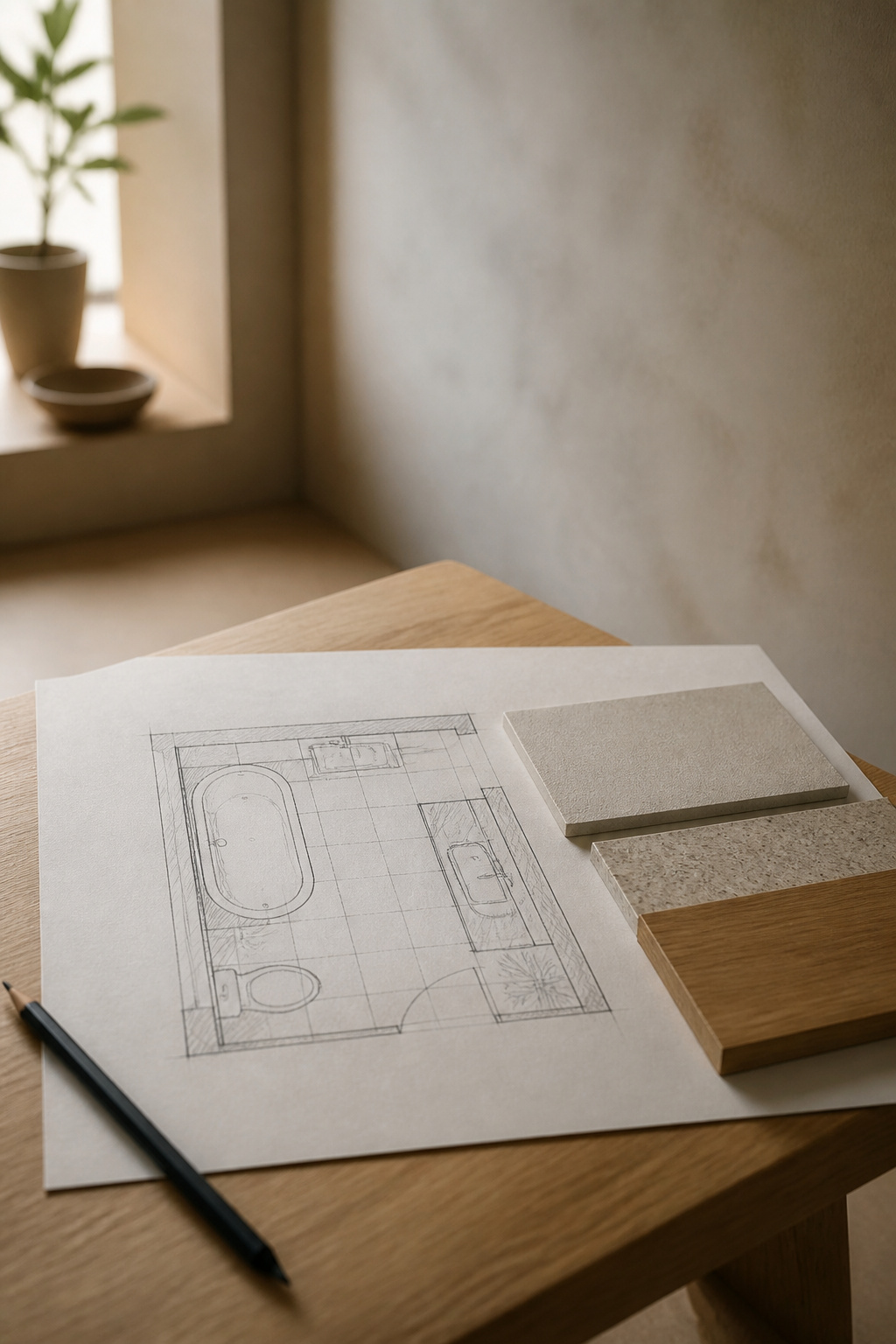
Why layout comes first
A remodelling planning guide names it as a mistake outright: starting work without final selections, then reworking the space around whatever arrives. The principle behind it is that selections have to stay final once work begins, and that only holds if the plan was settled before the product.
The layout is where the plan lives, and it fixes the things that cost the most to move: drain positions, the door swing, which walls carry water. Barrie Cutchie, design director at BC Designs, treats drainage as its own planning step rather than a detail of the layout: “Water drainage can be a huge headache in bathroom design.” Misaligned drains show up after installation, which is the worst possible time to learn anything.
Getting a plan right on paper is a whole discipline, and the work is dimensional: clear floor space, the distances between fixtures, the door opening. Those numbers belong to planning the layout on paper first, and they are the reason a vanity’s width is less of a free choice than a showroom makes it look.
The four decisions in sequence: layout, surfaces, fixtures, hardware
Each decision constrains the next, and the constraint runs one way only.
| Decision | What it fixes | What reversing it costs later |
|---|---|---|
| 1. Layout | Drain and vent positions, door swing, which walls are wet | The most: floors and walls come open |
| 2. Surfaces | The largest area in the room, and the substrate beneath it | A full strip-out of that area |
| 3. Fixtures | What the wall has to carry, and at what height | Wall work, sometimes new framing |
| 4. Hardware | What your hand meets every morning | An afternoon and a hex key |
If you respect one row, make it the first; everything below it is negotiable. Layout is the only row you cannot buy your way out of later, and it is also the one people postpone, because drawing a plan produces nothing to look at.
What happens when you buy out of order
Buying ahead of the plan produces incompatible purchases that no longer fit the revised space, along with the waste and rework of ordering twice. It is always the same pattern: a vanity bought to a width the final plan does not have, a surface ordered for a wall that moves, a fixture that needs a wall depth nobody has confirmed yet.
That is a sequencing failure rather than a failure of taste, and it costs real money in a way a wrong colour never does.
Surfaces that read as modern
Most of the time, what dates a surface is the number of lines in it more than the material it is made of.
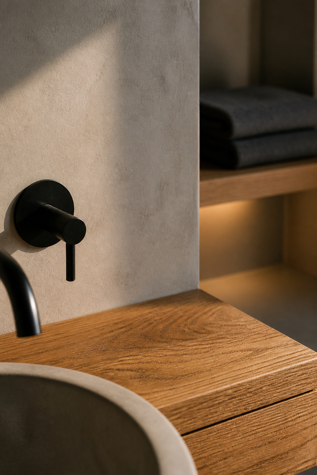
Why grout lines are the first thing that dates a bathroom
Designer Dijana Savic-Jambert of MAREDI Design adds an argument to the aesthetic one: “An added advantage is that with less grout comes less unwanted and unnecessary chemicals in your home.” Fewer joints leave fewer places for mildew, and fewer bottles under the sink to fight it. Designer Rosanna Bassford makes the wet-area case for going further still, specifying full slab porcelain or quartz to eliminate seams.
Taken all the way, that idea becomes a continuous mineral coating with no joints at all, and it brings its own demands. What it needs underneath it, how it is sealed, and what it costs against tiling the same area are involved questions. Seamless microcement surfaces answers them in full, so read it before you fall in love with a sample.
Where a warm material belongs against a cool one
Subtraction on its own gives you a cold room, and one warm material set against the cool ones is what stops that happening. The pairing works on undertone rather than colour family. Warm stones (beige, cream, gold, brown, soft red) pair with warm oak, walnut and hickory; cool stones carrying grey, blue or charcoal sit better with cooler, more neutral woods. Match the undertone and a room looks composed. Miss it and a perfectly good oak vanity turns slightly orange against a grey floor.
The ratio matters as much as the match: choose one dominant material and hold the second to an accent, rather than splitting the room evenly between them. And when you are deliberately mixing warm against cool, run a bridge through the room so it reads as a decision. That can be a wall colour or, most often in a bathroom, a single metal finish carried across every fixture. The bridge gets the last section of this article, and it comes last for a reason.
The fixtures that signal modern: floating vanity and wall-hung toilet
Both fixtures make the same trade. They give you uninterrupted floor, and in exchange they want structure you will never see again.
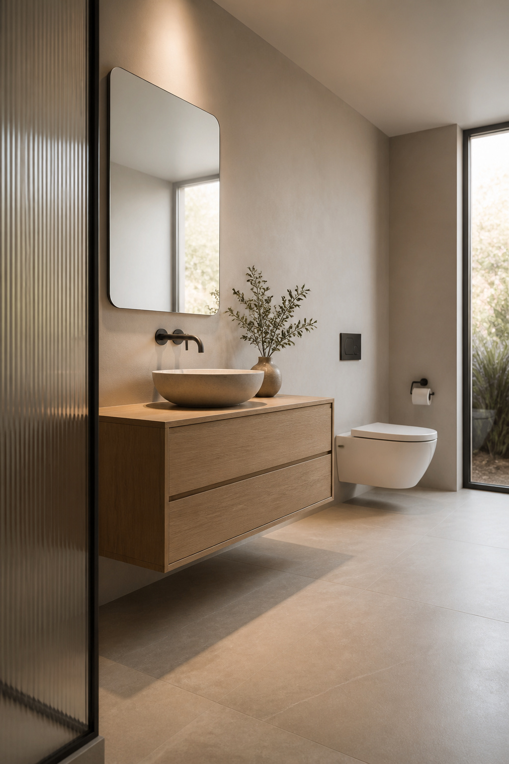
What “floating” requires behind the wall
A floating vanity should never be installed into drywall alone. It has to reach studs or reinforced backing behind the wall surface, and provided it is properly anchored, capacity then scales with the width of the cabinet. So whether it will hold is a question about the wall more than about the vanity.
A wall-hung toilet is the same argument with more steel in it. The pan hangs on a carrier frame buried in the wall, and that assembly generally needs more finished depth than standard stud framing gives you, so the wall gets rebuilt or furred out to make room. The premium over a floor-mounted toilet is real, and the framing work drives it more than the fixture itself does.
Neither decision runs on category averages. Carrier depth, waste-outlet position and mounting spacing are all manufacturer-specific, so the installation manual for the exact model governs over any general spec. Tess Carver has worked both fixtures through in detail. What actually holds a floating vanity up covers the fixing and the load, and Wall hung toilets and the carrier behind them covers the wall, the cost gap, and what servicing behind tile involves.
The case for and against each fixture
For the vanity, the case is the one Lauren Conner makes: more visible floor, a lighter room, and no legs or toe kicks to clean around. The caution to take seriously comes from designer Andrea Goldman, who says proportions still have to preserve real storage and access, or a sculptural cabinet costs you the function it replaced. That trade bites hardest in a small room.
For the toilet, the reward is the cleanest floor in the room and the strongest single signal of the whole style. The wall is the case against it. This is the fixture people most often talk themselves out of once they learn what has to happen behind the tile, and deciding against it is a legitimate outcome, not a failure of nerve.
Scaling the look to your room and your budget
How much of this you can reach in the room you have comes down to two constraints: space and money.
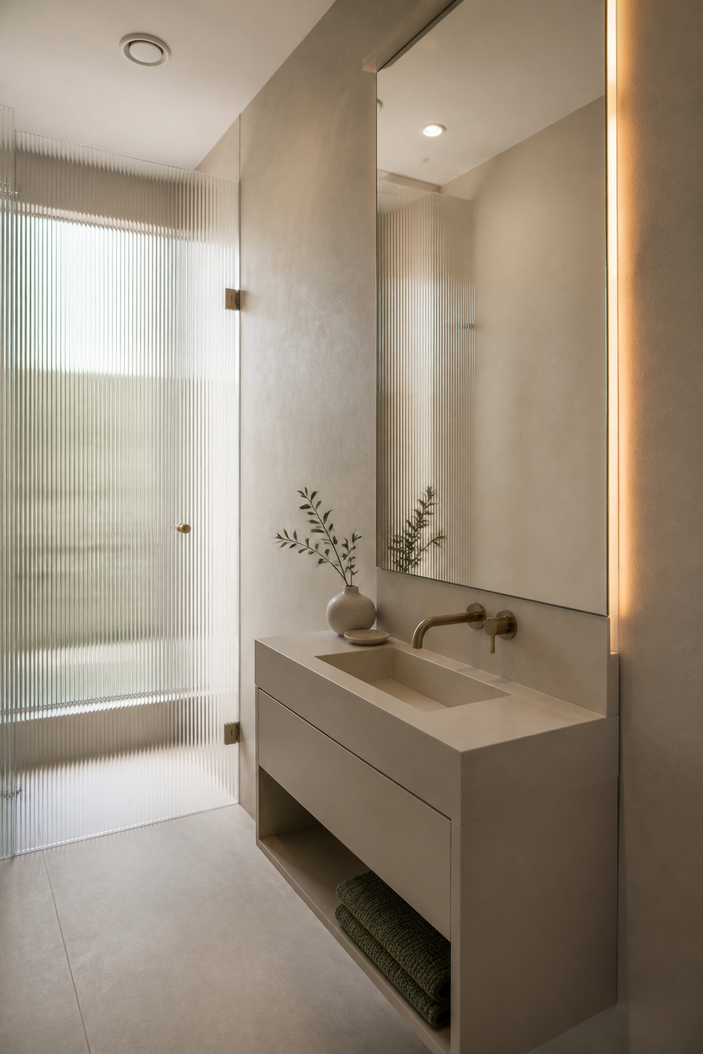
What a small room has to give up
A small bathroom cannot have every modern signature at once. Floating fixtures, a continuous surface run and generous storage all compete for the same limited wall and floor, so in a tight room the hard part is deciding what leaves.
That decision has an order to it, and it starts with bathing, the fixture with the largest fixed footprint. Whether a small bathroom keeps a tub is also the one question in this series where the evidence pulls two ways, and I am not going to pretend otherwise here. Both cases, and the order to work down the rest of the list, sit in what to give up first in a small bathroom.
What’s reachable without a remodel
These figures are for scale rather than for budgeting. This Old House puts a basic cosmetic refresh of a roughly 50-square-foot bathroom (paint, hardware, lighting) at about $8,478 to $10,883. A high-end remodel of that same room, with structural change and custom cabinetry, runs roughly $27,492 to $35,808, which is three times the money for the same square footage. A midrange update lands between them.
Almost all of that gap is structural work, so a surprising amount of the look is reachable at the bottom of the range: the finish family, the hardware, the fixture that sits on plumbing already there. A modern update without demolition prices each of those swaps individually. Anything that moves a drain is the part you cannot reach cheaply.
Working within an older house
An old house answers back, usually with conditions rather than a flat refusal, and the conditions surface in a fixed order.
What the building was never built for
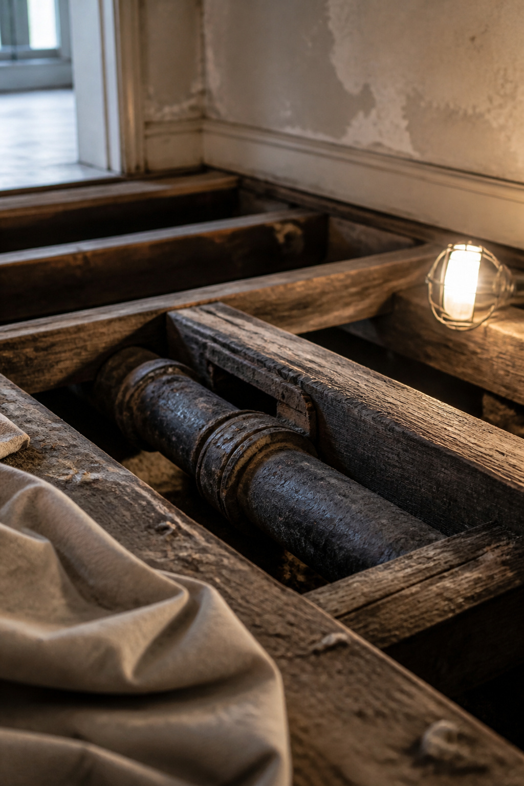
Older buildings were not designed around the plumbing they now carry. Cast-iron stacks fail in recognisable ways: barnacle-like rust scabs, pinhole leaks, waste seeping at the joints. Any of those means replacement rather than patching, before a new layout is built on top.
The floor sets the other limit. IRC 502.8 governs where and how deeply a joist may be drilled or notched, and it bans notching in the middle third of the span outright, which is exactly where a relocated drain usually wants to run. The specific fractions, and what to do when the drain and the joist disagree, belong to what an older house will structurally allow. One related change to settle early: converting a tub to a shower means the drain grows, so size it before a fixture is chosen, not after.
The order that avoids expensive surprises
Stack replacement needs a plumbing permit, which means the structural questions get asked one way or another. Asking them during planning costs a torch and an afternoon; asking them during demolition costs whatever has already been built.
So in an older building the sequence gains a step at the front. Read the building (joists, stack, wall construction), then draw the layout around what you found. Rachel Blackwood’s article works that reading through room by room.
Hardware and finish, the last decision
Most people choose the tap first, and it is the one decision that should have waited.
Why finish comes after everything else
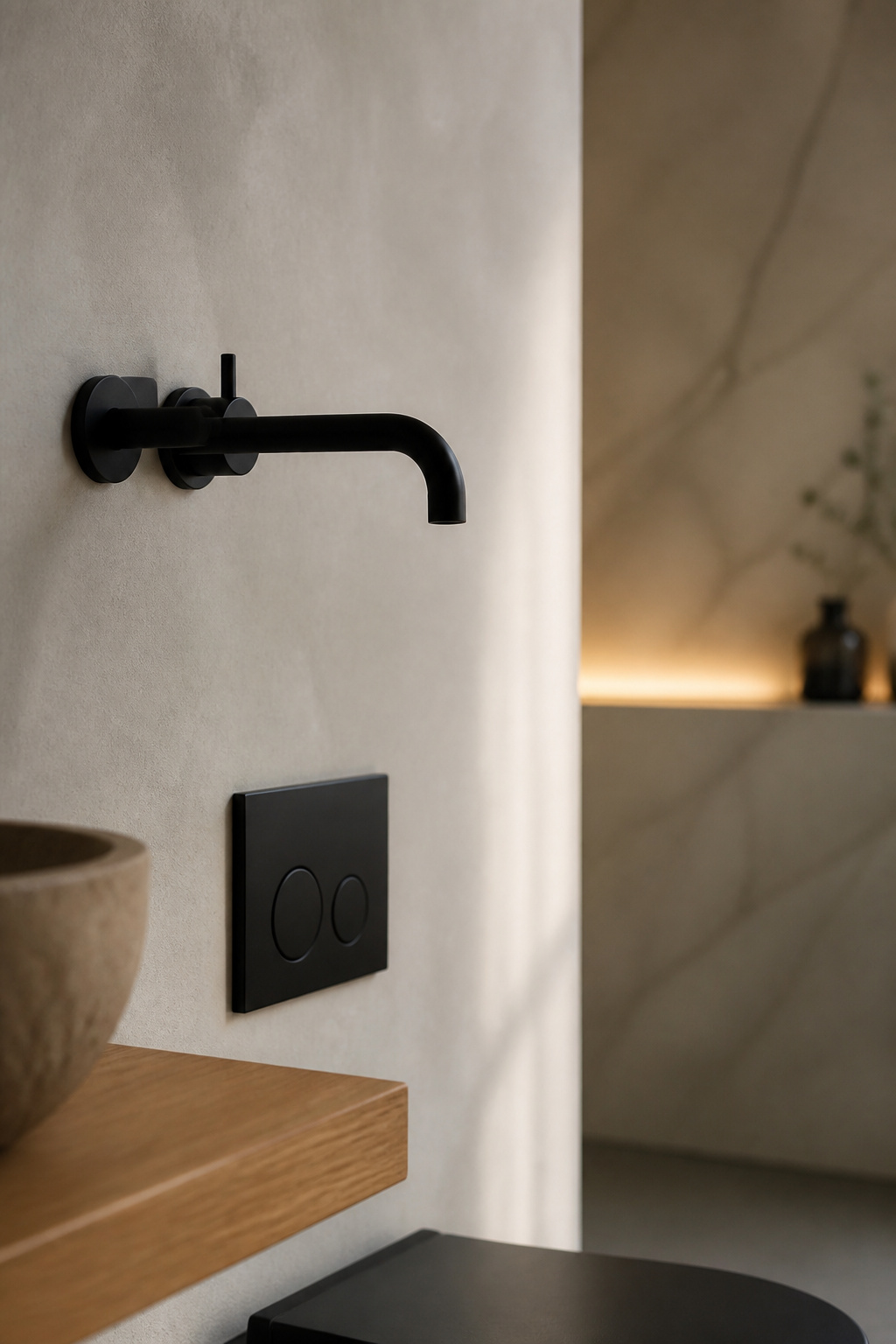
Hardware touches every other decision in the room: the vanity’s tap, the shower valve, the toilet’s flush plate, the door handle, the towel rail. That is the argument for choosing it last. Decide it early and it starts eliminating fixtures for you on the grounds of a colour. Decide it once everything it has to coordinate with is fixed, and it coordinates instead of constraining.
It is also the cheapest layer to change and the only one you physically touch every day, which is a good reason to spend the last of the budget here rather than the first.
One finish family, chosen for wear
The classic mistake is mixing metals that were trying to match, which is a different thing from mixing metals on purpose. Designer Stefana Silber explains why: chrome runs cool where polished nickel runs warm, so putting them side by side shows up their differences and they end up clashing. Her related rule is even easier to apply. Never put a polished and a brushed version of the same metal in one room.
Choosing between the families comes down to durability more than mood, though, because these are the pieces that meet water, hands and cleaning products daily. Rachel Blackwood’s guide to which fixture finishes survive daily use is where that gets settled, including which household cleaners destroy a finish that was fine the day it went in.
The decisions that are hardest to undo later
Everything expensive in this room hides behind something else.
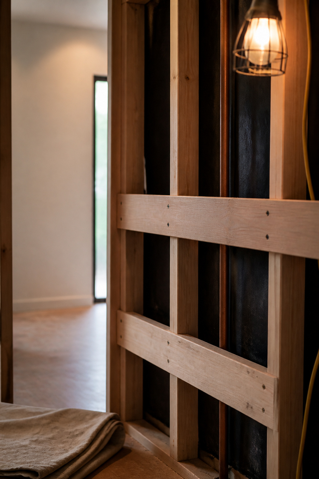
Three mistakes recur across every stage above, and they follow the same pattern. A drain gets moved without checking what the joists allow, and nobody finds out until the floor comes up. Blocking gets skipped behind a wall that was always going to carry a floating vanity or a toilet carrier, and that surfaces when the fixture has nothing solid to fix to. A continuous surface gets sealed to the wrong regime for a wet area, and the mistake shows when water finds the gap it should never have had.
None of the three is visible at the moment it is made. Each one is invisible again the day it is covered, and each becomes expensive only when tile, plaster or drywall has closed over it. That is the whole case for the order: the sequence puts the irreversible decisions where you can still see them.
The definition comes first in any summary, because it is the part you can use immediately. Modern in a bathroom now is warm rather than white, continuous rather than gridded, and lifted off the floor wherever the structure allows it. Those three qualities are what a current eye registers, and none of them arrives in a shopping basket.
The sequence follows from it. Layout goes first, because it fixes what everything else must live with, and surfaces second, because they are the largest area and the hardest to swap. Fixtures come third, because they mount to and through those surfaces. Hardware is last, because it is the one layer you can change in an afternoon.
What that order buys is the ability to spend deliberately. A room decided this way can be finished in stages, at very different budgets, without any stage undoing the last. It is also still the room you want in ten years. That is the only test of modern I trust, and it is why subtraction, done once and warmed back up, outlasts every trend it happens to resemble.